|
| Group |
Round |
C/R |
Comment |
Date |
Image |
| 80 |
Dec 20 |
Reply |
Let us know how it did |
Dec 29th |
| 80 |
Dec 20 |
Comment |
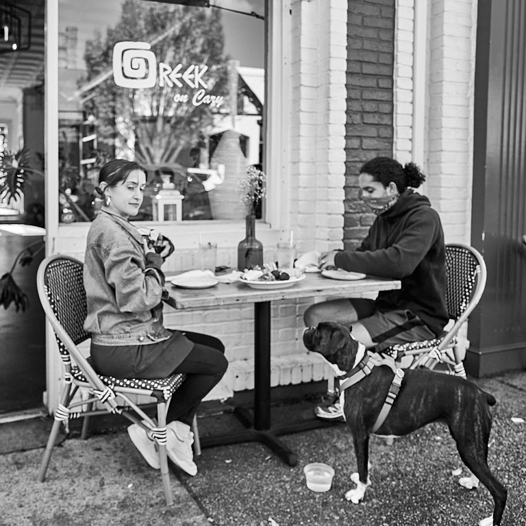
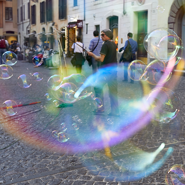
I like Stephen's crop and straightening but I agree with Carol and Jim that the color version is stronger. To me there is not enough tonal variety to make the B&W rendering interesting. |
Dec 5th |
| 80 |
Dec 20 |
Reply |
Thanks, Victor. Yes, toning down the hoodie more did make it look a muddy gray, which is why I stopped where I did.
I keep bouncing back and forth between Carol's crop and my original. Carol's corp creates a stronger image focused on the mom and daughter. The original is, in my mind, a more complete story of the family unit. Oy vey, what's a boy to do?? <LOL>.
Thanks again. |
Dec 5th |
| 80 |
Dec 20 |
Reply |
Carol, thanks for the crop idea. I tried it and I think it does work better. |
Dec 5th |
| 80 |
Dec 20 |
Comment |
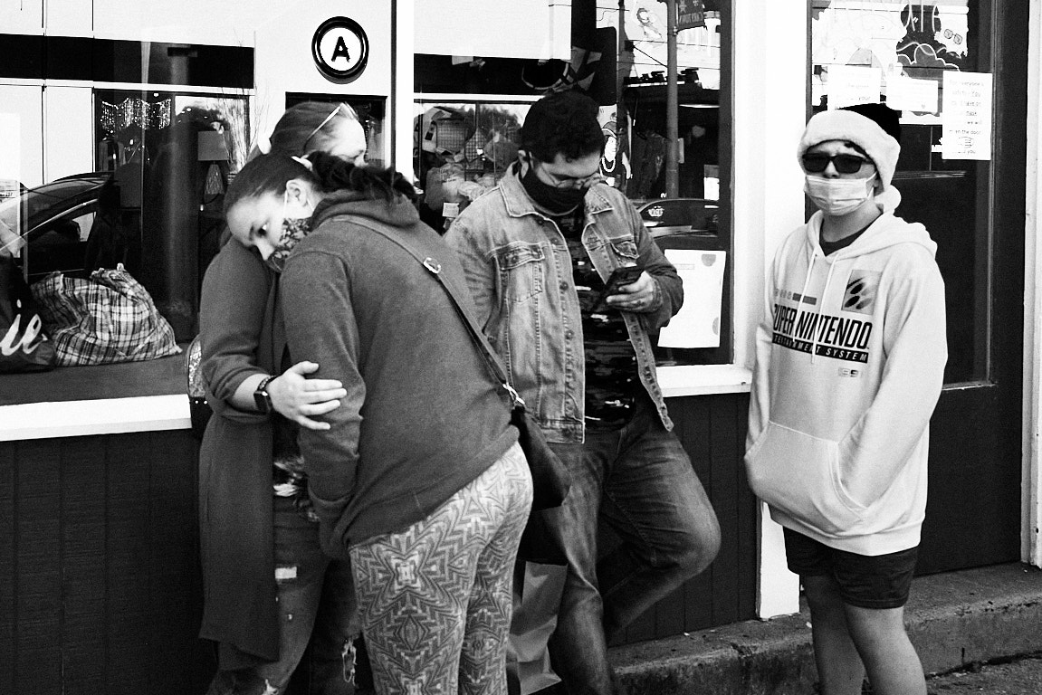
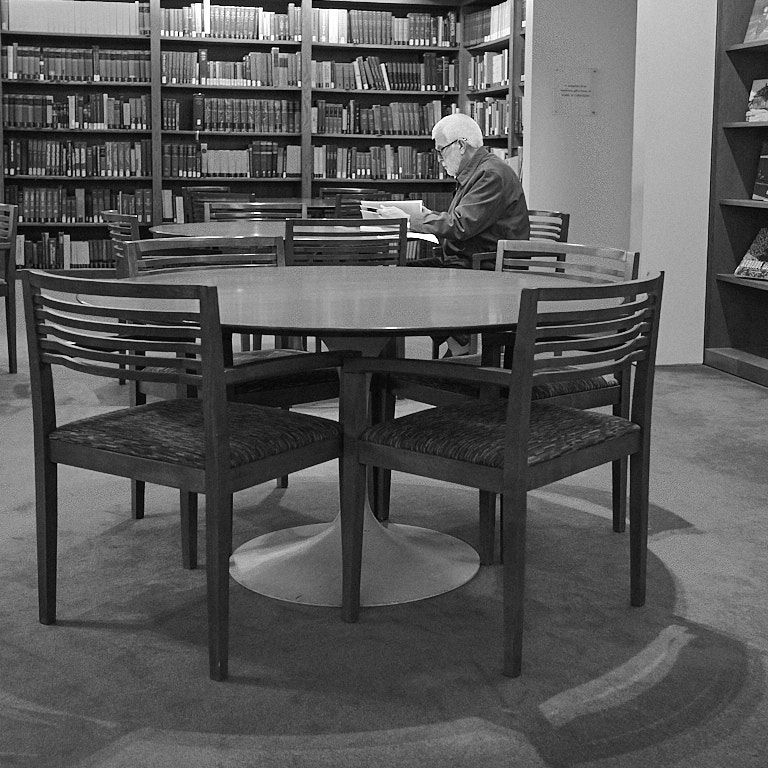
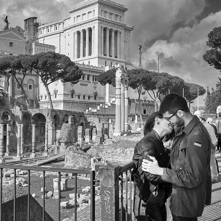
I think this is a great photo very well done.
Picking up on your comment that photo judges are "picky" (personally I think most are insane), they seem to be obsessed with perfectly straight horizon lines. Looking at the way you have this cropped on the top and bottom, the horizon line looks crooked. Looking at your original, it seems that the street is angled. Try opening up the crop to give more of a sense of place and eliminating, or at least minimizing the perceived angle of the horizontals.
Good luck in the competition. |
Dec 2nd |
| 80 |
Dec 20 |
Comment |
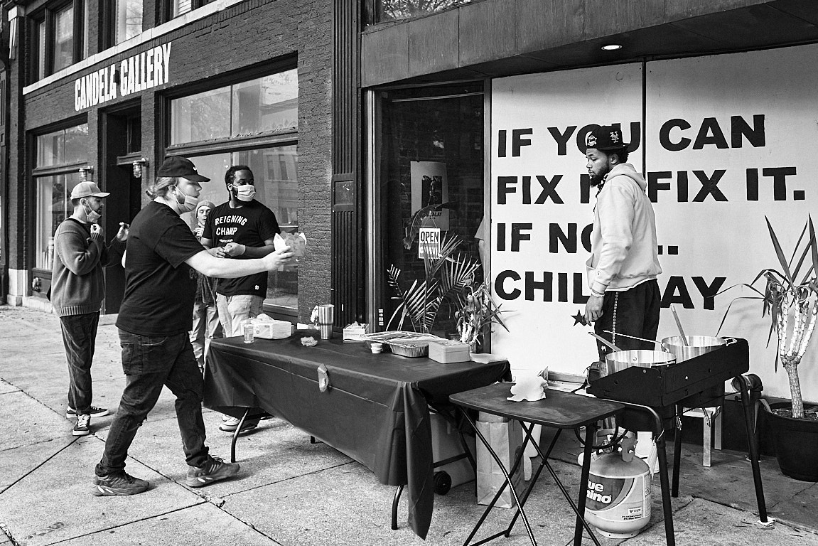
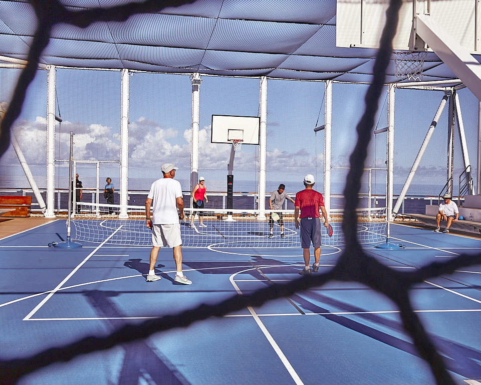
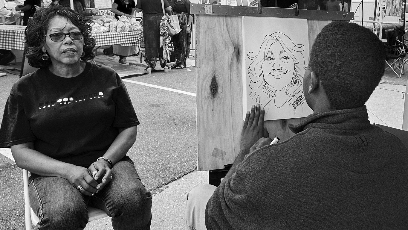
I think this had the potential to be a really good photo. The story is compelling.
To me the background blur is overdone. I think reducing the luminance there with a graduated filter would have made it look more natural and separate your main subject from the background. I'd like to see more detail in his face. The shadows on the artwork are very distracting to me. |
Dec 2nd |
| 80 |
Dec 20 |
Comment |
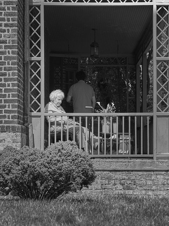
Love the story and how you framed it.
I like Jim's ideas about contrast. |
Dec 2nd |
| 80 |
Dec 20 |
Comment |
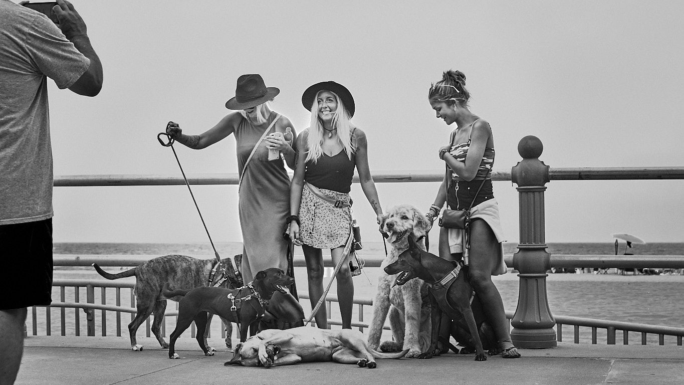
Very interesting story. I like Jim's idea for cropping although I think it's a little too tight for my taste. Experiment with it. |
Dec 2nd |
| 80 |
Dec 20 |
Comment |
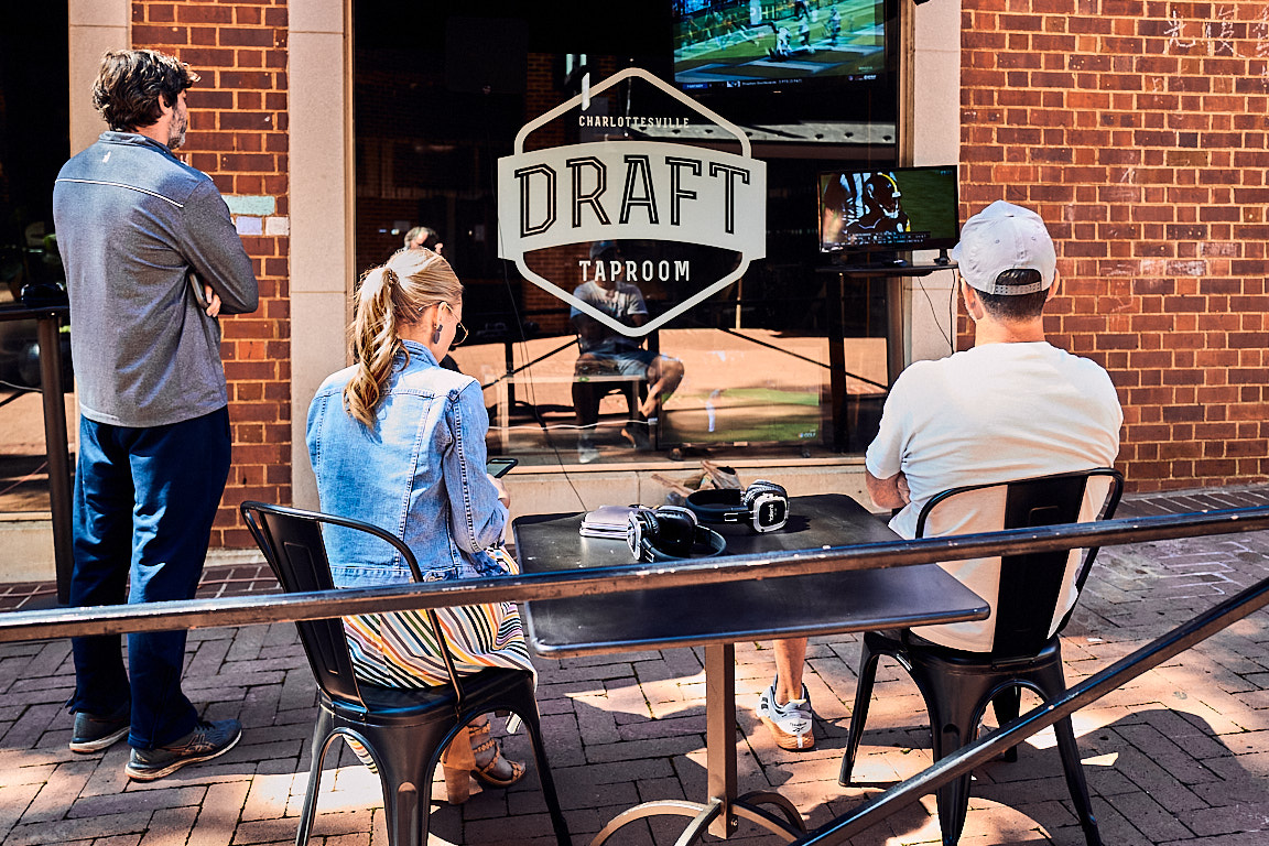
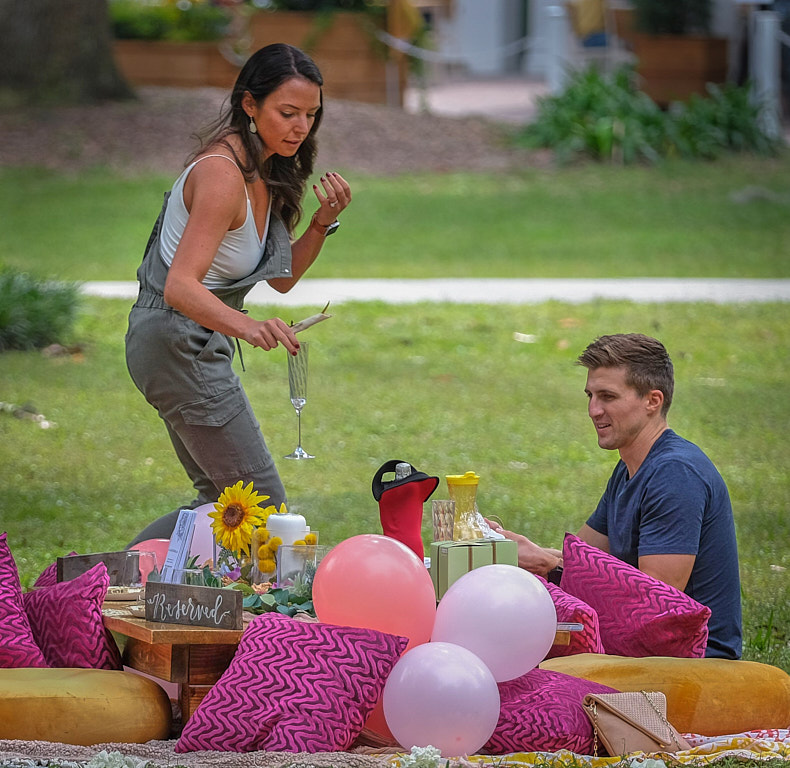
I love this story and how you framed it. I also like the timing on the woman's movement with the glass of champagne.
The one suggestion I have is to make the people and foreground brighter than the background. In your file, my eye is drawn to the brighter area in the background. In the attached file, I opened up the shadows there and reduced the brightness in the background It was a quick masking job and not very good but I hope you can see a slight difference.
|
Dec 2nd |
 |
| 80 |
Dec 20 |
Comment |
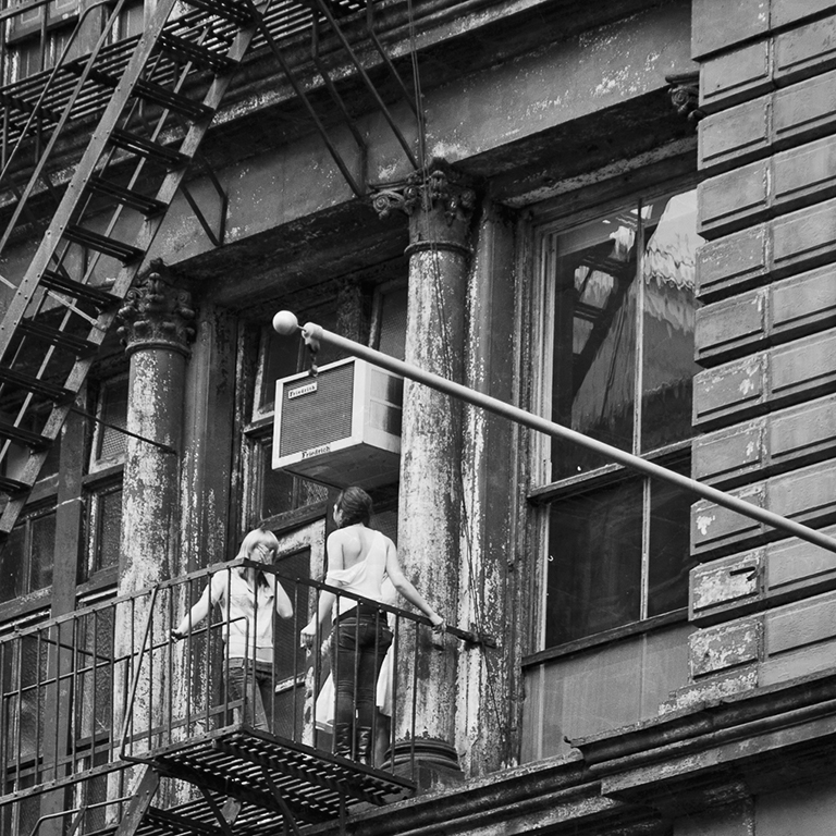
I also like this image very much. The good focus on the mystery woman's face and the DOF out of focus on the other woman's face works well for me. |
Dec 2nd |
| 80 |
Dec 20 |
Reply |
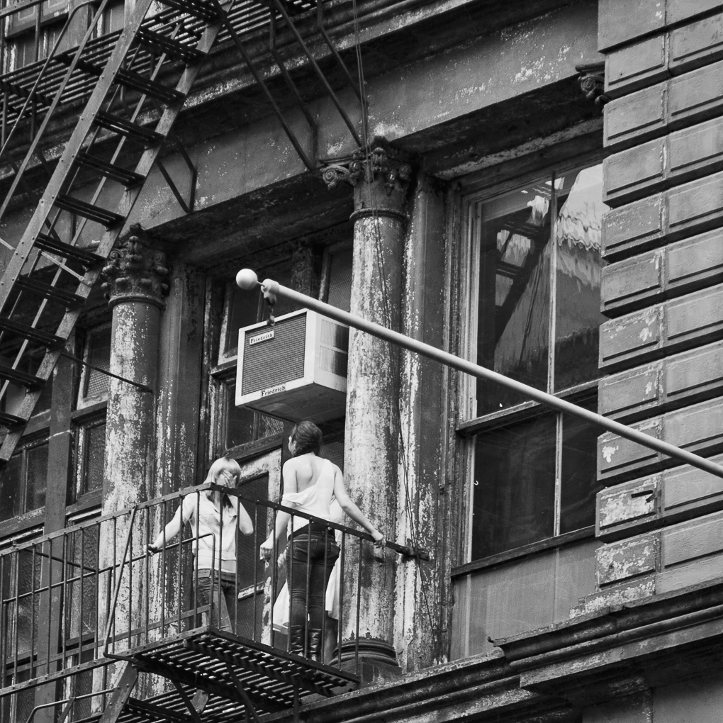
Jim, thanks for your comments and compliments. I also like the reflections in the color version but I did decide that they would detract from the story I wanted to tell. |
Dec 2nd |
7 comments - 4 replies for Group 80
|
7 comments - 4 replies Total
|