|
| Group |
Round |
C/R |
Comment |
Date |
Image |
| 80 |
Oct 20 |
Reply |
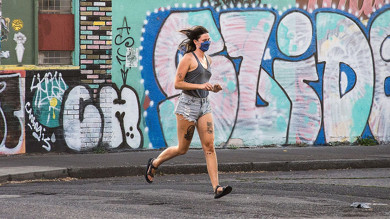
Thanks for your comments Victor. I disagree with your opinion that B&W is a better choice. I alway test to see if a B&W rendering looks better than color to me. For this photo I like the realism of color and I think the color adds to the story where B&W would take away from it. The color scheme, red-orange (bricks), blue (woman's jacket and man's pants) and green (the TV screen) for a nice split complementary color scheme. |
Oct 11th |
| 80 |
Oct 20 |
Reply |
It's up to you to decide what your story is. To me you had 2 competing stories, the wall & the runner. I prefer to emphasize the runner as the story and use the wall as a supporting actor. |
Oct 5th |
| 80 |
Oct 20 |
Comment |
I absolutely love this shot and the story you're telling. You caught the woman at the perfect moment with both feet off the ground and her hair flying.
The graffiti is a great background. I'd like to offer an alternative crop of 16:9 just for kicks and giggles. What do think about it? |
Oct 4th |
 |
| 80 |
Oct 20 |
Comment |
Excellent story.
I'm wondering how it would look if you cropped it landscape and showed more of the road behind her. |
Oct 4th |
| 80 |
Oct 20 |
Comment |
Love the photo and love the story. I have a few of my granddaughter on a carousel and I treasure them
In the attached image I reduced the highlights quite a bit, which darkened the background. I then used the graduated radial filter to draw a mask on the boy's face and add a touch of brightness. What do you think? |
Oct 4th |
 |
| 80 |
Oct 20 |
Reply |
instead of copying the image, use "save as." |
Oct 4th |
| 80 |
Oct 20 |
Reply |
I don't like "heavy" vignetting either. Try using the graduated linear adjustment tool so the vignetting falls off where you want to fall off. Then brighten the man's face ever so slightly so he's just a touch brighter than the right wall. |
Oct 4th |
| 80 |
Oct 20 |
Comment |
I like the story I think you're trying to tell and the B&W rendering is really nice.
For my taste it is too tightly cropped and I don't get the story just from looking at the photo. I'm wondering what it would look like if you re-cropped it to be a horizontal and showed the environment. |
Oct 4th |
| 80 |
Oct 20 |
Comment |
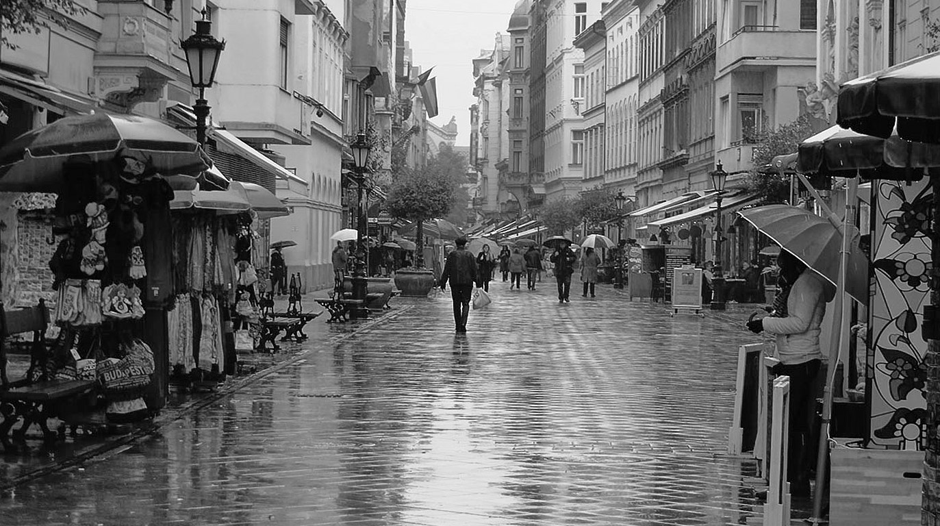
Definitely a moody shot Bill. Too bad about the weather. Budapest is an amazing city. I hope you enjoyed it in spite fo the wetness.
I like the wide angle view and the wet street acting as a leading line through the frame. There is some keystoning that could easily be corrected in your PP program.
There is very little color in the photo and what is there does not to me add to the story and the sky is colorless. To me this image works much better as a B&W.
What do you think?
|
Oct 4th |
 |
| 80 |
Oct 20 |
Reply |
Thanks, Carol. Adjustments were:
Crop and straightened as needed.
Added universal contrast with slider and also added more contrast as a last adjustment by adding an S curve adjustment.
Reduced highlights and darkened shadows (another universal contrast adjustment)
Added some clarity (midtone contrast) and structure to get more detail in the bricks.
Using the color balance tool, cooled the shadows and midtones and warmed the highlights.
Saturated the blue jacket on the woman.
Reduced the brightness on the woman's hair.
|
Oct 4th |
| 80 |
Oct 20 |
Comment |
I like the story in this photo and how you framed it. I think the B&W version is more appealing. The strong colors in the color version are a distraction to me. In the B&W version, that distraction doesn't exist and my eye is drawn to the people.
I would look at reducing the luminance in the lightbulbs but be careful to not make them unnaturally gray. Also think about reducing the luminance on the bottom and sides so that the people are slightly brighter than the surrounding area.
Well seen scene.
|
Oct 2nd |
6 comments - 5 replies for Group 80
|
6 comments - 5 replies Total
|