|
| Group |
Round |
C/R |
Comment |
Date |
Image |
| 80 |
Sep 20 |
Reply |
Thanks for that Victor. I was able to darken the greens and add contrast in the sky. That did make a good improvement. |
Sep 7th |
| 80 |
Sep 20 |
Reply |
Interesting comparison, thanks!! Next time I do a color photo I'll make sure I'm exporting in sRGB and we'll see what happens. I don't know why the color tag was eliminated from the Exif. |
Sep 7th |
| 80 |
Sep 20 |
Reply |
Yes, the exported version |
Sep 4th |
| 80 |
Sep 20 |
Reply |
Screw it. I don't have that problem with my website, Facebook or Instagram. I'll ignore it here. |
Sep 4th |
| 80 |
Sep 20 |
Comment |
Thanks for the comments. I compared my uploaded image to the image on my computer and found that the uploaded photo was less vibrant than my original. The original was closer to how Beverly's adjustment looks. I'm feeling that most photos uploaded here are somewhat flat so I'm thinking that the system is not showing what we're uploading. Any of you noticed the same?
|
Sep 4th |
| 80 |
Sep 20 |
Comment |
To me the impact of the photo is the waiter staring at you over his face mask and his body position and I like how you cropped to get that story told.
It seems to me that everyone's photos posted on this site look a little dark and flat. That might be the systems fault but see how the large file looks on your computer. You might need some additional contrast.
Love the story! |
Sep 3rd |
| 80 |
Sep 20 |
Reply |
ok ... but they're at the very fringes of the frame and the composition doesn't work for me but it's your composition. |
Sep 3rd |
| 80 |
Sep 20 |
Comment |
I like the perspective and the layering of the two musicians. I disagree with Beverly's suggestion because to me the lettering adds to the environment. |
Sep 3rd |
| 80 |
Sep 20 |
Reply |
Thanks Beverly. |
Sep 3rd |
| 80 |
Sep 20 |
Comment |
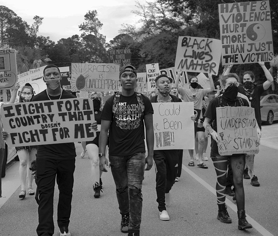
Very nice protest capture. I like how you framed it.
I agree with Beverly's suggestions and think that by darkening the darkest shades adds a little more pop. |
Sep 3rd |
 |
| 80 |
Sep 20 |
Comment |
I like the story and how you framed it.
To me everything except the closest parts is out of focus. You didn't mention your settings but it seems to me you need more DOF to make this work well. |
Sep 3rd |
| 80 |
Sep 20 |
Comment |
I like the story and the linear composition works really well for me. The reflections in the window add depth which I like.
I think reducing the brightness of the background might add some separation from the family. See my file.
You can try the spot coloring but there's not much color in the ice cream so I don't think it will work well ... but try it. |
Sep 3rd |
 |
6 comments - 6 replies for Group 80
|
6 comments - 6 replies Total
|