|
| Group |
Round |
C/R |
Comment |
Date |
Image |
| 80 |
May 20 |
Comment |
Update on this photo -- I've been informed that it was chosen to appear in the latest issue of The Street Photographer Notebook print magazine. |
May 26th |
| 80 |
May 20 |
Reply |
Thanks Victor, I like your crop. |
May 19th |
| 80 |
May 20 |
Comment |
Thanks for all your comments. I struggled with this one a lot. |
May 19th |
| 80 |
May 20 |
Comment |
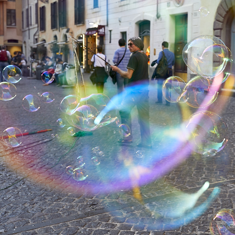
I like the story you're trying to tell and it's interesting to me to see the artist painting and what his subject is. I like your crop (16:9?, very cinematic). I think seeing the entire scene gives the photo the sense of place it deserves.
I like the color version much better than the B&W version as you have presented them. To me the B&W version is very flat and uninteresting. I think to make it work you'll need to find a way to add much more contrast probably using local adjustment brushes rather than the global contrast slider. To me the muted colors in the color version adds that contrast and is much more pleasing to look at. The sky in the B&W version looks dull. In the color version there looks like a little blue in there that you might be able to pull out more, especially if you shot in RAW.
Bottom line is that you need to go back to Venice to do this over. I'll carry your camera bag <LOL>. Seriously, I think that if you gave the color version some TLC, you'd likely be pleased with what you create. |
May 8th |
| 80 |
May 20 |
Comment |
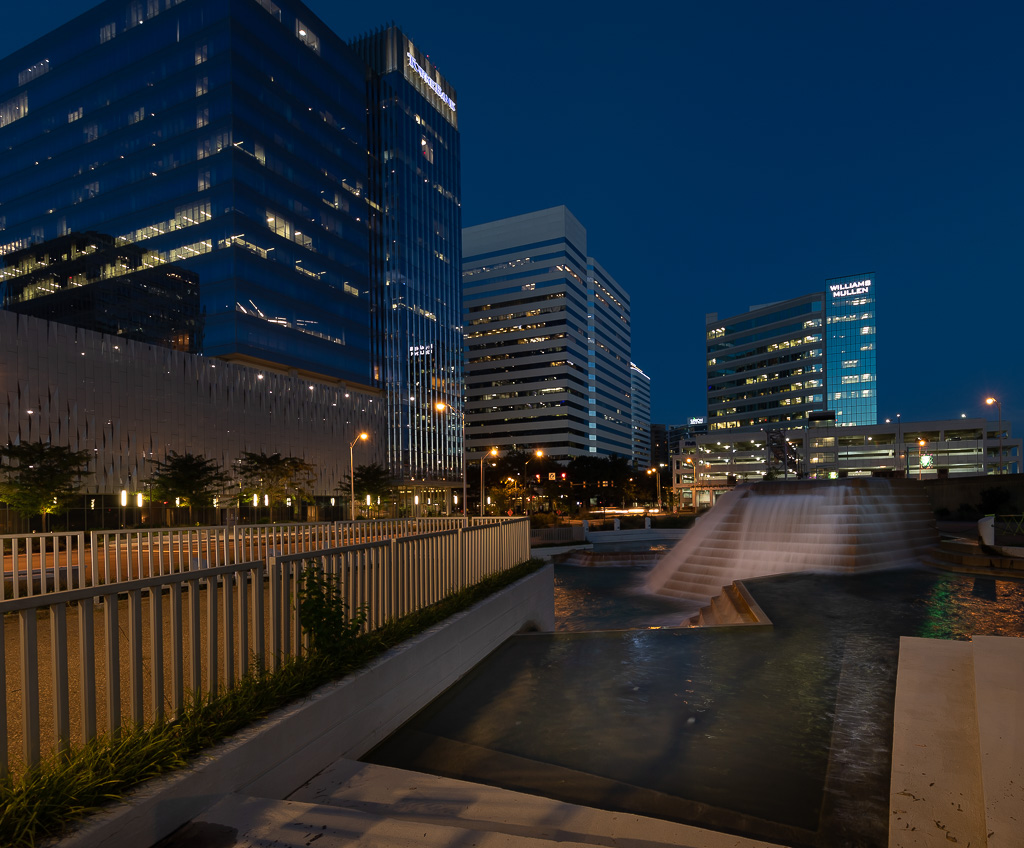
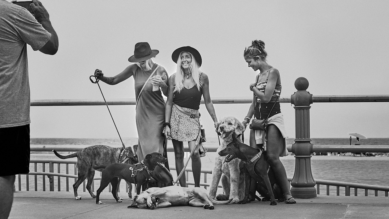
I think this is an interesting story that is well composed and exposed.
Think about 2 minor adjustments that might better attract a viewer's eye to man: use the gradient radial adjustment tool to add a vignette centered around the man and use the adjustment brush to add just a little brightness to him. |
May 8th |
| 80 |
May 20 |
Comment |
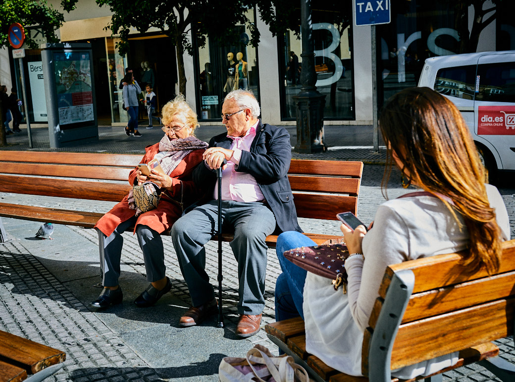
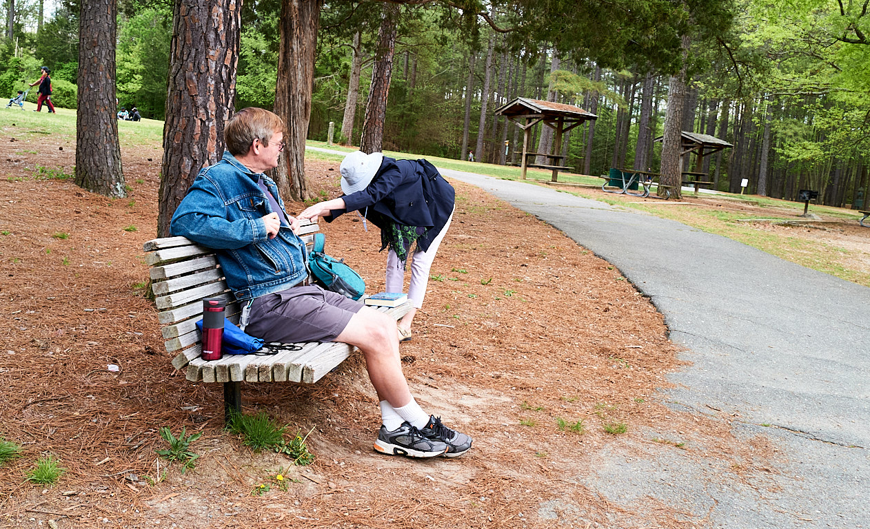
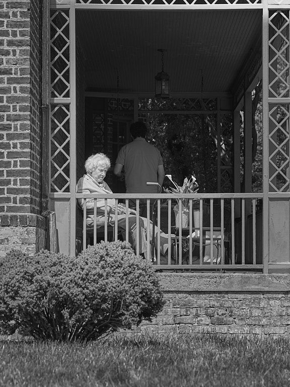
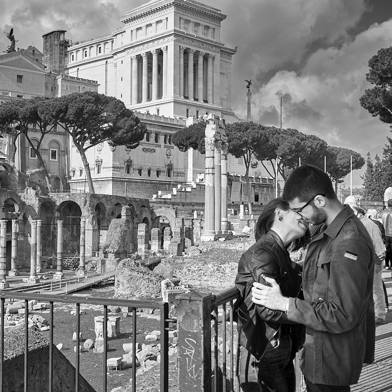
I think this is a beautiful scene and a tender story. I like the scene at the top. To me it completes the scene.
Think about adding a radial gradient mask around the couple, brighten them up a little so there's enough contrast to draw a viewer's eye to them and a linear gradient mask to darken the foreground. And yes, the legs need to take a walk (LOL). |
May 8th |
| 80 |
May 20 |
Comment |
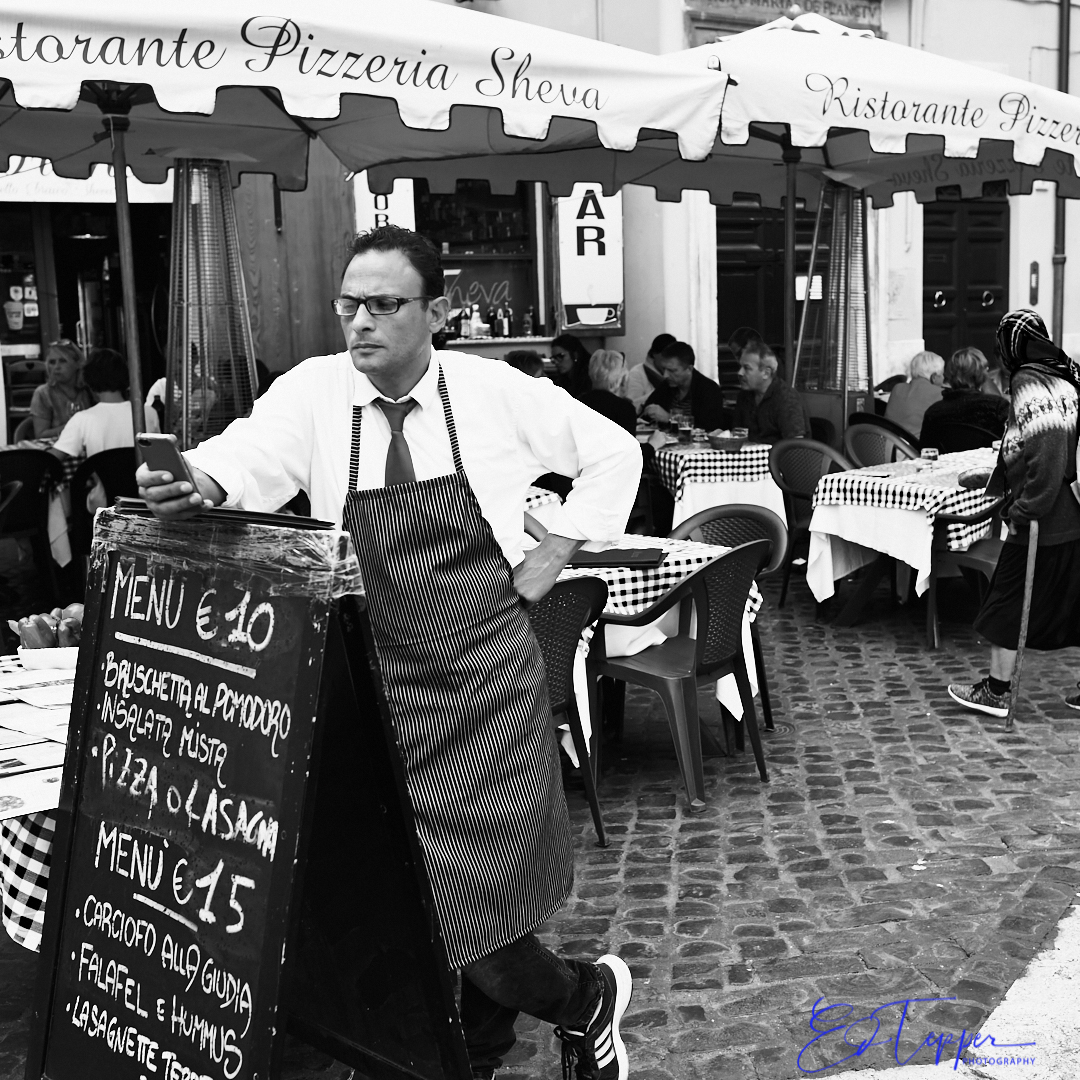
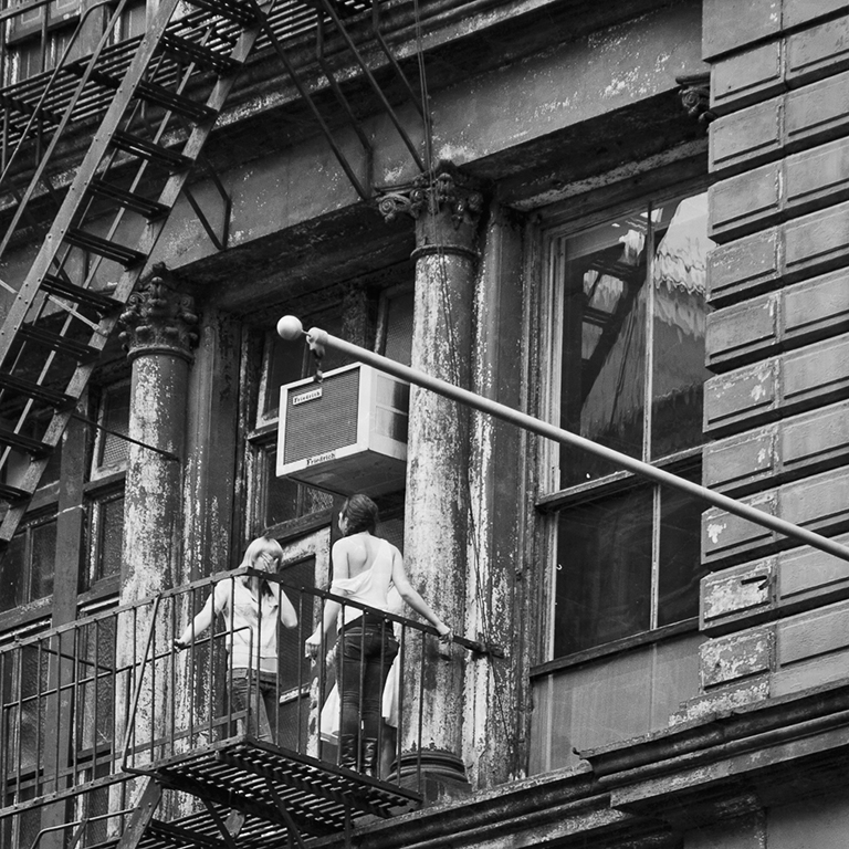
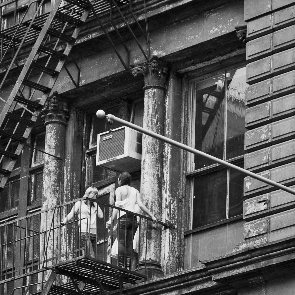
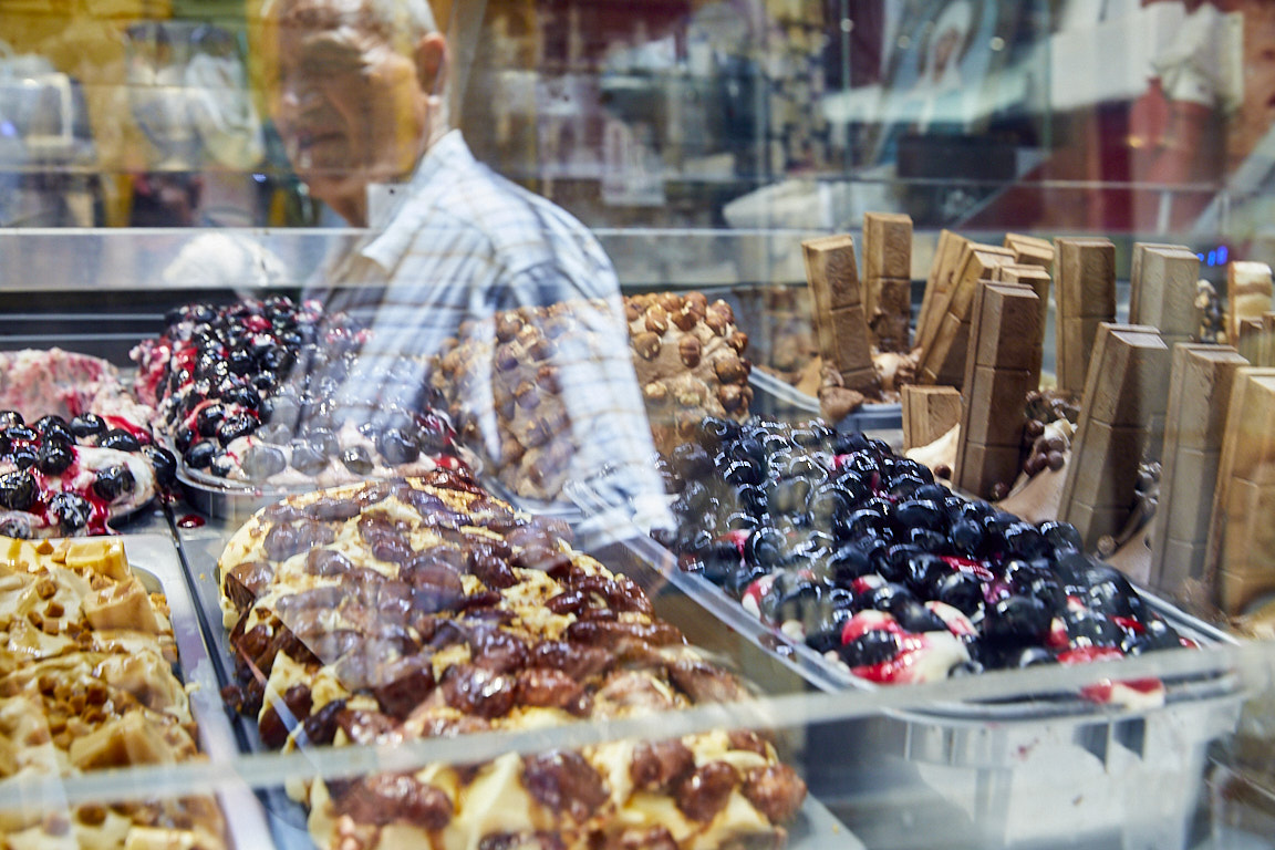
Jim, I think this is a very interesting photo. I like the visual and that the glass produces a somewhat blurry effect on the woman; makes it look classic in the Pictorialist tradition.
Think about widening the crop somewhat, especially in the left but also a little on the right to give the woman more breathing room. To me she's little scrunched in on both sides. Also think about bring the Tequila sign back in. To me that adds to the story. |
May 8th |
| 80 |
May 20 |
Comment |
This doesn't work for me at any level. It's not street photography under any definition of the genre I've seen. Just pushing Topaz buttons doesn't make a bad photo look good. |
May 8th |
| 80 |
May 20 |
Comment |
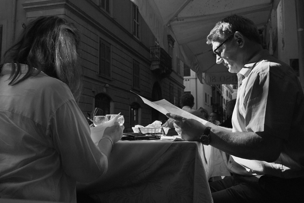
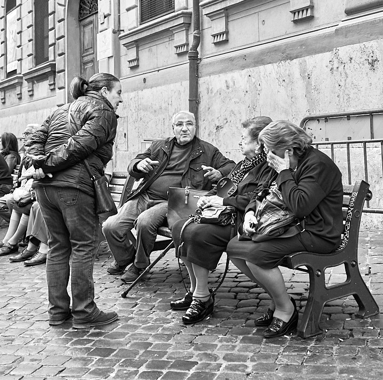
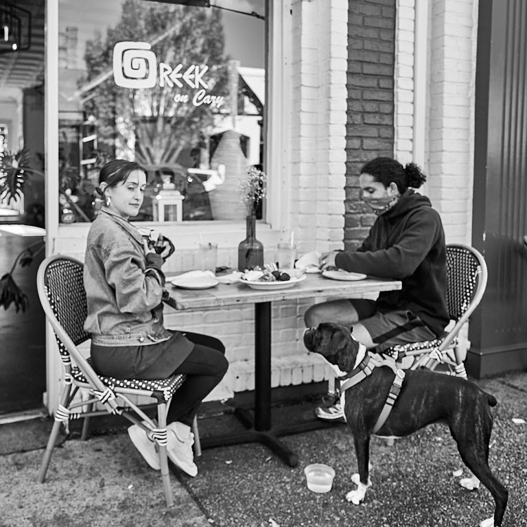
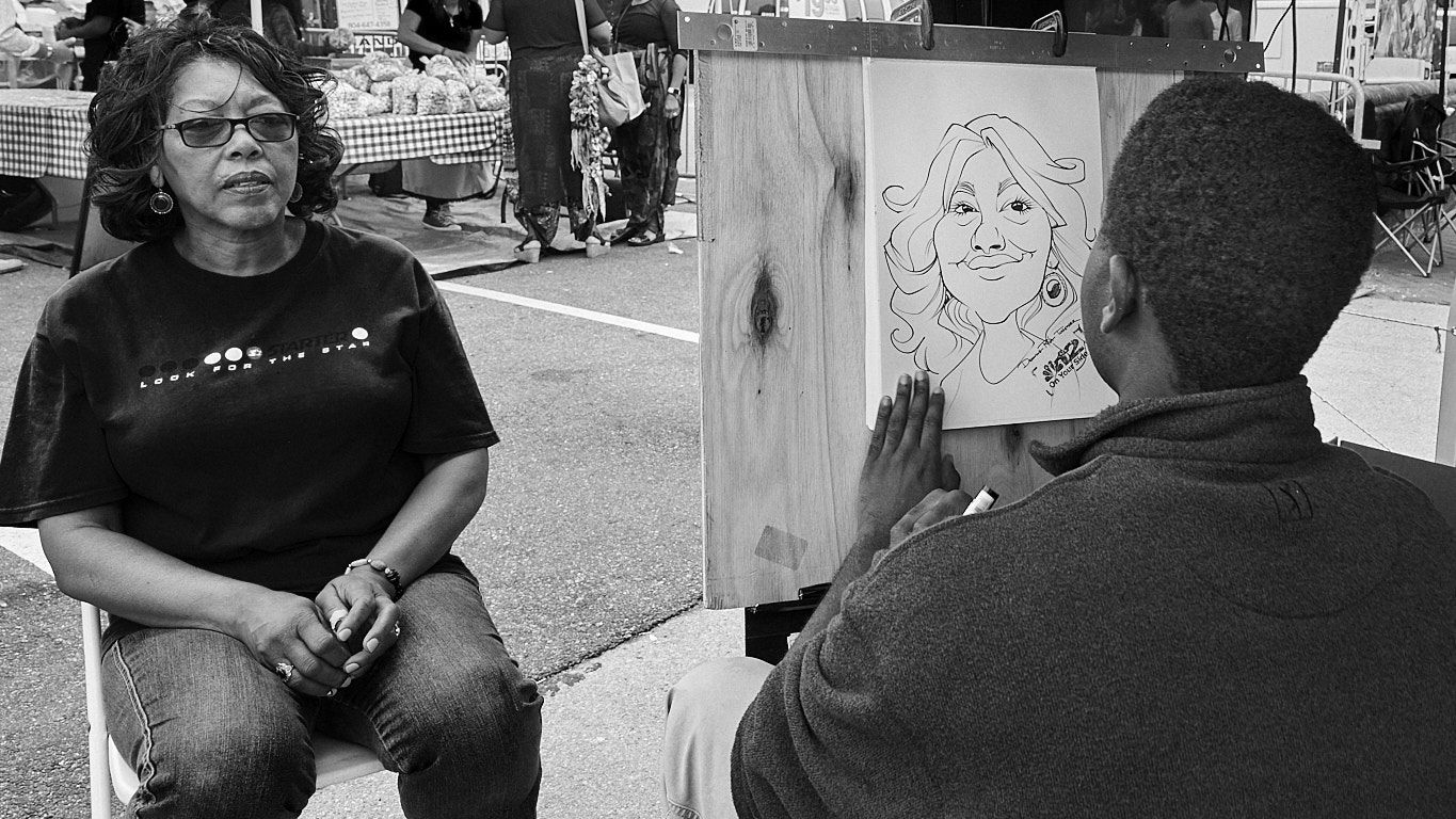
I think this is an excellent story Victor. The interaction between the two people really makes this work for me. The way you rendered the B&W draws my eyes directly to subjects and results in good tonal spread. Very well done!
I see that you straightened the verticals well but in doing so the angle view results in the optical illusion of the horizontals looking crooked, especially the top of the doorway. When that happens to me I try to crop out the horizontals if possible; I cropped this down just a little. In this photo I think that also cropping in from the right might make the composition stronger - to me the right side does not add to the story. See my attached file and let me know what you think. |
May 8th |
 |
8 comments - 1 reply for Group 80
|
8 comments - 1 reply Total
|