|
| Group |
Round |
C/R |
Comment |
Date |
Image |
| 80 |
Apr 20 |
Reply |
Thanks Bill, coincidentally I just had a video meeting with one of my photo clubs and shared this photo. One person said she initially had the same thought as you but then changed her mind. Beauty is in the eye of the beholder. I think both tell the story equally well. I'll revisit this photo some time and rethink the crop.
Stay safe out there. |
Apr 13th |
| 80 |
Apr 20 |
Comment |
I'll offer this crop as a suggestion. To me it allows more of a sense of place to the photo. |
Apr 11th |
 |
| 80 |
Apr 20 |
Reply |
Thank you! |
Apr 10th |
| 80 |
Apr 20 |
Comment |
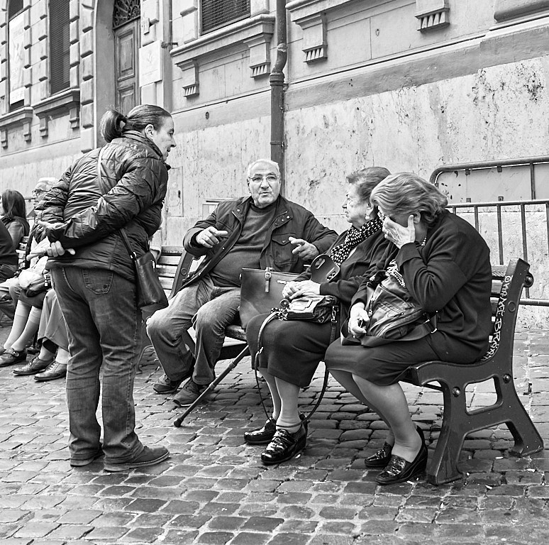
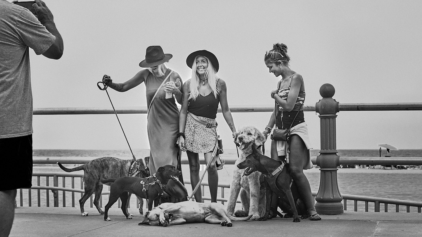
To me this is a wonderful Street scene well framed and processed. You caught them in mid stride which adds a bit of motion to the photo. Well done! |
Apr 10th |
| 80 |
Apr 20 |
Comment |
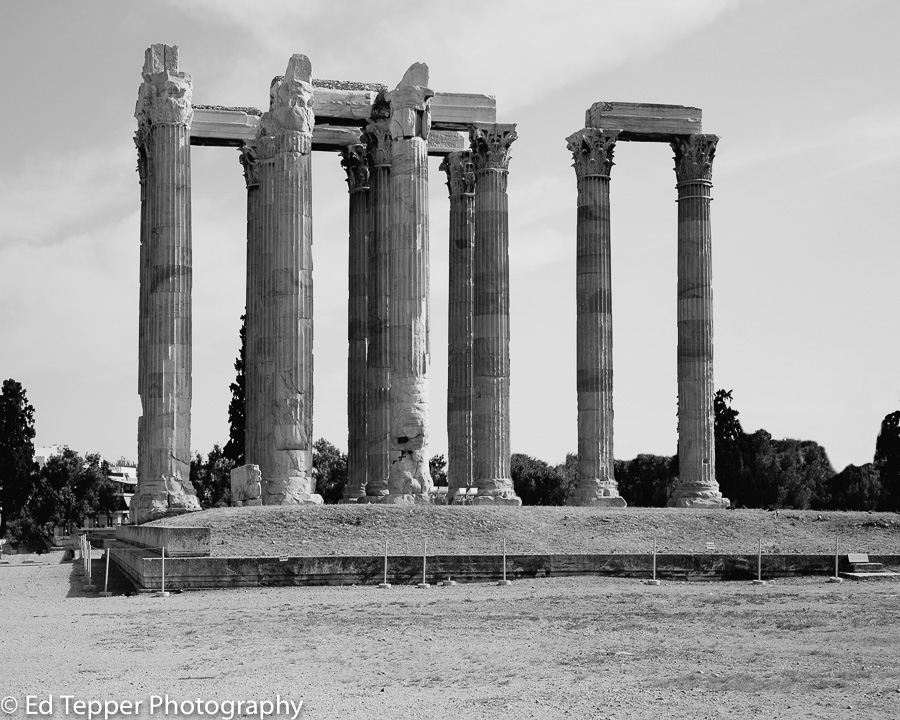
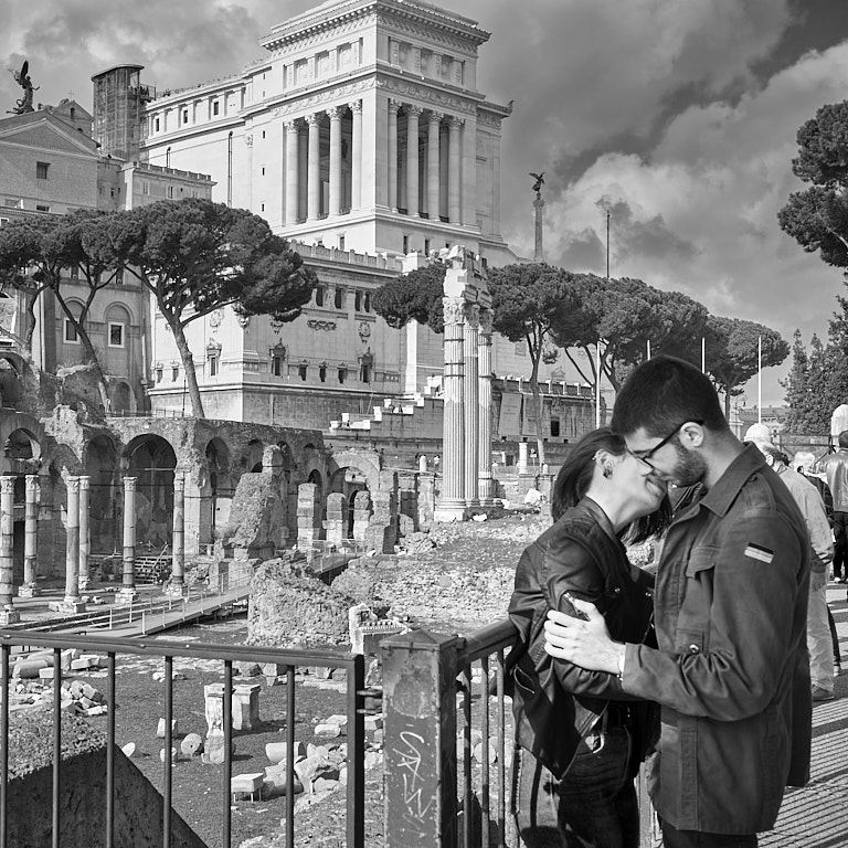
I think this is a good travel shot of the Basilica but I agree with Carol that I would've liked to see more interaction of the people to make it a street photography scene.
The colors to me look very overcooked and unnatural. There looks like a white haze around the edges of the Basilica in the sky which is extremely distracting to me. |
Apr 10th |
| 80 |
Apr 20 |
Comment |
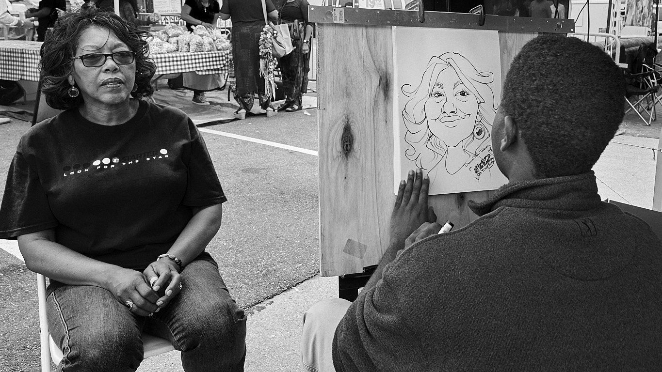
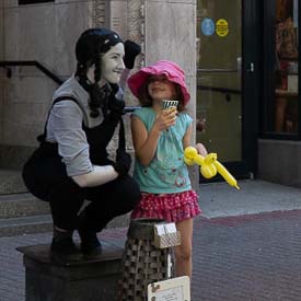
Photos of happy children are always fun and I like the moment of the capture with the child looking up and smiling at the actress.
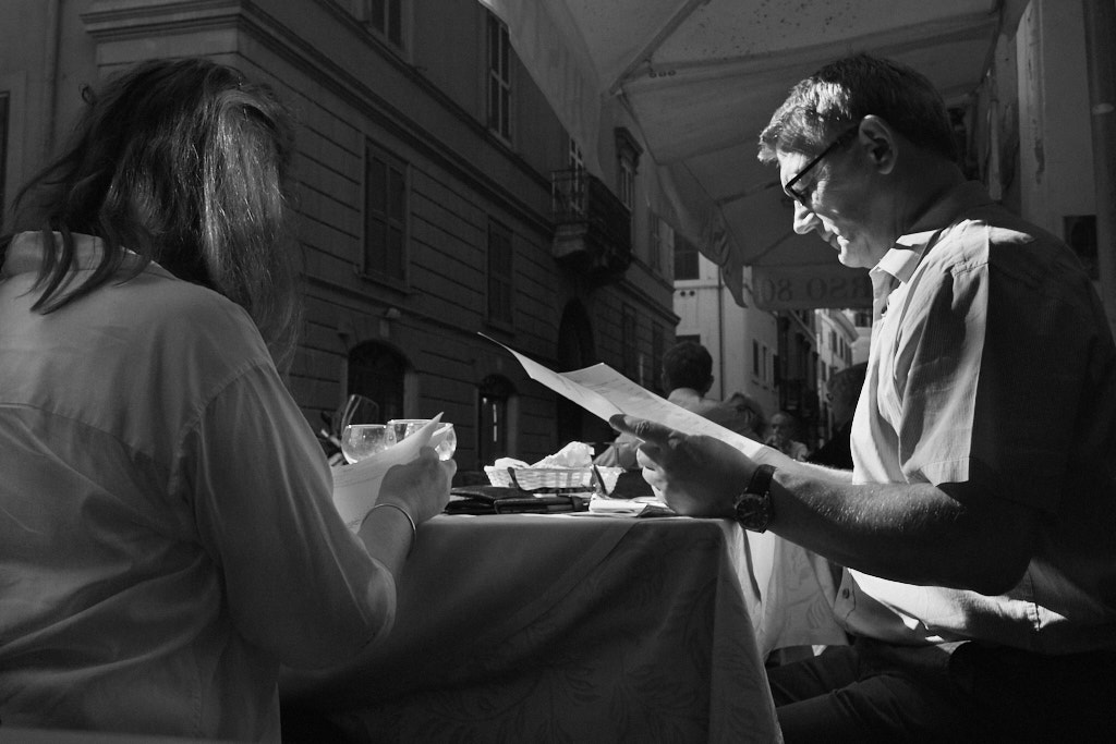
I would have liked to see the original uncropped photo. The way you cropped this one with the child's hand partially cut off is quite distracting to me. One thing about the pose that is also distracting to me is the actress's hand by her head kind of looks like a blob coming out of nowhere. The actress's face looks very bluish to me, which could be her makeup but to me looks more like a color correction possibility. I think also the child's face, especially the shadow on her eyes could be brightened up to add some detail there. |
Apr 10th |
| 80 |
Apr 20 |
Comment |
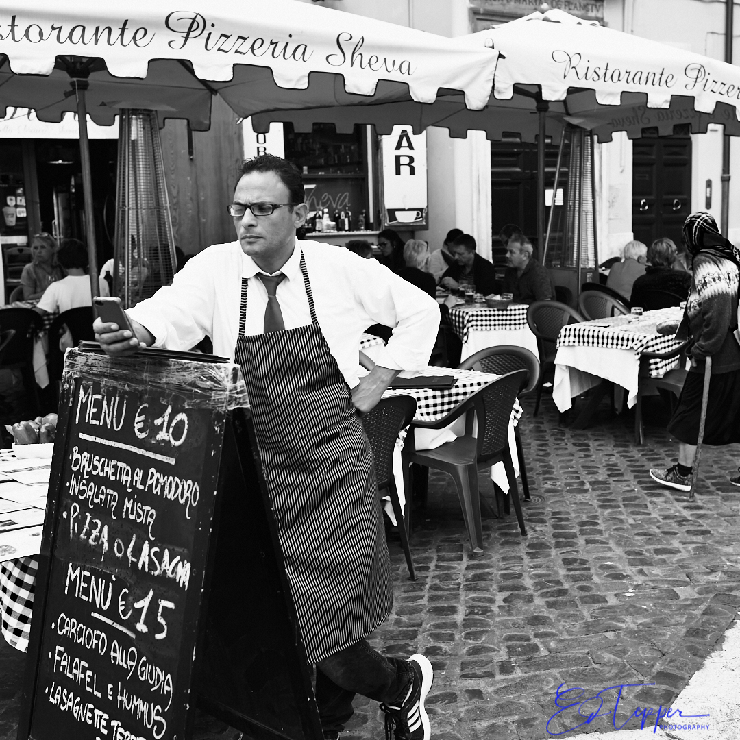
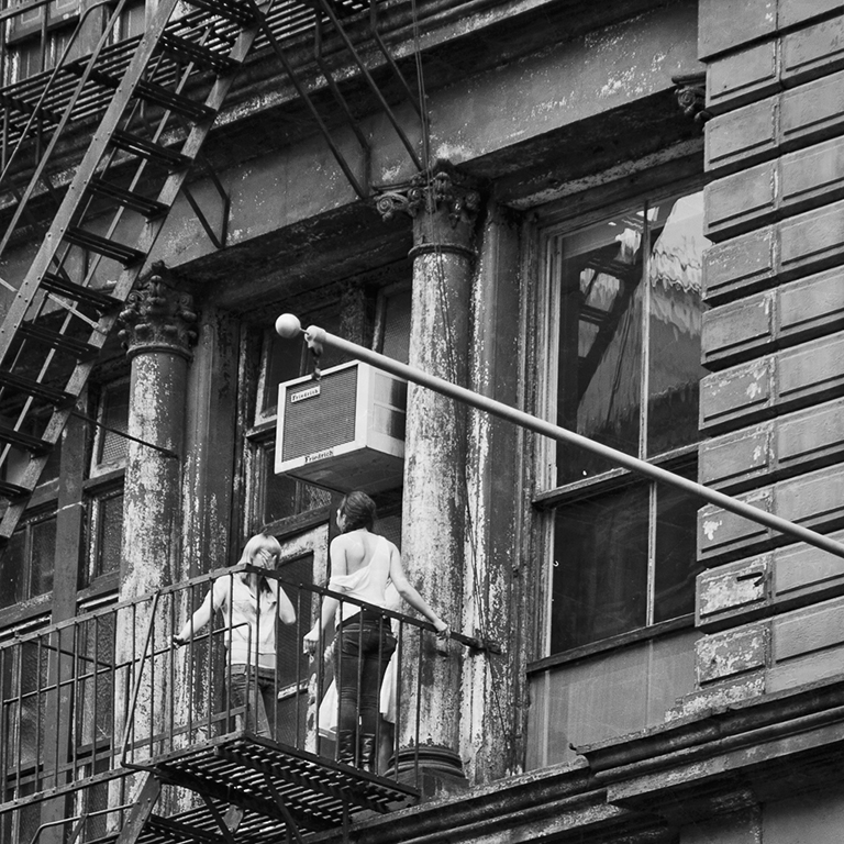
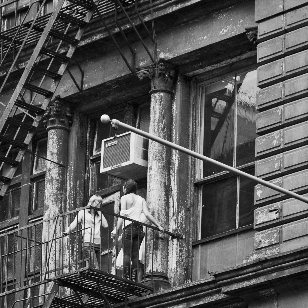
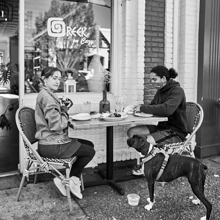
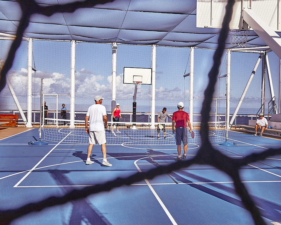
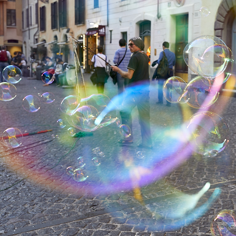
Wow, you must of been there really early in the morning to get a photo with so few people there. I very much like the story and the flow of my eyes. My eyes are first drawn to the photographer's red jacket then down along the line of his camera angle to the woman with the pigeons.
I tend to agree with Beverly's suggestion for the closer crop, but not the one where you eliminate the photographer. |
Apr 10th |
| 80 |
Apr 20 |
Comment |
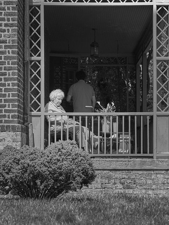
I like the story and I think it would serve as an excellent addition to your book. In the street photography world we often have to take what's given to us because we simply do not have the time to organize the scene in different ways. I am not at all bothered by the way this photo is cropped especially given your explanation for which, if you put it in the book, would explain the rather unique viewpoint. I'm not bothered by the softness of the woman's face; to me it adds a little drama to the photo.
The empty path behind the car tends to draw my eye away from the main subject. I think if you darkened that up a bit and might help keep my eye focused on the car.
One thing you might think about is adding some contrast with the clarity slider, which would add contrast to mid tones and I think my make the overall photo a little better. |
Apr 10th |
| 80 |
Apr 20 |
Comment |
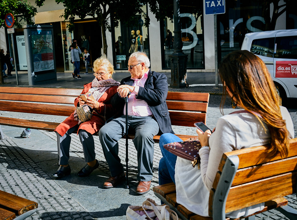
Bill, I like this story a lot with the one boy feeding the pigeons and the other three children just hanging out behind him. I like the square cropping (just happens to be my favorite crop) and it eliminates the extraneous person who appears in your original as well as bringing more focus to the main subject. The BW conversion works well for me.
A couple of things to think about: the vertical building line looks distorted to me and can use some correction with the keystone tool. There also seems to be a little vignetting in the top right hand corner that I think should be eliminated. The photo looks a little dark and flat to me. I think that maybe if you increased the brightness overall and then applied a slight vignette centering on the boy feeding the pigeons, my eye might be drawn more directly to this main subject. |
Apr 10th |
| 80 |
Apr 20 |
Reply |
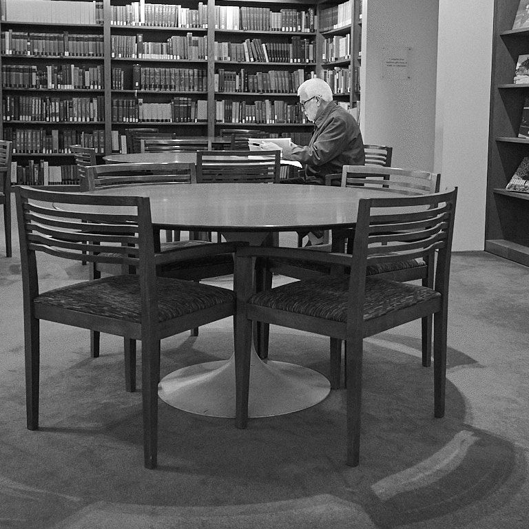
Carol, you're seeing exactly what I hoped a viewer would see. I did brighten the man and his hair to draw a viewer's attention to him. It's a dark inside scene and the histogram is heavier on the left although it is spread out nicely along the spectrum, which ties in to your comment about balance. The photo here is flatter than what appears on my screen with the original, which may be due to the compression algorithm, but it does look flat here. I'll increase the overall contrast for future online views.
Thanks for your comments and compliment. |
Apr 10th |
7 comments - 3 replies for Group 80
|
7 comments - 3 replies Total
|