|
| Group |
Round |
C/R |
Comment |
Date |
Image |
| 45 |
Jan 19 |
Comment |
I agree with Ray on the cropping. This is an interesting group because some usually prefer a tighter crop and some usually prefer a wider crop. I'm definitely a wider crop eye. But that's only me. |
Jan 17th |
| 45 |
Jan 19 |
Comment |
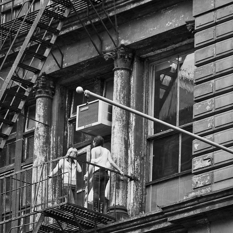
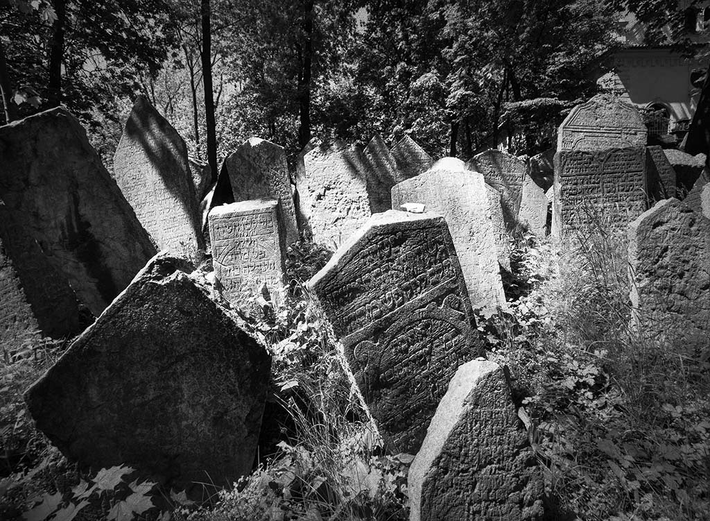
Ray, thanks for your comments and very valid questions. No privacy was invaded. The Western Wall courtyard is a public place, albeit heavily guarded, and many were taking pictures. Nobody objected. The strings hanging down are from a garment called TziTzit. Here's a good link that explains it -- https://www.myjewishlearning.com/article/ask-the-expert-tzitzit-hanging-out/
The Talit is the prayer shawl that is worn over the shoulders when in prayer. When a child enters adulthood at age 13, he or she (in some forms of Judaism) becomes a Bar or Bat Mitzvah. At that time they receive their first Talit.
Thank you for the compliment on the print quality. I chose to print the photo on metallic paper, which gives the monochrome print a really nice feel. I've sold this and two other prints of photos I took on the same day matted in linen embossed mat board and framed in square black gallery style frames. I think they look awesome (of course). |
Jan 17th |
| 45 |
Jan 19 |
Comment |
Welcome to the group Bai!
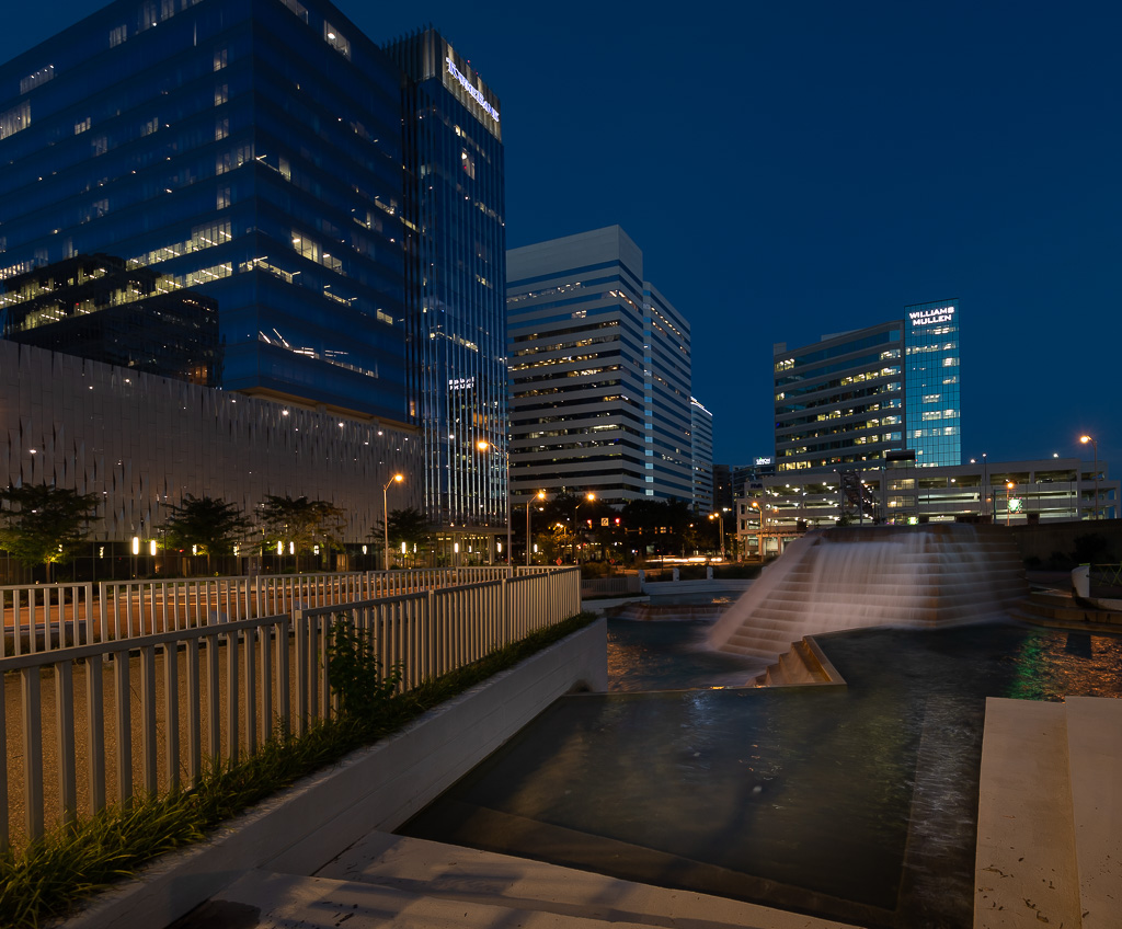
When I first look at this photo I'm drawn to bright colorful lights of the fireworks by the building and then drawn around the image by the reflections in the water, all of which makes a pleasing composition for me. I think the cloudy and misty sky adds to the photo because that fireworks like are reflecting off them. Focus looks sharp and exposure looks good to me.
I am mildly distracted by the one very bright light on the right. I think if you cloned that out along with its reflection on the water, the photo might be improved.
Again welcome to the group. |
Jan 6th |
| 45 |
Jan 19 |
Comment |
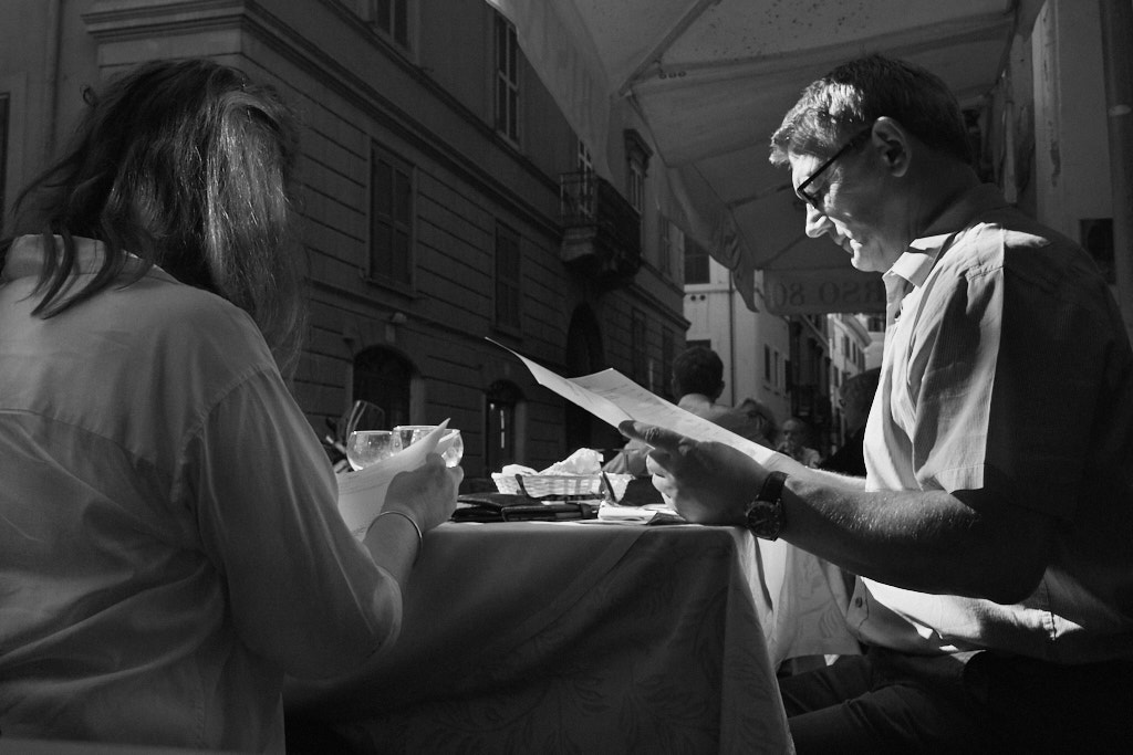
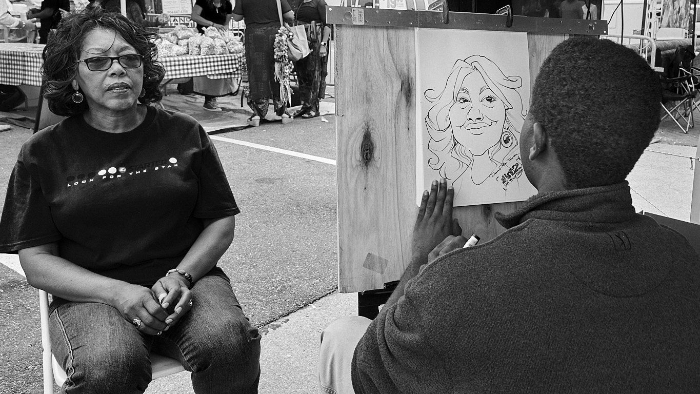
Happy New Year everyone. Thank you for your compliments and comments. One thing I have learned from listening to many critiques of art is that the person critiquing is expressing their own opinion and no one's opinion is better that another's <LOL>. I find it interesting that Cindy and Charlie prefer a narrower crop and Don likes the one I presented. I side with Don on this one. To my eye when I look at Cindy's suggested crop, the first thing I see is the floor creating a leading line through the people to the wall so the wall becomes the main subject in my mind, which is, of course, not what I intended. But again, that's just my opinion.
CHARLIE: I don't know if I would recommend this camera as a primary low light camera where colors are an important element. I haven't tried it in golden hour but colors in brighter light situations are very good. It's a great travel and carry around pocket camera and takes very sharp photos.
|
Jan 6th |
| 45 |
Jan 19 |
Comment |
To me the post-processing greatly enhanced this photo and made it great. Focus is very sharp on the flower in my eyes. Exposure and the use of shadows adds depth to me.
To me the bright green pad on the left competes with the flower for my attention. I think if you reduced the luminance on the leaf, my view could be more directed to the flower. |
Jan 1st |
| 45 |
Jan 19 |
Comment |
The composition looks great to me. The lighting on the ducks heads and wings draw my eyes directly into the subject. Focus and exposure look excellent to me. Comparing the original to the final, I find your post-processing nicely enhanced the photo. |
Jan 1st |
| 45 |
Jan 19 |
Comment |
I love the composition with the wings spread and the bokeh in the background. The light on the wings draws my eyes to the bird, which I like. Focus looks good to me.
I think if you opened up the shadows on the front of the bird, especially the head and beak and a little in the rest of the body, the photo may have more impact for me. |
Jan 1st |
| 45 |
Jan 19 |
Comment |
To me this is an interesting combination of color and texture. Focus and exposure look good to me.
I think the photo might benefit from some additional contrast, saturation and /or vibrance to bring out the colors. |
Jan 1st |
| 45 |
Jan 19 |
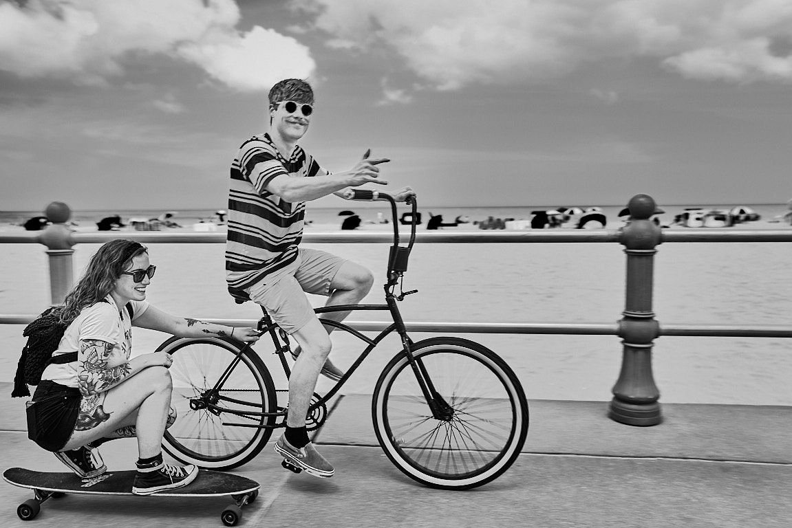
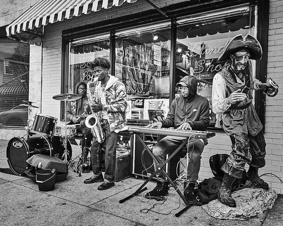
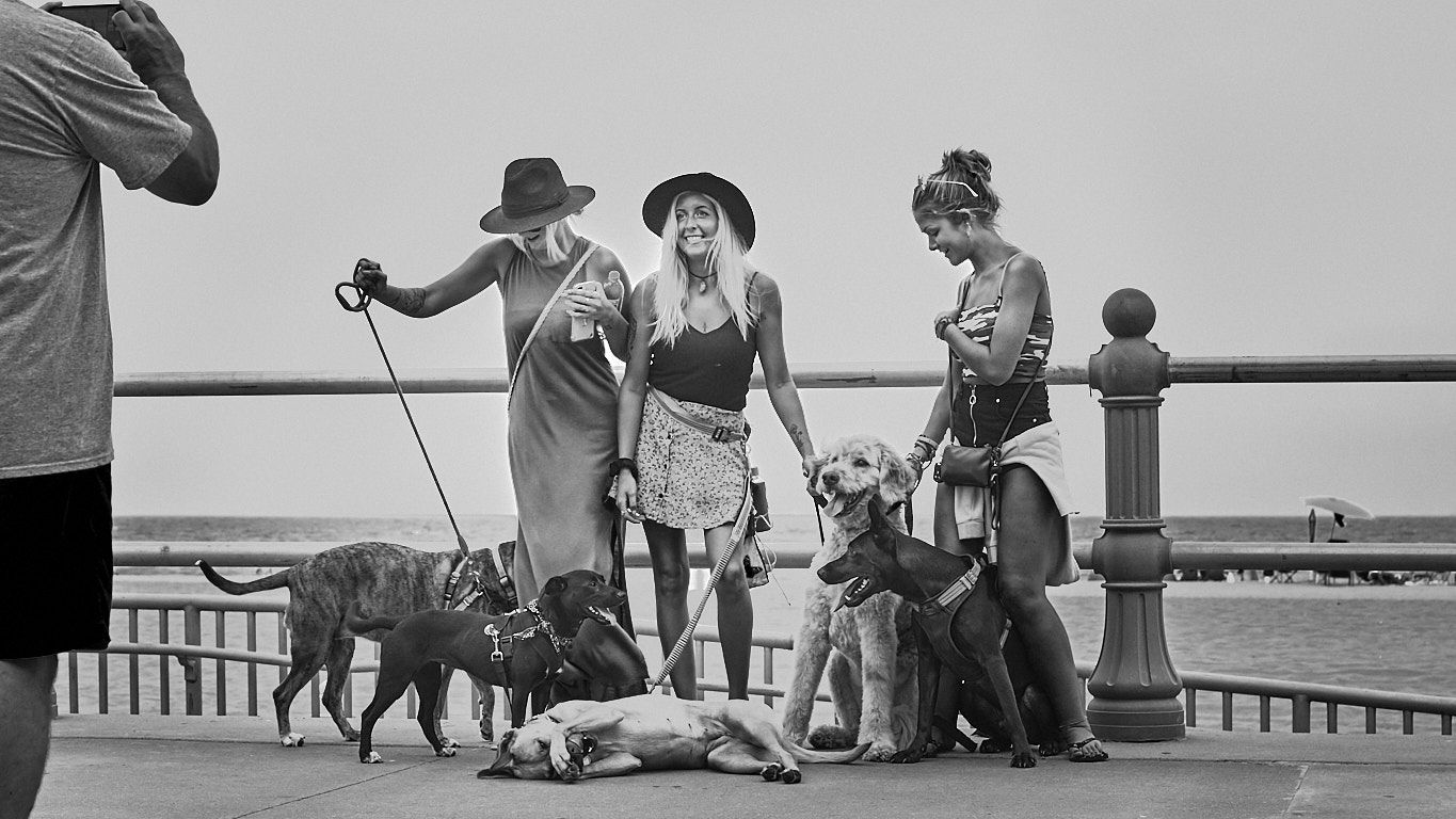
Comment |
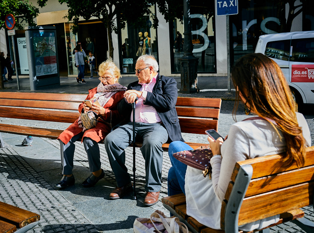
Very cute whimsical shot. I think that the space to the left of the subjects adds to the story and in my opinion makes the photo. Exposure and focus on the subjects looks good to me.
I think the photo could be cropped down a bit. You'd lose the light tower on the Barnes & Noble building but you'd also eliminate much of the brown post. I think that crop could bring better focus to the subjects. |
Jan 1st |
9 comments - 0 replies for Group 45
|
9 comments - 0 replies Total
|