|
| Group |
Round |
C/R |
Comment |
Date |
Image |
| 45 |
Sep 18 |
Reply |
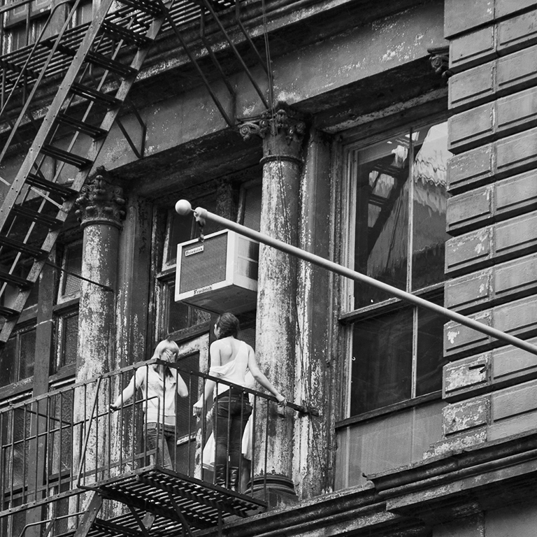
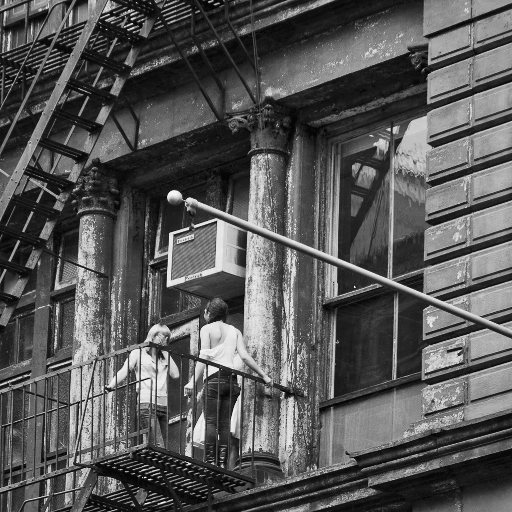
Don and Charlie, thanks for your opinions about the cropping but I disagree with you. The story is about the girls on a fire escape on an old building. To me the fire escape ladder on the left, the flagpole on the right and the columns around the window form a frame within a frame that directs the viewers attention to the girls. Some people like tight crops but many times I don't and prefer to use the space around the main subject to enhance the story. |
Sep 8th |
| 45 |
Sep 18 |
Comment |
Ditto, great post production work and results. |
Sep 7th |
| 45 |
Sep 18 |
Comment |
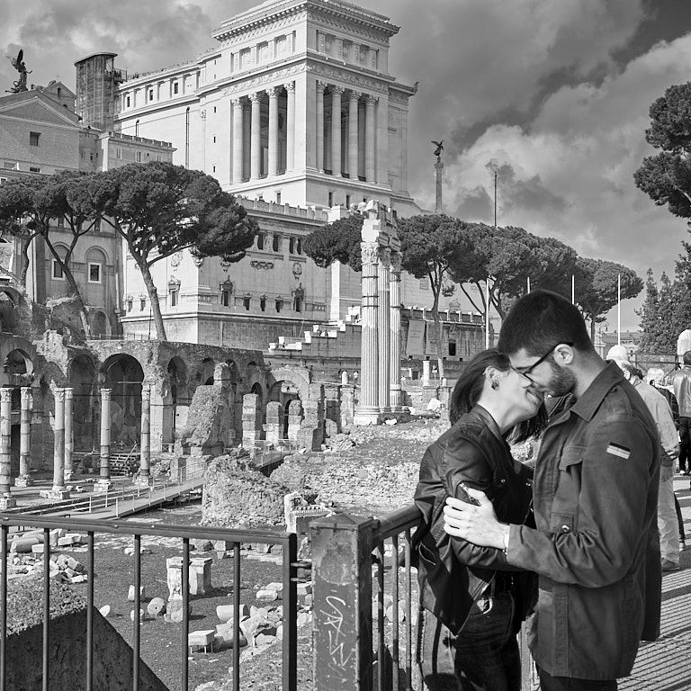
To me this is an interesting composition of chaos in the classroom. I think you captured a precious moment here.
Focus looks a little soft to me. The headless people in the last row is distracting to me. |
Sep 7th |
| 45 |
Sep 18 |
Comment |
I like the crop of the composition showing the bird feeding.
The body of the bird (not just the wings) looks very blurry to me. The brighter green background against the green bird is distracting to me. |
Sep 7th |
| 45 |
Sep 18 |
Comment |
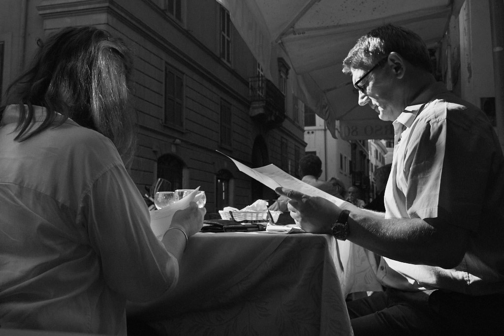
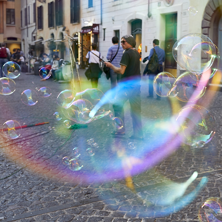
These days I'm very much into "street photography" and this photo really intrigues me. I think you caught a "decisive moment" when the player lifted his hands off the piano. To me the light shining on his hands emphasizes the moment. I like the negative space to the left because it tells me more of the story of where this scene is.
I'm thinking maybe, just maybe, if you brought out the contrast and colors in the piano, the photo might have more impact for me. |
Sep 7th |
| 45 |
Sep 18 |
Comment |
The "frame within a frame" effect of having the Ferris wheel inside the circle of the closer ride draws me into the photo and I want to explore it deeper. The colors look great to me. I really like the stop action of the ride up top. Focus looks very good to me. I like the idea of the two young people in the lower left. To me leaving them in there gives the photo more of a sense of place and leaves me wondering what they're looking at, which I find intriguing. |
Sep 7th |
| 45 |
Sep 18 |
Comment |
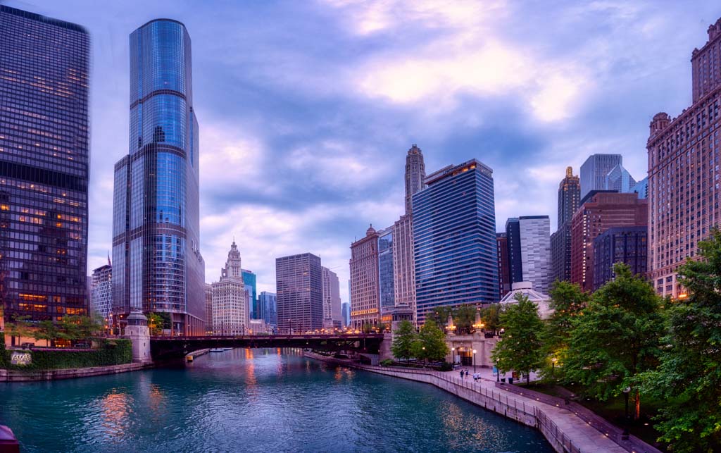
I think you did a really nice job of stiching the photos together. I like the colors; it seems a little surreal to me and I find that intriguing.
To me there is still too much tilt to the buildings on each side, which I find distracting. To straighten the buildings on the left and right, I made separate layer adjustments in PS using the transform tool in ACR filter (same filter as is in LR). Of course that also skewed the middle too so in each layer I added a black hide mask and then painted in the buildings using the white brush. That revealed the transform adjustments to the side buildings and hid the transform adjustments everywhere else. I think the buildings look more natural.
How does it look to you? |
Sep 6th |
 |
6 comments - 1 reply for Group 45
|
6 comments - 1 reply Total
|