|
| Group |
Round |
C/R |
Comment |
Date |
Image |
| 45 |
Feb 18 |
Comment |
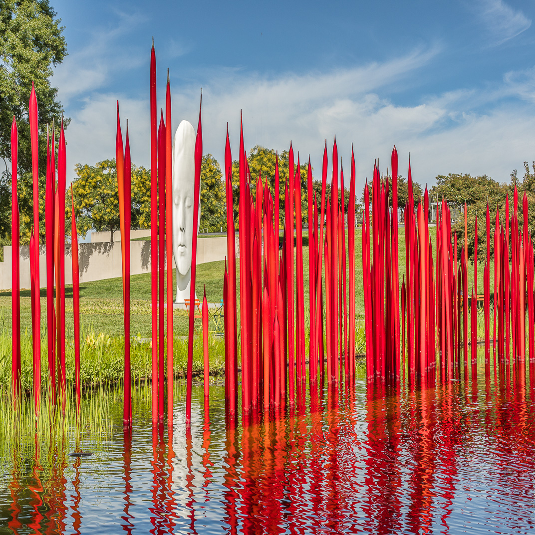
To me this is an iconic lighthouse photo. My eye first goes to the red structure and then bounces to the brighter top right and then around to the left. I like that feeling. I would leave the strip of water in or, if you cropped some out, put more back in. To me the water, the sea wall, the small red and white structures add depth to the photo, which I find pleasing. |
Feb 22nd |
| 45 |
Feb 18 |
Comment |
I like the way the lines cross cross throughout the frame. I don't worry about finding a focal point here because there isn't one and I think that makes the composition stronger. I do find the shallow depth of field a little distracting, especially with the stem in the upper right. |
Feb 22nd |
| 45 |
Feb 18 |
Comment |
Sorry that I forgot to continue my comments. I really like the composition. I do agree with Ray, et.al. about the softness. |
Feb 22nd |
| 45 |
Feb 18 |
Reply |
Yeah, my old knees are a pain too <LOL> |
Feb 22nd |
| 45 |
Feb 18 |
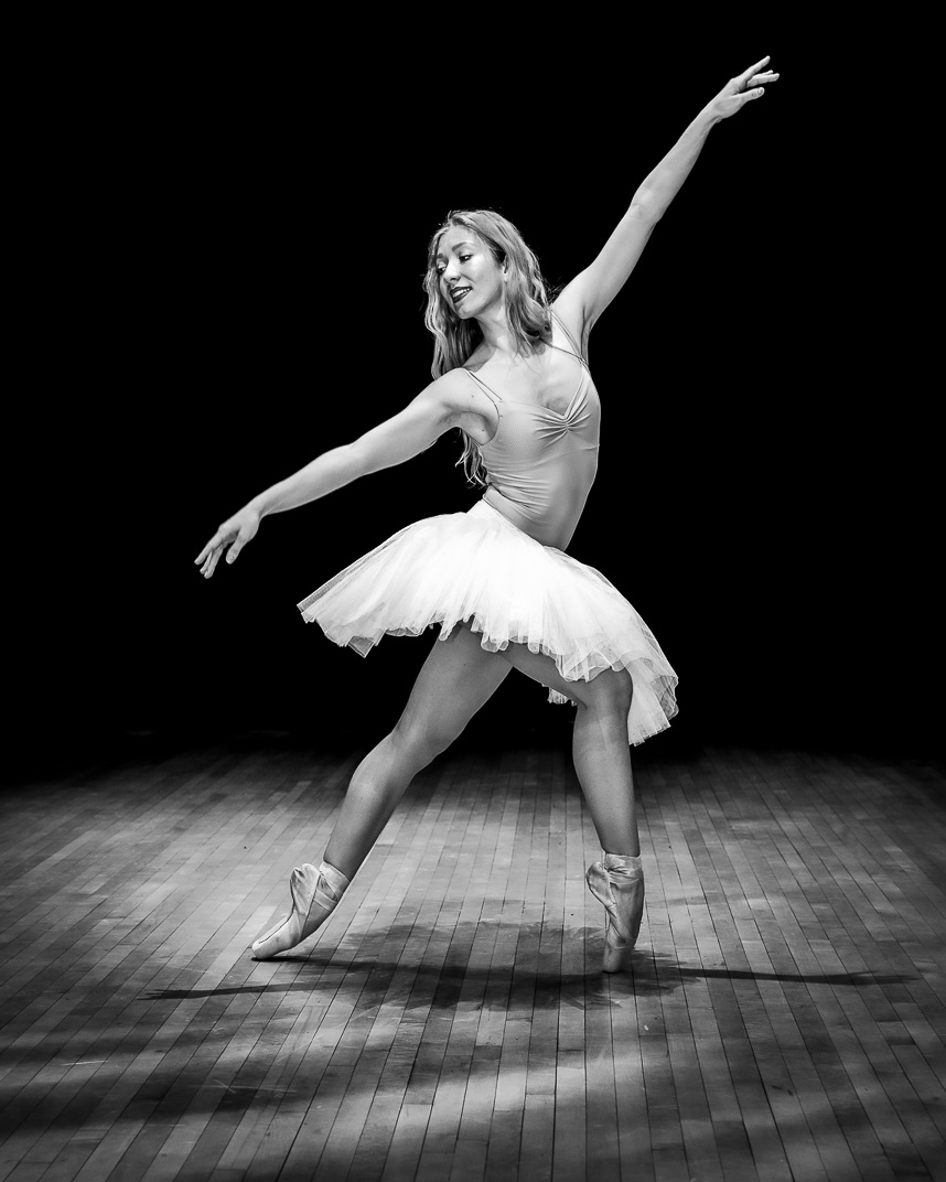
Comment |
Thanks all. I think the digital file is somewhat brighter than the print, which did show more detail in the skirt. |
Feb 22nd |
| 45 |
Feb 18 |
Comment |
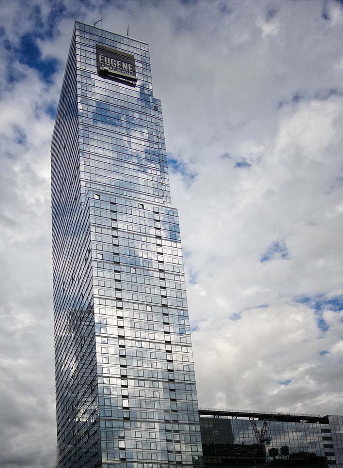
I think that the angle of the building creates a tension in the photo that makes it interesting. The reflections of the clouds off the building gives it a nice feel and depth in my opinion. Focus and exposure look good to me.
To me the advertising sign in the bottom is distracting. In the attached file I cropped the photo up and also off the right to get rid of the brown building. I cloned the building down to eliminate the shadow that's on it and cloned the sky on the bottom left to eliminate the sliver of the brown building that's showing. How do you like it? |
Feb 2nd |
 |
| 45 |
Feb 18 |
Comment |
I like the composition with the stem flowing from bottom left & curving up through the center. Exposure looks good to me. I fell that the highlights and shadows combine to add depth to the photo. I like the way you used the natural light.
It looks to me that the final photo lost a lot of sharpness compared to to the original. The soft focus is not appealing to me. |
Feb 2nd |
| 45 |
Feb 18 |
Comment |
I like the composition of the tracks moving through photo. Looks like someone might have been cross country skiing through there. I think the shadows in the tracks and on the right side had a dimension to the photo. Focus looks sharp to me.
On my screen the snow looks a little pinkish and I'm thinking that might be cured by tweaking the white balance. I don't see the contrast between the shadows and snow to be strong enough. I think adding contrast might make the photo more powerful. I looks like you took the shot standing up and I'm wondering whether a lower perspective might add more dimension to the photo. |
Feb 1st |
7 comments - 1 reply for Group 45
|
7 comments - 1 reply Total
|