|
| Group |
Round |
C/R |
Comment |
Date |
Image |
| 33 |
Mar 18 |
Comment |
Wow! Thanks to everyone for the feedback. Thanks, especially, to those who took the time to reprocess the image to demonstrate their suggestions. Looking over these remakes, I notice what a wide variety of interpretations and tastes are on display. |
Mar 19th |
| 33 |
Mar 18 |
Reply |
Thanks to both Ken and Lloyd for good suggestions. Lloyd, I agree that the blue cast is a problem, and I've adjusted the color temperature to take care of that. I still agree with Ken's point about the luminosity of the vegetation competing with the water. The image needs a focal point, and, often, the focal point is accentuated by being the lightest point in the image in terms of luminosity. I don't lose the golden tones; I merely subdue them. Here's where I am after your suggestions. I like it much better. |
Mar 16th |
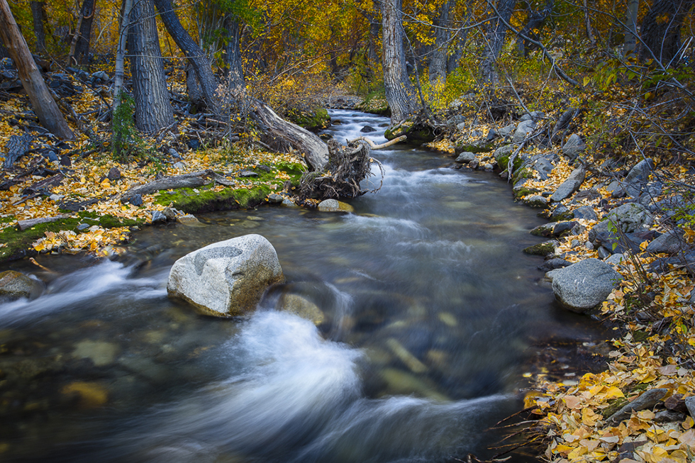 |
| 33 |
Mar 18 |
Reply |
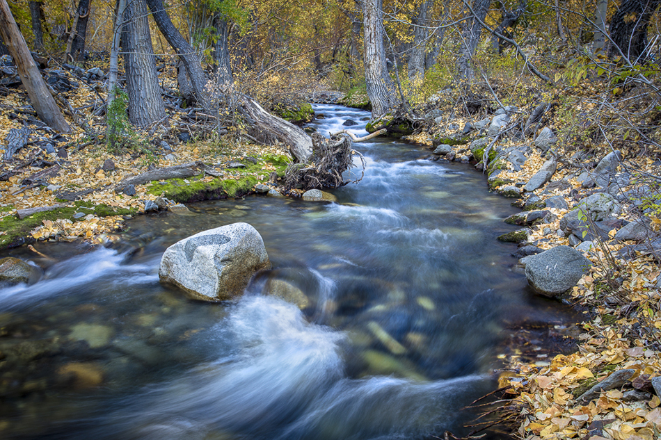
Thanks, Ken. I think you may be on to something. The vegetation is competing with the stream. It was hard for me to let go of the idea that the yellow of the fallen aspen leaves should be prominent. (After all, the aspen color was the main reason I was there at that time of year.) I'm going to work on it using your ideas. |
Mar 16th |
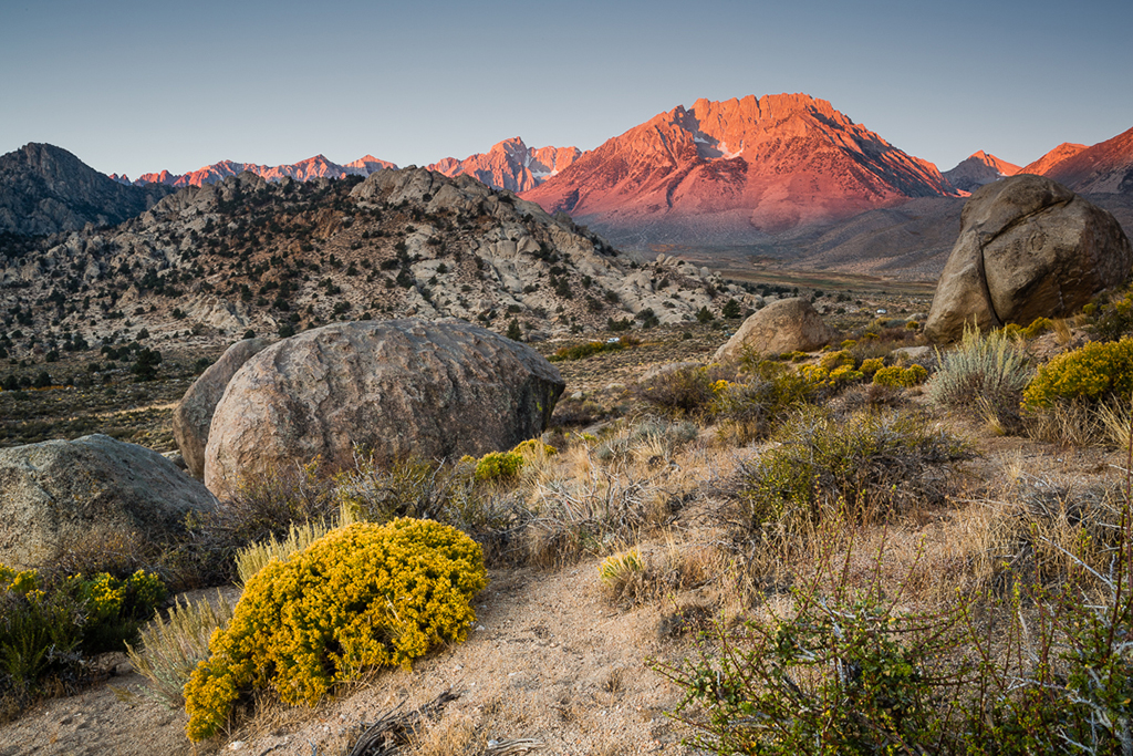
| 33 |
Mar 18 |
Comment |
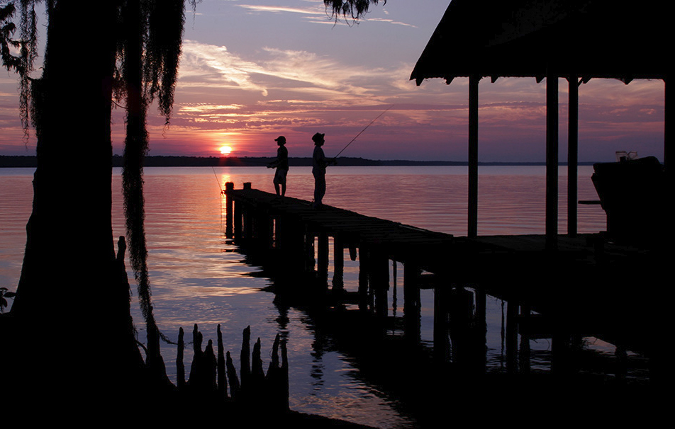
I really love this image. This is a beautiful silhouette. The colors are stunning. The story is conveyed beautifully. I love the framing provided by the tree. I struggle to find a way to improve the image. The only suggestion I can make, and this is being very picky, is to crop just a little off the left and top--just a rule of thirds thing to achieve a better placement of the setting sun. Although, after doing that, I find I hate losing the top of the tree. Outstanding shot. |
Mar 13th |
 |
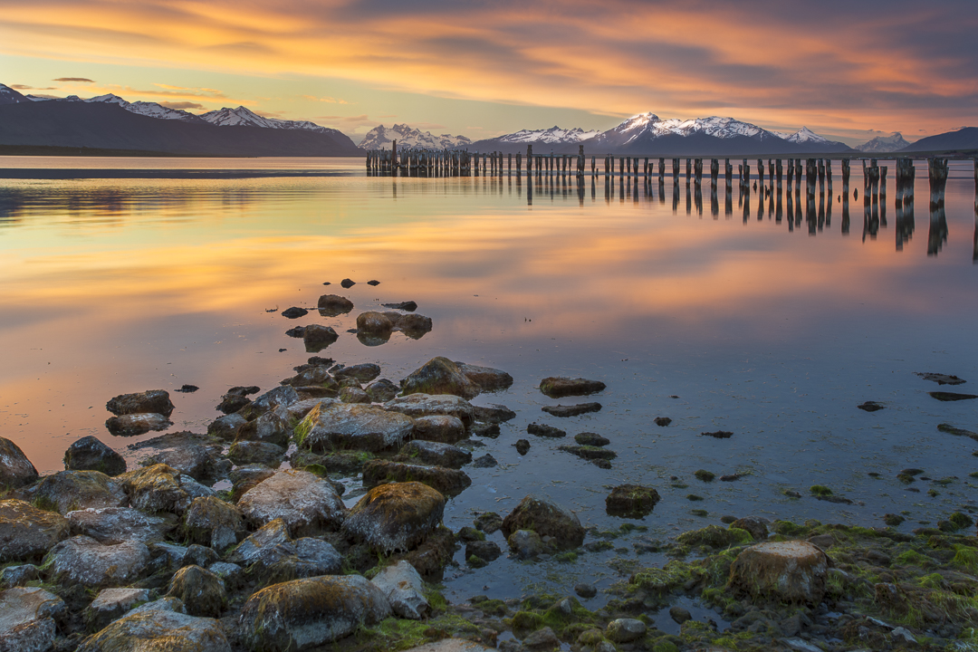
| 33 |
Mar 18 |
Comment |
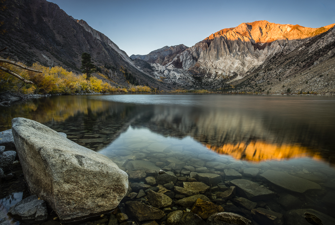
A very peaceful scene. Nice colors. Well composed. I, personally, find the signs nailed to the tree to detract from the image. I agree with burning down the highlights on the lower right, and I would slightly increase the sunny highlights at the clearing at the end of the road, so that the road seems to lead somewhere promising. |
Mar 13th |
| 33 |
Mar 18 |
Comment |
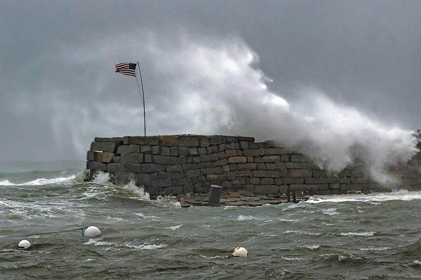
I love the drama in this photo. Clearly, the flag and flagpole, bent from the wind force, is the center of attention. I would have cropped differently, as I think you're showing too much of the left side of the image. |
Mar 13th |
 |
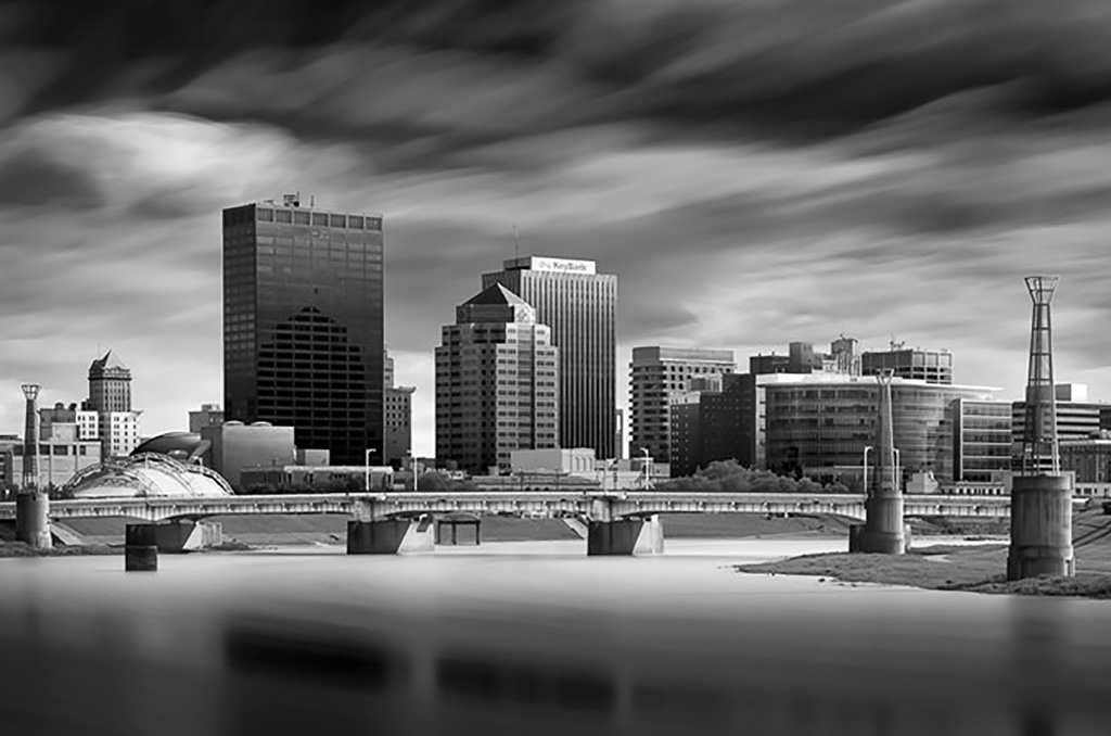
| 33 |
Mar 18 |
Comment |
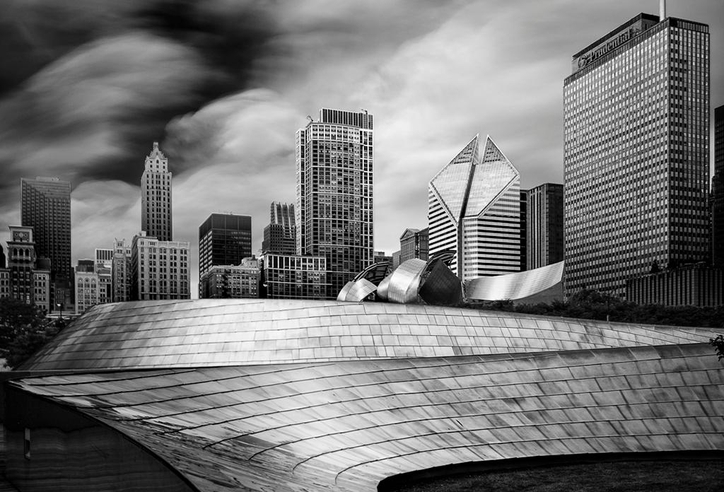
This image is very well composed. The placement of the building structures is according to rule of thirds. I do agree with the gradient darkening of the upper part of the image, but perhaps it was done a little too much. The upper left seems unnaturally dark. I also think the image could do with a little less contrast, as I agree with Ken that the white buildings are a bit blown out. |
Mar 13th |
5 comments - 2 replies for Group 33
|
5 comments - 2 replies Total
|