|
| Group |
Round |
C/R |
Comment |
Date |
Image |
| 33 |
Feb 18 |
Reply |
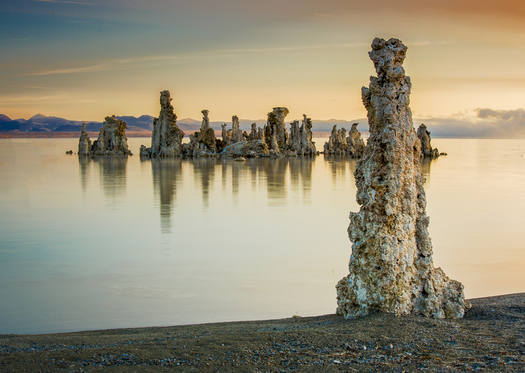
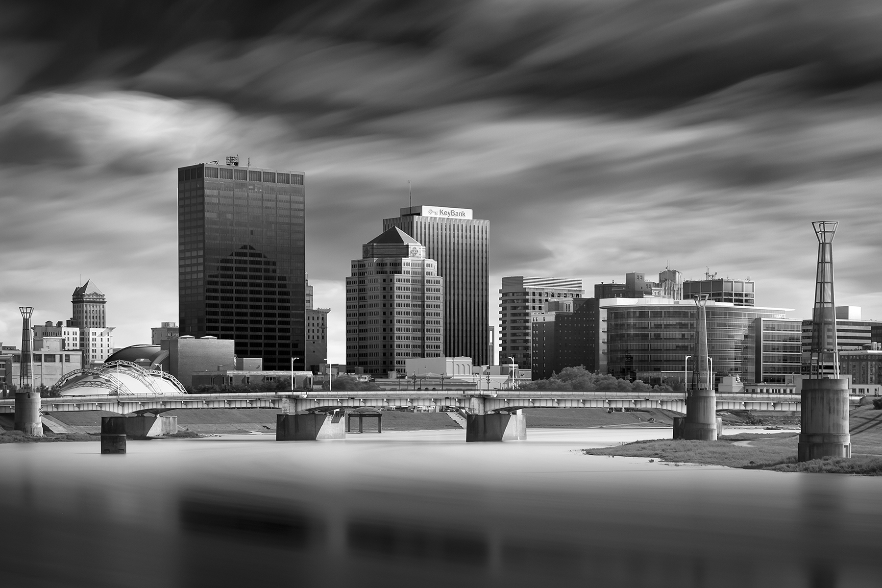
Thanks, Paul,
I totally accept the description, "over processed" in this case. I think that's the nature of the effect I was going for-certainly not a realistic one. Also, if you detect tripod movement, that is also very possible. I used a 70-200mm lens because that was the only way to get the composition I wanted. Over a five minute period, it's almost impossible to avoid movement with a telephoto. I appreciate the comments, as I will learn from them. |
Feb 16th |
| 33 |
Feb 18 |
Comment |
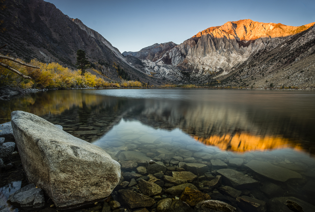
I love the framing, formed by the leaves. Gorgeous sky. Perfect exposure. A very successful image overall. I find myself, as I study the image, wanting something closer in the foreground. Perhaps, as Ken suggested, show more of the gravel road. Perhaps that would serve as a leading line. |
Feb 14th |
| 33 |
Feb 18 |
Comment |
Outstanding sky. I do see the blur that Ken mentioned in the trees. My main feeling is that I want that wonderful leading line to take me to a more worthy subject. Can we move Bob Patrick's winch and park it just under the tree? How awesome would that be? |
Feb 14th |
| 33 |
Feb 18 |
Comment |
A great subject, but as others have noted, difficult light to work with. It appears to me that the winch is backlit, and I don't think you can ever make that work. Then you have bright sun on the field vegetation, and pretty deep shadows in the woods in back. Bringing down those extreme highlights while bringing up the shadows can only result in a very unnatural look. |
Feb 14th |
| 33 |
Feb 18 |
Comment |
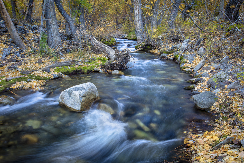
Beautiful job of capturing the water at the right shutter speed. You nailed it. I also like that the water has great detail without being blown out--and that can be very hard to do while retaining a few highlights. In terms of cropping, I actually prefer Original 1 over the cropped image. I like being able to see a start and end to the falls, and I like seeing more of the yellow vegetation. |
Feb 14th |
| 33 |
Feb 18 |
Comment |
I love photography that, at first glance, appears as an abstract painting. That's how I view this image. It's about composition, color, and flow. If the highlights in the rock face are blown out, as others have suggested, it's only slightly. Love it!
|
Feb 14th |
| 33 |
Feb 18 |
Comment |
I hope that this is a better rendering of my image. I struggled in Photoshop to arrive at a 1 megabyte image. Seems the resulting jpeg isn't what Photoshop says it is in Image Size. |
Feb 13th |
 |
| 33 |
Feb 18 |
Comment |
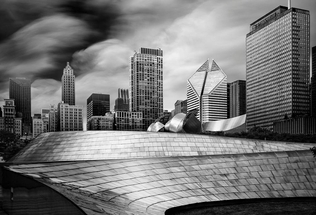
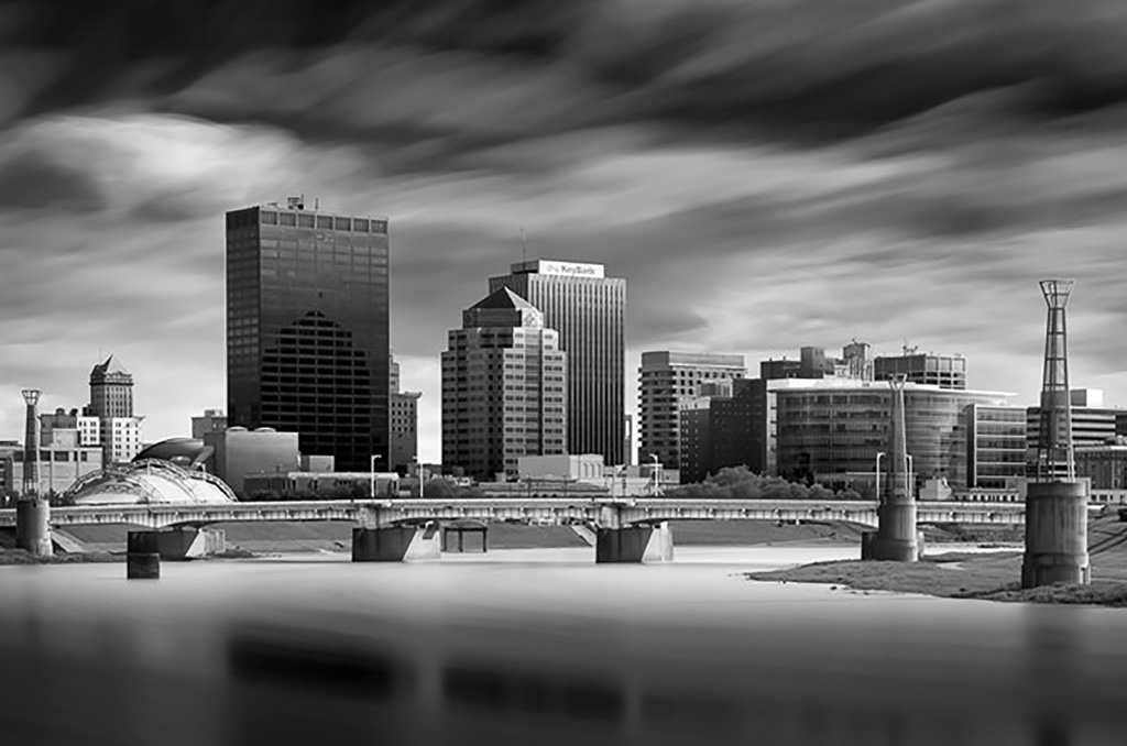
Oops,
Ken, I think I exported with the wrong preset. You're looking at poor resolution, not poor focus. The original image is much sharper. But, to follow up on your comments, I used a technique from a tutorial from architectural photographer Joel Tjintjalaar. |
Feb 12th |
7 comments - 1 reply for Group 33
|
7 comments - 1 reply Total
|