|
| Group |
Round |
C/R |
Comment |
Date |
Image |
| 33 |
Jan 18 |
Comment |
I'm out of my depth here. This is a fun assignment, and I'm sure your image fits the assignment requirements for your club. I just can't find a way to critique it as a landscape image. It's well composed, but I find the beam to be artificial looking, and the beam seems a heavy-handed method for drawing attention to the bike. Just not to my taste, I guess. |
Jan 21st |
| 33 |
Jan 18 |
Comment |
Great scene! I love what the 10 stop ND did to the water. My 2 cents on the debate: I agree with Elizabeth. I would have a hard time ethically with reversing the scene. I love it as it is. |
Jan 19th |
| 33 |
Jan 18 |
Reply |
Thanks, Larry,
I think your idea is about the only way to rescue the image, and I think I will spend some time trying to make the path look natural. |
Jan 19th |
| 33 |
Jan 18 |
Comment |
I like your idea, Ken. This photo is in desperate need of a leading line.
|
Jan 14th |
| 33 |
Jan 18 |
Comment |
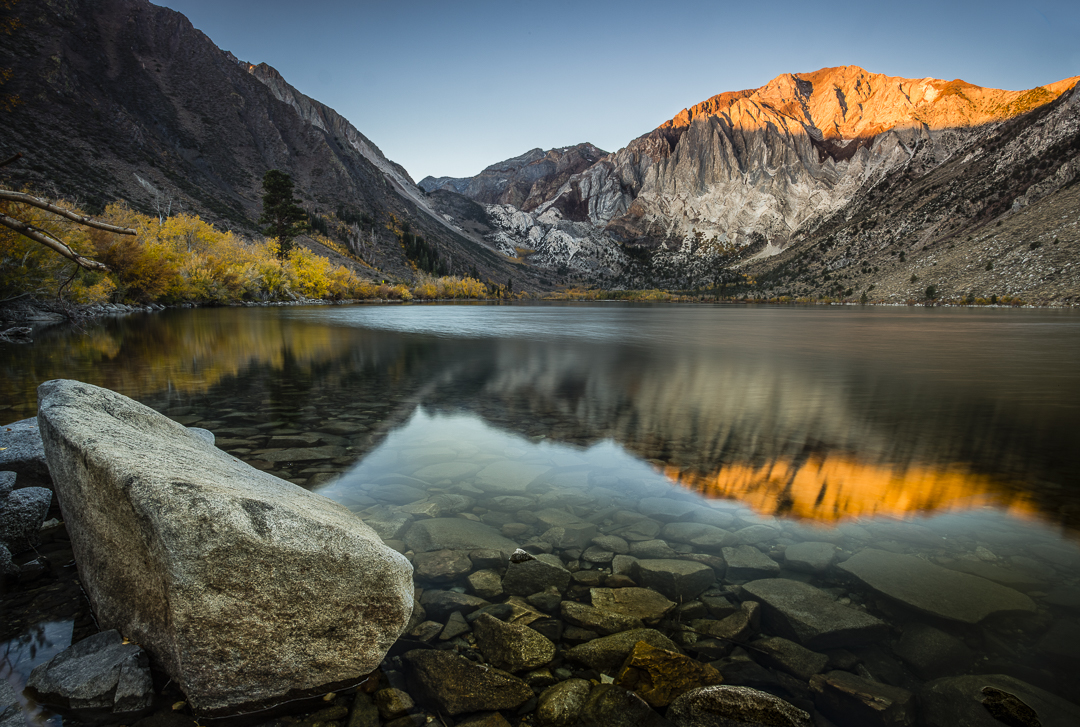
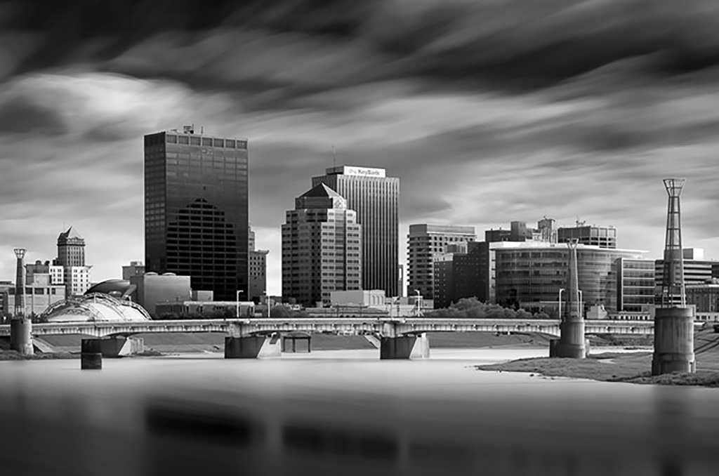
This is beautiful. The buildings in the lower right are so important for perspective. I love the light streaming in from the upper left, illuminating the mountainside. Can anything be done in post to accentuate those rays? Maybe, drop a graduated filter in Lightroom and pop the contrast or clarity a bit? (I see in your notes that you already tried this. Perhaps apply a bit more?) I also wonder if the shadow detail in the evergreens near the buildings (lower right) might be brought up a touch. The darks seem blocked up there. Overall, I think this is a very successful image. Well done. |
Jan 13th |
| 33 |
Jan 18 |
Comment |
I love the fog, and I like the red gate, closer in the foreground. However, (for me) compositionally, that tree is a big problem. It splits the photo in two. I copied your photo into Photoshop to see if I could solve the problem through different cropping, and I just couldn't find a satisfactory crop. I like it a little better cropped down about 1/4, which eliminates the top of the tree, but it's still a problem. |
Jan 13th |
| 33 |
Jan 18 |
Comment |
What a great subject. I love the barn. The sky is also great, with a lot of interest in the clouds. It's already pretty great, but if it were mine, I'd make some minor adjustments. First, and I don't know if this is possible, I would include more of the surroundings so that it's not cropped so closely. I think including more of the surroundings would increase the "abandoned" feel. Second, I would lighten the darker areas of the barn just a little--not too much. I feel that some of the barn detail is lost in shadow. Third, keeping in mind that the eye is drawn to the brightest areas of an image, I would tone down the bright areas in the clouds (upper right). |
Jan 12th |
6 comments - 1 reply for Group 33
|
6 comments - 1 reply Total
|