|
| Group |
Round |
C/R |
Comment |
Date |
Image |
| 33 |
Dec 17 |
Reply |
Thanks, Paul,
Your point is well-taken. A higher perspective would, indeed, allow for separation of the piles from the waterline. That occurred to me as well--days after I took the photo. I think I was concentrating on getting the stones in the foreground, and neglecting other elements. It goes to show how important it is to carefully consider all elements of a composition. At the time, I was a bit rushed by the rapidly setting sun and distracted by the four other photographers who were vying for space beside me. I still like the shot a lot. |
Dec 15th |
| 33 |
Dec 17 |
Comment |
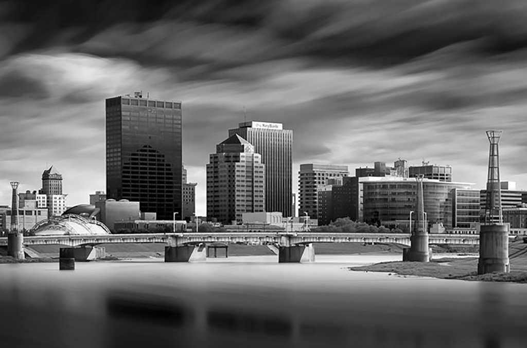
Hi Elizabeth,
I like the scene, with the various colors and shapes, and the water in the foreground is lovely. I agree with Ken in that the image needs to be simplified somehow, so that there is no confusion as to what elements in the picture have dominance. The least interesting building is the white building behind the green dome, which, because of its brightness, attracts more attention than you want. Ken's advice to darken this building "quite a bit" is a good suggestion. In addition, you might consider darkening other unwanted white "hot spots" such as the building to the right. |
Dec 12th |
| 33 |
Dec 17 |
Reply |
I assumed that the buildings were crooked because of age--these are abandoned buildings, so crookedness is part of the character of the scene. I wouldn't straighten them. |
Dec 12th |
| 33 |
Dec 17 |
Comment |
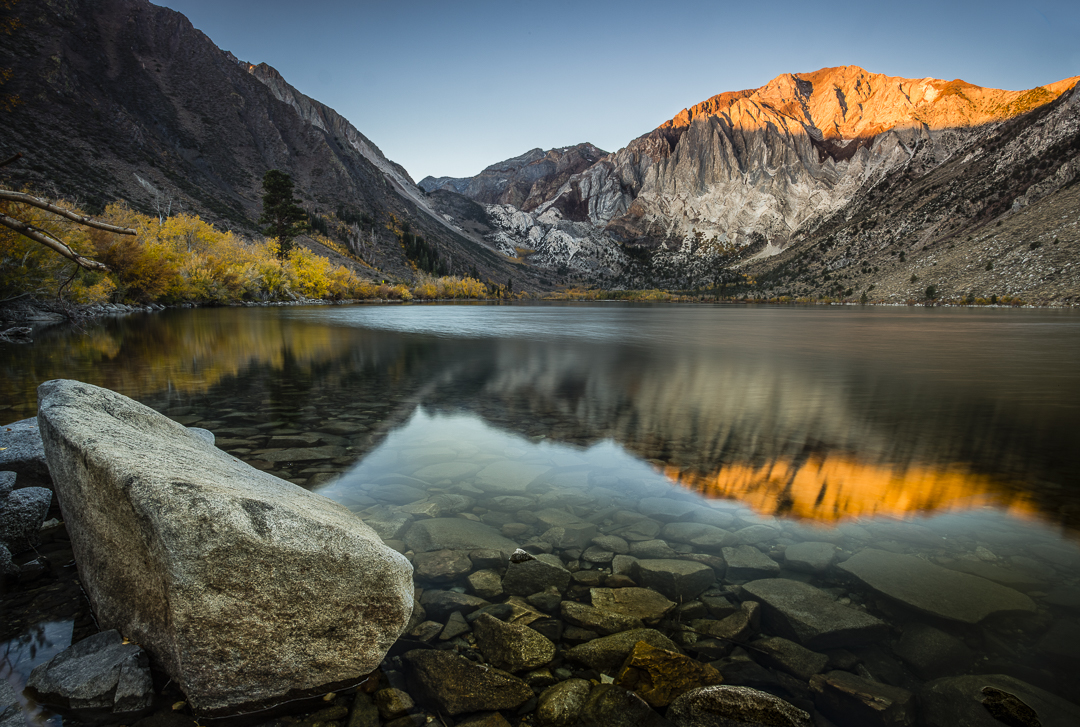
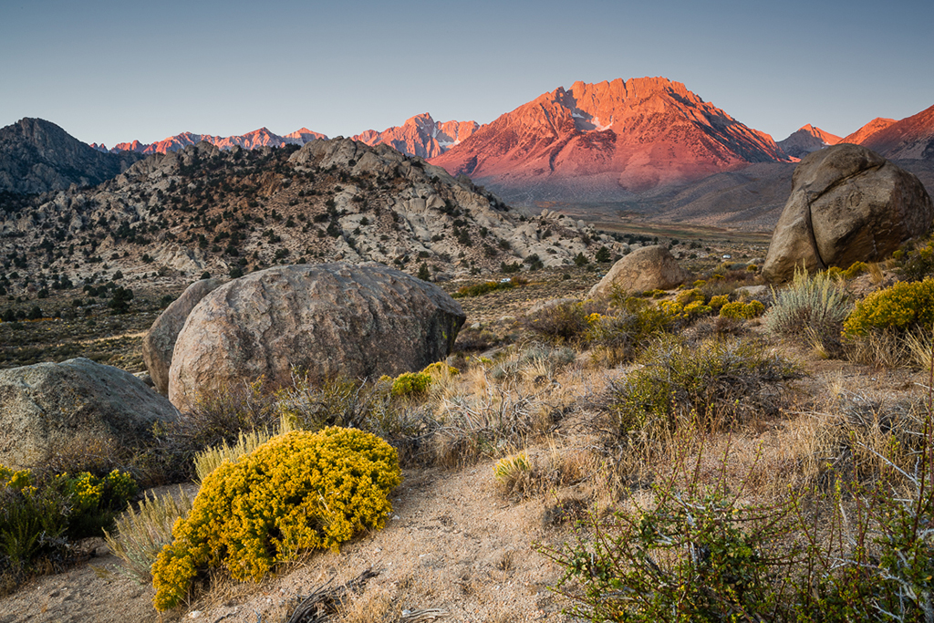
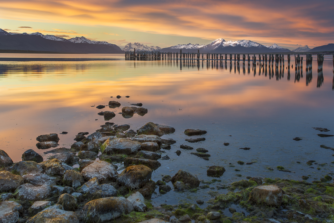
I agree with Ken's comments. I love the texture. I love the warm color. The rocks in the foreground form a leading line which takes me to the mountain, but the mountain, due to being only half present, apparently isn't the focal point of the image. And, the upper left quadrant of the image seems empty.
|
Dec 12th |
| 33 |
Dec 17 |
Reply |
Thanks, Ken
Thanks for your comments. I did intend for the rocks to be a leading line to the point of interest. I hear what you're saying about the pilings being a visual block to the mountain. I guess I considered them part of the scene. The main reason I stopped to photograph this spot was because of the pilings. The pilings were naturally backlit, and to make them stand out would be a challenge. I may experiment with darkening the mountain to see if the pilings alone make a focal point. |
Dec 10th |
| 33 |
Dec 17 |
Comment |
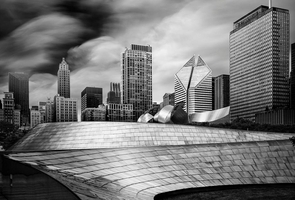
Wow! I love this image. B&W was a wise choice to enhance the feeling of starkness. I can't think of too much to improve it. Perhaps run a gradient filter over the bottom foreground and ever so slightly darken just a tad. The cloud in the upper left corner is a bit bright and takes the eye there. Perhaps that cloud could be darkened just a touch. Really nice job overall. |
Dec 9th |
| 33 |
Dec 17 |
Comment |
Very dramatic. But, with the horizon splitting the composition right down the middle, one wonders, is this picture about the sky or about the rock? I would prefer to see the sky reduced in the composition. Perhaps crop it just at the top of the tree to the left. If possible, I would also reveal more of the rock in the foreground, if you're not already cropped to the bottom of the image. Good shadow detail in the trees. |
Dec 9th |
| 33 |
Dec 17 |
Comment |
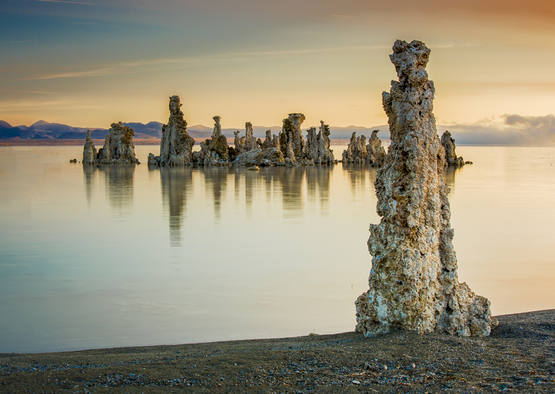
This image appeals to me as an abstract composition. The yellow and orange wave first appears to the eye as a textured series of brush strokes. Blue is a complimentary color to orange, and that's why I'd like to see much more of the blue band at the bottom. If possible, I would have that blue be 25-33% of the picture. Nicely done. |
Dec 9th |
5 comments - 3 replies for Group 33
|
5 comments - 3 replies Total
|