|
| Group |
Round |
C/R |
Comment |
Date |
Image |
| 10 |
Oct 17 |
Comment |
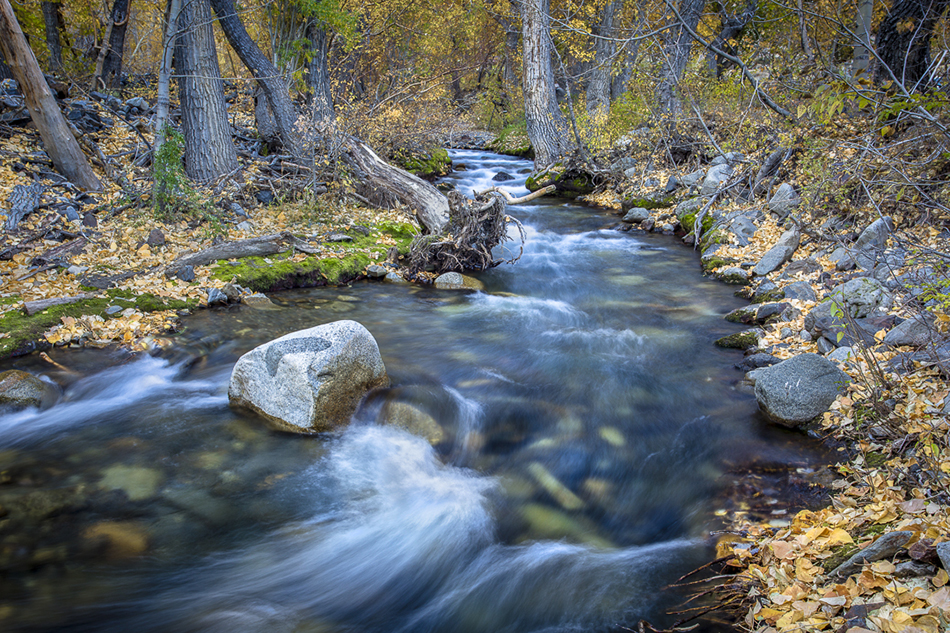
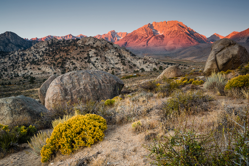
This is a really cool image. Compositionally, though, my eye wanders all over. Is there a way to darken parts of the image so that the eye follows a path from foreground to background? While I like that there's interest all over the image, a focal point might help. What a cool subject. |
Oct 12th |
| 10 |
Oct 17 |
Comment |
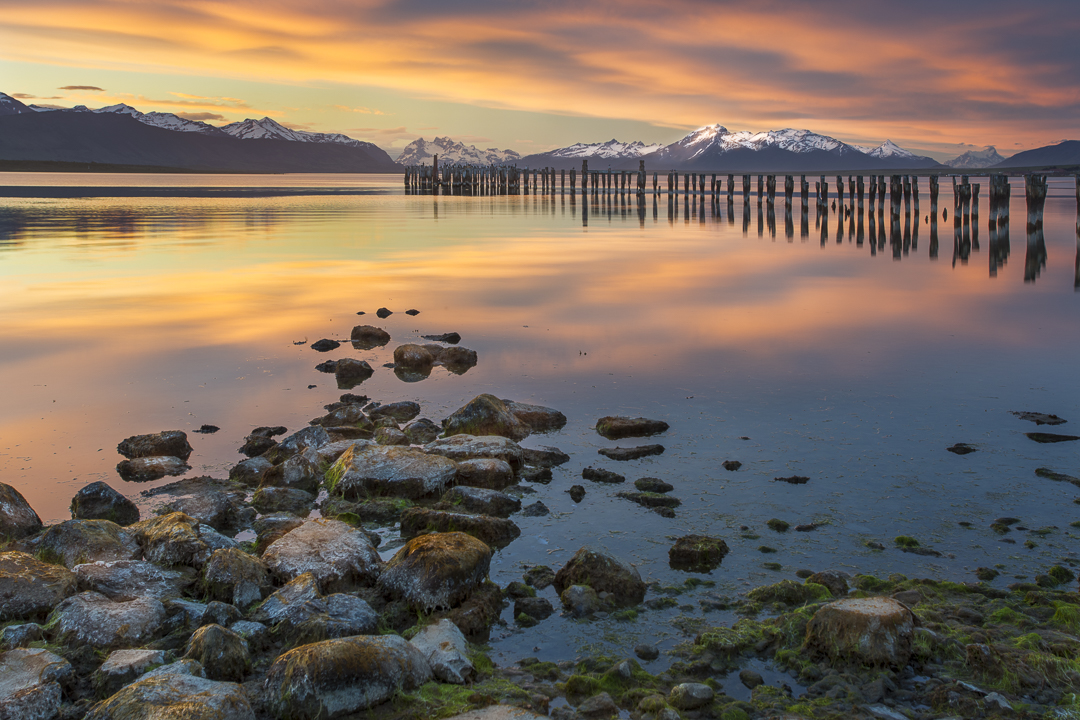
I think the image is sharp where it needs to be sharp, and soft where it needs to be soft. I think you nailed the depth of field and focus. The delicacy of the flower really comes through. The edge vignetting might be slightly overdone. Nice work. |
Oct 12th |
| 10 |
Oct 17 |
Comment |
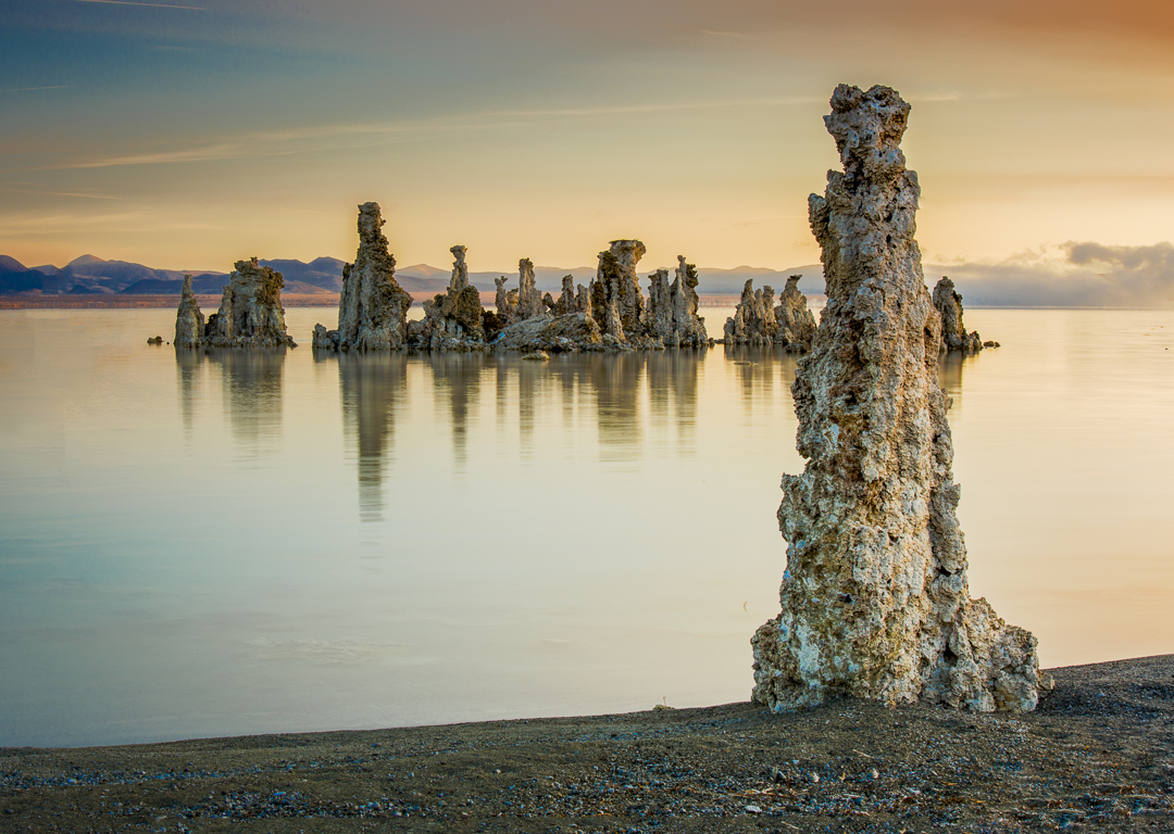
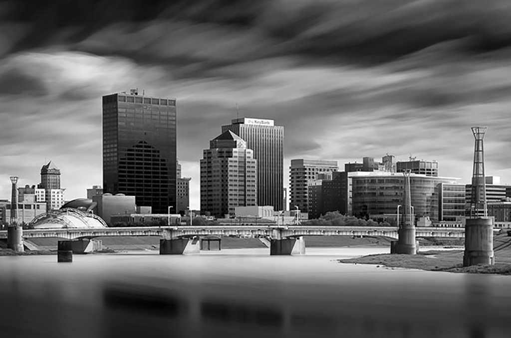
I agree with removing the sensor spots. Also, I would crop out the upper left corner. The image seems crowded into the lower right with too much empty space. Otherwise, nice capture, well exposed and fairly sharp. |
Oct 12th |
| 10 |
Oct 17 |
Comment |
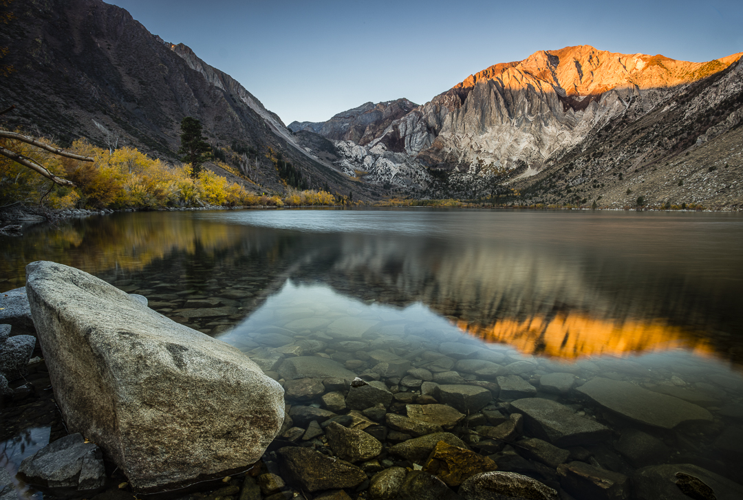
This is a great image. I agree with John's comments. The tree in the corner helps. So much about this image works that I struggle to suggest a way to make it better. Am I seeing a slight bit of noise in the blue sky? Maybe that could be smoothed. Nice job overall! |
Oct 12th |
| 10 |
Oct 17 |
Comment |
I love the feeling I get from this photo. The amber hues work well. I love the symmetry. I think the symmetry would be improved with perspective correction, so that all lines are parallel. (It seems as if the photo was taken slightly to the right, so that the left side of the photo, top and bottom, recedes a bit.) I would also use the clarity tool in Lightroom to "pop" the mid level contrast, but not too much. I wonder if it's possible to use the shadow slider to bring up some detail on the central door ornaments. They're a nice feature. As a final adjustment, I might use the post crip vignetting tool to darken the corners just a teensy bit. |
Oct 6th |
5 comments - 0 replies for Group 10
|
5 comments - 0 replies Total
|