|
| Group |
Round |
C/R |
Comment |
Date |
Image |
| 57 |
Aug 19 |
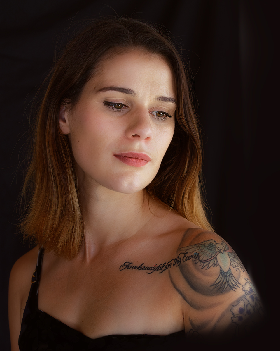
Comment |
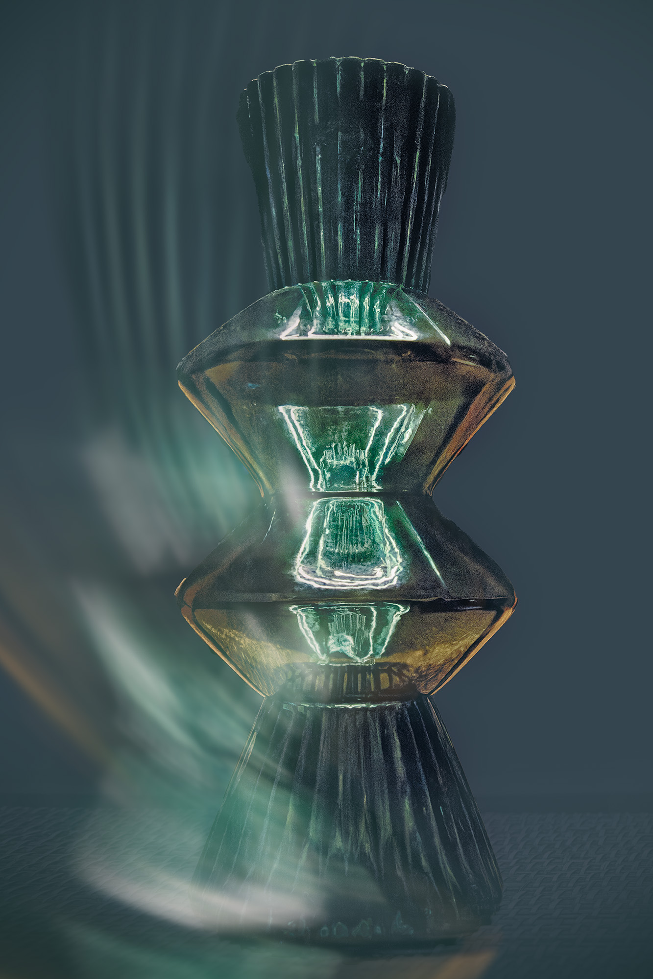
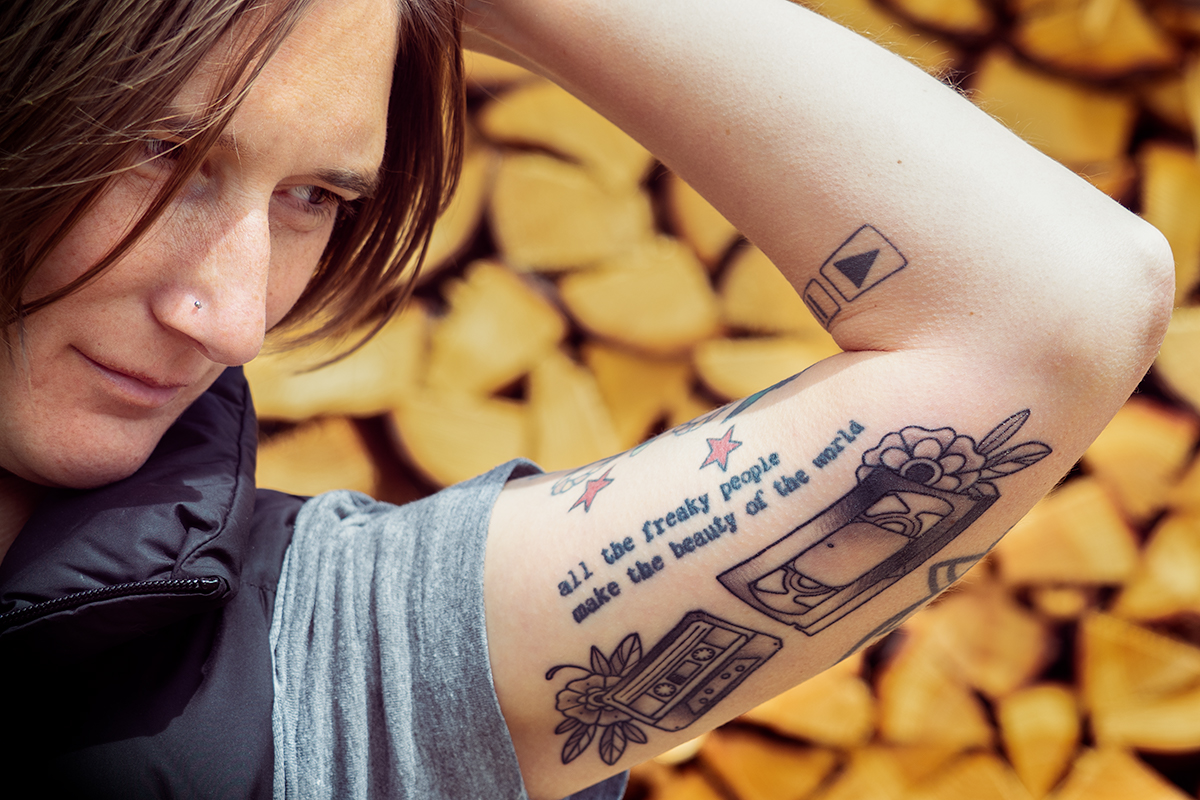
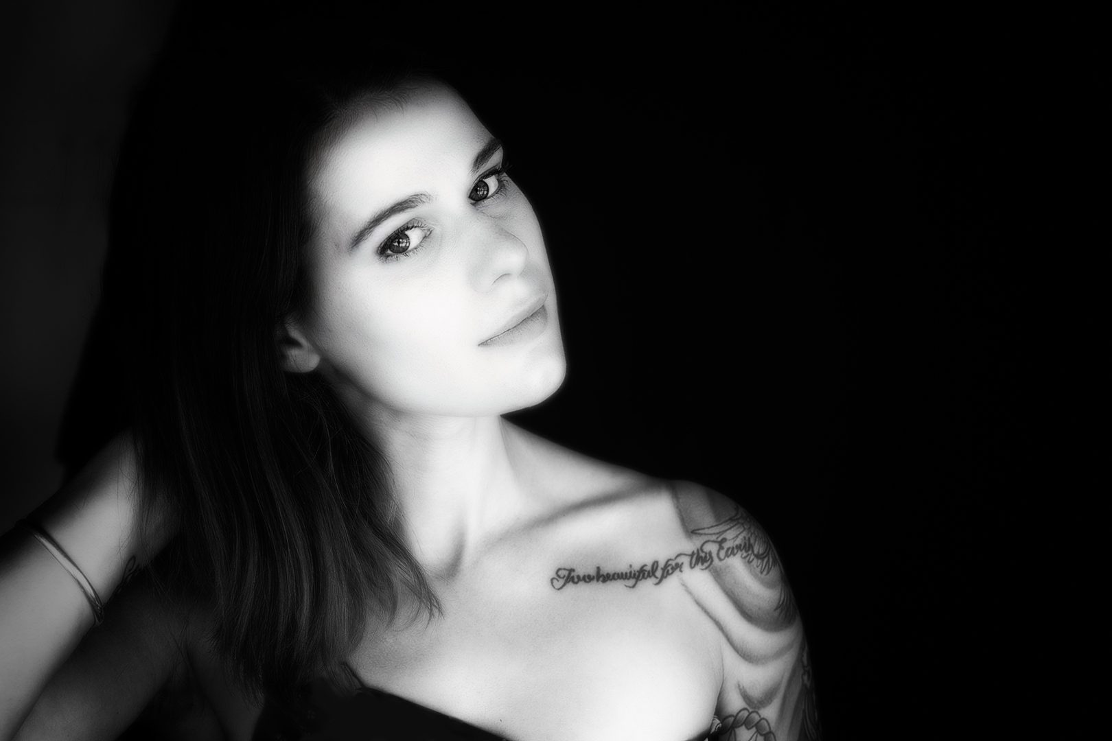
Hi Laurie. This is a lovely commercial-style shot of the necklace, and I like your experiment with the background. The background shows through the clear beads and contrasts beautifully with the pink.
Did you happen to watch Charles Needle's webinar recently? He shoots through glass and had a lot of different techniques that really inspired me to try new things. I've started using some of his techniques for macro shots of food, and also with my close-up tattoo images.
If you didn't get to watch the webinar, I'm sure the recorded version will still be available through the PSA website :) |
Aug 6th |
| 57 |
Aug 19 |
Comment |
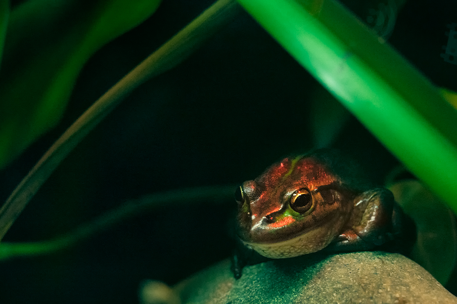
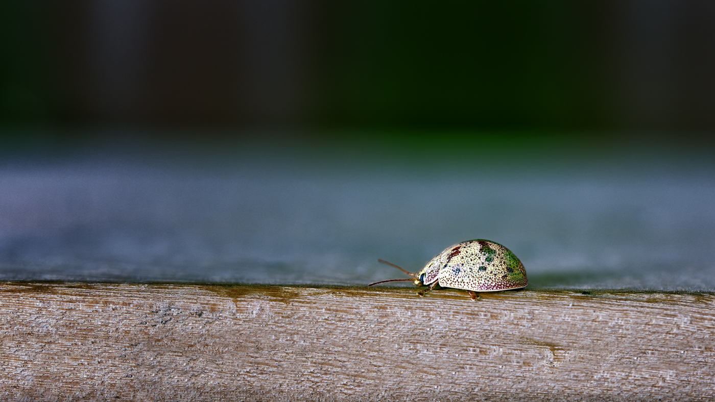
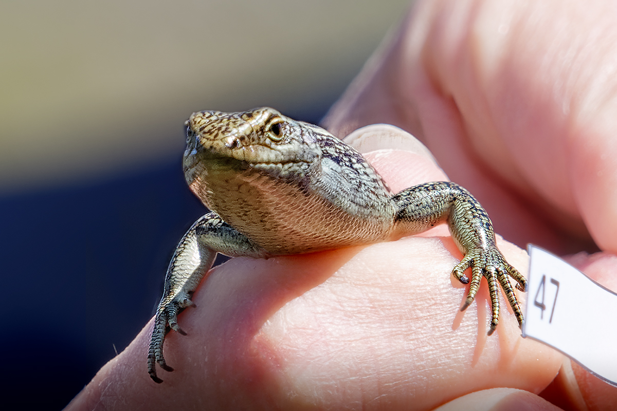
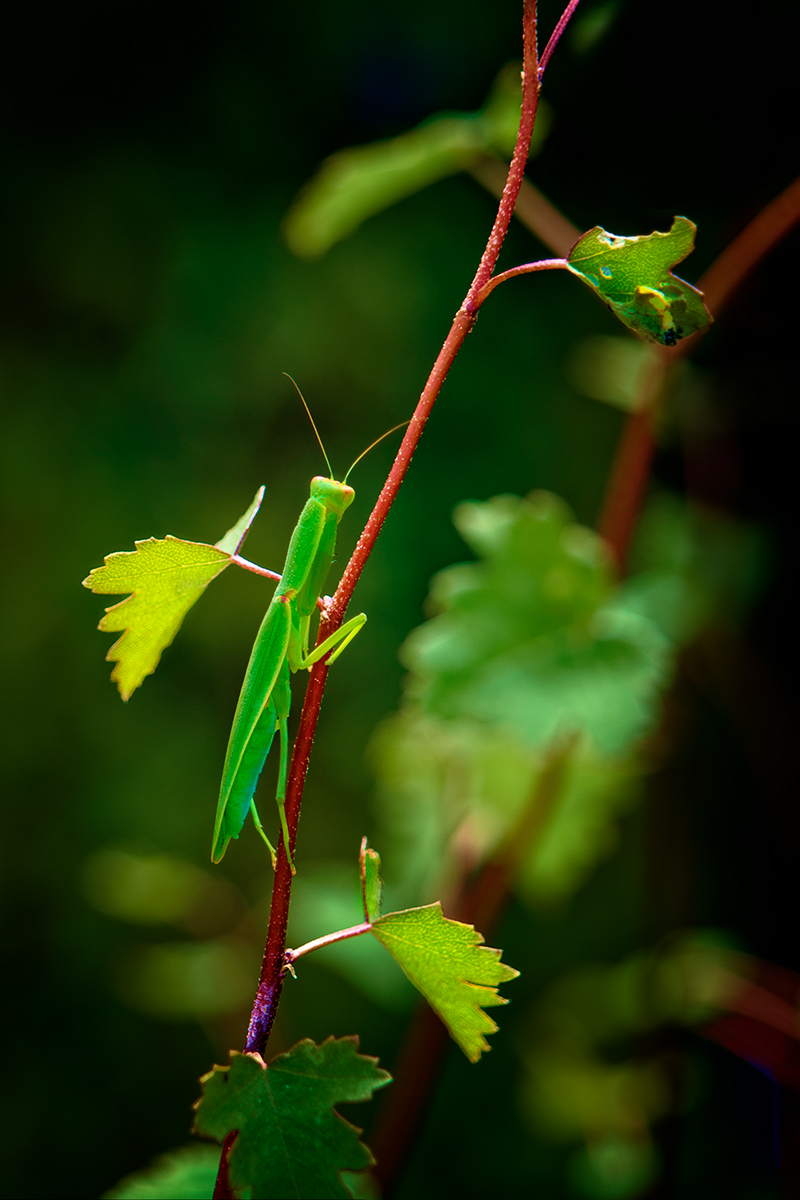
Hi Marcela. This is a very interesting capture. I love that there's another insect just waiting to be discovered and eaten! And the two shadows are interesting. Was the light bouncing off something light-coloured in the environment to give the second shadow?
I think the background is fine - the insect will stand out from the background with its finer detail if, as Laurie suggested, you lower the whites/exposure on its body. The red tinges on the body will also help keep it separate from the background. |
Aug 6th |
| 57 |
Aug 19 |
Comment |
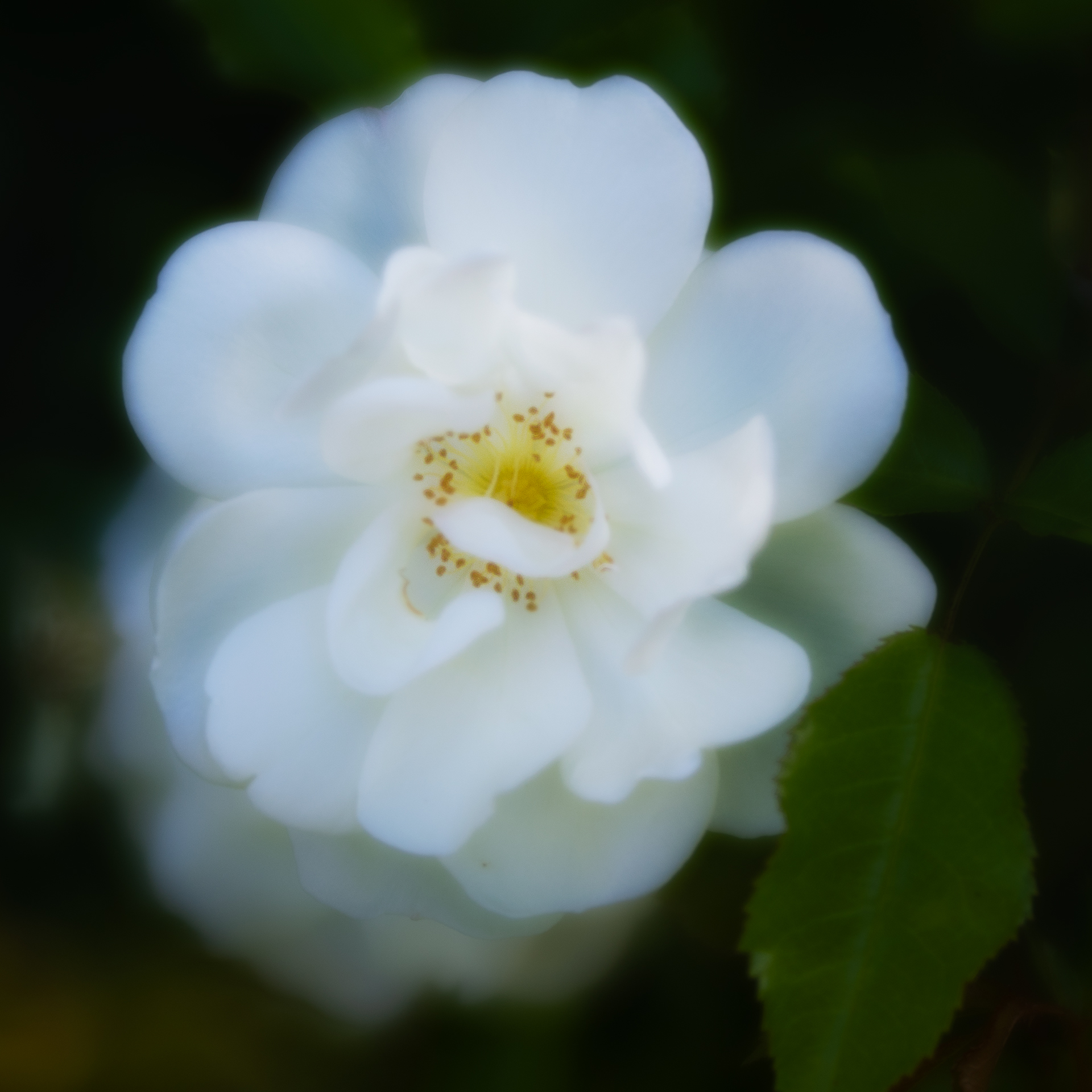
Hi Janis - what a lovely image. The background is soft and the close up details clear. I love that you have captured the butterfly's antennae inspecting the milkweed.
The composition is lovely. My only suggestion for you is the same as Laurie's. Well done. |
Aug 6th |
| 57 |
Aug 19 |
Comment |
Hi Nelson - this is an interesting image. I like the detail of the flamingo, the depth of field and your crop.
I too am a bit distracted by the brown earth - however it is important to keep the length of the crop as you have done. Could you try adjusting the colour a little. It wouldn't need to be much, as brown earth is what it is. However, a slightly softer colour gradient might blend it into the background better as a whole.
Lovely image. |
Aug 6th |
| 57 |
Aug 19 |
Comment |
Hi Cindy - I like your image. I like the way you've created depth with both colour and detail, and the flowing diagonal lines, with only a few horizontal components.
I can't suggest any changes - I'm enjoying what you've done :) |
Aug 6th |
5 comments - 0 replies for Group 57
|
| 77 |
Aug 19 |
Comment |
Love it! And I love the debate your image and title sparked - art is very personal.
You had me looking closer to see what was being thrown in the air. I had to zoom in very close to see that it was a camera. This could be a good thing - you had my attention. However, I would like to see the camera a little more enhanced. It would add to the drama you have already created. I really do like this image.
Thank you to Georgianne for your edit suggestions. Looking at what you have suggested for this image has led me to make improvements to some of my own images.
|
Aug 6th |
| 77 |
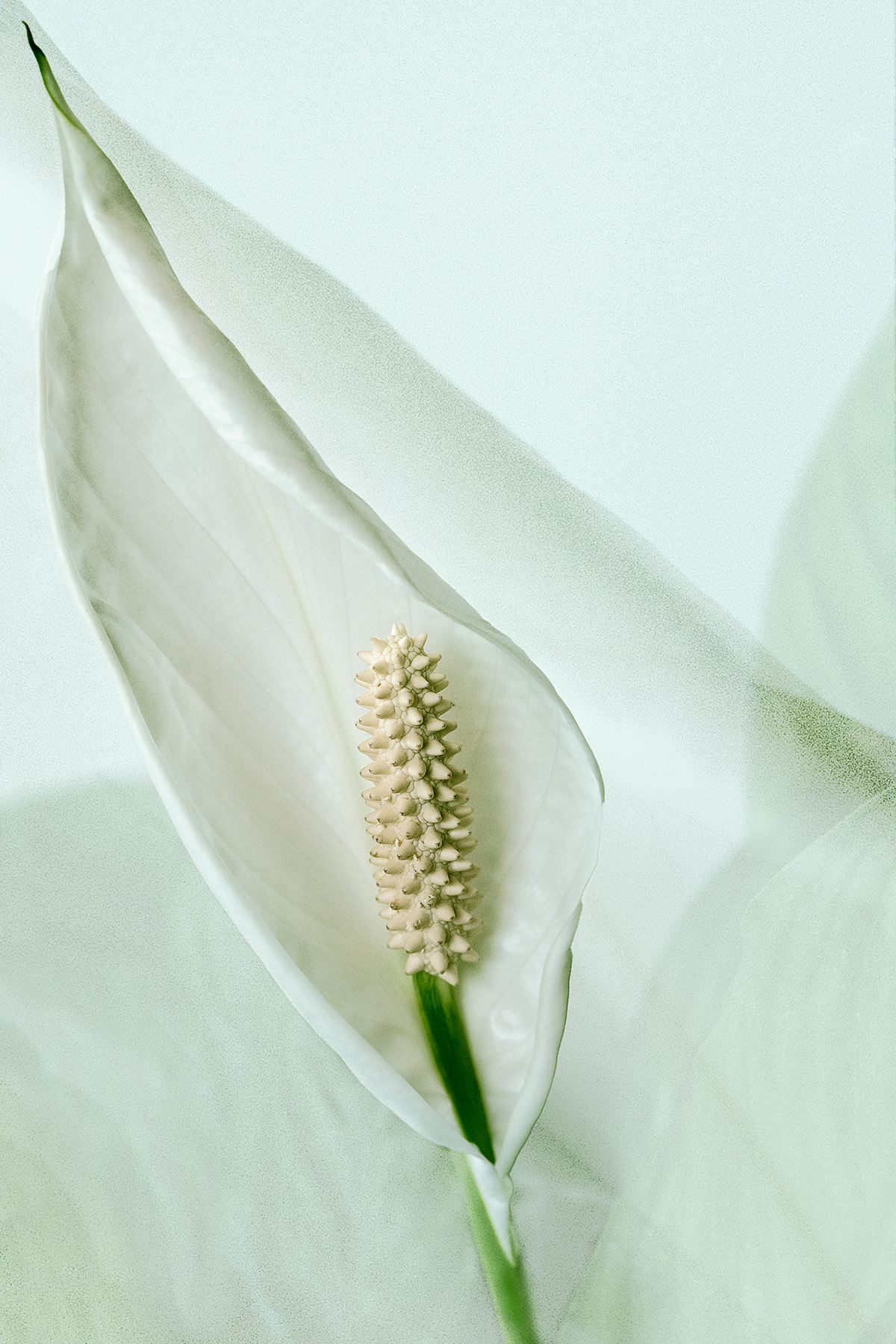
Aug 19 |
Comment |
Wow! Definitely a fine art image - and one you should be proud of.
It's an interesting debate: when is a photograph not a photograph, and is a fine art image still a photograph? We also have these discussions at our camera club.
I love the way you have interpreted your image - and I feel the background really compliments the shapes created by the petals and the wood.
On a side note, I'm interested that a lot of people talk about using Topaz. I have never used it and had not heard of it until I joined digital dialogue groups. I think I should take a look! I would be interested to hear what everyone finds it most useful for, and how it is different from Photoshop. |
Aug 6th |
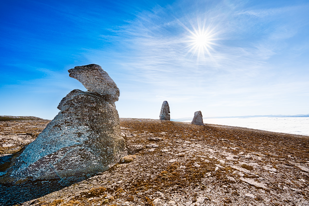
| 77 |
Aug 19 |
Comment |
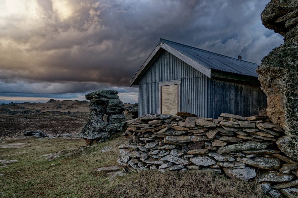
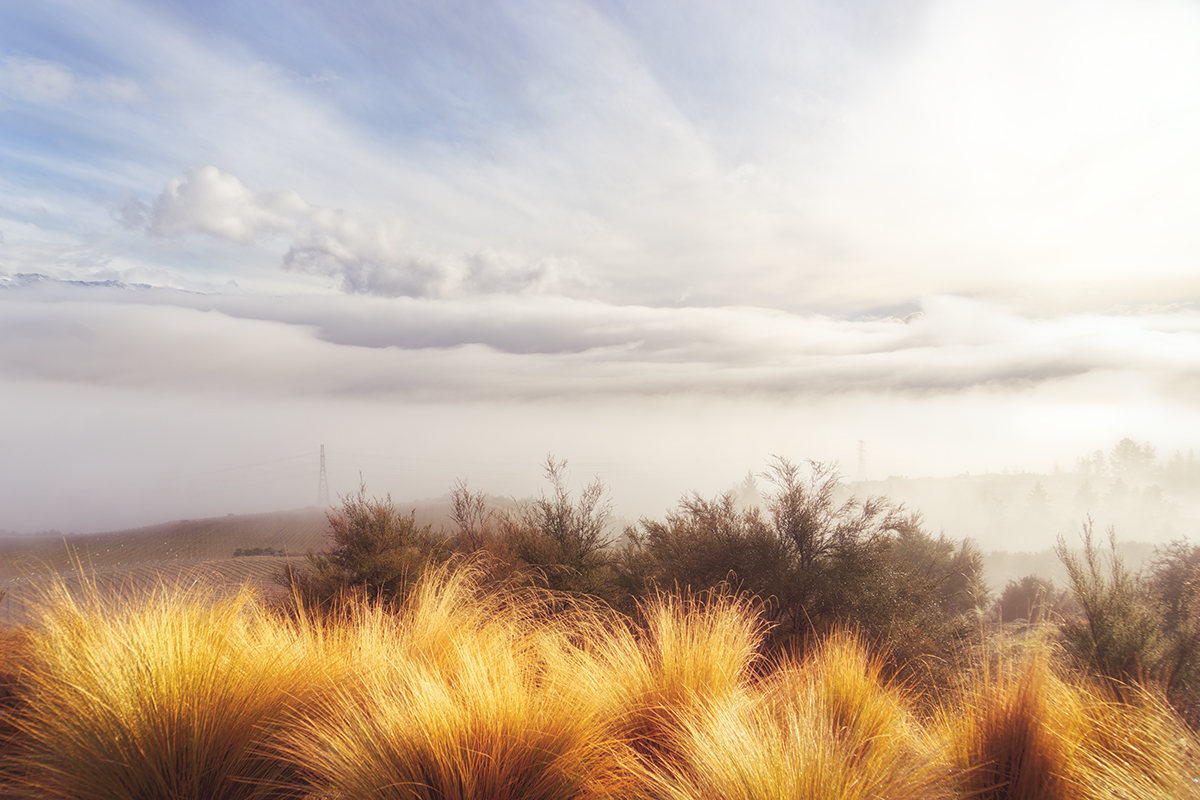
Hi Witta. I love what you have done with this image. It is dreamy, misty and textured and makes me want to go there.
I also find the peak peeping out of the clouds a little distracting - only because there is no other context in the image to tie it to. Hence it looks like it's just floating there.
My suggestion is to add some visual texturing or layers to the snow-capped peak, so it is there but matches the texture of everything else.
You have both your texture overlays and cloud to work with. Overlaying cloud and adjusting opacity might work, so you still know it's there and it gives depth to the mountains overall.
I'd be interested to see your final result :) |
Aug 6th |
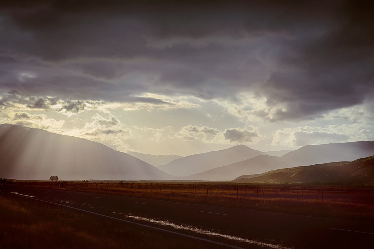
| 77 |
Aug 19 |
Comment |
Hi Georgianne. How lucky you were to see such a beautiful sunset! I like what you have done with the image - you have resisted over-processing and retained its natural look and feel.
I love the circling birds - they add drama and story to the shot.
I am a little distracted by the slightly cut off boat on the right, but see from your original image that this is not a crop problem. I feel that cloning out the small sign might take the attention away from the boat edge. Also slightly darkening the line where the prow of the boat becomes lighter at the very RH edge of the image. This would help keep the attention on the sunset scene and the boat edge won't be noticed.
Lovely :) |
Aug 6th |
4 comments - 0 replies for Group 77
|
9 comments - 0 replies Total
|