|
| Group |
Round |
C/R |
Comment |
Date |
Image |
| 45 |
Jul 18 |
Comment |
Cindy, the colors are great and I like the reflection of the flowers in the table. Too bad you had to crop the bottom so tightly because it cuts off part of the reflection, but I understand you did not want to include the side of the table. The black background really sets these colors up nicely. At first I thought there might be too much black background, "empty" space, especially in the upper right of the image. However, the more I look at the image the more I like the negative space. |
Jul 18th |
| 45 |
Jul 18 |
Comment |
Don, it is all about the eyes, and you have captured his intensity and his character with the tighter crop of his face. Perhaps include a little bit more of his face on the bottom of the image. Right now the crop is too tight up against his lower lip. The facial colors seem natural. Good image. |
Jul 18th |
| 45 |
Jul 18 |
Comment |
Ed, you have done a nice job of improving the original. It is brighter but also "grittier", if that is such a word. The blue of the round drum is a tiny bit on the "too blue" side, and the bright white area on the drum looks a little blown out, as does the white wall on the far left. I would say just diminish the intensity of the blue a little bit, and scale back the brightest white areas. |
Jul 18th |
| 45 |
Jul 18 |
Comment |
I think just removing the feature on the far left of the image that is out of focus is all you need here. It is composed nicely, the colors are excellent, you have the turtle on the left side looking right and leaving room on the right side of the image. Also I am happy you included the reflection of the turtle in the water. |
Jul 13th |
| 45 |
Jul 18 |
Comment |
This is a really interesting technique and I think you succeeded in the result. It looks like a painting. I think the images blend together quite well. Colors look well balanced, too. This looks like a fun thing to attempt. As you say, sometimes it works, sometimes it doesn't, but it is certainly worth trying. This was a success. |
Jul 13th |
| 45 |
Jul 18 |
Comment |
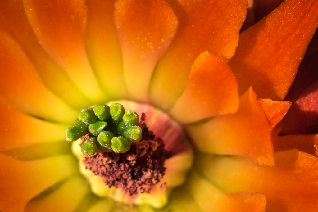
Richard, the original image is spectacular. I love the color the background, everything about it. However, I also see why you would want to zoom in to show the bee. On the cropped version, I would shift it to the left a little bit more in order to include the entire yellow center of the flower. But that is a minor critique and not a major issue with the image. The white of the flower leaf in the left side of the image just to the left of the bee seems a little blown out and could be muted a bit more. Overall, though, the bee stands out nicely from the background. |
Jul 13th |
6 comments - 0 replies for Group 45
|
6 comments - 0 replies Total
|