|
| Group |
Round |
C/R |
Comment |
Date |
Image |
| 45 |
Nov 17 |
Reply |
Richard, I like your more dramatic modification of the photo. Thank you. |
Nov 17th |
| 45 |
Nov 17 |
Reply |
Agreed, Don. I think this would be a good monochrome candidate. That is something I need to attempt more often in post processing. |
Nov 17th |
| 45 |
Nov 17 |
Reply |
Thanks, Cindy! |
Nov 17th |
| 45 |
Nov 17 |
Reply |
Hah! Well, a nude would certainly add interest, Ray. |
Nov 17th |
| 45 |
Nov 17 |
Reply |
Great point, Ed. I need to carry my tripod with me more often. I shot this hand-held. However, to keep things sharp all the way to the back of the image I need to shoot a more closed aperture to increase the depth of field. So perhaps an f/16 or so with slower shutter speed. |
Nov 17th |
| 45 |
Nov 17 |
Reply |
Charlie, I have the a7II, a prior model to the "r". I think the "r" has a 42 mp sensor...mine is a 24, and I have heard it has a reputation for sucking battery power. My a7II is not bad at all, but I never go out on huge photo shoots where I am shooting several hundred photos. My biggest shoots may include 50 to 75 photos. But I always carry an extra battery anyway. |
Nov 17th |
| 45 |
Nov 17 |
Comment |
Brilliant effort getting rid of the background! What a transformation from the original image, Cindy. The background is nice and subtle and the colors fit so well with the color of the horse. Isolating this horse from all other aspects of the scene draws me right in to his eyes. One suggestion would be to clone out the silver ball on the left side of the horse. I realize this is part of his harness but it seems to throw the image a little off balance. I like how you took the slightly overexposed white of his face and returned texture to it. |
Nov 13th |
| 45 |
Nov 17 |
Comment |
The haze removal was successful. I like the depth you have created here, with the foreground mountains standing out clearly while the background mountains fade out in the haze. It's also nice how you brought out some texture in the sky. It is a bit washed out in the original. |
Nov 12th |
| 45 |
Nov 17 |
Comment |
This is cropped perfectly, Ed, in my opinion. The green color of the grass behind the subject looks a little too bright, especially the color reflected in the water. So maybe pull back on the green a little bit. However, I agree, the symmetry is fantastic. |
Nov 12th |
| 45 |
Nov 17 |
Comment |
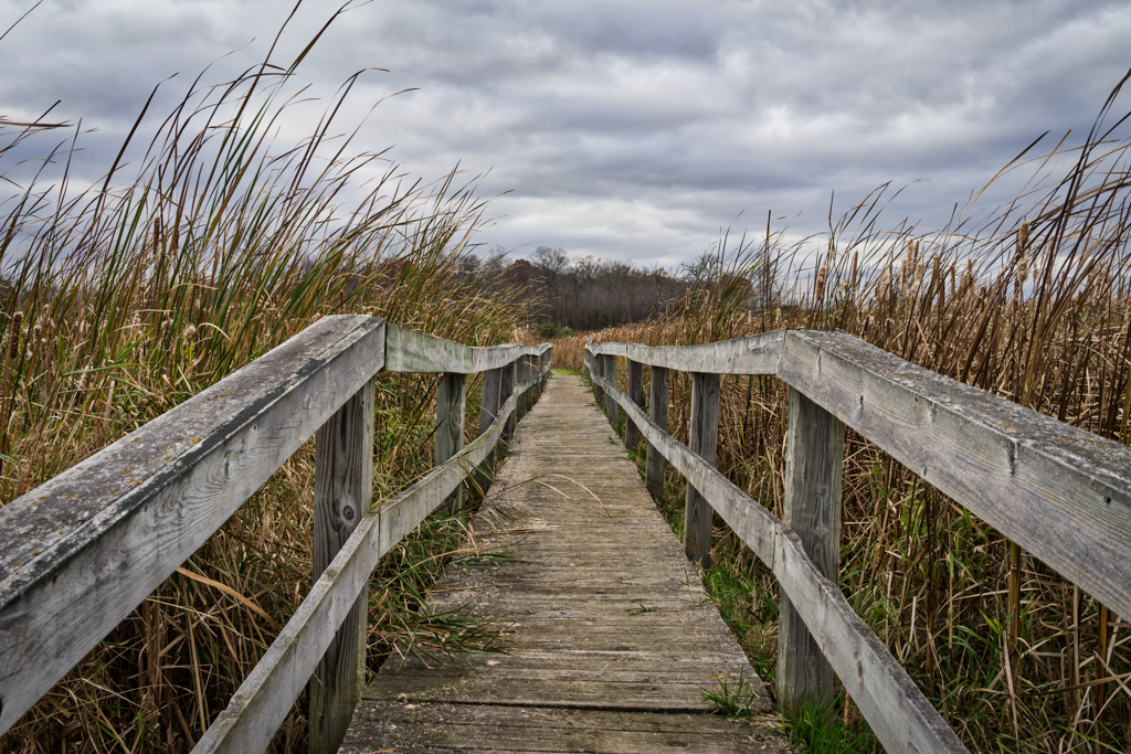
This image captures the peacefulness of an autumn walk in the woods. I would crop it a little tighter on the left side to eliminate the leaves that are close to the camera and out of focus. Plus this will accentuate the vertical nature of the trees which I think is a strong element in this photo. The image looks a wee bit too yellow compared to the original BUT this may be due to boosting the exposure just a little but too much. I find it to be a fine line to tread. When we are in the woods we see a brighter, more colorful scene compared to our camera's sensor. Whenever I try to replicate in LR what I saw in person, I often tend to overdue the exposure and color. |
Nov 12th |
| 45 |
Nov 17 |
Comment |
Two things initially bothered me about the image. The bottom of the image is slanted because it is a silhouette of the ground. Also, there appears to be too much negative space on the left side of the image. However, the more I looked at the image the less those two things bothered me. I like how leaves from the trees seem to reach down lower over the two subjects. |
Nov 12th |
| 45 |
Nov 17 |
Comment |
I think you cropped this photo very well, Richard. It really focuses in on the surfer. The original was too wide and the surfer tended to get "lost" in the image. The overall color looks like it has shifted too far into the green. The water appears too green and the surfer's shirt looks too green as well. I like how you have the surfer positioned to the left of center, giving him room to surf from left to right across the image. |
Nov 12th |
6 comments - 6 replies for Group 45
|
6 comments - 6 replies Total
|