|
| Group |
Round |
C/R |
Comment |
Date |
Image |
| 2 |
May 25 |
Reply |
Regarding background a possible idea is to use a composite color or mix representing the environmental surroundings - a concept used by an Oklahoman artist called Edgar Heap of Birds who is currently exhibiting. He effectively contrasts what he calls nothing with something. |
May 9th |
| 2 |
May 25 |
Comment |
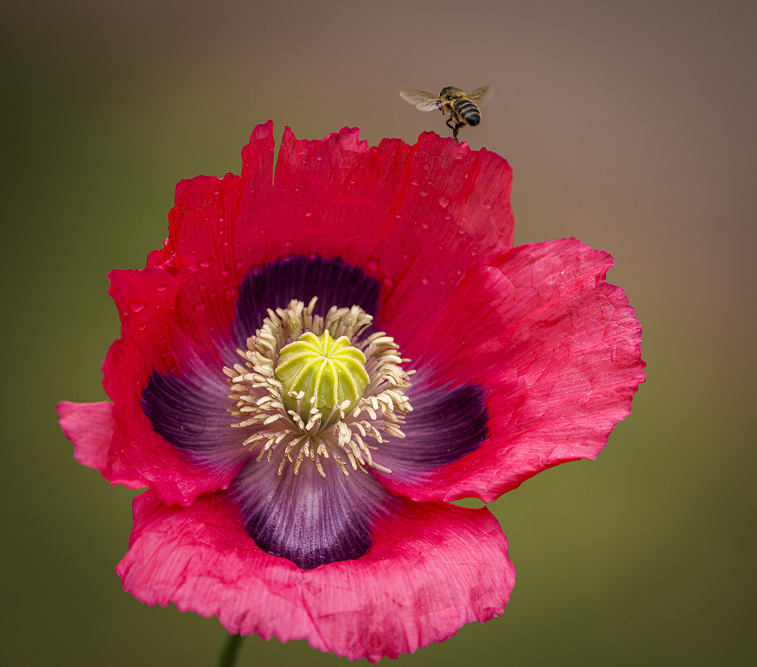
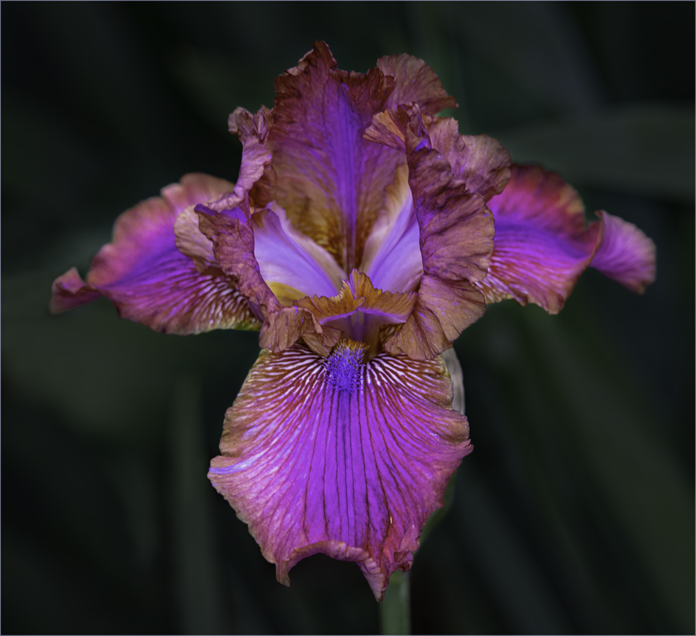
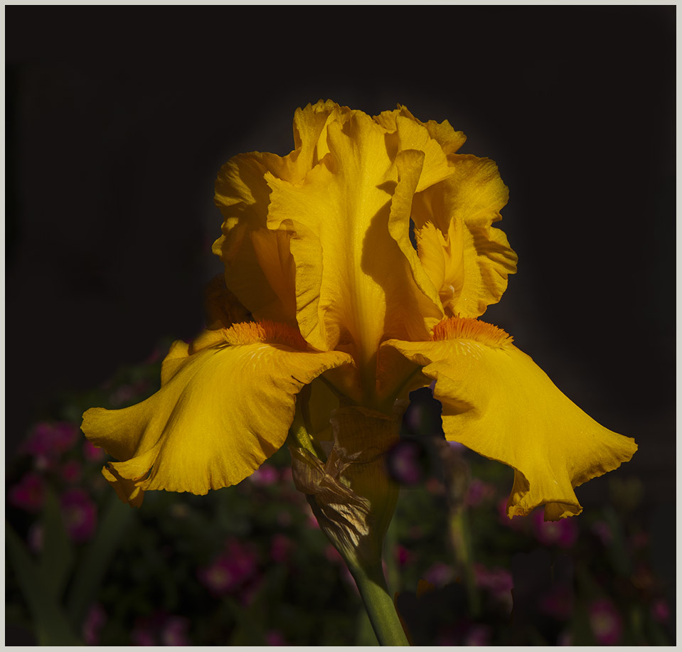
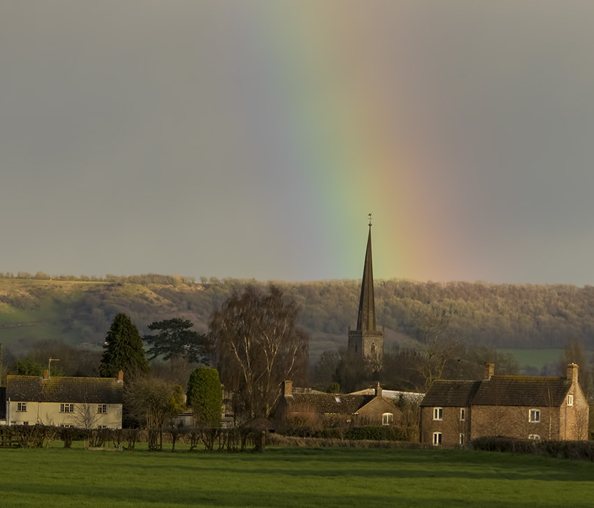
That's the best cactus flower I have ever seen - they grow wild in South Africa but the hot weather and tropical rainfall is tough on the flowers. I am dealing with similar background issues with my neighbor's current crop of irises and am paying close attention to Jim's comments! I have tried black but prefer a more natural and textured one with some foliage but difficult in your situation. |
May 8th |
| 2 |
May 25 |
Reply |
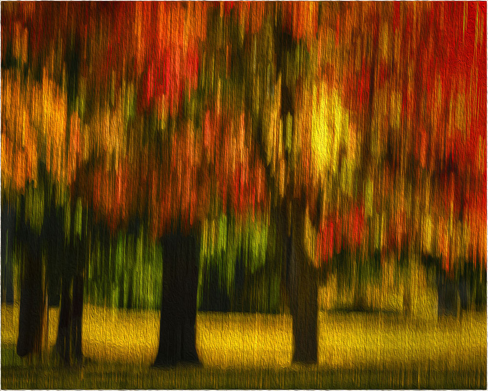
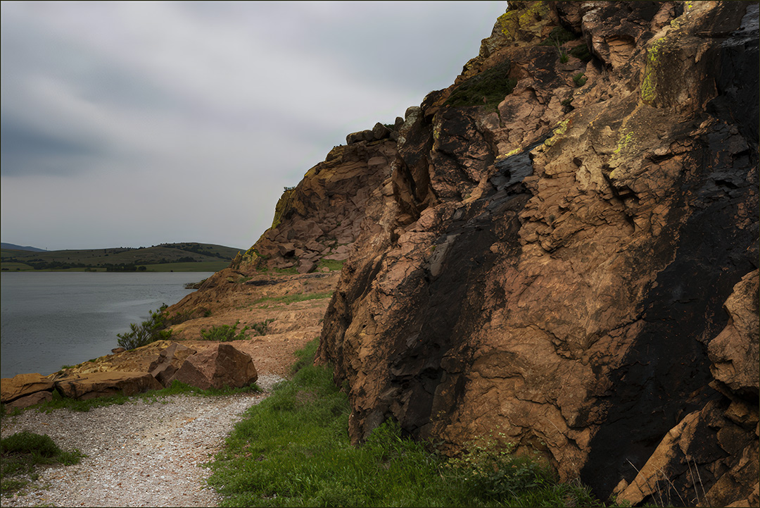
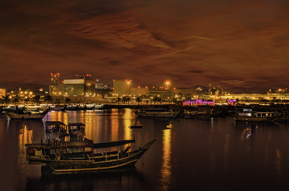
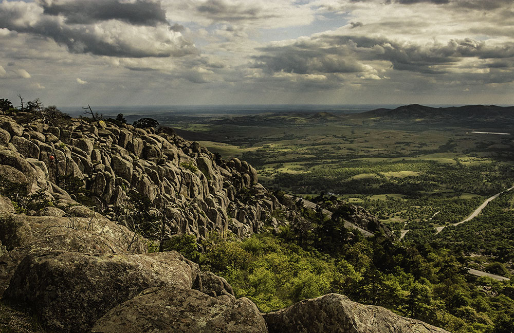
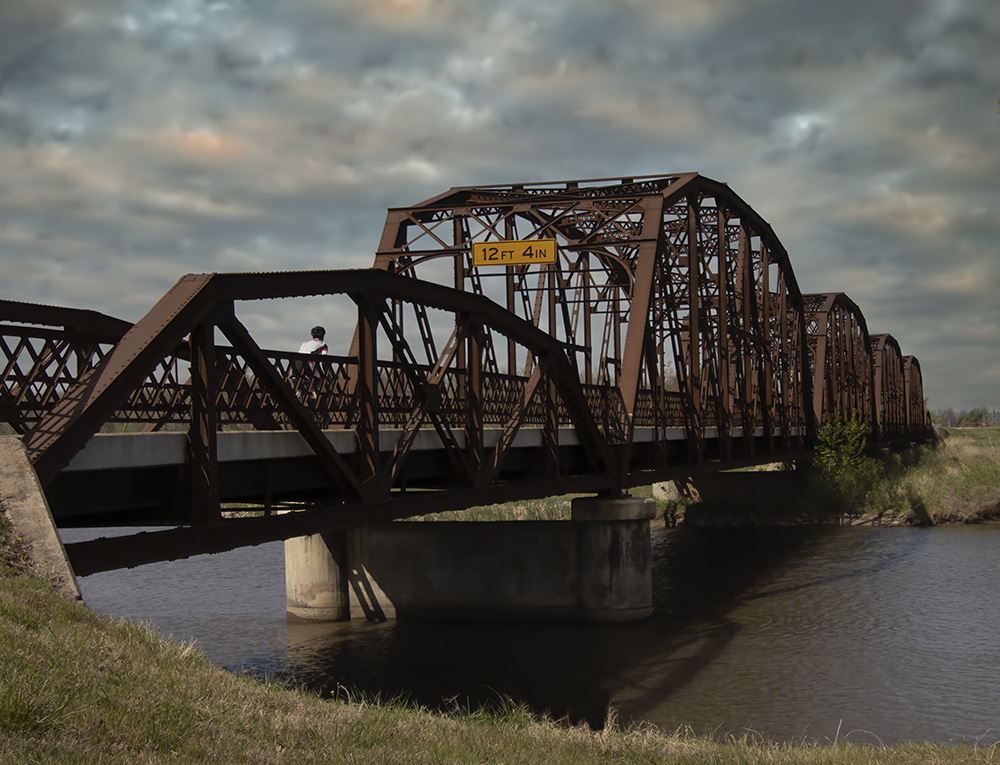
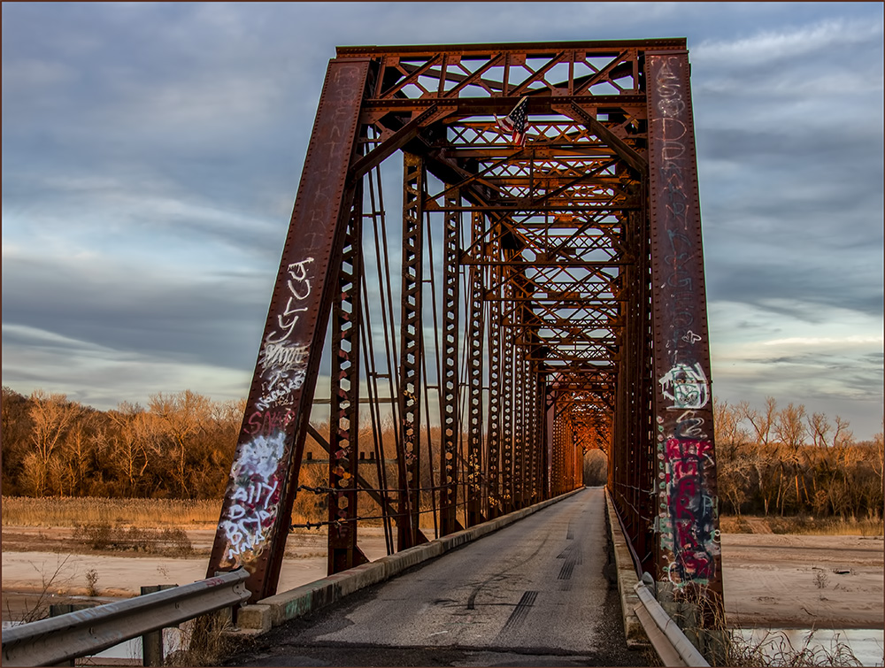
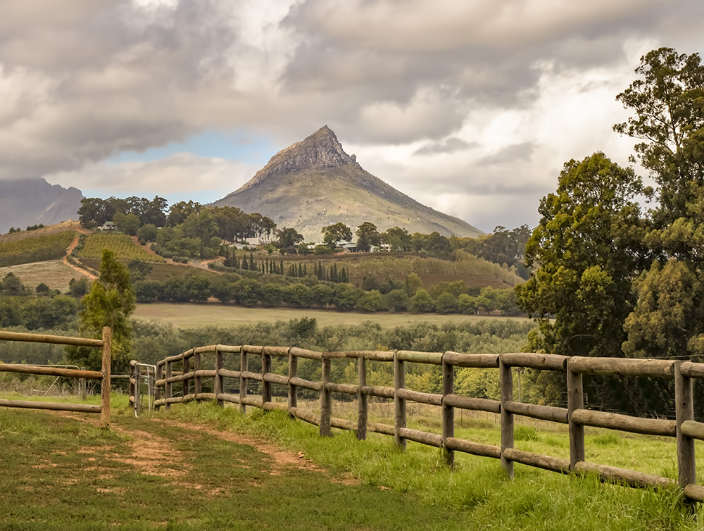
Distorting is a new concept for me - so I tried the a central distortion to bring out the island followed by a horizontal skew. Then I found the top diagonal branch need to come out because of visual weight and the de-shadowing had gone beyond max. Then it needed a better sky.
I'm now thinking of asking the ranger to cut away some of the foliage along the trail to improve the view! |
May 8th |
 |
| 2 |
May 25 |
Reply |
Thanks for your comments. I walked by there again and decided against another attempt because of even more foliage as a result of all the rain we had. |
May 4th |
| 2 |
May 25 |
Comment |
Very nice piece of art with some flow from left to right and a full tonal spectrum including the deep black in the hill on the right. However, you could consider this hill as being too incongruous, and therefore backing off on the black slightly. |
May 3rd |
| 2 |
May 25 |
Comment |
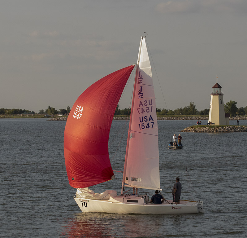
Another thought. As in other sports, narrowing the depth of field to <2.8 to blur the background can help, since you could argue the array of numbers is taking away attention from the subject? |
May 3rd |
| 2 |
May 25 |
Comment |
Good point - I need to take a tripod, but difficult to set up since the trail is narrow and crowded. Going with a painterly effect could be another option. |
May 3rd |
| 2 |
May 25 |
Comment |
Congrats on effective use of compositing and effectively matching Robbie's exposure. Catchlight and expression portray his expertise with the "story" in the background. |
May 2nd |
| 2 |
May 25 |
Comment |
It looks like close to the finish and slightly down hill since the winning post is straight. I think the colors could be brought out slightly and the jockey's face is in the shade. The American flag is too close to the post but you may not have had elbow room to move? I have problems with the horses head: 1. why so much harness? Is that considered humane or protective? 2. The dark corner of the hedge merges with the mane and ears. |
May 2nd |
| 2 |
May 25 |
Comment |
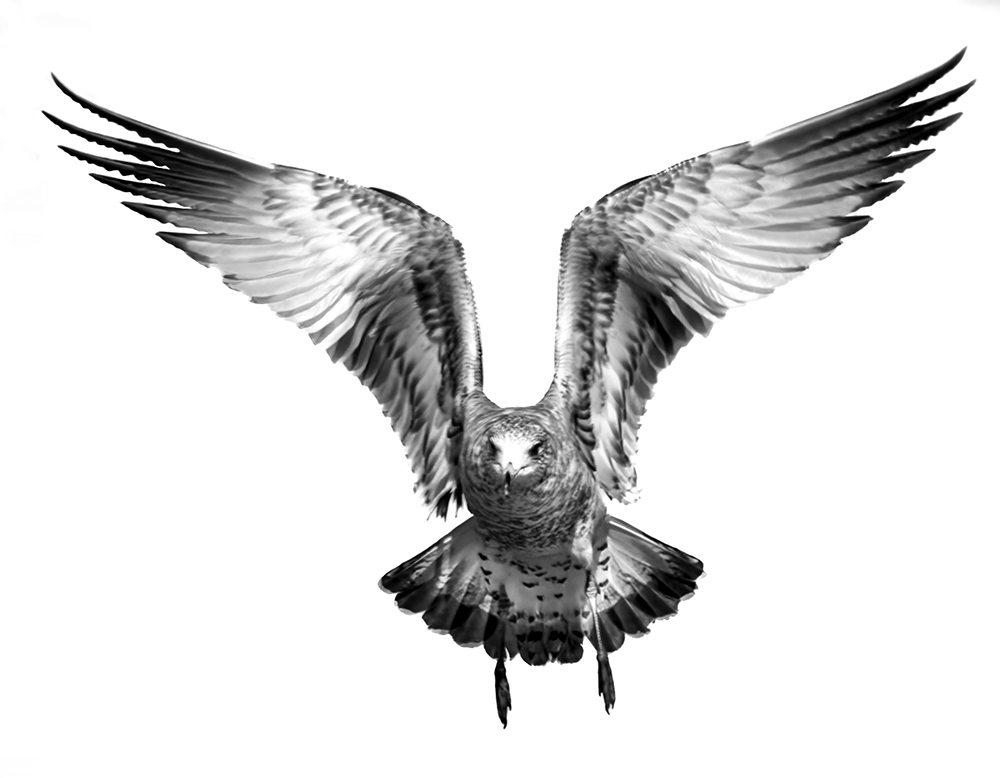
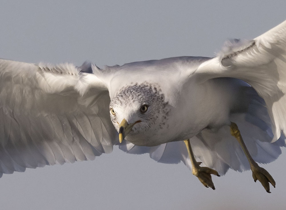
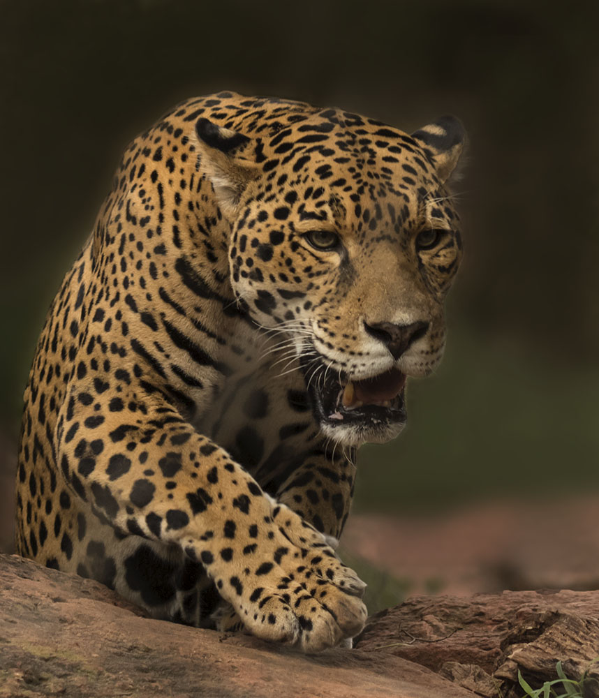
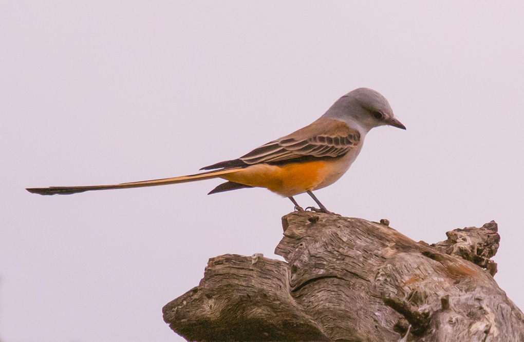
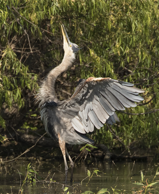
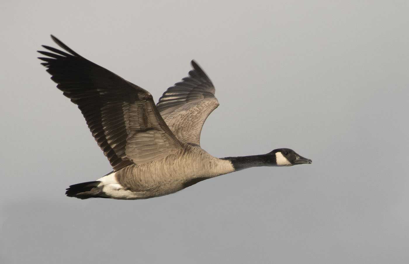
The high key elements of the background and the fading of the branch brings out detail in the Anhinga very well - perhaps as Audubon would have liked! I wondered why the cormorants spread their wings in the heraldic pose - perhaps for the same reason? |
May 2nd |
| 2 |
May 25 |
Reply |
Thanks for helpful advice - I do not have experience with landscapes and feel encouraged to go back there since I like the concept - perhaps I will try some focus stacking. I did try multiple angles of view and settings and saved one that was editable with cloning and selective tone mapping.
|
May 2nd |
 |
7 comments - 4 replies for Group 2
|
7 comments - 4 replies Total
|