|
| Group |
Round |
C/R |
Comment |
Date |
Image |
| 2 |
Sep 24 |
Comment |
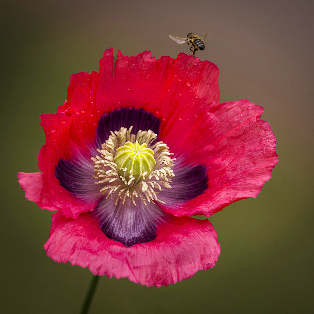
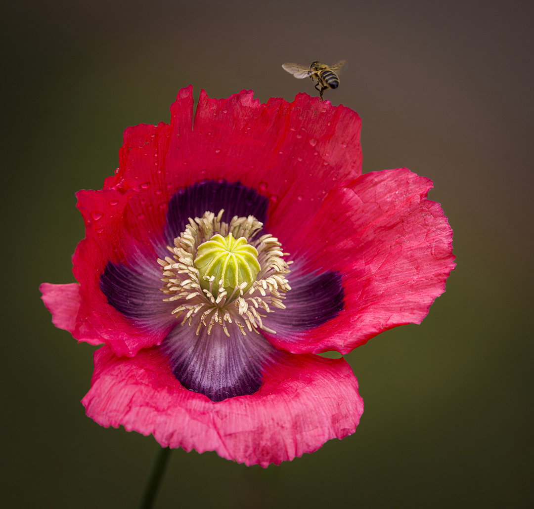
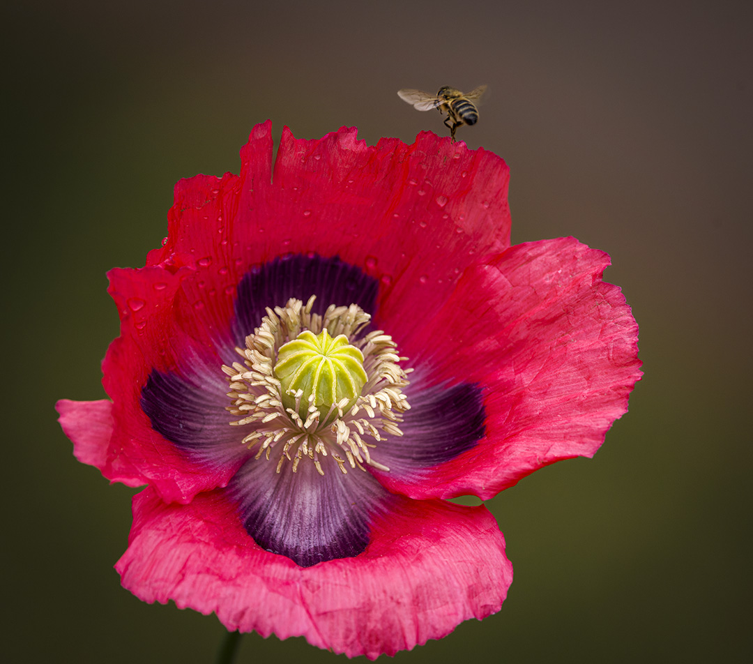
Thanks for your helpful comments. I agree and have also tried to bring out the rain drops by adding exposure and contrast as well as slight dehaze plus "burning" the lower petals slightly and reducing highlights and whites to cut down the sheen. |
Sep 18th |
 |
| 2 |
Sep 24 |
Reply |
On second thoughts you probably have to leave the handle out to retain the nice diagonal formed by the door edge. |
Sep 17th |
| 2 |
Sep 24 |
Comment |
Sorry I'm late! Congratulations on a superb high key image with intrigue and style. I would actually leave the handle but place it a fraction more into the image by cropping or cloning - then I would do a horizontal flip to give both direction and confirmation to the viewers that it is indeed representing a classic car. Yes, it is print worthy without question. |
Sep 17th |
| 2 |
Sep 24 |
Comment |
Thanks. The sun had dried the rain drops a bit but enough remained. |
Sep 17th |
| 2 |
Sep 24 |
Reply |
Thanks for your helpful comments, Karen. Adding space below does make a difference. Turning the bee is beyond my level of expertise but putting another bee in could be possible. |
Sep 11th |
 |
| 2 |
Sep 24 |
Comment |
I'm not sure where the sweet spot is, but you probably have found it. You could also try black and white to see the contrast better? |
Sep 11th |
| 2 |
Sep 24 |
Comment |
I tried going down on background exposure by minus 1 on the CR mask. I think it works - thanks! |
Sep 8th |
 |
| 2 |
Sep 24 |
Reply |
Thanks! I do have a 100 macro and need to use it more often, but the 100-500 seems to allow better capture of fast-moving insect events.
|
Sep 8th |
| 2 |
Sep 24 |
Comment |
Very interesting set of versions each with their own merits. In choosing one, my inclination is to go back to the original. I see a beautiful and thoughtful person who I think is best portrayed by the monochrome version - so I agree with Karen. |
Sep 7th |
| 2 |
Sep 24 |
Comment |
I think what makes this stunning image is the yellow bars and how they contrast with or complement the red and reddish-brown sides of the rail car. Taking out the shadow on the left bar is a good move - also consider taking out the dark rectangle at the top left |
Sep 7th |
| 2 |
Sep 24 |
Comment |
Very impressed with the clarity and sharpness of the image against the high key background. To match the background with an overall high key effect did you consider subject masking to increase its exposure? |
Sep 7th |
| 2 |
Sep 24 |
Comment |
Congrats on great and dramatic achievement! I would consider cropping in from the left based on viewing the original which concentrates more on your main subjects in the sky. But a crop to focus on the sky would be an alternative not a substitute. |
Sep 7th |
9 comments - 3 replies for Group 2
|
9 comments - 3 replies Total
|