|
| Group |
Round |
C/R |
Comment |
Date |
Image |
| 2 |
Feb 24 |
Comment |
Thanks. That helps. |
Feb 18th |
 |
| 2 |
Feb 24 |
Reply |
Better! The vase for the carnations is the central subject and needs more space - consider moving the cup slightly to the right and using a landscape mode? That would also give more room for the cloth. |
Feb 12th |
| 2 |
Feb 24 |
Reply |
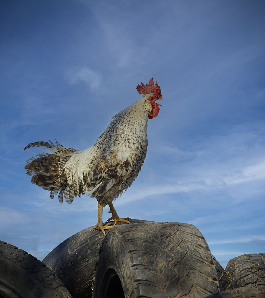
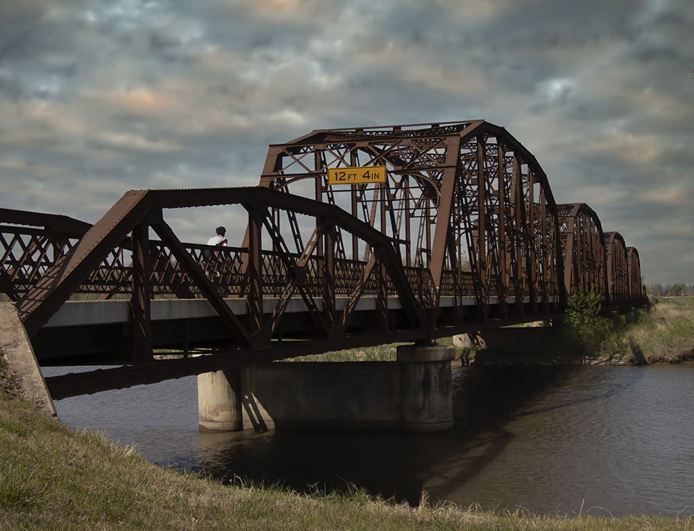
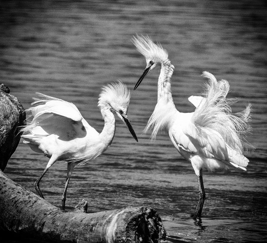
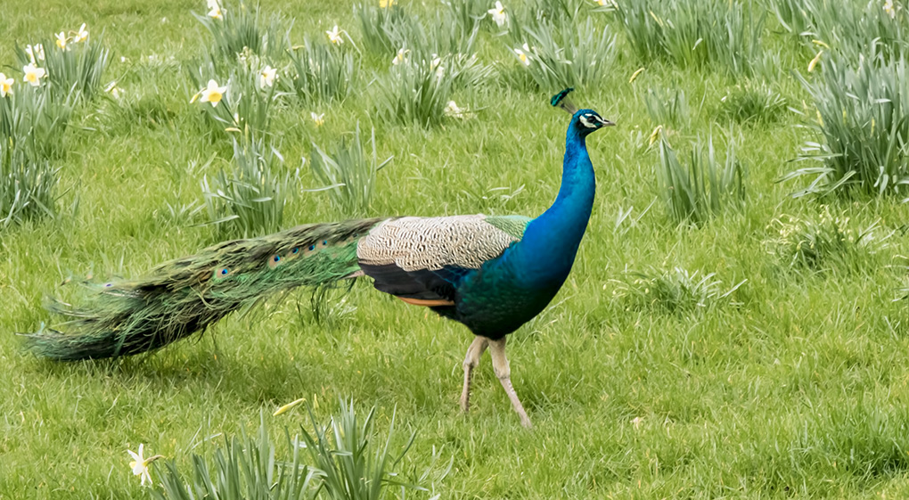
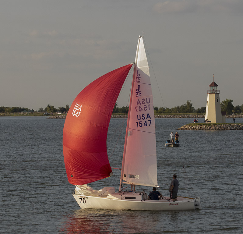
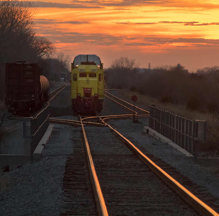
Do you agree that the horizontal flip really brings out the "Fibonacci spiral" more effectively. I would still argue that lower right or now left window could go. Also stepping about two feet to the left would have been great to catch the bend in the bannister as it goes behind the corner? |
Feb 9th |
| 2 |
Feb 24 |
Reply |
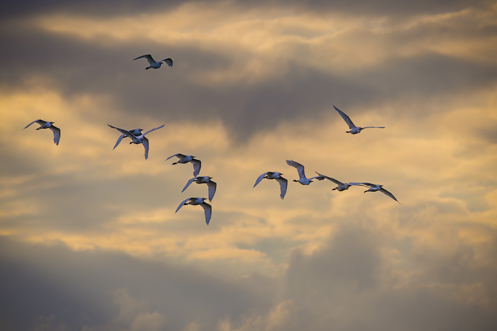
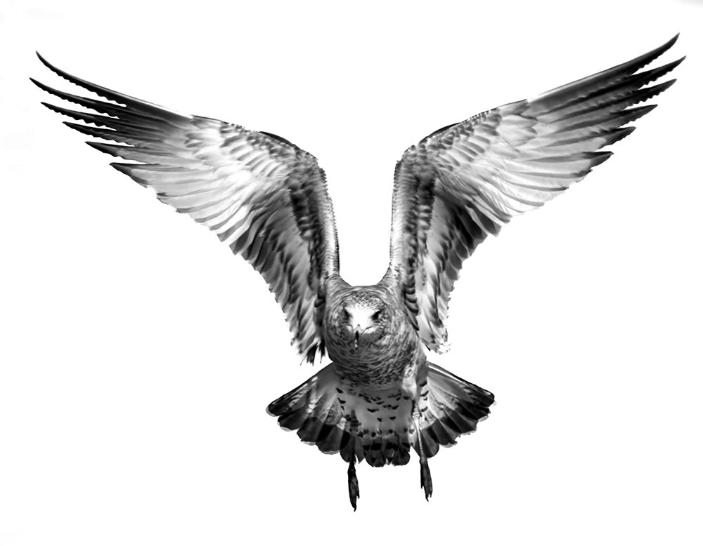
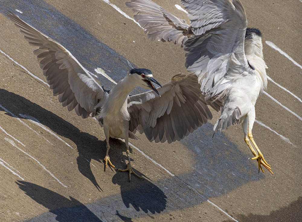
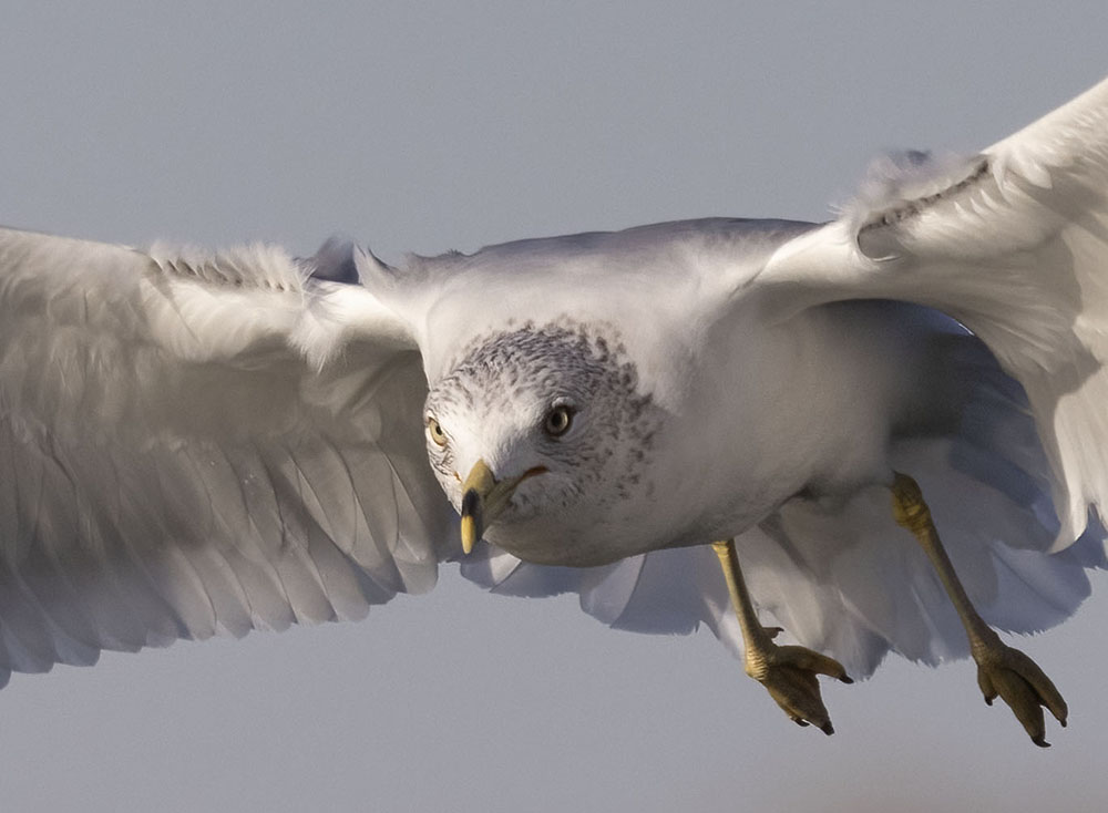
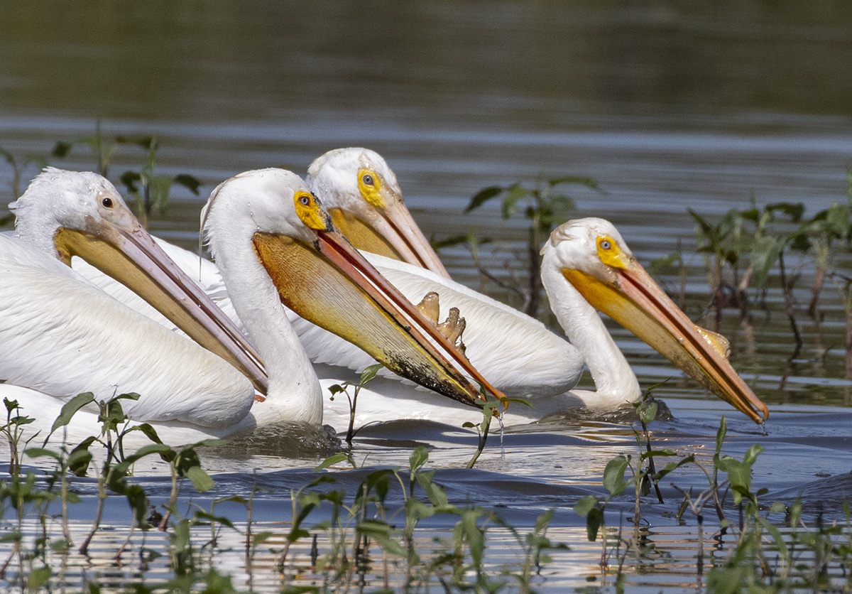
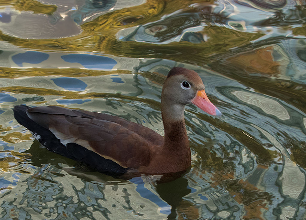
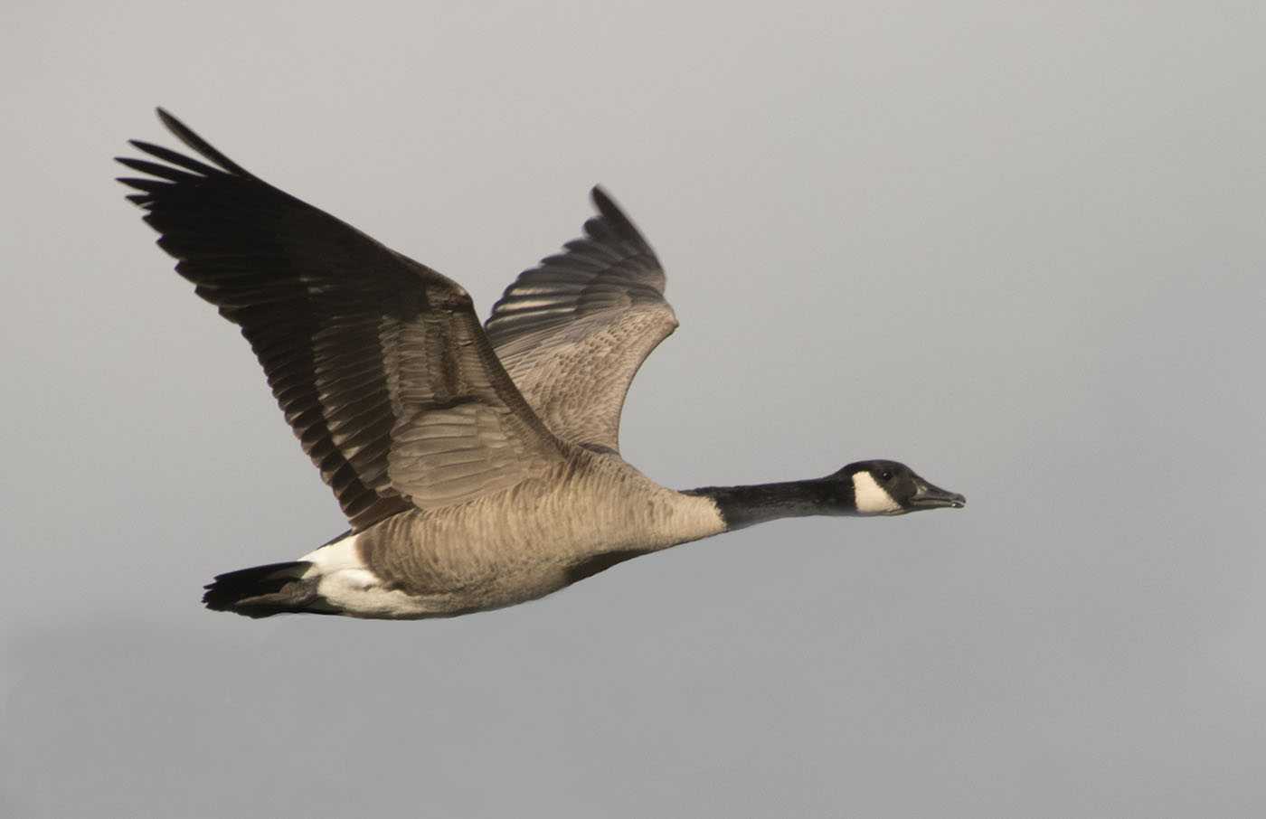
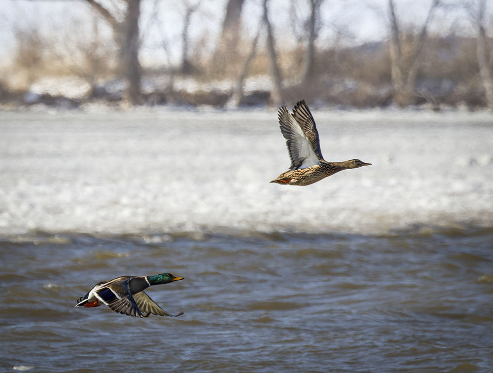
The image was selected from a burst, but lucky to find good wing positions. I agree the distant background is too dark and dominating. I have used a linear gradient on a duplicate image to reduce the blacks almost all the way, then painted in the background on the image while preserving the top duck's feathers. I brushed in a reduced temperature for the sky to give it a slight blueness. |
Feb 9th |
 |
| 2 |
Feb 24 |
Reply |
Thanks. That's a really great point I had overlooked. Midground and background are overlooked in nature photos I think. |
Feb 6th |
| 2 |
Feb 24 |
Comment |
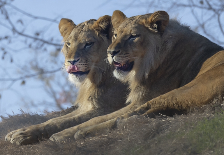
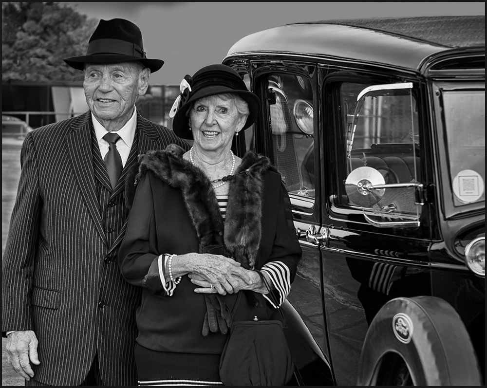
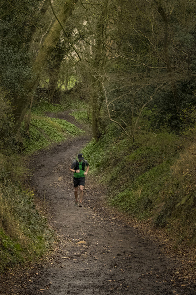
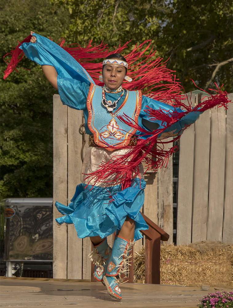
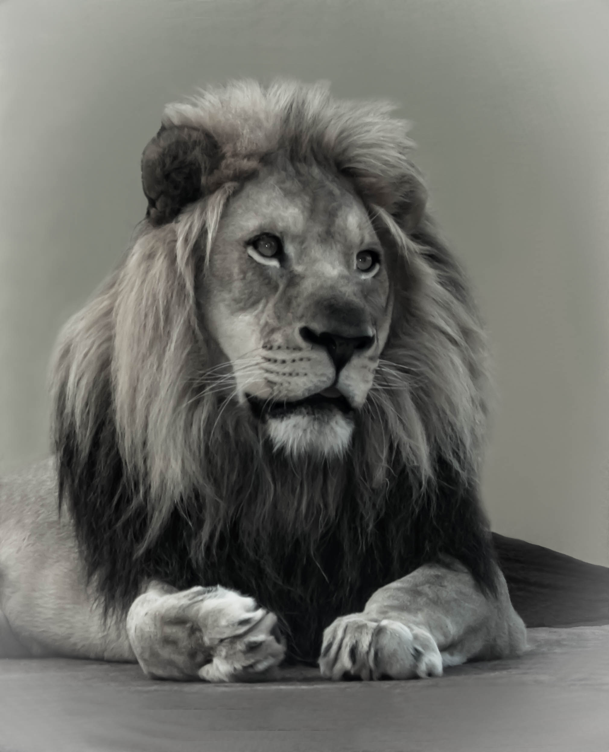
Superb use of real-life anatomy for showing lines!
I count 4 triangles and possibly a fifth one if you imagine a line from right toe to left knee. The face gives an impression of intense concentration and I can count another three triangles on the face adding to the intensity.
Because there is so much in the image I think the black and white version has an edge and improves the message and facial expression.
I would add background to give him more space mainly at the top and sides. |
Feb 2nd |
| 2 |
Feb 24 |
Comment |
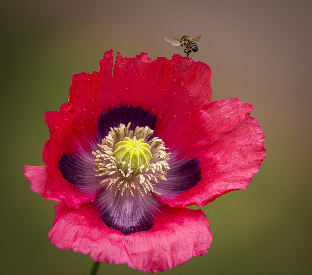
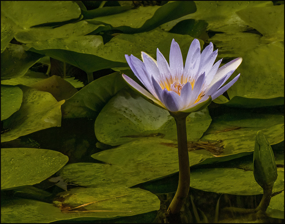
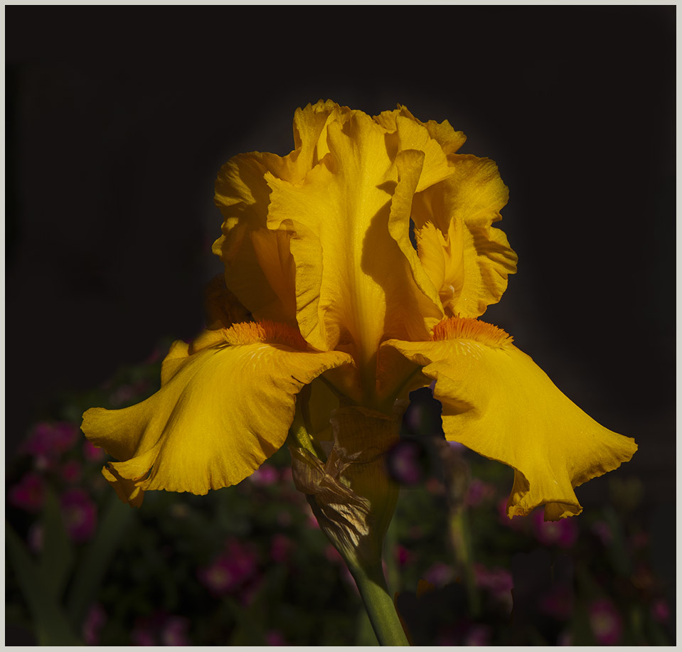
I like the balanced arrangement and colors. The carnations and ? lavender are superb quality. Perhaps I am biased because my late father grew and sold carnations.
I think the background is slightly too blotchy behind the flower on the right. The smoke from the cup is obscured by the background cloth and I think a wood background would show it better.
I don't think it has potential for a black and white image without enough extremes of gradation from black to white as would be shown on a histogram. The only way to correct this is to add or substitute black and white objects to your arrangement. |
Feb 2nd |
| 2 |
Feb 24 |
Comment |
Fascinating play with light and color. I think the original moon is closer to reality and less like a flying banana or tropical fruit, but you have balanced the image well. Is that Saturn in the lower left of the original? The title could be changed to "A Lunar Perspective" perhaps. |
Feb 2nd |
| 2 |
Feb 24 |
Comment |
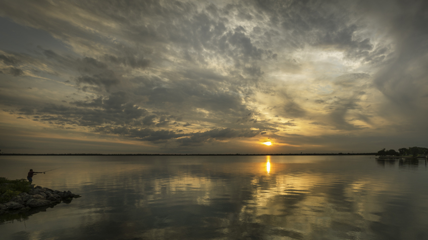
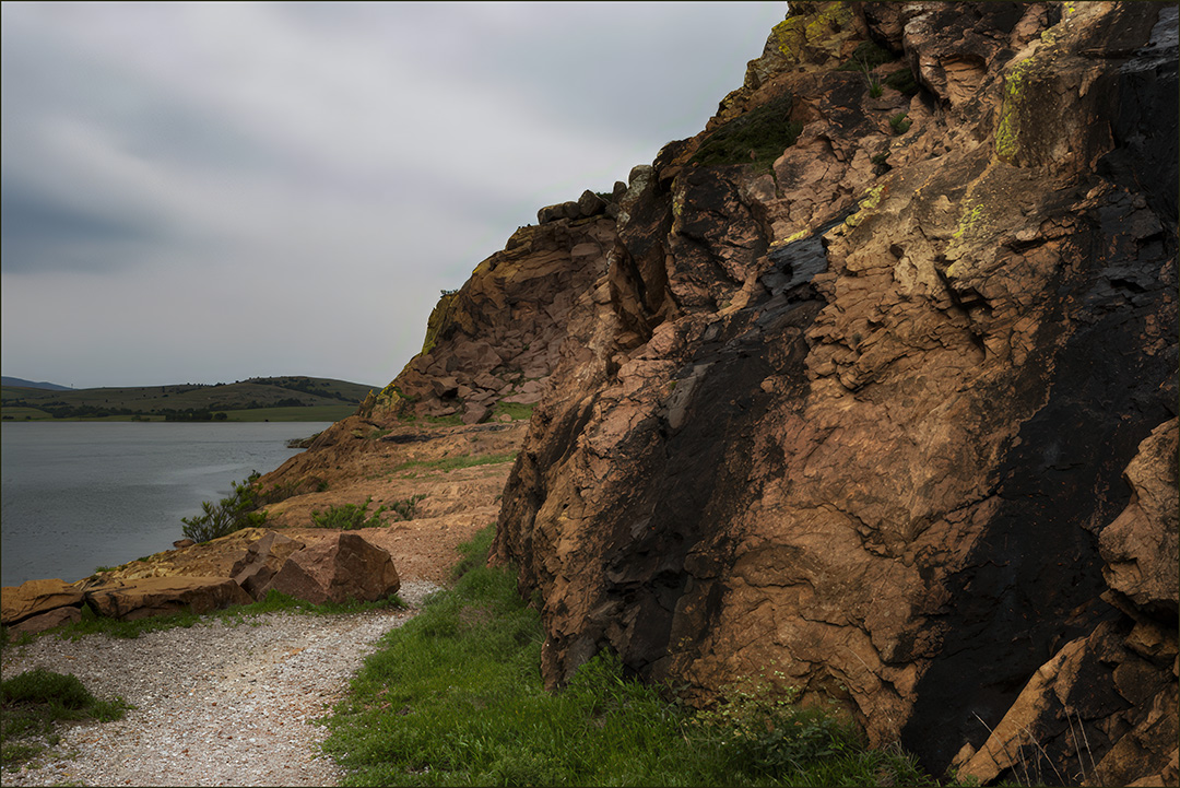
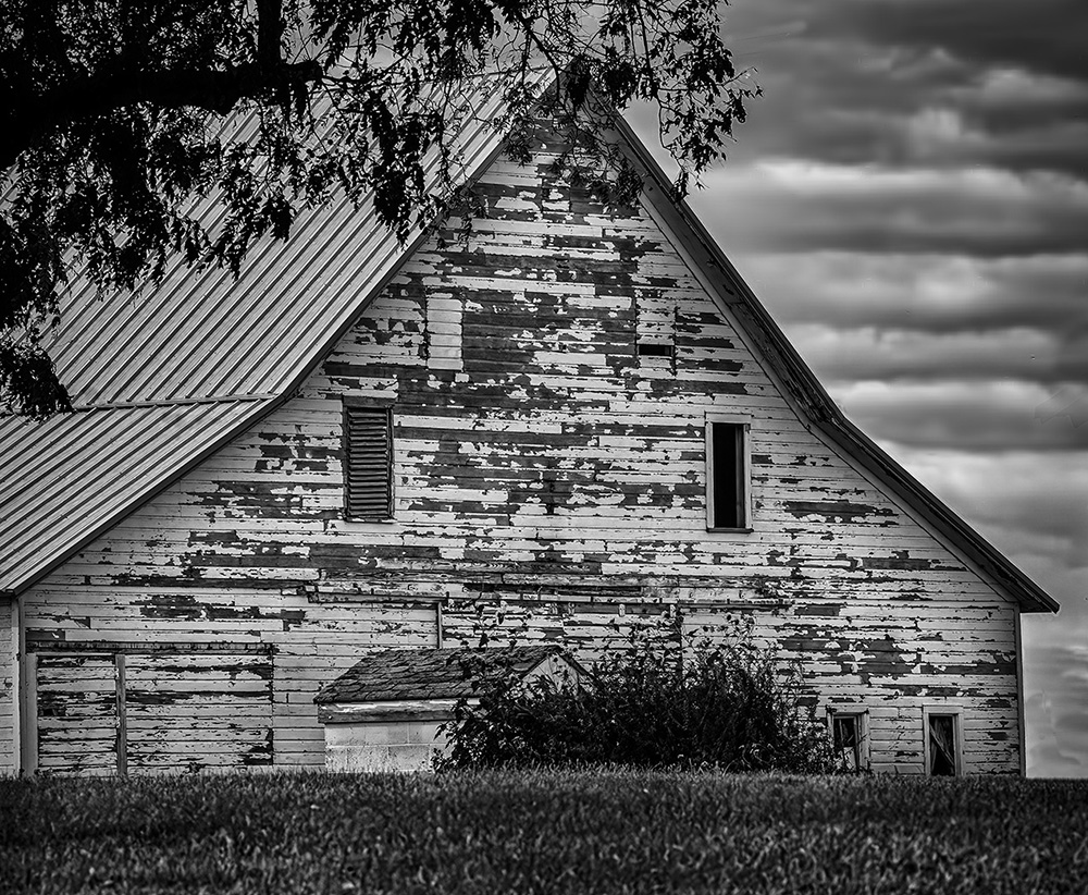
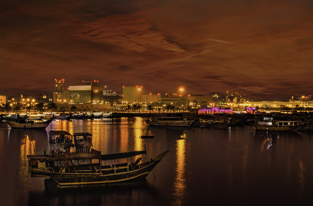
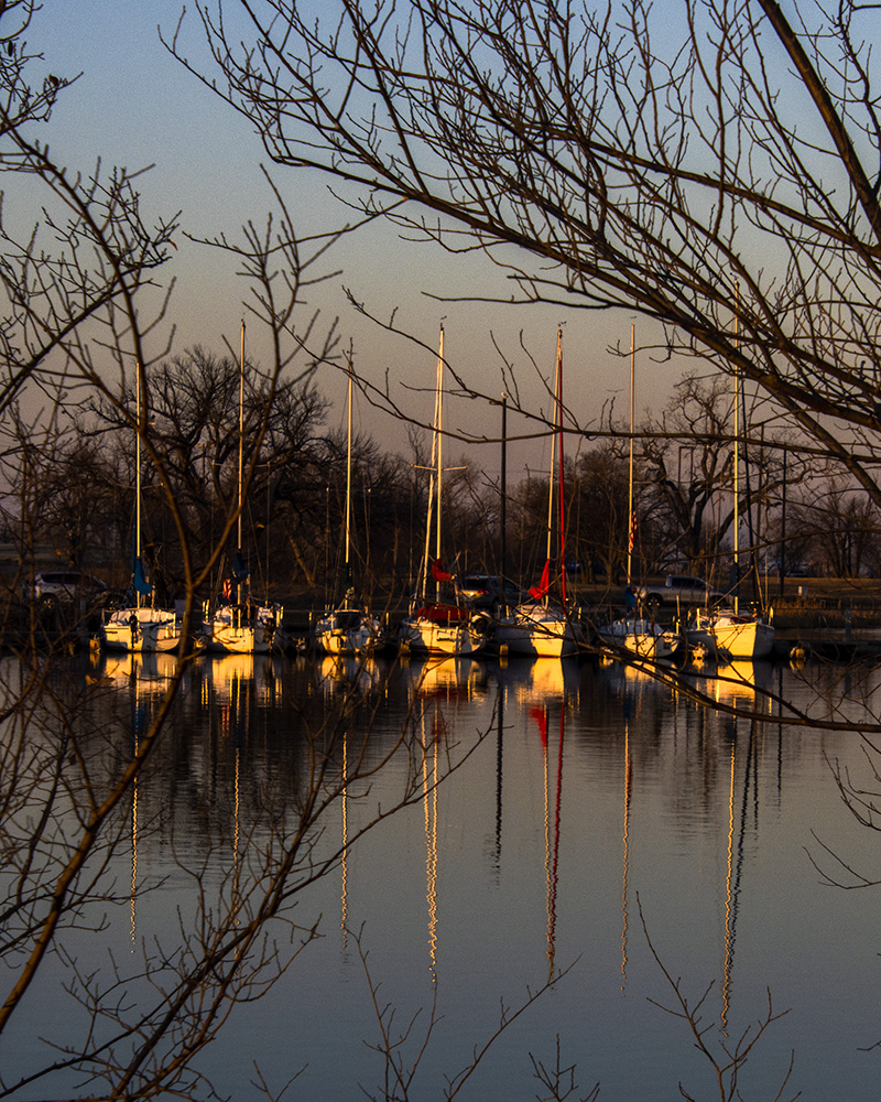
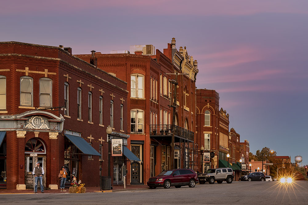
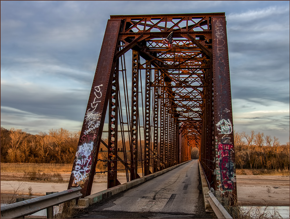
Fascinating story, technique and image. The only criticism I can think of is to bring up the question of where the lines lead to; the "line to nowhere" cliche. However the placement of the windows and the central one at the upper end of the stairway is perfect I think. |
Feb 2nd |
| 2 |
Feb 24 |
Comment |
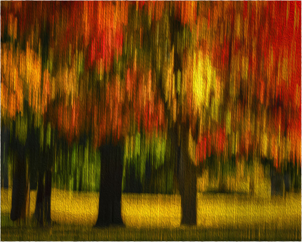
Since I had tried pushing the de-shadow slider to no avail, I have taken steps to complete a pictorial image as opposed to nature. I tried some cloning from two separate images of Mallards in flight with matching bit depth and size (attached). |
Feb 2nd |
 |
6 comments - 4 replies for Group 2
|
6 comments - 4 replies Total
|