|
| Group |
Round |
C/R |
Comment |
Date |
Image |
| 2 |
Apr 22 |
Reply |
Yes, well done! |
Apr 20th |
| 2 |
Apr 22 |
Reply |
According to the color wheel red and pink are analogous and help each other, therefore I don't believe they should differ in brightness too much. The green in the stems is on the opposite side of the wheel is complementary and supports the red and pink. The partial frame in turquoise is neither and I don't think supports the image. |
Apr 20th |
| 2 |
Apr 22 |
Reply |
Yes, but I think the shadows on the hut have become darker relative to the brighter sky - so possibly some selective adjustments could work. |
Apr 13th |
| 2 |
Apr 22 |
Reply |
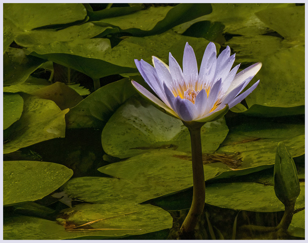
Yes, I had thought about taking it out, but then I thought of the potential it has to form a competing blue lily. However, composition for impact probably trumps afterthoughts on creative potential. |
Apr 13th |
| 2 |
Apr 22 |
Reply |
Thanks. Yes, it had rained. I used blue toning to match the flower, but I can also try green. |
Apr 12th |
| 2 |
Apr 22 |
Reply |
Thanks. All this time I did not realize you can click on the image to get the enhanced view. Yes 20 pixels for the frame is overkill. |
Apr 10th |
| 2 |
Apr 22 |
Comment |
Outstanding image and pioneer post-processing! - a solid wind-swept church in winter. On looking round the edges I note the mountains showing on the left need some more snow, and the rock on the far left could be darkened.
|
Apr 9th |
| 2 |
Apr 22 |
Comment |
Good capture and timing with a nice result! I think the compositional balance is weighted to the left somewhat, although the heavily signed gate is interesting. Perhaps the balance could be considered effective negative space on the right. Hopefully the signs on the gate are welcoming! |
Apr 9th |
| 2 |
Apr 22 |
Comment |
The sky grunge matches the tone and color of the image, but I felt on first impression, that it was overdone. Perhaps reducing the opacity might help.
It looks like a platform with a canopy on the right - perhaps a place to have dinner?
|
Apr 9th |
| 2 |
Apr 22 |
Comment |
The red flowers dominate because they are red and steal the effect of the pink flowers. I suggest selectively desaturate the red - but not completely. I'm not sure about the background modifications - perhaps masking in some water or a pond would do it. |
Apr 9th |
| 2 |
Apr 22 |
Comment |
I think the softer shades bring out the foreground spiral and the sunburst. The tones and shapes suggest to me that it might be worth trying black and white in either your original or Stuart's modification. |
Apr 9th |
| 2 |
Apr 22 |
Comment |
There is a problem showing the border here, so I have increased it to 20 pixels, but 10 pixels should be adequate. |
Apr 9th |
 |
| 2 |
Apr 22 |
Reply |
Thanks for your comment. I have put in an off-white border with slight blue tinge. Before I had a black border which failed to show. |
Apr 9th |
6 comments - 7 replies for Group 2
|
6 comments - 7 replies Total
|