|
| Group |
Round |
C/R |
Comment |
Date |
Image |
| 2 |
May 21 |
Reply |
I concur and think the woman's head and shoulders should be just above the third line. I used the crop tool with content aware to do this to Martin's edit. I hope you agree Hung but feel free to disagree. |
May 10th |
 |
| 2 |
May 21 |
Reply |
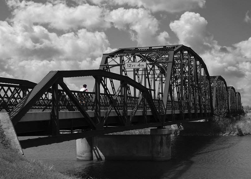
I saw the cyclist coming up and waited for the best view in the burst but still suboptimal. Thanks for the information about Pittsburgh. |
May 10th |
| 2 |
May 21 |
Reply |
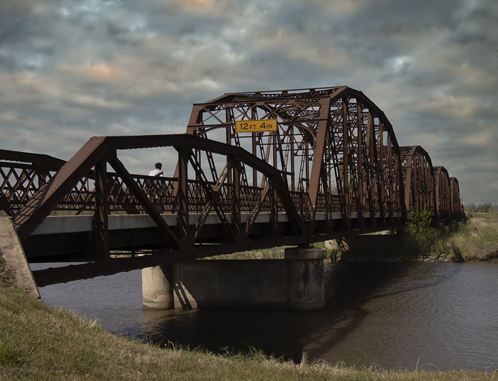
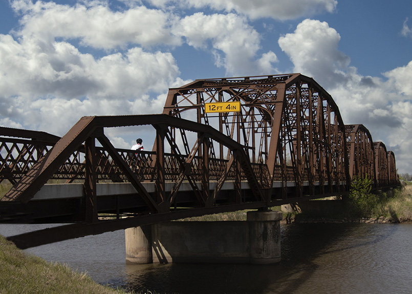
Yes, I had also contemplated taking out the yellow height sign but that is much more difficult. Piers |
May 10th |
 |
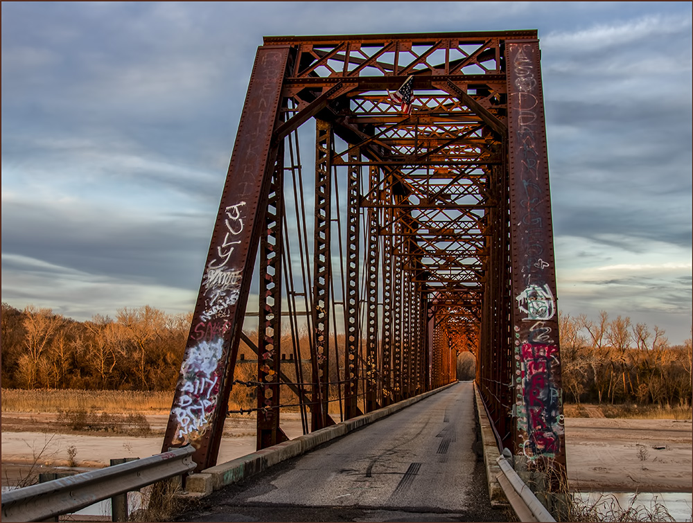
| 2 |
May 21 |
Reply |
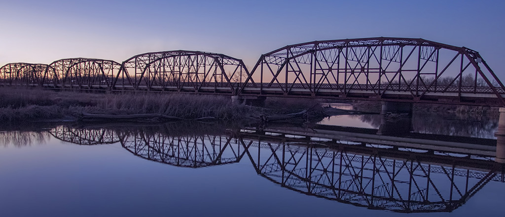
Thanks for your helpful comments. I was standing southeast of the bridge on a narrow trail with no exits at that point. There could be a better angle the other end of the bridge from a lighting point of view. |
May 6th |
| 2 |
May 21 |
Reply |
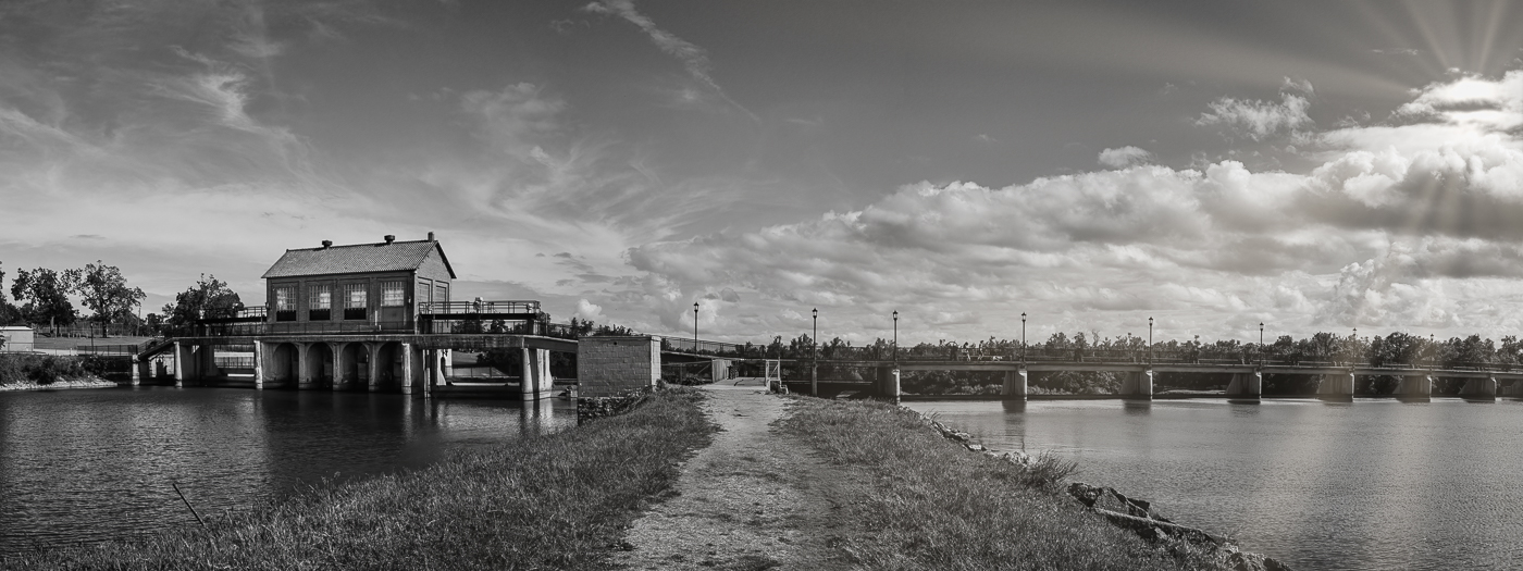
Very nice bridge, perhaps built in the same era. I'm thinking it would make a good panorama too. |
May 5th |
| 2 |
May 21 |
Reply |
Yes I agree and its better for black and white (see my response to Jacqueline). |
May 5th |
 |
| 2 |
May 21 |
Reply |
Great idea to color the cyclist. Also I took Shirley's advice and changed the sky - perhaps the added contrast helps. |
May 5th |
 |
| 2 |
May 21 |
Reply |
I'm not sure why you are seeing a brown color. With sky replace the software can have problems in deciding what is sky and can overlap onto the blue part of the planes. I tried this in Photoshop with your jpeg and a sky from my library and found this problem could be cloned out. The propeller blades seemed to fade but I cloned them back in. The company (Skylum) could possibly help you out if the browning problem persists. |
May 5th |
 |
| 2 |
May 21 |
Reply |
Interesting, we had fences as an item for a "scavenger hunt"...challenging indeed. |
May 5th |
| 2 |
May 21 |
Comment |
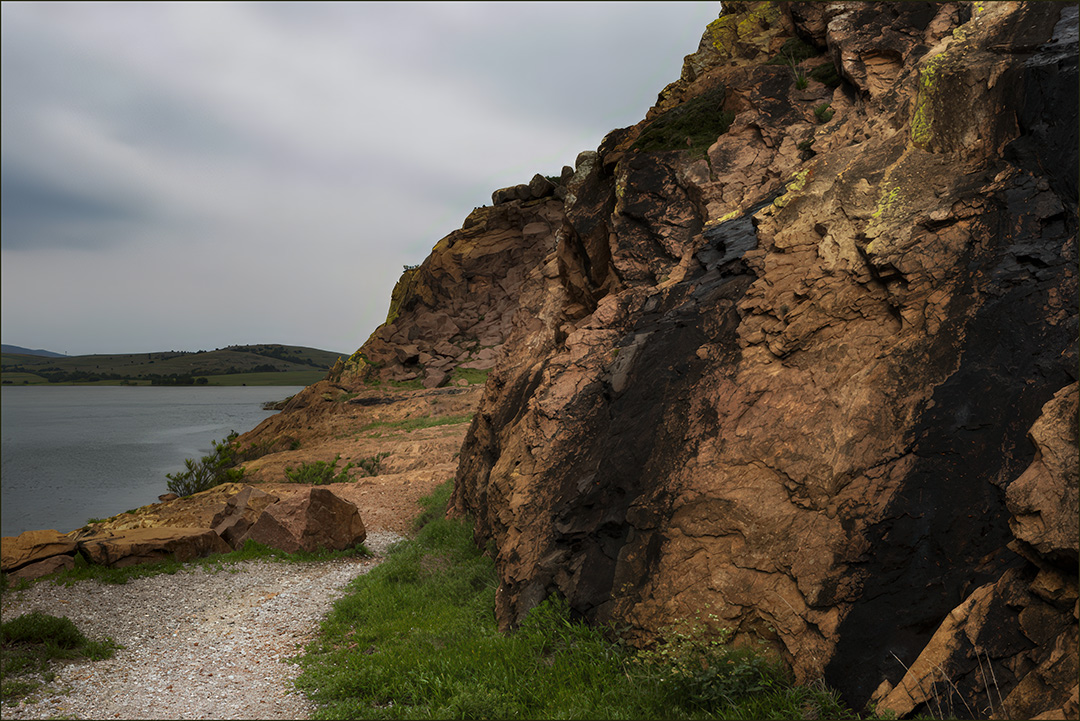
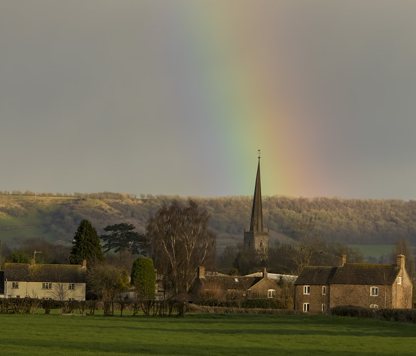
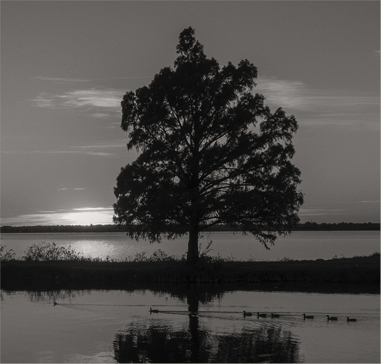
The image comes across as being minimalistic causing composition to appear prominent as well as being a striking sunset over a sparse outback landscape. I was tempted to see if there was more color in the jpeg taken into Photoshop CR and found some variety to the red with some magenta. The left post shifted more to the third line improves the diagonal lines I think, but I think you close to optimized. It could belong in a global warming collection. |
May 4th |
 |
| 2 |
May 21 |
Comment |
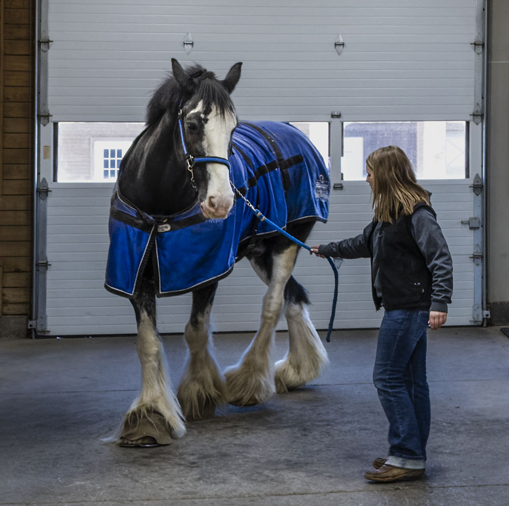
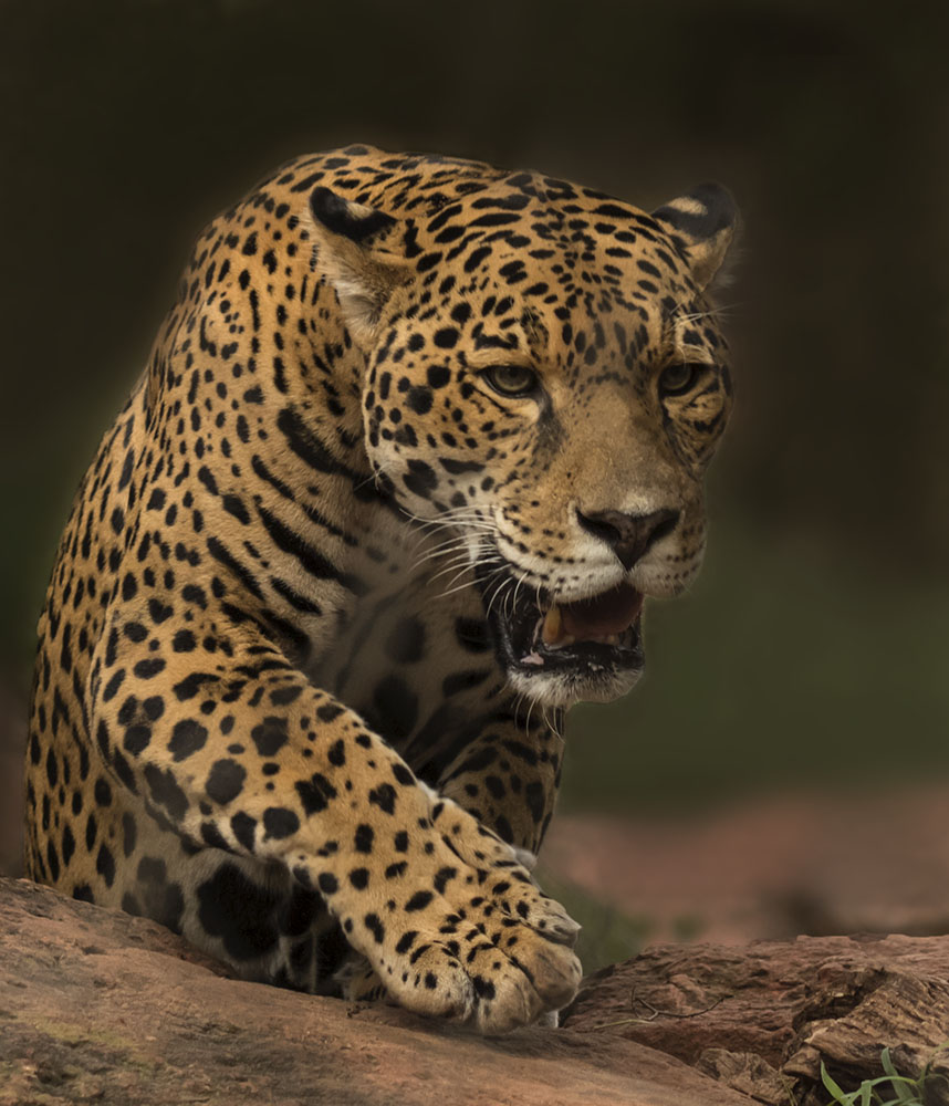
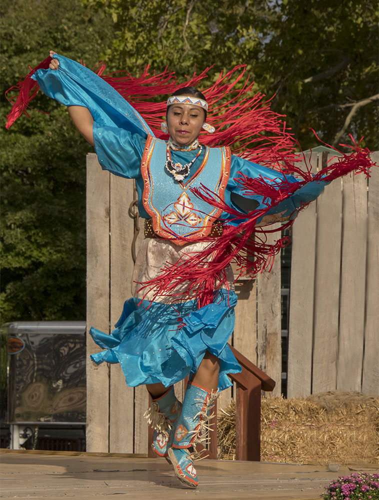
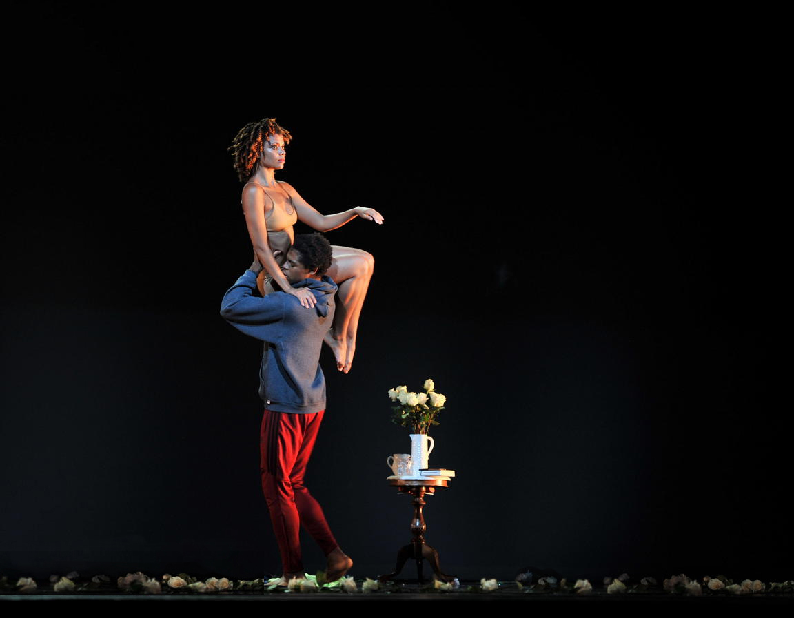
The impact is the subtle and graceful pose depicting human to horse interaction. Although the main interactions at the eye-level are close the a 1/3 cross-point, it could be improved either with the crop or by using content aware above and to the left of the image. Great adjustments, Martin - I hope the bright white thing is not a costly pearl!
|
May 4th |
| 2 |
May 21 |
Comment |
Congratulations on an impactful and original image. The main figures on the 1/3 line is effective. The objects on the floor on the left appear too bright. I think you could add some negative space at the top to centralize the woman a bit more. |
May 4th |
| 2 |
May 21 |
Comment |
Good angle of view and choice of shutter speed for the props. Nice use of Sky Replacement in Luminar 4. However there is a mismatch in the exposure of the planes. I suggest try increasing the exposure and decreasing shadows of the planes before bringing in the sky replacement. The sky exposure is about right, so decreasing the sky exposure as a first move would not be as effective.
Another thought is that because there is overlap in the lower two planes, removing the middle plane on the original with a sharp-edged brush or clone-stamp would be good. Also three is more appealing than four. |
May 4th |
| 2 |
May 21 |
Comment |
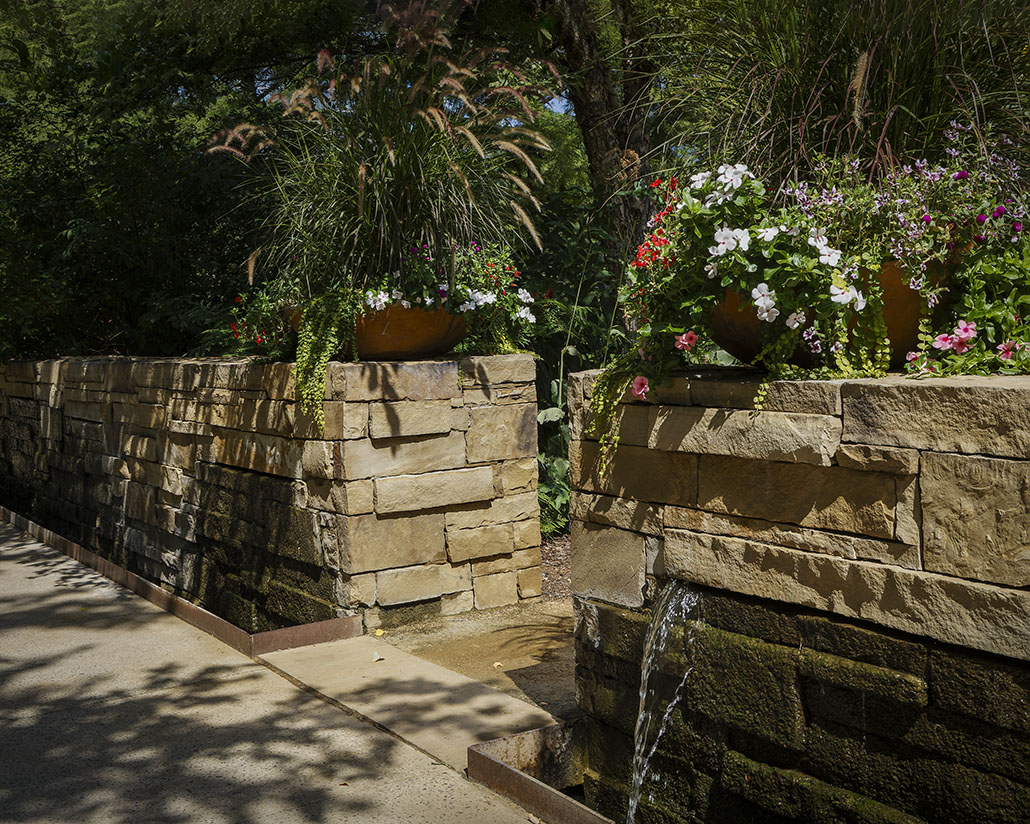
I think the image does have potential as pointed out. I like Stuart and Bev Caine's approaches because they preserve the fascinating 3D effect of the light in the garden. Martin's approach is different and adds mystery and tends to isolate the foreground. |
May 4th |
5 comments - 9 replies for Group 2
|
5 comments - 9 replies Total
|