|
| Group |
Round |
C/R |
Comment |
Date |
Image |
| 2 |
Jan 18 |
Comment |
I apologize for my excessive comments about the kids, they were only having fun probably and appear unaware of how tough it was for the rider! |
Jan 19th |
| 2 |
Jan 18 |
Comment |
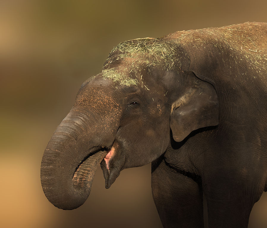
I used the quick selection tool to outline the elephant and pressed ALT on my PC to correct the dotted line when it went astray or over the elephant outline, then used the inverse command to select the background before selecting the gaussian blur, which can be adjusted with a slider. I have also tried de-saturating the elephant to make it more gray to contrast with the background. Thanks for your comments. |
Jan 19th |
| 2 |
Jan 18 |
Comment |
Great image. I think she is well framed by the rustic window and she has a subtle questioning pose. I think the diagonal line of the empty clothes line has a natural look and contributes. The negative space on her right is about 1/3 of the image but appears slightly excessive so I would take out some of it. I would also clone out the central dark spot on the wall. The texture and lighting of the wall is good and contrasts with the dark background within the window frame so I would not darken it, however it might select well with select tool and could be darkened very slightly without losing the texture. Harry's darkening looks good but the effect of the negative space becomes less negative I think. |
Jan 17th |
| 2 |
Jan 18 |
Comment |
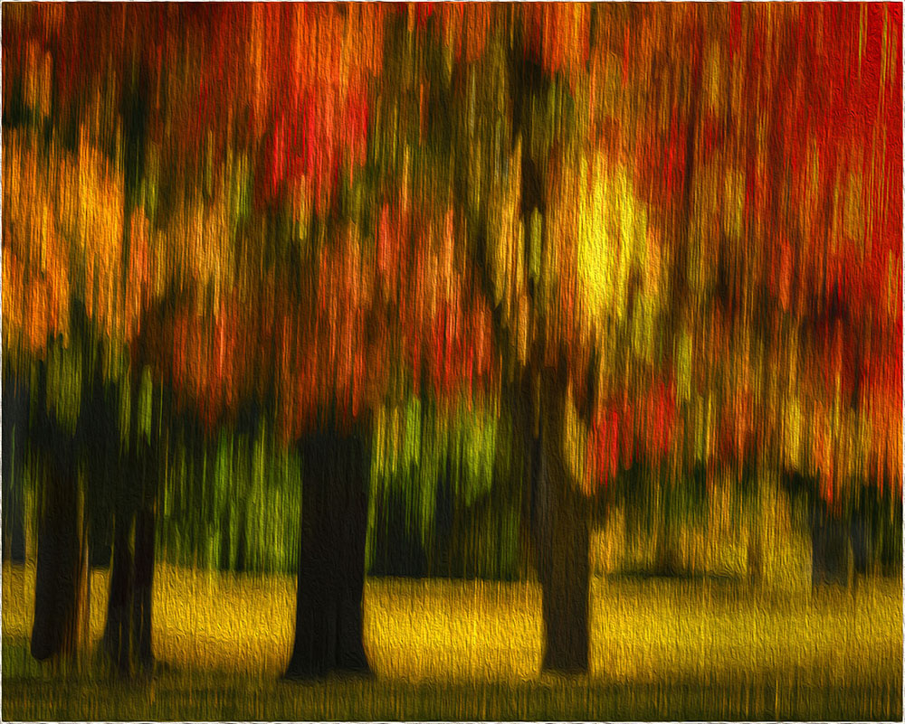
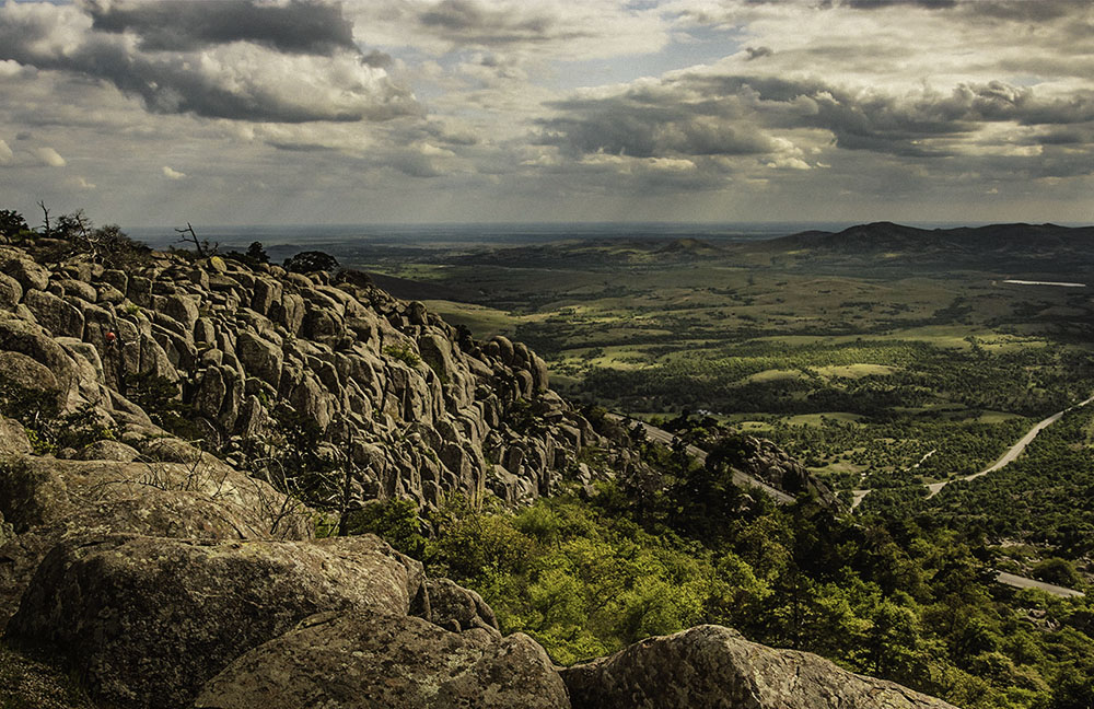
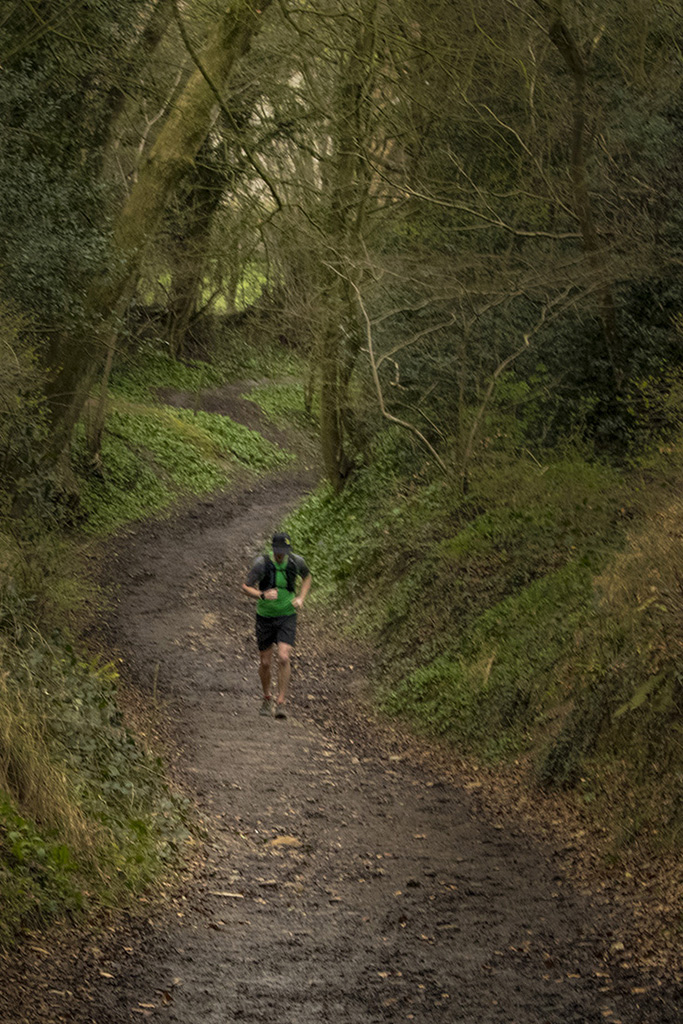
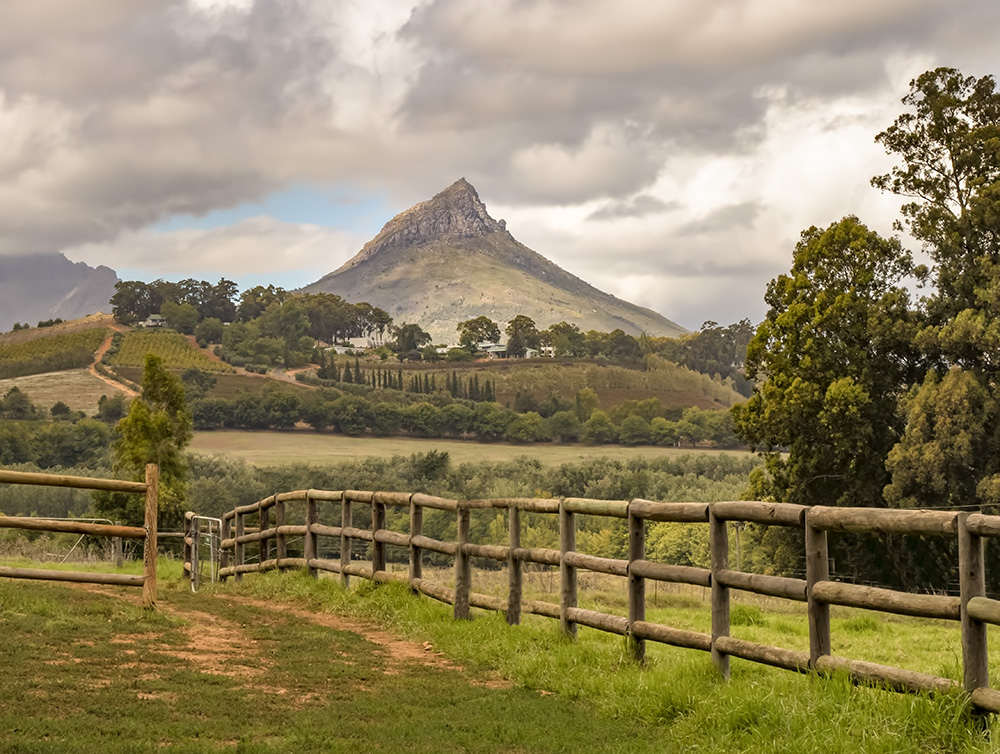
The image has a peaceful quality with the crooked path leading up to the bench with very tall trees. The lack of focus gives it a dreamy quality and almost a painted appearance. However, I think going to about f/11-16 on a tripod perhaps with a higher ISO (200-400 say) would be stronger and focus point about at the apex of the path's bend (1/3 in). The fall colors are strong enough so I would not increase saturation but decrease brightness and increase contrast. I like the tall trees with the blue sky coming through so would not crop out the top that much. |
Jan 17th |
| 2 |
Jan 18 |
Comment |
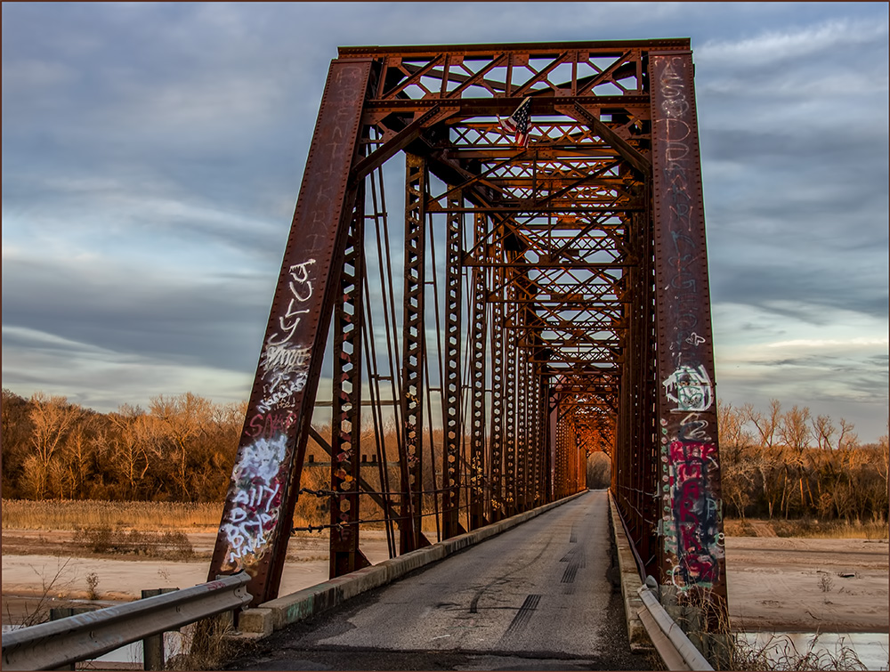
The balance is great with upper right and lower left contrast and a leading line of light leading from the lower right up to the leaf, so I would leave as is, as a masterpiece. I would call it something with the word ice in it, to make it more descriptive than metaphorical to take away the impression that it might be glass. ? "Winter's Icy Grip" |
Jan 17th |
| 2 |
Jan 18 |
Comment |
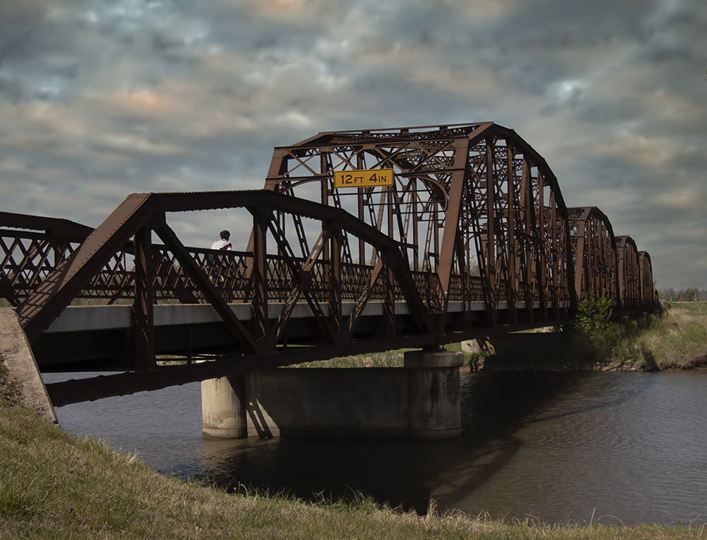
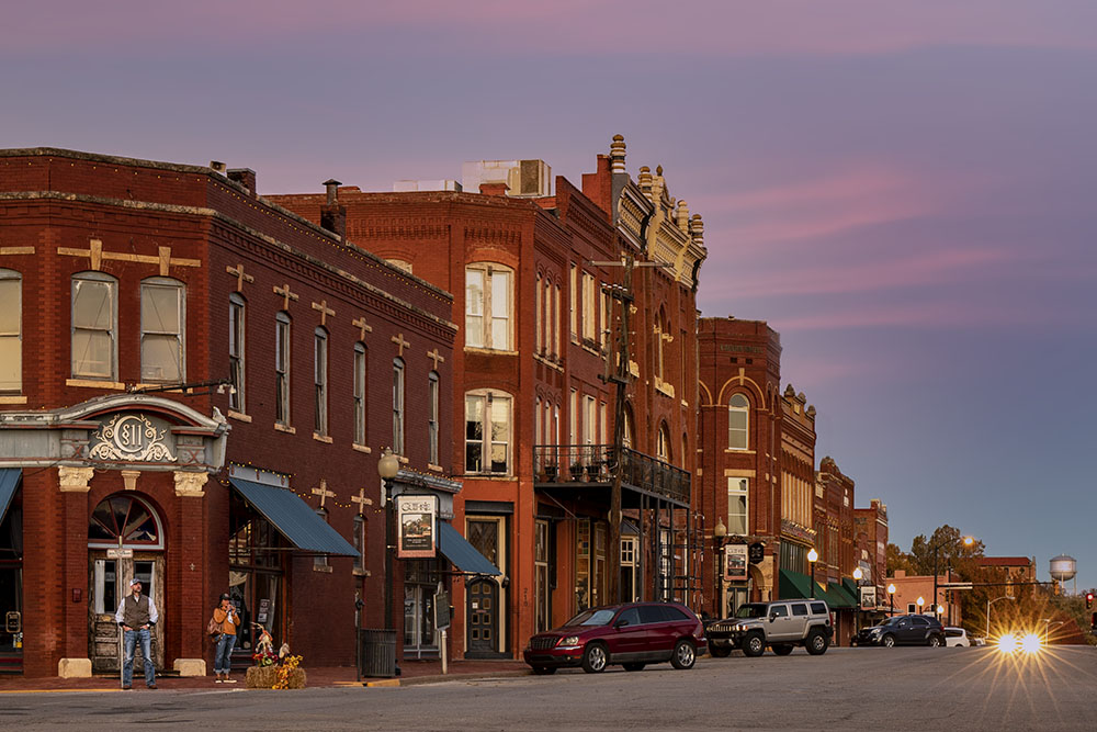
This is a very interesting picture. There is a strong story-line giving it a photo-journalistic quality. He is working hard to pull up hill, and the family in the background are so sorry. The sorrow would probably turn to anger if they could see the brats in the cart. The only way I can think to strengthen it would be to work with a smaller aperture than you have, but would require pre-planning and positioning. I think you had enough light. Tight cropping just keeping the rider and sympathetic mother and children behind him plus taking out some road up the the crack might be OK. |
Jan 17th |
| 2 |
Jan 18 |
Comment |
Really great image. I think the HDR really lifted it up to make a big impression. I went back and forth to the -2/3 several times to try to understand what happened. It seems a combination of blending the people on the left and right into the scene in a participatory sense, and also strengthening the water line out to the distance. I might decrease the brightness of the final image very slightly. |
Jan 17th |
| 2 |
Jan 18 |
Comment |
I agree that the image has emotion and feeling. However, I think the color version is exceptional. The knitted brown jersey gives a feeling of warmth and contrasts well with the other colors to give depth. The slight fading of the light brown hat contributes to framing the very expressive face and a glow of happiness. I also like the negative space on both sides but would crop the color image by a third on her right and by half on the left for giving direction of gaze. All the spots in the color image appear natural but the B&W appears spotty and bright areas slightly too bright turning into a different portrayal, but still good. |
Jan 17th |
8 comments - 0 replies for Group 2
|
8 comments - 0 replies Total
|