|
| Group |
Round |
C/R |
Comment |
Date |
Image |
| 27 |
Nov 19 |
Reply |
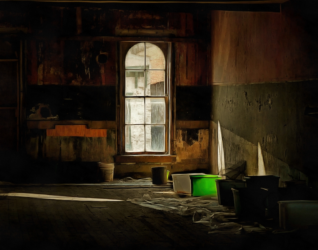
Yes, Brad is excellent in his feedback to me. He knows my style by now and knows what visual effect for which I am trying. I like the crop and additional edit suggestions. Way to go, Brad!
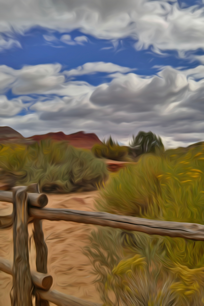
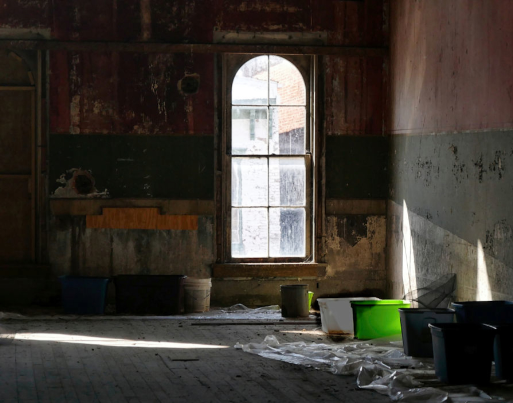
DAP or Dynamic Painter Program is a water color or painting effects program. I like it much better than a harsh HDR reality. Reality, for me, is harsh enough. I'm a rose color glasses type.
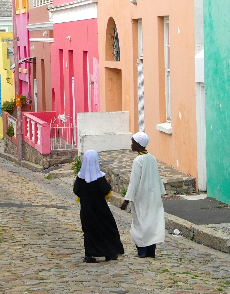
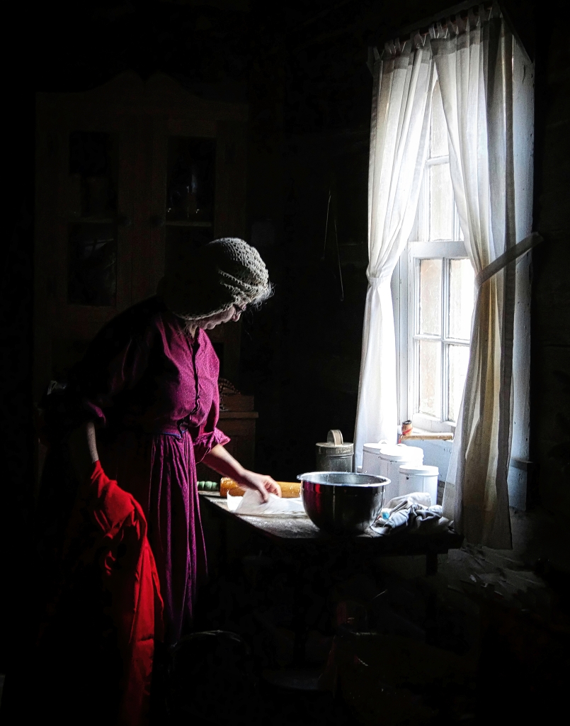
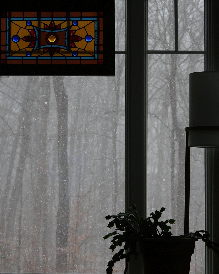
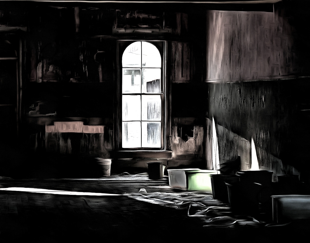
So, now we get to that orange strip. Like the Feng Shui plant in front of a window, it keeps my vision in the room and blocks it from going out the window. Besides, it's ORANGE and a harsher saturation than the rest of the colors. If I were to include it, I would dumb it down like I did with the white bucket.
Ok, let's agree to disagree on that glorious orange strip! |
Nov 23rd |
| 27 |
Nov 19 |
Reply |
Like DAP better than photoshop. Thanks for your expert feedback as always. |
Nov 21st |
 |
| 27 |
Nov 19 |
Reply |
Like it better in DAP if we are post processing |
Nov 21st |
 |
| 27 |
Nov 19 |
Reply |
|
Nov 21st |
 |
| 27 |
Nov 19 |
Reply |
Ok, here's a do over #1 in post processing. |
Nov 21st |
| 27 |
Nov 19 |
Reply |
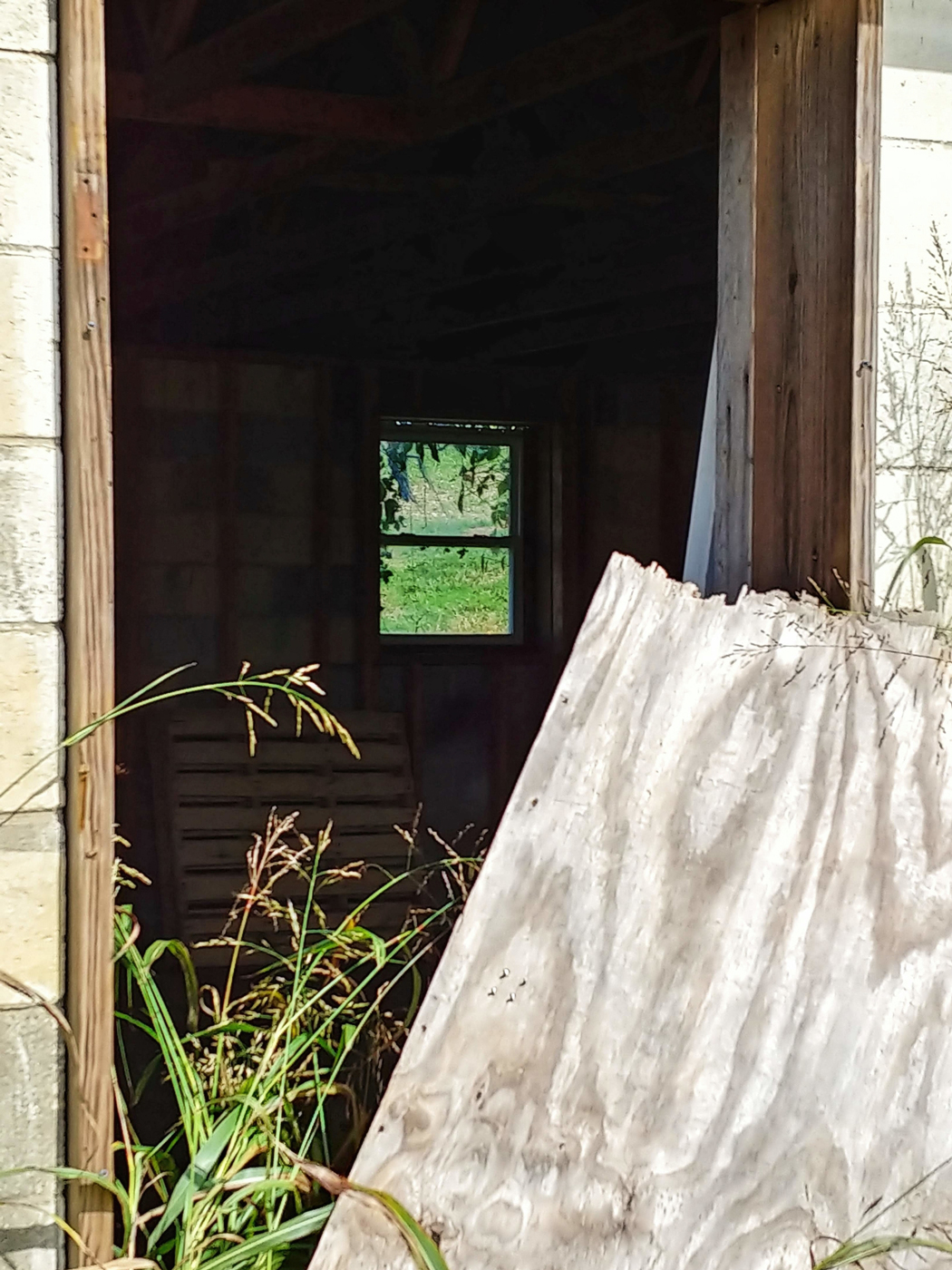
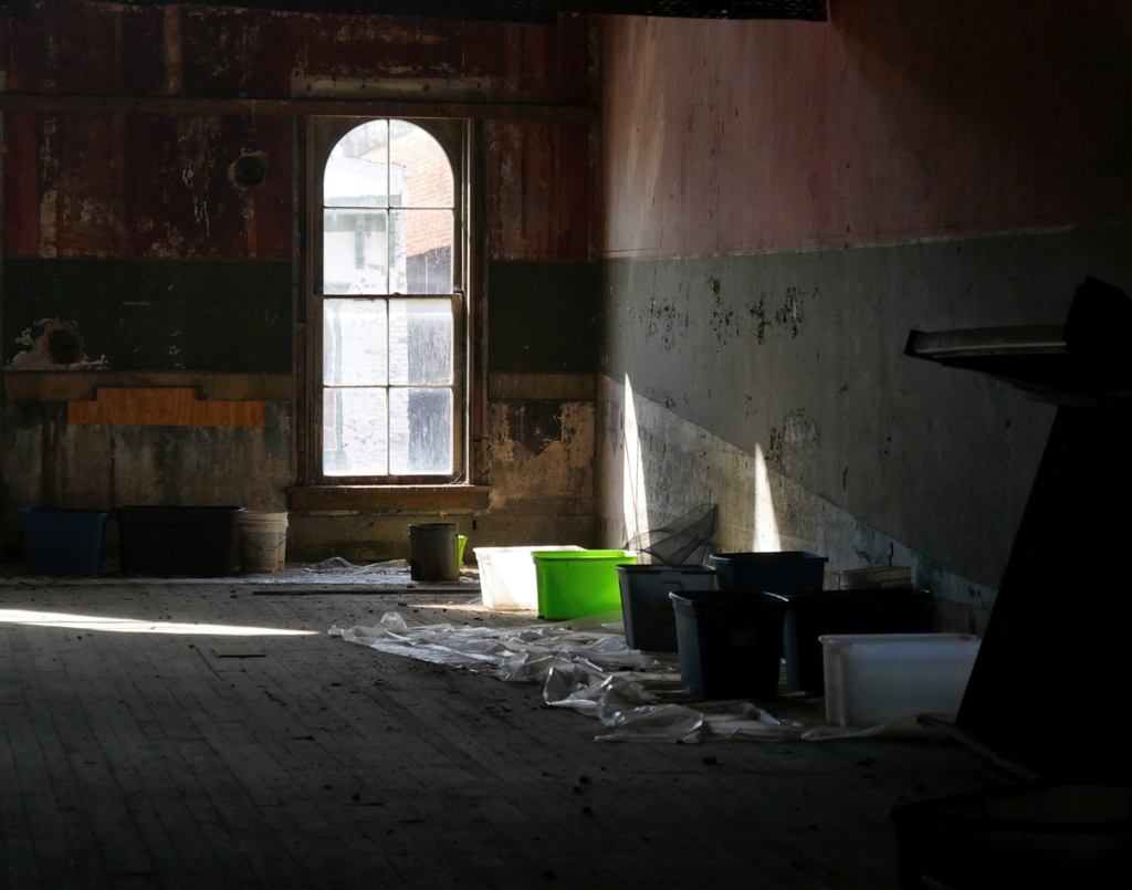
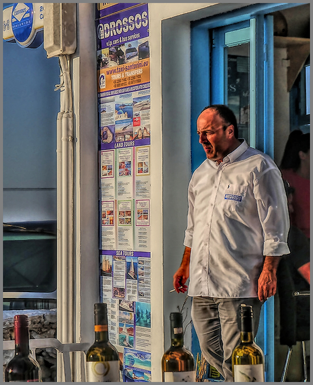
Oh, my, I can't believe the Queen of Cropping missed this. You are absolutely correct. I think I was so focused on getting the window into the upper right third that I forgot to look at the rest of the photo. I've cropped again but check it out. Also, I've darkened the white bucket.
Played with Luminar 3 painting with structure, clarity, micro stuff.
Thoughts or further suggestions? Thanks for your feedback.
|
Nov 20th |
 |
| 27 |
Nov 19 |
Reply |
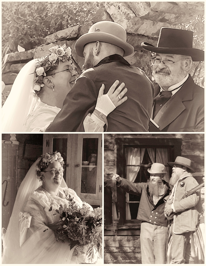
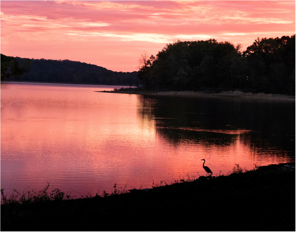
Thanks Jon. I wanted the abandon look. I like the feel of the color one also. Sometimes it's nice to let the viewer's imagination play. |
Nov 12th |
| 27 |
Nov 19 |
Reply |
Ditto on the information overload. Thanks for the suggestion but I submitted in my preference of color and light. |
Nov 12th |
| 27 |
Nov 19 |
Reply |
U tried and I rejected the HDR processing. I did not like the additional information but rather choose to leave the viewer "in the dark" for the imagination to be free. |
Nov 12th |
| 27 |
Nov 19 |
Comment |
Very fun save. I like it. Great save. |
Nov 11th |
| 27 |
Nov 19 |
Comment |
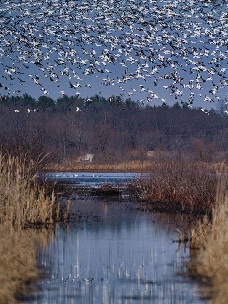
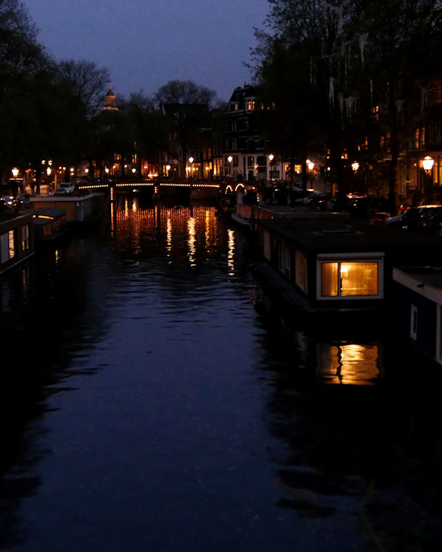
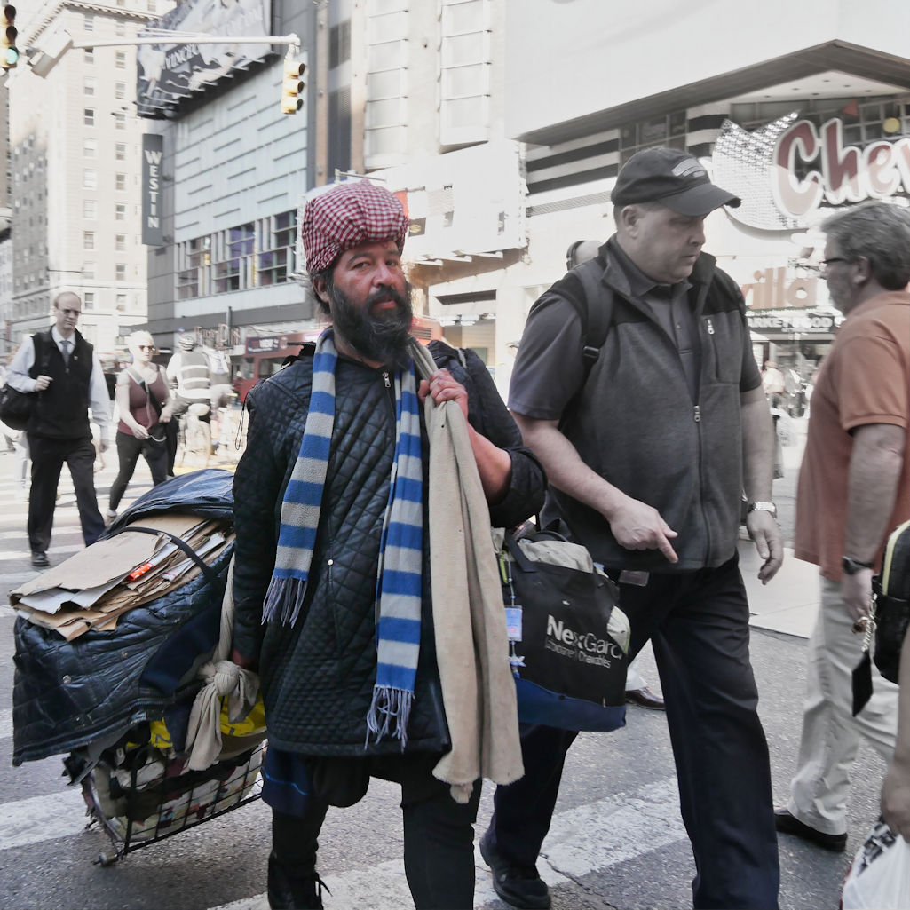
0h, well, I'm the cropping gal. I'd crop the right side and let the boats be the leading line. Definitely like the BW version. Ha! Wonder what it would look like all BW but with that pop of red on the one boat. Just playin'.
Agree that it might be over sharpened. Fun image
|
Nov 11th |
| 27 |
Nov 19 |
Comment |
I like the color also but see what you like about the black and white. Nice photo stacking.
Seems like a lot going on in this capture. I think a tighter crop would help focus one's eye. I agree with Stephen as he cropped to what I think is the most interesting area. |
Nov 11th |
| 27 |
Nov 19 |
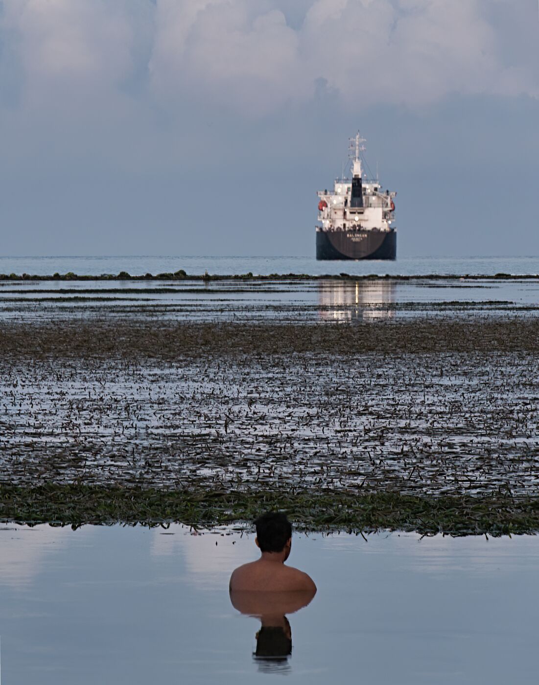
Comment |
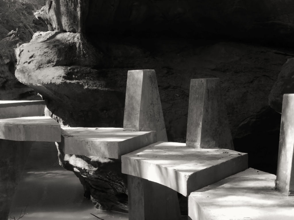
Oh, let me stand in the water!
Nice use of shutter speed. I might crop a little more off the right, like those two rocks. It might give a stronger leading line to me. |
Nov 11th |
| 27 |
Nov 19 |
Comment |
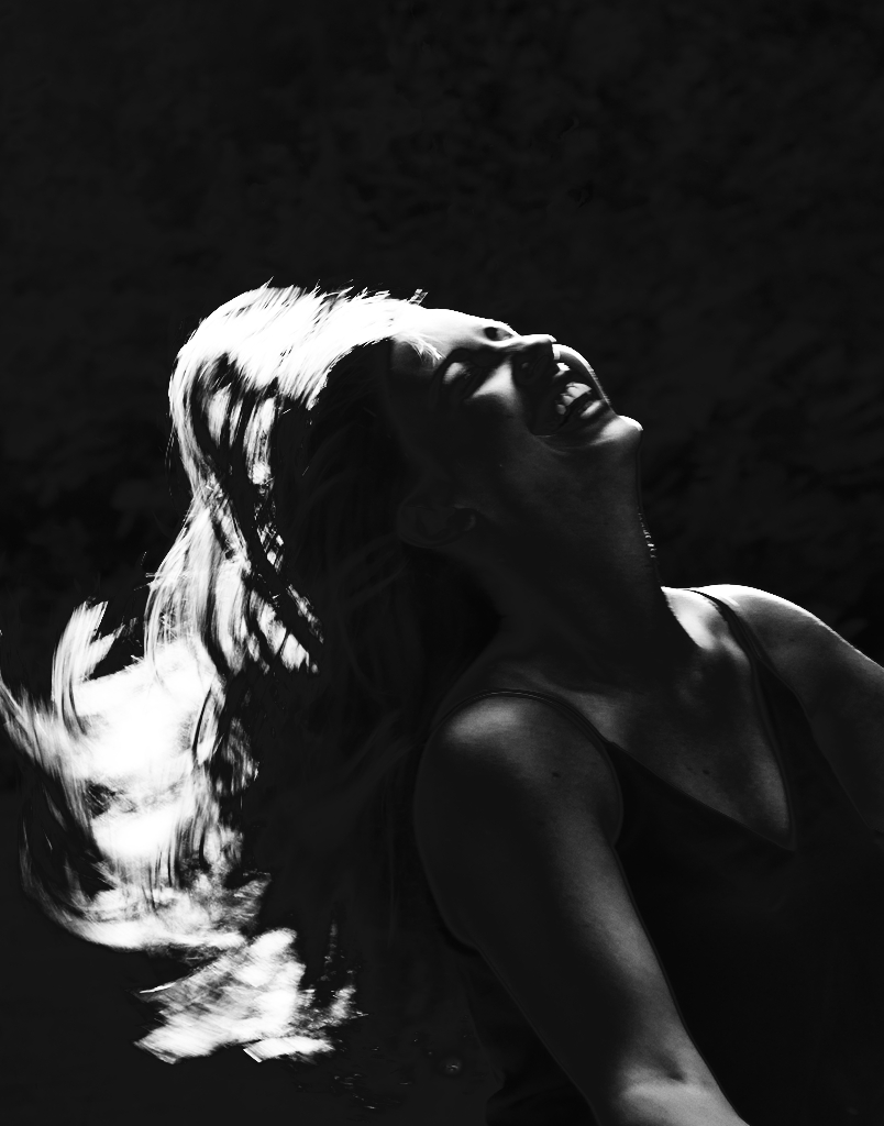
Oh, Renee! I love this.
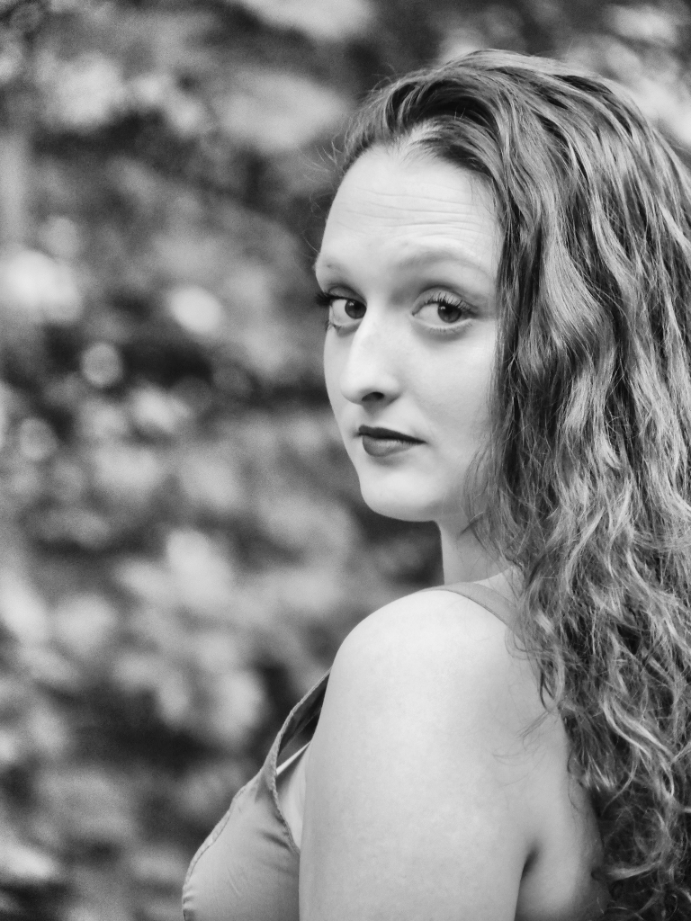
The only think I might have done is try a portrait crop thereby eliminating some of the dark shoulder shadow. It might also draw you to her face with the colorful eyes and top. There would still be some yellow on the left. What a fun shoot. |
Nov 11th |
5 comments - 9 replies for Group 27
|
5 comments - 9 replies Total
|