|
| Group |
Round |
C/R |
Comment |
Date |
Image |
| 16 |
Jun 25 |
Reply |
Thanks Joan. Try as I may, I could not reduce the red in the cheek. I think it has to do with the color of the reflector being used. Do you have any suggestions about how to reduce the red? |
Jun 25th |
| 16 |
Jun 25 |
Comment |
This definitely is an interesting image! A lot about color and movement. I am wodering is you considered making all 3 figures total black sillouettes. I think that would allow them to spur our imaginations even more. I also wondering if removing the cell phone would add to a more magical feel. |
Jun 24th |
| 16 |
Jun 25 |
Comment |
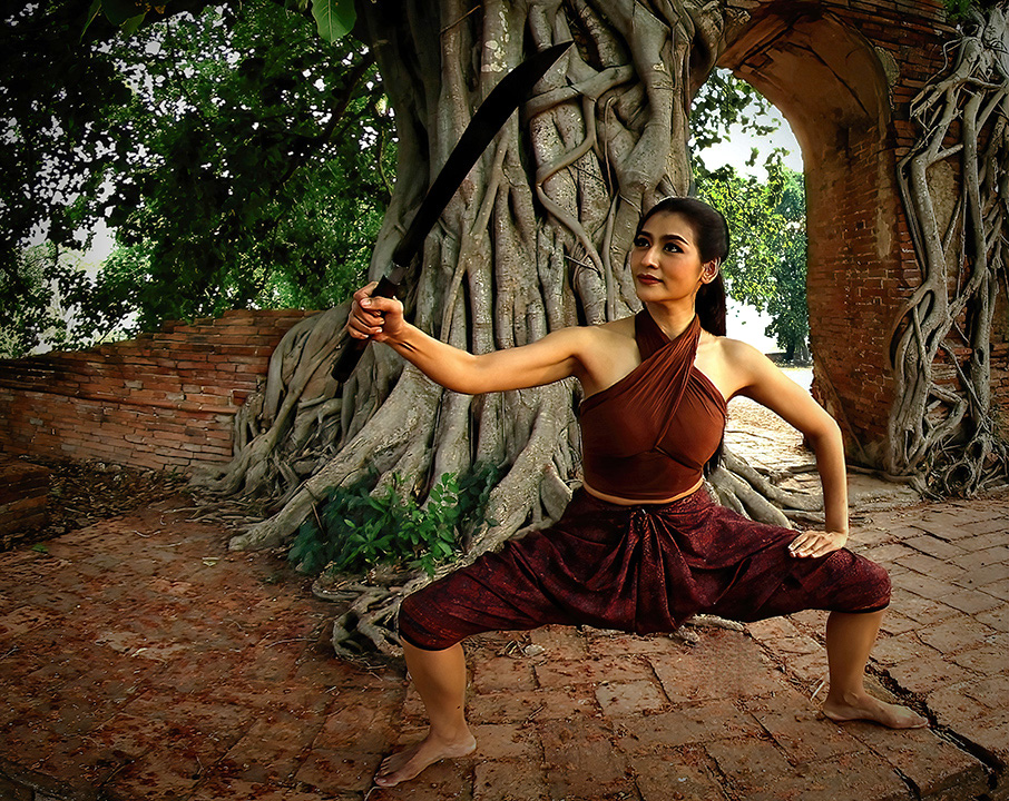
The sharpness of the image is very impressive. The beauty of the setting takes it to the next level. I am in agreement with Renee's suggestion about the brightness of the background over the models left shoulder. I would also suggest removing the light green leaf on the ground that is pointing toward us. I attempted to lighten the background to bring out more of the sword contrast. This is an outstanding image. Thank you for sharing it with us! |
Jun 9th |
 |
| 16 |
Jun 25 |
Reply |
Great suggestion. Thank you! |
Jun 9th |
| 16 |
Jun 25 |
Reply |
Renee, I have never calibrated my computer and I do feel that often my images when I have them printed, come out dark. Can you share how you go about calibrating your computer? I have a Mac. |
Jun 5th |
| 16 |
Jun 25 |
Comment |
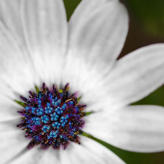
Renee, welcome to our group! I feel like this image has such great potential. The colors and sharpness of the center of this flower is truly the star of this photo. With that in mind, I wonder if you might consider downplaying the petals and accenting the beauty of the center even more. This is my attempt at what you might consider. Please let me know what you think. |
Jun 5th |
 |
| 16 |
Jun 25 |
Comment |
Charles, great image! I think your post processing is well done. I totally agree that the tighter crop takes this image to the next level. The triangle it creates moves our eyes around the image. My only suggestion would be to lighten and soften the vignette a bit. |
Jun 5th |
| 16 |
Jun 25 |
Reply |
Renee, thank you so much for taking the time to convert this image to black and white and to adjust the brightness. I to think your version is much more unifying. I felt his right cheek was a bit too red but the b&w also handled that issue. Again, thank you! |
Jun 5th |
4 comments - 4 replies for Group 16
|
4 comments - 4 replies Total
|