|
| Group |
Round |
C/R |
Comment |
Date |
Image |
| 16 |
Jan 24 |
Comment |
WOW! This is an incredible capture. The lighting is truly amazing. I am glad you continued to work on finding a solution to the best way to process this image. My suggestion would be to try to lighten the forest areas that are totally in darkness just a bit so that you get a hint of the texture and color of these trees. |
Jan 18th |
| 16 |
Jan 24 |
Comment |
Mohanan, this is a wonderful story telling piece! I think you did a great job of capturing the actors/ dancers in this story but i feel thatnthe audience that detracts from our entering into their story. I do think that with a few edits, you can eliminate your audience and make this piece all about the actors/dances. |
Jan 17th |
 |
| 16 |
Jan 24 |
Reply |
Thanks Joan! Now that I look at the original and the post process with the added space, I see the difference and totally agree with your suggestion. |
Jan 17th |
| 16 |
Jan 24 |
Comment |
Joan, great image! I definitely think that black & white was the way to go. Good post processing. May only suggestions would be to darken his lips. I also feel that lightening the trees on the right would make them less distracting. |
Jan 12th |
| 16 |
Jan 24 |
Comment |
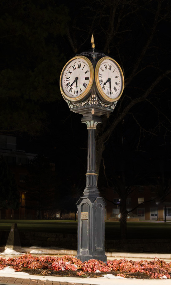
Renee, your skills for night- long exposure photography with your I-phone are definitely improving! Clock is pretty sharp, colors of the flowers under the clock are beautiful. Next, I think you may want to consider the composition. What is the story you are trying to tell? If it is about the clock, can you walk around the clock to find an angle to eliminates as many distractions as possible or find a way to minimize them as much as possible? |
Jan 12th |
 |
| 16 |
Jan 24 |
Comment |
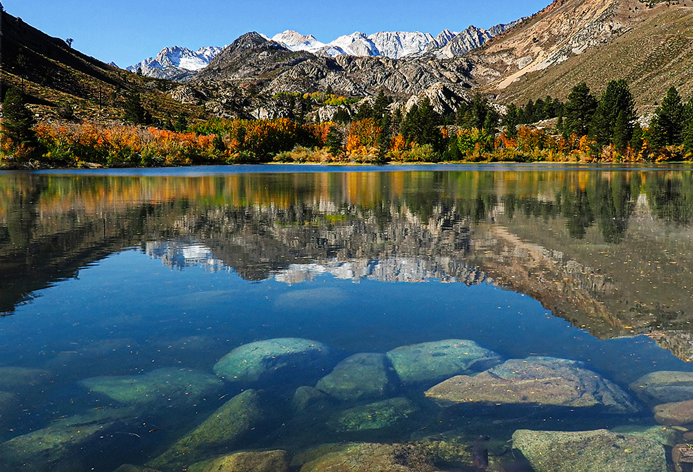
Darlene, for those of us that hunger for fall and all of the wonderful color it brings, this image is like a dream! I do think you are off to a great start with the composition you have created. Cropping the out most of the sky was definitely the way to go. To me, this image is all about color and texture and I would bring both out to the max. In my attempts to adjust, I tried to get the color of the sky more in line with the color of the water. I also, rather softening or desaturating the background, I pumped it up in both color and texture. Then again, those of us who live where it is green, green, green, no matter what this season long for that you have found. Great image! |
Jan 10th |
 |
| 16 |
Jan 24 |
Comment |
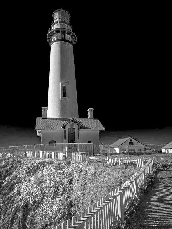
Walter, I like to line of the fence too! You did a great job straightening the lighthouse and cropping. Since the sky is to cloudless, I am wondering if you might consider making this a black and white image to add impact. I think I went a bit too far with the idea but it may inspire you to come up with other options. |
Jan 10th |
 |
6 comments - 1 reply for Group 16
|
6 comments - 1 reply Total
|