|
| Group |
Round |
C/R |
Comment |
Date |
Image |
| 16 |
Nov 22 |
Reply |
Mohanan, I do like the black and white version that you tried. Thanks! |
Nov 29th |
| 16 |
Nov 22 |
Reply |
That will lots of fun. She is a cutie! |
Nov 18th |
| 16 |
Nov 22 |
Comment |
Mohanan, what a wonderful tradition and a way to create community for the residents of your building. Using the fisheye lens allow us to gain even more of a sense of shape and the people in the background allow us to gain a sense of size. My only suggestion would be to tone town the lighting in the upper left of the image so that is does not distract us. I must say that I also love the coloring in the Original 2 image especially with the dark gray slate flooring. |
Nov 17th |
| 16 |
Nov 22 |
Comment |
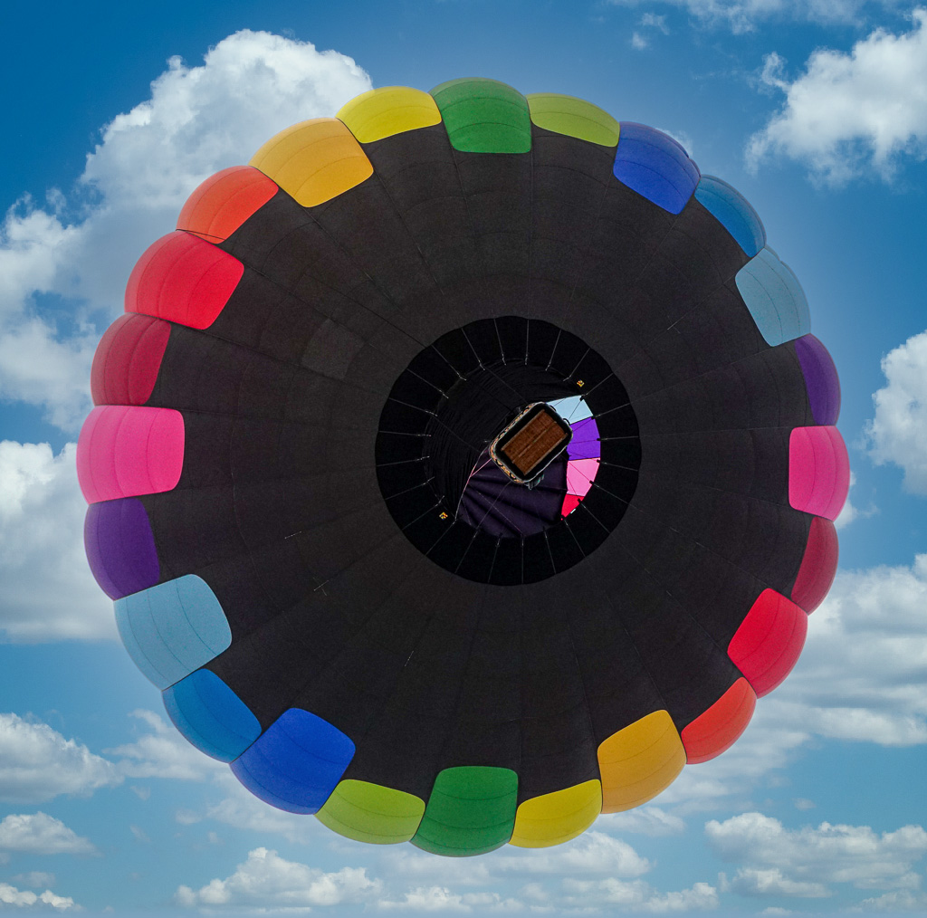
Joan, this is an amazing image. You were definitely standing in the right place at the right time. The image is sharp through and through. You captured the basket in the perfect position to give a sense of size of the balloon itself. I am truly not a fan of sky replacement but for this image, I feel it really helps tell the story, What do you think? |
Nov 17th |
 |
| 16 |
Nov 22 |
Comment |
Bogdan, this is an OUTSTANDING image. You have capture not only the action but the perfect lighting to take this image to the next level. I think it is award winning and that your editing to perfect! WOW..... |
Nov 16th |
| 16 |
Nov 22 |
Comment |
Zoey is a cutie! I like that you caught her in action and that you got low enough to allow us to meet her face-to-face. I think the bringing out her eyes a bit more and cropping to focus us on her expression would make this image more personable. I attempted some of the changes that I am suggested including sharpening the image as much as possible. What do you think? |
Nov 16th |
 |
| 16 |
Nov 22 |
Comment |
Darlene, what a wonderful story you created for us! Your capture of the crow & bear in conversation really makes this image work. I think your painterly effect adds to feel of the image. My only suggestions would be to tone down the colors in the fish. You definitely want him to stand out but he seems to be a bit too fuchsia to me. I agree with Joan about toning down the saturation a bit.. I might also feather the vignette a bit. |
Nov 16th |
5 comments - 2 replies for Group 16
|
5 comments - 2 replies Total
|