|
| Group |
Round |
C/R |
Comment |
Date |
Image |
| 16 |
May 21 |
Reply |
Dr. Nair, yes, I do agree that they highlights are a little blown out. Thank you for taking the time to show and explain the adjustments you made. It is definitely an improvement over the original. |
May 28th |
| 16 |
May 21 |
Comment |
Kathleen, WOW is the setting in the original different from the edited version. Great job! Your leveling of the rocks and cropping makes one believe that you just happened on the bird in the wilderness. |
May 16th |
| 16 |
May 21 |
Comment |
Walter, what an unusual flower! I can not tell from the photo how large they are. You did a great job getting this image sharp down to the small spines on each tendril. Your vignetting helps us focus our eyes. I am wondering if it could be simplified even further by removing some of the brownish stems and blurring everything beyond the flower itself a bit more. |
May 16th |
| 16 |
May 21 |
Comment |
Joan, LOVE, LOVE, LOVE this image! The line made by the staircase broken by the two boys really tell a story. The image almost has a painterly feel about it which adds to its uniqueness. I like your choice of greens because I feel that they balance the colors in the boys. I am amazed by the transformation from the original to you edited edition. |
May 13th |
| 16 |
May 21 |
Comment |
|
May 10th |
 |
| 16 |
May 21 |
Comment |
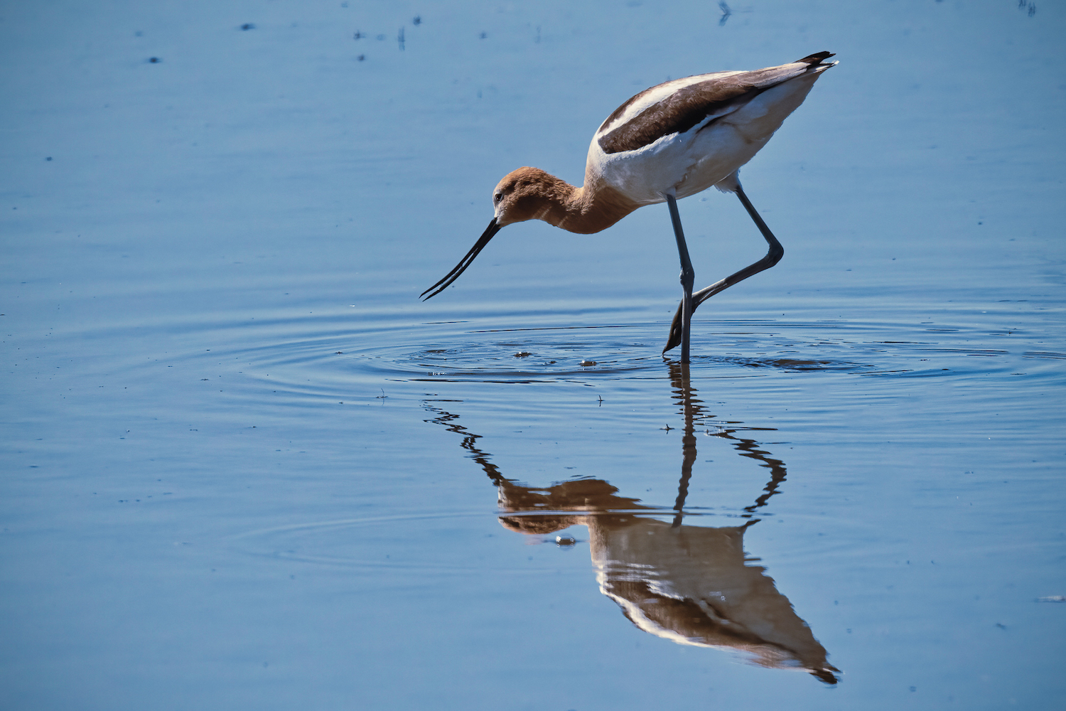
Bud, both the bird and the reflection are sharp making this an outstanding image. The fact that the bird has one leg ready to step and an open beak also take this image to the next level. I do however like the more saturated blue in the original image. It allows the Avocet to really pop. I also would like to suggest that you remove as many of the debris spots on the water as possible, especially in the ripples. To my eyes, this image does not need to be flipped....but I am sure others would disagree. This image is definitely a keeper. |
May 10th |
| 16 |
May 21 |
Comment |
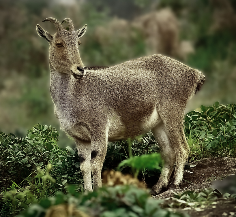
What an interesting animal. Your image is sharp and definitely captures a moment. You must be proud to have it processed for the Kerala University Botany Department competition. I am not sure of what guidelines you needed to follow for your submission but for PSA purposes, I am wondering if perhaps you might consider a second version in which you tone down the coloring somewhere between your original and post processed. I would also like to suggest a different crop and blurring so that the Nilgiri tahr is definitely front and center for the viewer. |
May 10th |
 |
6 comments - 1 reply for Group 16
|
6 comments - 1 reply Total
|