|
| Group |
Round |
C/R |
Comment |
Date |
Image |
| 16 |
Apr 20 |
Comment |
I think you have captured a very tender moment. I do like the color of the original better than the monochrome because I feel the natural colors of the rocks add to the image. I would, if at all possible, clone out the tree trunk that comes in at an angle from the right. I can't believe the sharpness that Dr. Nair achieved using Topaz. |
Apr 19th |
| 16 |
Apr 20 |
Comment |
Walter, I think you are spot on with your editing of this image. I think the two flowers you have chosen to include are made stronger by the fact that they are connected to one another. The water droplets add a lot of depth and the color of the flowers themselves well balanced by the varieties of green that surround them. Great shot! |
Apr 19th |
| 16 |
Apr 20 |
Reply |
Thanks Stephen. I LOVE the jump shot in Group 14. The rider steals my heart away. |
Apr 14th |
| 16 |
Apr 20 |
Comment |
Joan, what a great image! Color is perfect. The bokeh background adds to allowing the plant and caterpillars to pop. I think the two caterpillars you have included work but almost wish there was one more following behind. I agree with Dr. Nair that taking a bit off the top would better balance the composition. I am also enjoying my butterfly garden these days but so far the milkweed does not last long enough to allow the caterpillars to mature. |
Apr 14th |
| 16 |
Apr 20 |
Reply |
Both of these treatments are very interesting. I will be sure to try them on other images taken that day. Thanks! |
Apr 10th |
| 16 |
Apr 20 |
Reply |
Thank you for all the positive feedback! I think photographing this kind of action may be my new passion. I have several other images which may be good but I would like to keep them all in color and blur just the trees in the background. Does anyone have a suggestion on how you can blur just a portion of a background? |
Apr 9th |
| 16 |
Apr 20 |
Comment |
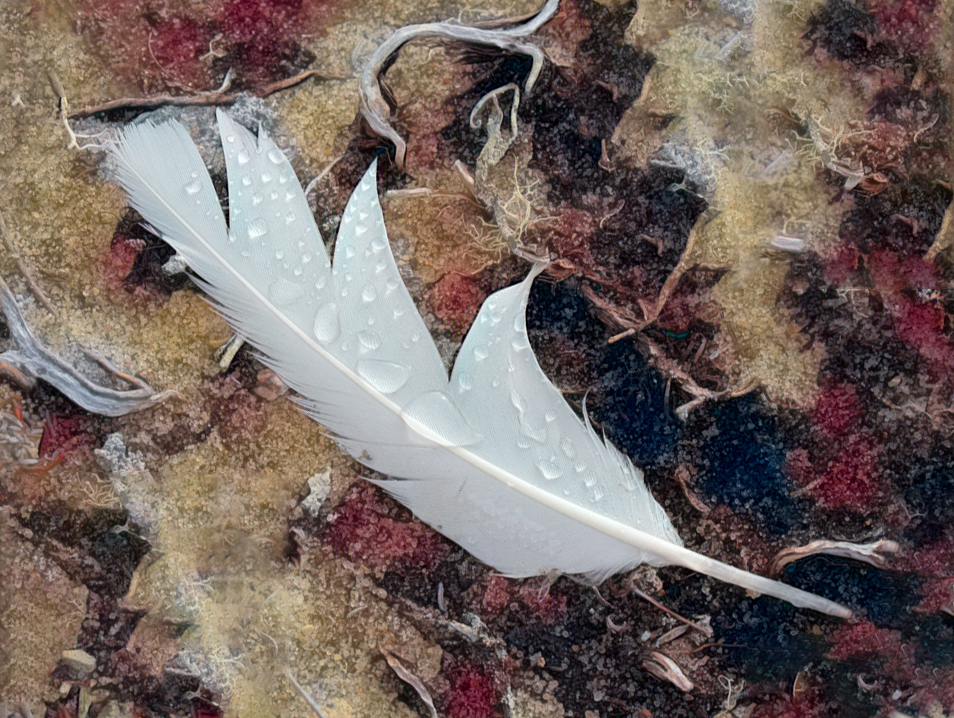
Wow! your editing really helped this image come to life!. The saturation and clarity brings this feather allows to feather to pop off the page. It is clear, it is well colored and the surrounding branches seem to echo the lines throughout. My only suggestion would be to comprise on the position and place it more on a diagonal than straight up. |
Apr 8th |
 |
| 16 |
Apr 20 |
Comment |
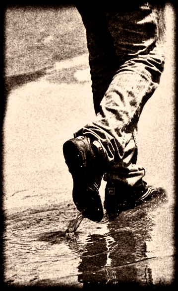
I can see why you were drawn to this image. It is so simple but seems to hold power. I think it very much reflects what we are all doing in these challenging times, just putting one foot in front of the other. I feel that in your editing, it may have become too oversaturated and I am bothered to the lack of space in the front. Maybe also reconsidering the crop. It is an image that is well worth working on. In playing with your image, I am wondering if a sepia version may work better. I realize that my version is very rough but it may give you some ideas. |
Apr 8th |
 |
5 comments - 3 replies for Group 16
|
5 comments - 3 replies Total
|