|
| Group |
Round |
C/R |
Comment |
Date |
Image |
| 14 |
Jul 18 |
Reply |
Thanks....I will be much more mindful in the future of conditions that impack glass reflections. |
Jul 15th |
| 14 |
Jul 18 |
Comment |
Larry, I can't believe the difference the flip made. You are right on to suggest it. You vignette also adds to the image. Thank's for taking the time to demonstrate your suggestions. |
Jul 14th |
| 14 |
Jul 18 |
Comment |
Larry, my vote is for the color version. I think it makes a stronger statement about your son's personality. I notice that you were able to get very little reflection in his eyeglasses. Is there a trick to doing that? I have tried to photograph people that wear eyeglasses and always find the end result includes distracting eyeglass reflections....sometimes including me. |
Jul 14th |
| 14 |
Jul 18 |
Comment |
Thank you all for the positive feedback. Now if I can only figure out how you increase the contrast using Photoshop, I will be all set. So much to learn..... |
Jul 11th |
| 14 |
Jul 18 |
Comment |
Larry, what a wonderful personality capture the image gives us! I think I might have left a bit more space on top and on the right.... but that is just me. It inspires me to try to capture the "spirit" of a person not the "perfect portrait". Thanks for sharing! |
Jul 8th |
| 14 |
Jul 18 |
Comment |
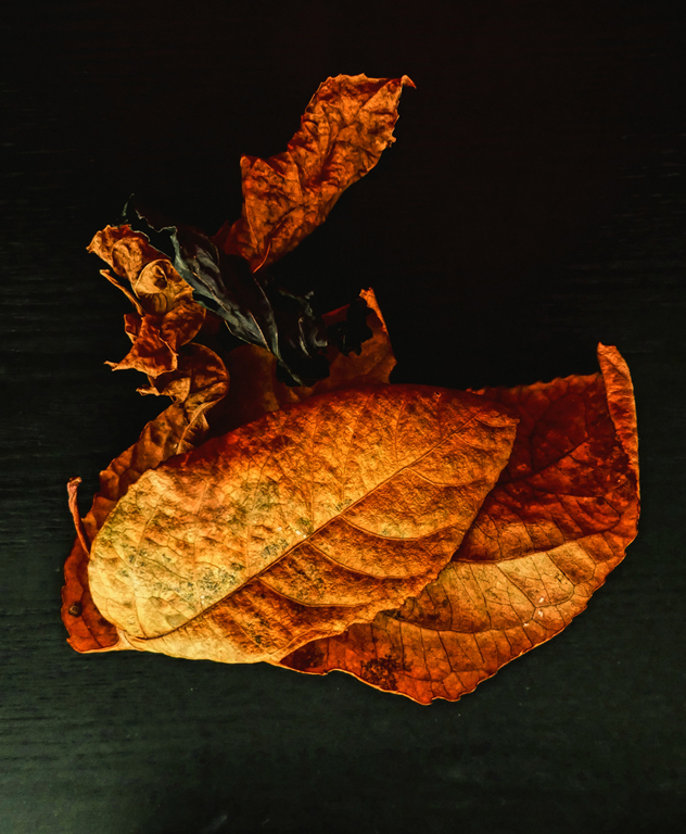
Yvonne, I love the color and texture of these leaves. They are stunning against the dark background. I was wondering what they would look like flipped, so I tried it. For me, flipping them allowed my eye to travel to an open space. Wondering what you and others think of this suggestion. |
Jul 8th |
 |
| 14 |
Jul 18 |
Comment |
Eleanor, what a great perspective this image allows us to see! I fact that bridge gives a hint of where we might want to explore next tells us a wonderful story. Your cropping and placement of the elements works for me. I may have added a bit more vibrance to the green foliage since it may add depth to what we see. Thanks for sharing! |
Jul 8th |
| 14 |
Jul 18 |
Comment |
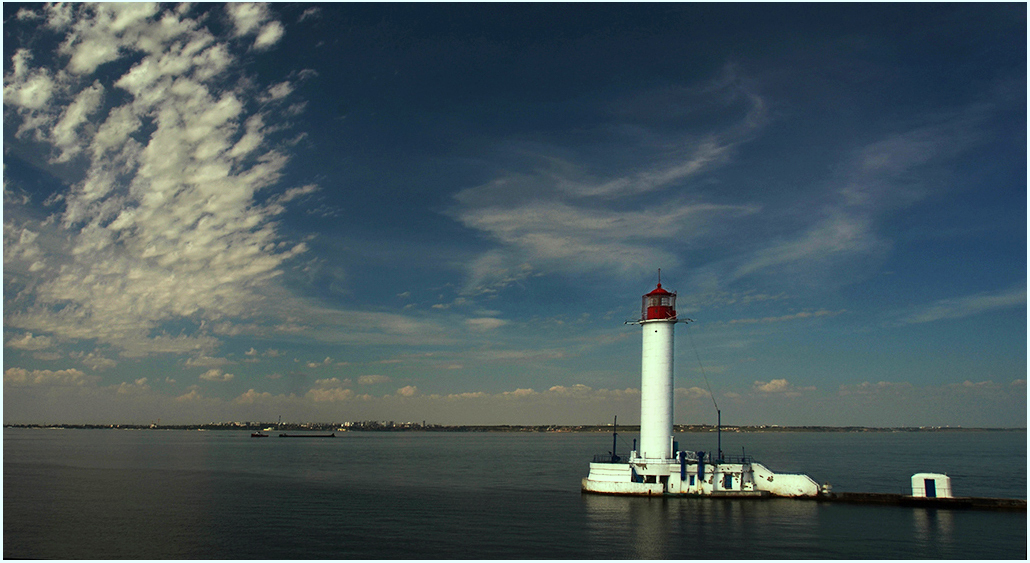
What a lovely scene! Beautiful sky creates wonderful leading lines to the light house. I felt it was a bit too dark for me so I took the liberty to brighten it up (maybe too bright for the lighthouse) and tried to add a bit more color/ contrast. I also added a vignette so which may help put more focus on the star of the image. |
Jul 8th |
 |
7 comments - 1 reply for Group 14
|
7 comments - 1 reply Total
|