|
| Group |
Round |
C/R |
Comment |
Date |
Image |
| 14 |
Nov 17 |
Comment |
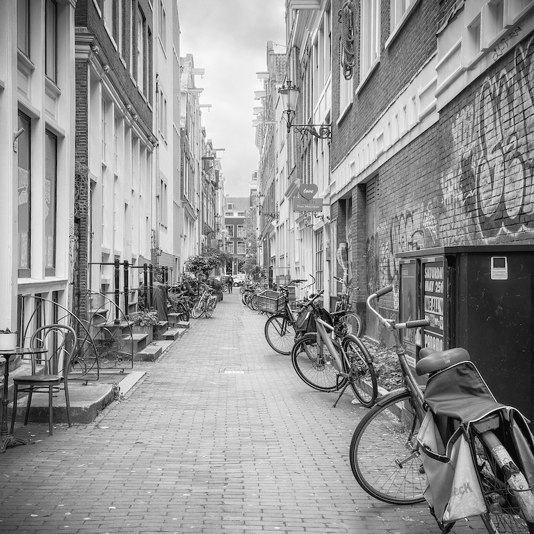
I agree with the suggestion for a bit more on top. It would allow our rider on the red bike to have a little more space and not bump his head on the top of the image. |
Nov 21st |
| 14 |
Nov 17 |
Comment |
Larry, I think you have done a great job toning down the blown out white areas but I agree with Arun that the top overhang provides balance.
I love that we all see these images from such different perspective. |
Nov 21st |
| 14 |
Nov 17 |
Reply |
Thanks for the suggestion Pat. I was so blown away by the colors I saw, I never considered changing it to a black and white. Making it black and white really makes a statement about the textures. Thanks |
Nov 17th |
| 14 |
Nov 17 |
Comment |
Larry, thanks it does "read" much better reversed. |
Nov 17th |
| 14 |
Nov 17 |
Comment |
WOW Larry, what a difference your few changes made. Took it from good to great. |
Nov 17th |
| 14 |
Nov 17 |
Comment |
Words can not express how much I LOVE this image! What a great capture. I love the color, the panoramic crop and the natural expressions of the children. The only suggestion I would make is to check the right edge of the image. It looks like you tried to take out another rider at the end of the line but need to clean it up a bit. I can see this image as the perfect format for adding a quote like: Every individual matters. Every individual has a role to play. -Jane Goodall
Thanks for sharing! |
Nov 17th |
| 14 |
Nov 17 |
Comment |
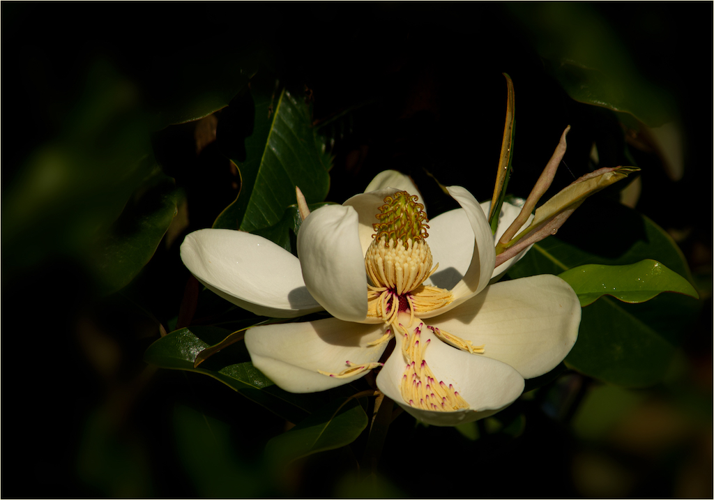
Charissa, I love the fact that you chose to make this image black and white! The bokeh in the background helps the meerkat stand out from the background. The texture of the tree stump is wonderful. What I might try to further enhance this image it to tone down the stump a bit and lighten up the meerkat a bit. Right now when I squint at the image the tree stump, in all its glory, takes center stage. By lightning up the meerkat himself (without loosing the wonderful texture you have captured) he will be equal to or more prominent than the stump. |
Nov 11th |
| 14 |
Nov 17 |
Comment |
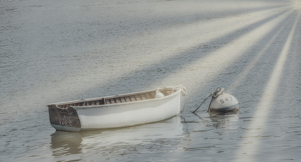
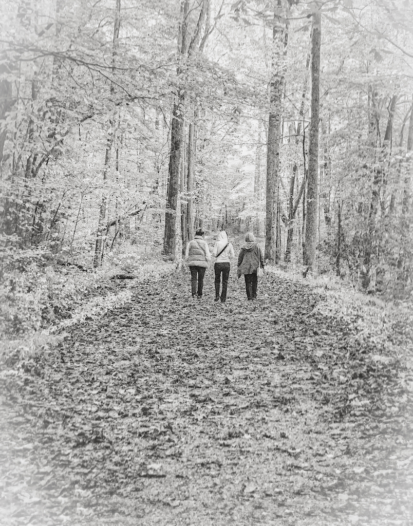
Larry, what a simple beautiful image this is! The lines and light tell the story. I especially like that you included a bit of the tree which adds texture and scale to the image. Thanks for sharing it with us. |
Nov 10th |
| 14 |
Nov 17 |
Comment |
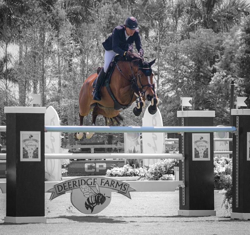
I too love the rim lighting you captured here. I also liked the fact that you got down low to take the image. I would suggest that you either crop out the yellowish pavement line in the front lower right hand corner or clone it out to remove its distraction. Finally, I would try to work to bring out the texture and interesting patterns of the fur on each cat.
Thanks for sharing this image with us. |
Nov 10th |
| 14 |
Nov 17 |
Comment |
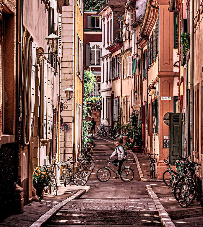
This image is like a rhapsody of golden light! Great capture. I would only make a few suggestions. I would vignette the entire image. Notice how it was naturally done in the lower potion of the image? It adds to the bring the eye to the center. I would also try to tone down the whites (which apprear a bit blown out). Finally, I would darken the woman walking toward us on the street so that she looks like a silhouette (which is more in line with how the other figures look).
Thanks for sharing this image with us. |
Nov 10th |
9 comments - 1 reply for Group 14
|
9 comments - 1 reply Total
|