|
| Group |
Round |
C/R |
Comment |
Date |
Image |
| 14 |
Sep 17 |
Comment |
Larry, I agree that increased contrast really adds to the image. Thanks for taking the time to show me the difference.
Arun, I use Aperture (an old Apple program) for enhancing my images. I used the "blur" option and brushed in into every part of the background. In this case, I upped the amount of blur and then used "retouch" to re-paint (clone) some areas I felt were still too distracting. Finally, I went over the entire background with the "smooth" option from this program. |
Sep 13th |
| 14 |
Sep 17 |
Comment |
Pat, this is a WONDERFUL sunset! The layers of color in the sky tell the story of serenity and beauty. If it were my image, I would make a few minor adjustments. I would remove the bird (it is not sharp or significant enough to add to the story). I would darken the trees until they were total silhouettes. In addition, I agree with Larry suggestion of toning down the yellow and white. Finally, I might flip to image so that the most significant players in the story are on the right. |
Sep 13th |
| 14 |
Sep 17 |
Comment |
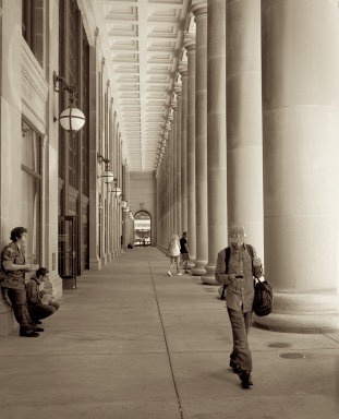
This image is wonderfully sharp from front to back. To me it not only captures a street scene but also it tells the story of leading lines, scale and perspective. With these ideas in mind, I would suggest that image lends itself using sepia rather than its original coloring. Sepia helps avoid the distraction of color pops that interfere with the flow yet allows you to keep the "typical day" feel that takes this image to the next level. Another suggestion is that your include just a bit more of the wall on the left so that the young man in the front of the images looks more like he is leaning on wall than leaning on the frame of the image. Great job!
|
Sep 13th |
 |
| 14 |
Sep 17 |
Comment |
Arun
WOW! Everything about this image works for me��color, texture, scale and mood. It really tells a story. Thanks for the inspiration. You nailed it!
|
Sep 13th |
| 14 |
Sep 17 |
Comment |
Larry, the texture and lines of this scene are just beautiful. I agree that the contrast in lighting and shade is what makes this an outstanding image. If it were mine, I would try to tone down the stark white on the left side of the two columns in the front perhaps seeing if I could capture a bit more of the marbling we see on the right side of the columns. This image is so sharp and clear I feel that I could reach out and touch the roughness of the stone. It is simple but powerful. Great job! |
Sep 13th |
5 comments - 0 replies for Group 14
|
5 comments - 0 replies Total
|