|
| Group |
Round |
C/R |
Comment |
Date |
Image |
| 99 |
Dec 23 |
Comment |
Linda, this is a really interesting image. I too noted a chandelier effect and the whole image has a kind of mythical feel to it. I like the way the viewer is drawn into the central 'grove'. Great lighting and finish to this and i think on the right paper this would make a wonderful print. |
Dec 26th |
| 99 |
Dec 23 |
Comment |
John, this is a strong image with great lines and colour grading. I agree that cutting out the slightly imprecise verticals on the left might help. As others have said you can play with the orientation and a complete horizontal might give this the impression of an arrow pattern more obviously. I enjoyed this one, thank you. |
Dec 26th |
| 99 |
Dec 23 |
Reply |
Linda, thanks for your comments. I hadn't seen the cross but now I do! Maybe I could make more of that. Glad you liked the image - it was an experiment I had not tried before. |
Dec 14th |
| 99 |
Dec 23 |
Comment |
Tom, I like the impact of this but agree with Gerard that a more dramatic version makes it more effective. I'd remove the black square on the left hand side near the top left. It is an interesting image to play with and I used Nik Silver Efex Antique Plate 2 and this is what happened. You can make this even more ethereal. |
Dec 4th |
 |
| 99 |
Dec 23 |
Comment |
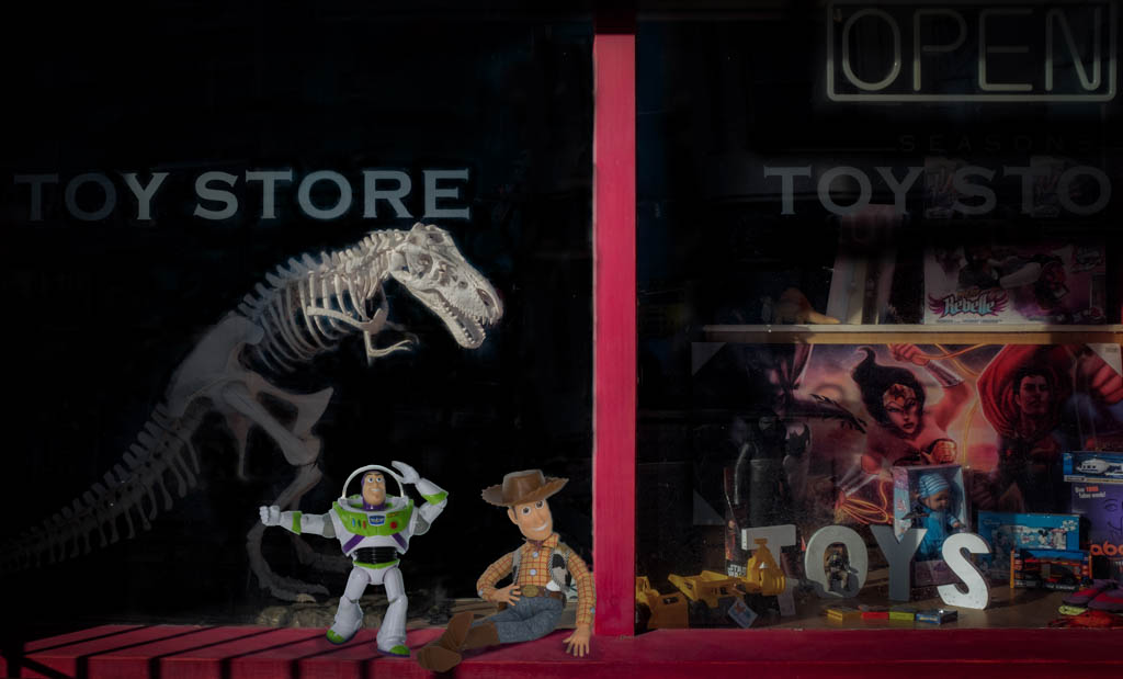
Kathleen, the mono version of this shot works very well as it removes a lot of the distractions. I too was taken by the 'flying saucer' shape and like its suggested other -worldliness contrasting against the more regular shapes of the other craft in the image. Whilst agreeing about the sliver of light on the right, the only other item that bothers me is the large letter B on the side of one of the ships on the left. Once you see that it stands out boldly and takes away from the rest of the image. Maybe darkening that somewhat would reduce its kind of 3D quality. I would also crop up a little of the foreground to remove most of the street markings. |
Dec 4th |
| 99 |
Dec 23 |
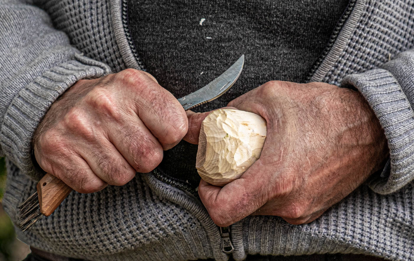
Comment |
Gerard,Thanks for two versions and it's good to experiment but your mono version is the one I prefer. You have captured the sculptors skill very well creating a very revealing macro shot. This is a foot that's done a lot of work! |
Dec 4th |
| 99 |
Dec 23 |
Comment |
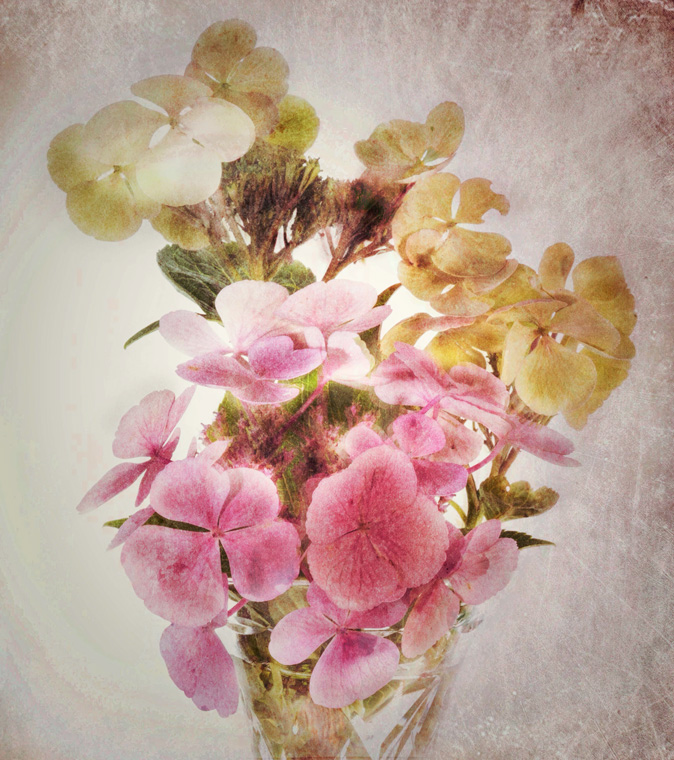
Barbara
This really has a woody feel to it - quite appropriate for this pine cone. Good use of the lightbox. The sepia mono treatment helps bring out the texture of the object and helps emphasise the strands bottom left. You might consider burning in some of the forefront edges of some of the cones 'petals' which are quite bright. I like vignette but don't know why it looks kind of blotchy in some areas particularly bottom left as these are not there in the original. The cone has almost become a walking animal related to pangolin family! |
Dec 4th |
6 comments - 1 reply for Group 99
|
6 comments - 1 reply Total
|