|
| Group |
Round |
C/R |
Comment |
Date |
Image |
| 99 |
Nov 23 |
Reply |
Kathleen, thanks for your reply and comments on mine. I am in a club critique group as well as this one and we all agree that sometimes you just have to say an image is difficult to critique - but as long as you keep it kind and honest then everyone gets on ok. Looking forward to your next image! |
Nov 4th |
| 99 |
Nov 23 |
Comment |
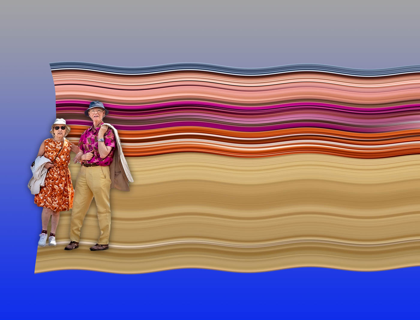
Kathleen, I think this image sets us a big test! Do we agree with you that his hat is interesting? Or is it , why is he so wrapped up in a blanket sitting outside the cafe on probably a coldish day? And does the fact that he's French add anything to the image? Unlike your previous image of the people walking across the bridge, I don't think this one has quite the same appeal. For me I'm drawn more to the back of his chair and the strange white cable going down the wall by his hat. So I'm not sure if I pass the test with this one! On the other hand this might just be an enigmatic masterpiece! But as you asked the question, yes I did enjoy looking at.
|
Nov 3rd |
| 99 |
Nov 23 |
Comment |
Hi John, don't know if this is your first image in this group but if so, welcome. You say this image got lukewarm responses when in colour and there may be a couple of reasons for that. The colour version is a little flat and need more contrast. Another reason might just be that the subject didn't appeal to whoever was looking at it. I think you can say that this a record shot of what was there and as such you've captured the lighthouse well. It is sharp and well composed with good verticals. But like the colour version I think it needs more contrast to create more of an impact - if that is fact what you want to do. I see you use Nik Silver Efex and Color Efex so it should be possible to experiment with a few of their options to bring more impact to this image and in particular, the sky. |
Nov 3rd |
| 99 |
Nov 23 |
Comment |
Linda, this is an atmospheric image and like you I like the feel of this image. Great phone pic and well worth your re-visiting the image. I'd maybe crop in from the left as the furthest tree distracts somewhat from the ones in the centre. Maybe the sky could be somewhat darker? |
Nov 3rd |
| 99 |
Nov 23 |
Comment |
Gerard, I like addition of the face at the far end and agree that without it it would be a point of 'vanished interest'. But I would like to see the face a tiny bit higher up so that there is more of the beard. I am also torn by how much of the top you need although if you do crop it you lose the effect of actually being there where you have to crane your head back to see it all. So maybe this image does in fact give the viewer an opportunity to time travel and really be there! |
Nov 3rd |
| 99 |
Nov 23 |
Comment |
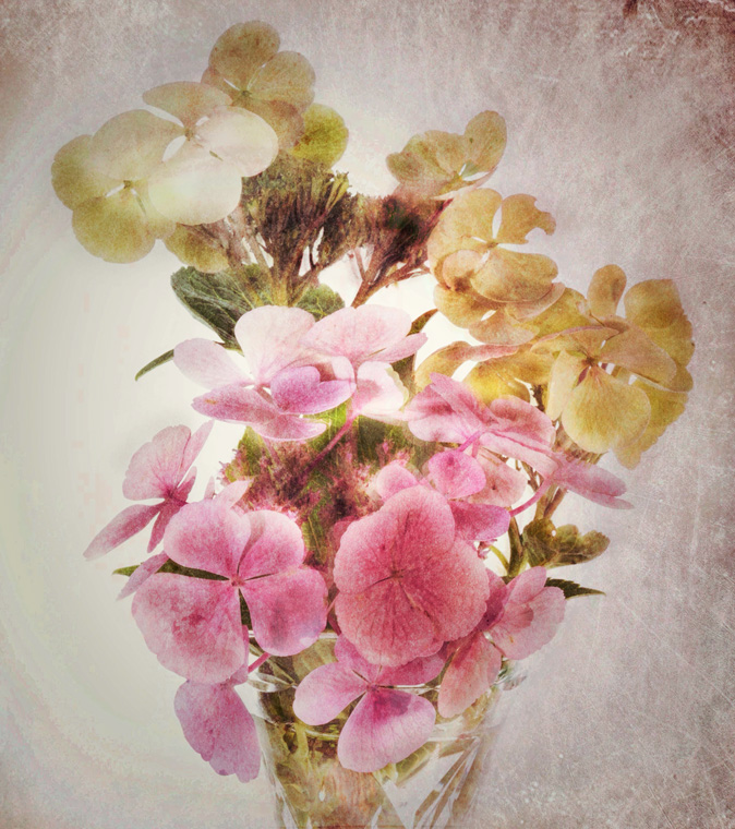
Barbara, this is an exquisite delicate arrangement which works well. I particularly like the way one of the stems crosses another - without that it would have been far less interesting! I think the only thing that you might have considered is how much dead space there is top left and right which is dictated by the height of the tallest blade of grass and even more stem would still have created the issue. Trimming that stem to lower it might have helped reduce that space. I like the sepia effect. |
Nov 3rd |
5 comments - 1 reply for Group 99
|
5 comments - 1 reply Total
|