|
| Group |
Round |
C/R |
Comment |
Date |
Image |
| 99 |
Aug 23 |
Comment |
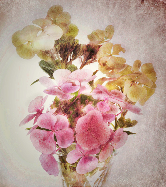
Denice, I'm always somewhat ambivalent about mono images of flowers so the end result has to be special to have made the mono conversion worthwhile. And with Your image you have done that. I particularly like the composition and the texture detail especially in the white bloom. I think Linda's treatment also give tge image added impact. |
Aug 9th |
| 99 |
Aug 23 |
Reply |
Thanks Linda, great suggestions as always |
Aug 9th |
| 99 |
Aug 23 |
Reply |
Barbara thanks for your kind comments. This was actually one image taken on an 18-55 mm lens. I cropped it a little to create a letterbox shape which accentuates the line of poles. |
Aug 7th |
| 99 |
Aug 23 |
Comment |
Tom this is a well taken shot which certainly depicts the point of the ride out. I like the low angle and the flowing flags. I'm also happy with the amount of space in front of the rider. As for the white line on the road - I'd keep it in as it sets the rider up clearly as to where he is. |
Aug 5th |
| 99 |
Aug 23 |
Comment |
Kathleen, I'm not sure about the Cartier-Bresson comment! But I prefer your blurred/soft focus version to Gerard's sharpened one. I suppose it's a question of what you might want this image to do in the future. If you want to enter it into a photo competition then you would probably find it rejected quite quickly especially as judgements are usually made very quickly. If you want to just hang it in a room or in an exhibition where it's possible to dwell on the image for a time, then it certainly invites ideas and creates discussion. There is a kind of gentleness to this soft image which is contrary to the force that is implied by the uniforms and battle gear. So, I would say the technique or accidental softness adds something to this image that a fully sharpened one would not.
|
Aug 5th |
| 99 |
Aug 23 |
Comment |
Linda, the mono conversion and flipping off the image work well as does the replacement sky which adds to the dramatic effect. I agree with Gerard that this has given it a kind of spooky feel. On that basis I would suggest darkening the area to the back left of the image where the light field pulls the eye somewhat. |
Aug 5th |
| 99 |
Aug 23 |
Comment |
Gerard, this is certainly different! I don't know if you have heard of a british artist called Tracey Emin, once thought of as the 'enfant terrible' of Young British artists who once exhibited an installation called 'My Bed' which consisted of her actual bed in a shambolic state surrounded by a number of items, some of them somewhat basic or sordid? Well, your image reminded me of that and was intriguing for a similar reason. So you ask is it art or just an unmade bed - well maybe it is both. I'm not totally sure what the object is but maybe that adds to the mystery. However, as you have titled it 'the cat left a present' that does offer up some clues. At least it wasn't a dead body! On a composition level, I think you could lose a little from the base so that the object comes lower in the frame. The sheets have great shapes and shadows. |
Aug 5th |
| 99 |
Aug 23 |
Comment |
Barbara, this is a very interesting image and a great experiment. Simple yet effective. You have made the egg look similar to another planet! The lighting is good as the lighter parts of the egg shell are not burnt out and the shadow beneath it gives depth. Gerard's comment about the depth of field would bring greater depth of field but I am not sure this really needs that as the softness at the left side of the egg shell does add perhaps a sense of mystery, of something unseeable or undiscovered. Or maybe that's me just overdoing this with some pseudo phot literary thinking! |
Aug 5th |
6 comments - 2 replies for Group 99
|
6 comments - 2 replies Total
|