|
| Group |
Round |
C/R |
Comment |
Date |
Image |
| 99 |
Feb 23 |
Reply |
Lance
Thanks for visiting the group and your comments which were helpful and very much appreciated. I wouldn't want to cause any viewer apprehension! But maybe sometimes that would be the kind of response I would be hoping to evoke - but not necessarily with this image.
Peter |
Feb 22nd |
| 99 |
Feb 23 |
Comment |
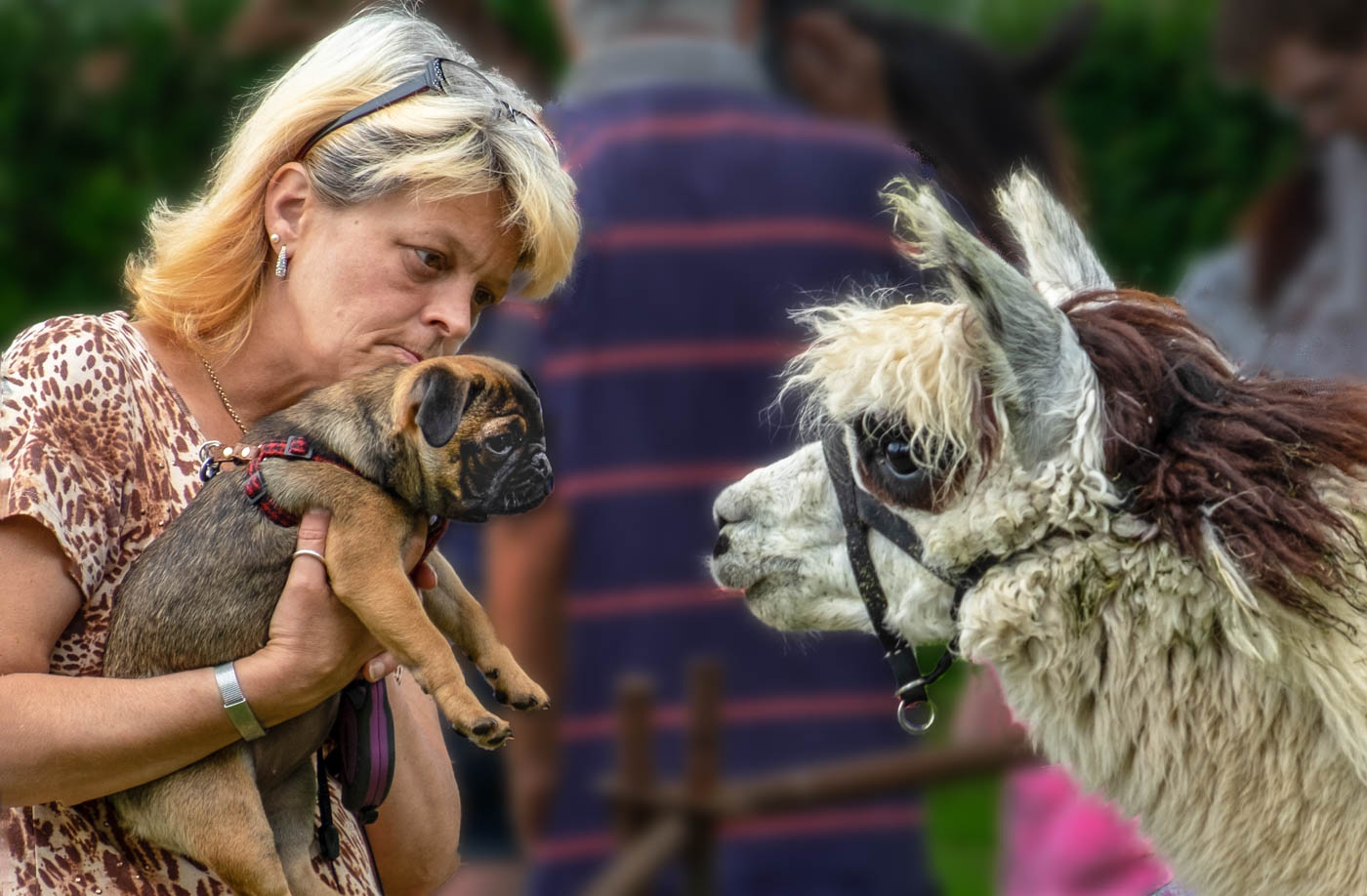
Kathleen, this is great. Street photography is very difficult because of unwanted obstructions getting in the way. But this succeeds because everything you want to show is unencumbered by anything else. The delight on this child's face at the balloon above her is wonderful and the boy capturing the scene reflects exactly what you as the photographer on the side is doing. I think the girl is slightly too light on her face and arms so you might try to tone those areas back somewhat and remove the bright patch bottom left. |
Feb 6th |
| 99 |
Feb 23 |
Comment |
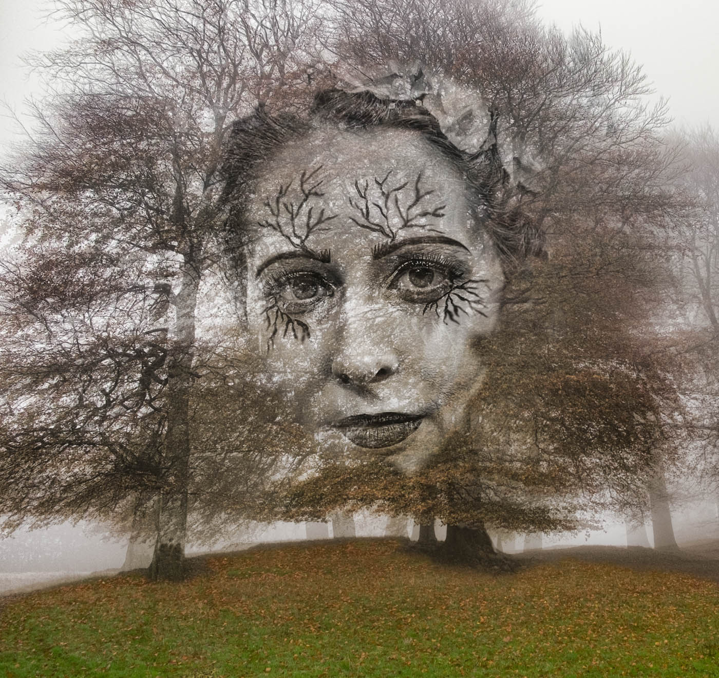
Michael. bring Maths into this is not helpful for me! It would be interesting to see if your judge was as dim as me at equations. This is a very skilfully presented triptych and with Valentine's Day on the horizon you could perhaps turn this technique into something that would work for that occasion but would probably have to use colour for that. As it is I'm struggling to find the way or reason the first two develop into the third or isn't there one and it's left entirely to the viewer's imagination/ I like the idea very much but need a clearer steer towards image 3.
|
Feb 6th |
| 99 |
Feb 23 |
Comment |
Linda, this is a very brave image to submit for critique! It's one of those where a judge might ask 'just where is its focus point?' I like the sheer confusion of the image and the force of the birds rising that it demonstrates. I also like the solitary bird top centre and agree with Gerard that you might remove the bird wing top left. However, it does appear on my screen as over light and could do with more contrast. It is also one of those images where you might consider a half colour half mono effect - with the solitary bird in colour and the flock in mono or vice versa. Might be worth a try. |
Feb 6th |
| 99 |
Feb 23 |
Comment |
Gerard, this is a great self portrait and I like the tight crop. The lighting is great without any blown out sections although maybe you could slightly tone down the forehead and your left cheek. Great definition and expression - makes you look as if you are ready for ten rounds with someone who might come off worst! That's enough critique before I dig a bigger hole for myself. |
Feb 6th |
| 99 |
Feb 23 |
Comment |
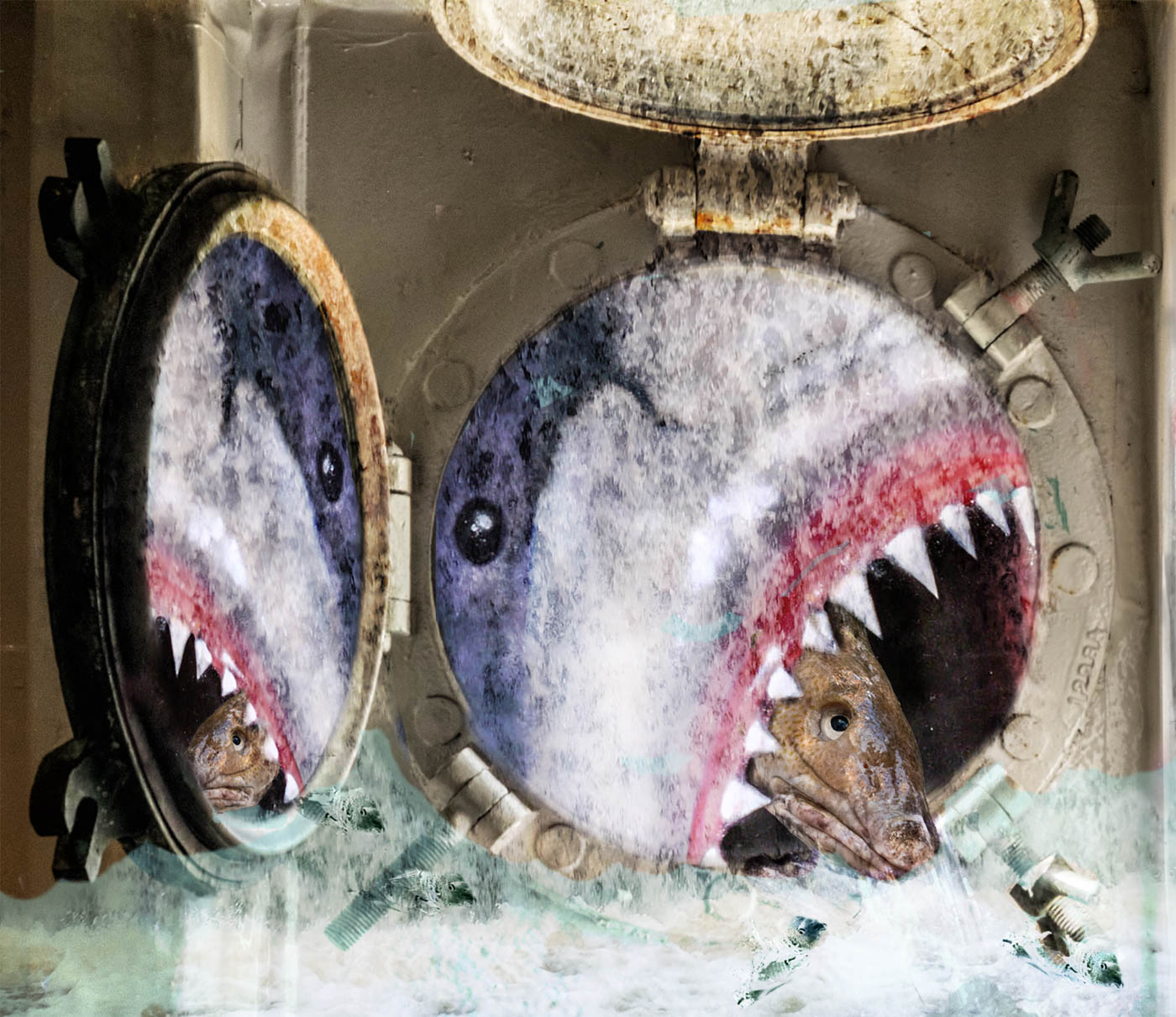
Barbara, this is an intriguing image. I too have sometimes photographed dead trees because they had very unusual formations and texture and yours is a really good one to have spotted. First of all I like the mono conversion as it helps highlight the texture of the tree. I also like darkening or partial vignette on the left hand side as that directs the viewer to the main part of the image. I don't mind the background as this adds context. And what do I see? For me this is a diver about to launch into the sea or the head of some prehistoric creature akin to an elephant with a long trunk. Technically I wouldn't do much to it but perhaps tone down the highlight in the centre where someone has scratched initials to emphasis them more. |
Feb 6th |
5 comments - 1 reply for Group 99
|
5 comments - 1 reply Total
|