|
| Group |
Round |
C/R |
Comment |
Date |
Image |
| 17 |
Dec 22 |
Comment |
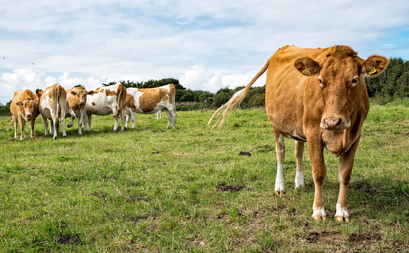
Glenn, another bear! I think this one has plenty of impact and stands out well from the background. I think you might consider just some slight dodging around the bear's eye and maybe a little on the lower, darker areas of the legs. I find its very difficult to know how much sharpening to apply to an animal like this which has quite a hairy coat - as it is it looks slightly our of focus but applying sharpening to it might ruin it. But you might try it to see what happens.
|
Dec 9th |
| 17 |
Dec 22 |
Comment |
Joe, this is a well-captured shot. I hope this rabbit wasn't after your crops! How far away from the rabbit were you? The positioning of the rabbit in the frame is good but maybe I'd suggest just a slight crop of the top of the image to remove some of the very bright light green leaves at the top and this would also give the rabbit more prominence. |
Dec 9th |
| 17 |
Dec 22 |
Comment |
Sheldon, this is a lady with plenty of good attitude! My sort of shot for any number of reasons. Great colours and splendidly sharp eyes. I also like angle of the shot. So no recommendations from me - I like it as it is. |
Dec 9th |
| 17 |
Dec 22 |
Comment |
Priscilla, wow that is some impressive building and very aptly named. Well captured and exposed and off centre which is so much the better than a dead straight on image. Good detail in shady underside area of the building and in the reflections. I also like framing by the bushes at the base. |
Dec 9th |
| 17 |
Dec 22 |
Comment |
John, this is a simple but effective shot. You have a good level horizon and one which does not split the image directly in half. I think I would have preferred to have seen more shadows from the post and maybe you could have created a little more drama by a somewhat lower shooting position to throw the posts up higher. |
Dec 9th |
5 comments - 0 replies for Group 17
|
| 99 |
Dec 22 |
Comment |
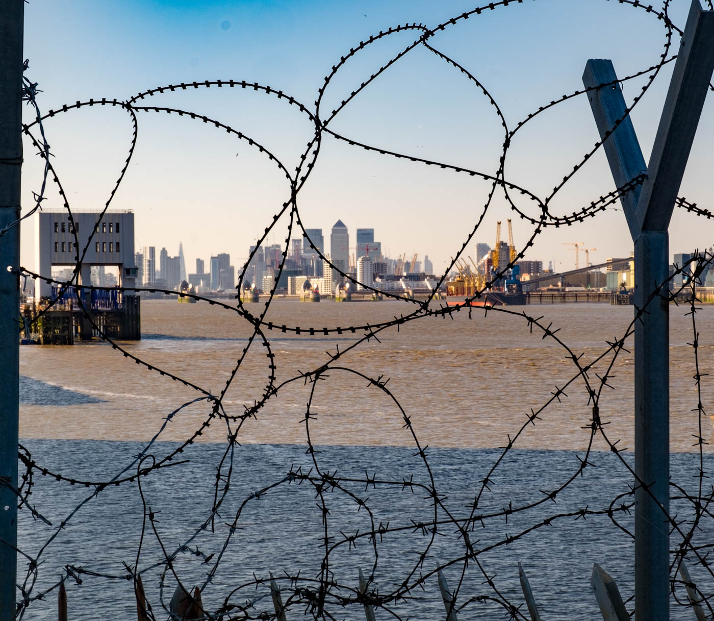
Randy, I very much enjoyed seeing this one. As has been said, it has a really effective gritty feel to it that works well in mono. It's also interesting that as far as I can see, none of the people are looking at London Bridge unless that one person by the far railings is taking photograph! The composition is interesting and creates a story within a story. But as has been mentioned I feel it is a shame that the central window bar cuts a number of the people in half. Maybe you have another shot taken a little earlier or later that might include more of them? |
Dec 19th |
| 99 |
Dec 22 |
Reply |
Jack,Many thanks for the comment. I have to come clean and say that wasn't in my mind and that I didn't know of the Dorothy Lange image (shame on me!) but have since looked it up - and yes, there are similarities in the defiant look of the woman. Thanks for the link - I will take some time to investigate more of Lange's work. |
Dec 5th |
| 99 |
Dec 22 |
Comment |
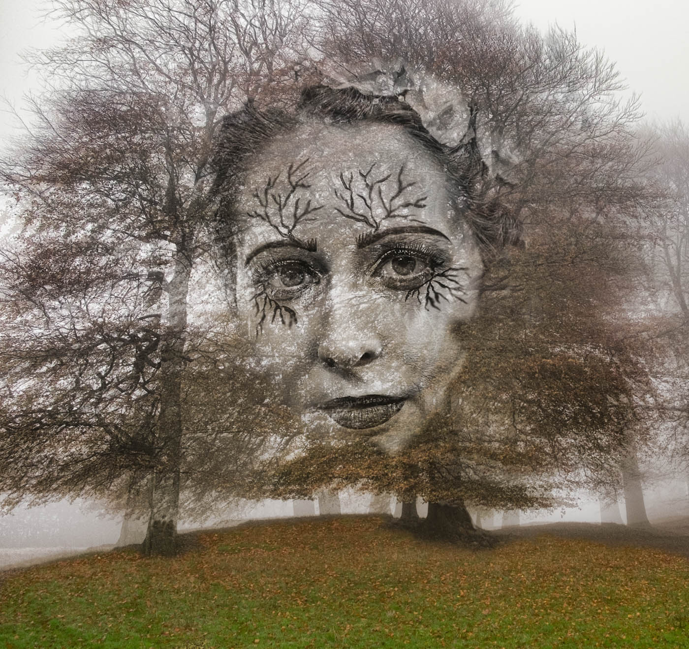
Michael, this is an interesting triptych but as Linda has said, needs the third face and if possible again with the cobweb effect. I also feel that the right hand face could become the central image as the face doesn't quite turn inwards enough to be on that side. So maybe, if you return you could find one which is looking more towards the centre. I like the presentation as it adds depth to the composition. |
Dec 4th |
| 99 |
Dec 22 |
Comment |
Linda, this certainly works better for me in the mono version. I particularly like the smaller pad below the the flower which is almost heart-shaped. I think the middle pad is somewhat too dark at the furthest edge and is almost getting lost in the dark water, so maybe dodge in a little there.
|
Dec 4th |
| 99 |
Dec 22 |
Comment |
Gerard, this is a very effective shot and agree with Michael about the explosive feel to the image. But for me you need that seed head on the left to balance the image. I like the treatment and the use of an almost white vignette to emphasise the central subject. You might like to extend the canvas slightly to allow just a little more room to the top.
|
Dec 4th |
| 99 |
Dec 22 |
Comment |
Barbara, this is a really interesting image. As has been pointed out, the shadow seems to have a life force of its own - as if it too is intrigued by what the man is doing. I like the shape of it and the contrasting bands of light across the image. The only thing I would ask about is the white outline around the man's legs and also that of the shadow. Has sharpening caused that? Maybe too the image needs levelling up a little.This was a good creative capture. |
Dec 4th |
| 99 |
Dec 22 |
Reply |
Stephen many thanks. Your tItle change suggestion is a good one and I will adopt it� |
Dec 3rd |
5 comments - 2 replies for Group 99
|
10 comments - 2 replies Total
|