|
| Group |
Round |
C/R |
Comment |
Date |
Image |
| 17 |
Nov 22 |
Reply |
Yes, that works for me. |
Nov 9th |
| 17 |
Nov 22 |
Comment |
Joe, I know very little about infra red, but do know that it can create some very interesting and often other-worldly images. I think this one does too. This has 'cold' written all over it. As a depiction of an inhospitable landscape, this is it. I also like the rendering of the sky and the capture of the whisky cloud in the centre which adds interest. And you got up at 5 am to do this?! That's photographic dedication - or something else! |
Nov 6th |
| 17 |
Nov 22 |
Comment |
Joe, this is a stunning autumn shot with impressive colours and reflections. I particularly like the way the flag is also part of the reflections. Well composed and exposed but a surprisingly high ISO and shutter speed for a shot which had good light. |
Nov 6th |
| 17 |
Nov 22 |
Comment |
Sheldon I think this is another of your 'abstract' architectural images that I have seen. It is another powerful image, especially the main buildings with their bold colours and set against a wonderful blue sky. This is almost like a painting and it also contains, as they often do, a somewhat irritating element - namely the monolith in front of the building. It makes for quite a talking point because it is so out of keeping with the rest of the image and it is almost as if the designer has put it there to wind people up! So, I like the background but the jury's out on the foreground!! |
Nov 6th |
| 17 |
Nov 22 |
Comment |
Brian, this a restful and peaceful scene. The moored boat suggests a story - maybe someone has brought it across from the far shore sometime and just left it until they go back. I think there is an issue with your exposure here. It does seem somewhat over exposed. It looks like it was a bright sunny day. The exposures you mention are somewhat contradictory - f2.8 and also f8 and a very fast shutter speed which doesn't seem to be necessary for this still subject. I don't know if you can set your Powershot up to show the histogram of your settings but you look at it, you will inevitably see an unbalance between light and dark. You could pull the highlights back in Photoshop to see what difference that makes. |
Nov 6th |
| 17 |
Nov 22 |
Comment |
Priscilla, this is an accomplished architectural image which shows the building off very well. I like the lines and the dynamic of the building which you have captured well in this image. The sky is a slightly odd shade of blue which may have happened in the processing, so you may like to see if you could reduce the saturation of that a little. |
Nov 6th |
| 17 |
Nov 22 |
Comment |
Hi John, this may have been a rescued pet but 'kitty' it certainly is not! If you know what I mean. A good closeup of the wonderful animal who has the most enormous paws. Good colour and sharp. The background is somewhat intrusive, particularly the green twig on the right. Darkening the background would throw the cat into more relief. |
Nov 6th |
6 comments - 1 reply for Group 17
|
| 99 |
Nov 22 |
Comment |
Linda, your mono version of the brown pelican certainly is more dramatic. I think he could do with a little ,ore sharpening and I have been experimenting with the High Pass in filters recently and providing you don't overdo it, it can work pretty well. There is a beautiful shape to the bird, especially the lower wing. Suspended in mid air sets it off very well but somehow makes it look a little odd as if it's frozen.This might be one of the occasions where you import another sky to add a bit of drama. Just a thought. |
Nov 12th |
| 99 |
Nov 22 |
Reply |
Thanks Gerard. Your version is pretty close to what I was attempting so maybe I will have to try something similar. |
Nov 12th |
| 99 |
Nov 22 |
Comment |
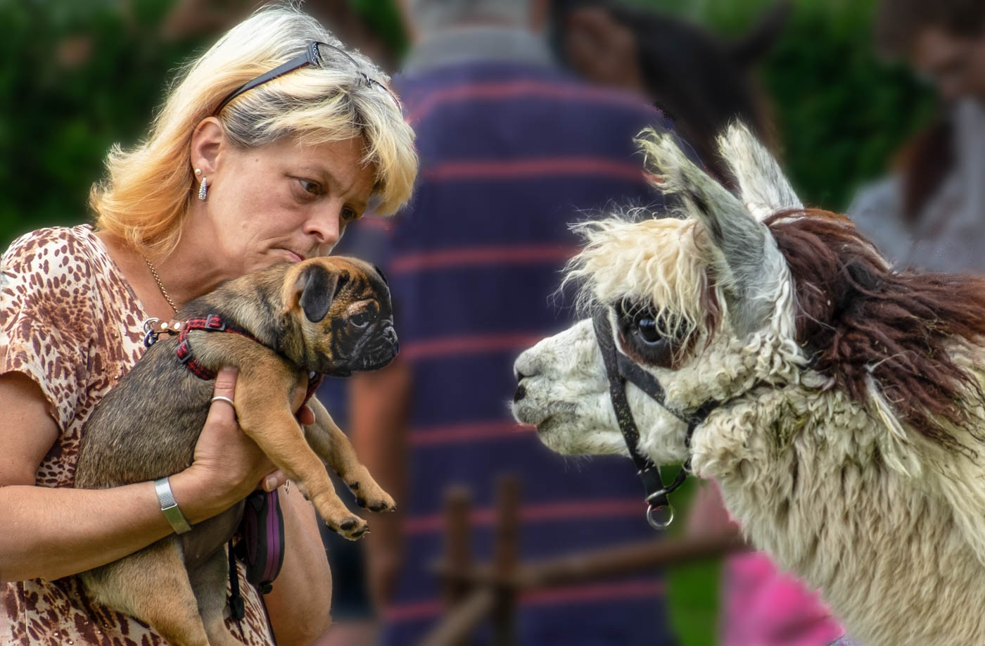
Kathleen, rear view shots of people is always difficult to assess. On the one hand it might be said that this type of viewpoint is too easy a shot and rarely tells us anything about the character of the people in the image. But this one is different. You have captured a truly emotional and gentle moment here. The hand on the back of the child guiding him along and the man with the boy's bucket and spade in safe keeping. Of course it could née quite a different interpretation and the father is taking the som home because he has been naughty! But I prefer the first impression I had. Technically I think it is a little too bright in ares - such as on the back of both shirts and also the sandy area between the man's legs. I'd also take out the seaweed or beach stones that encroach at the top of the man's head. |
Nov 3rd |
| 99 |
Nov 22 |
Comment |
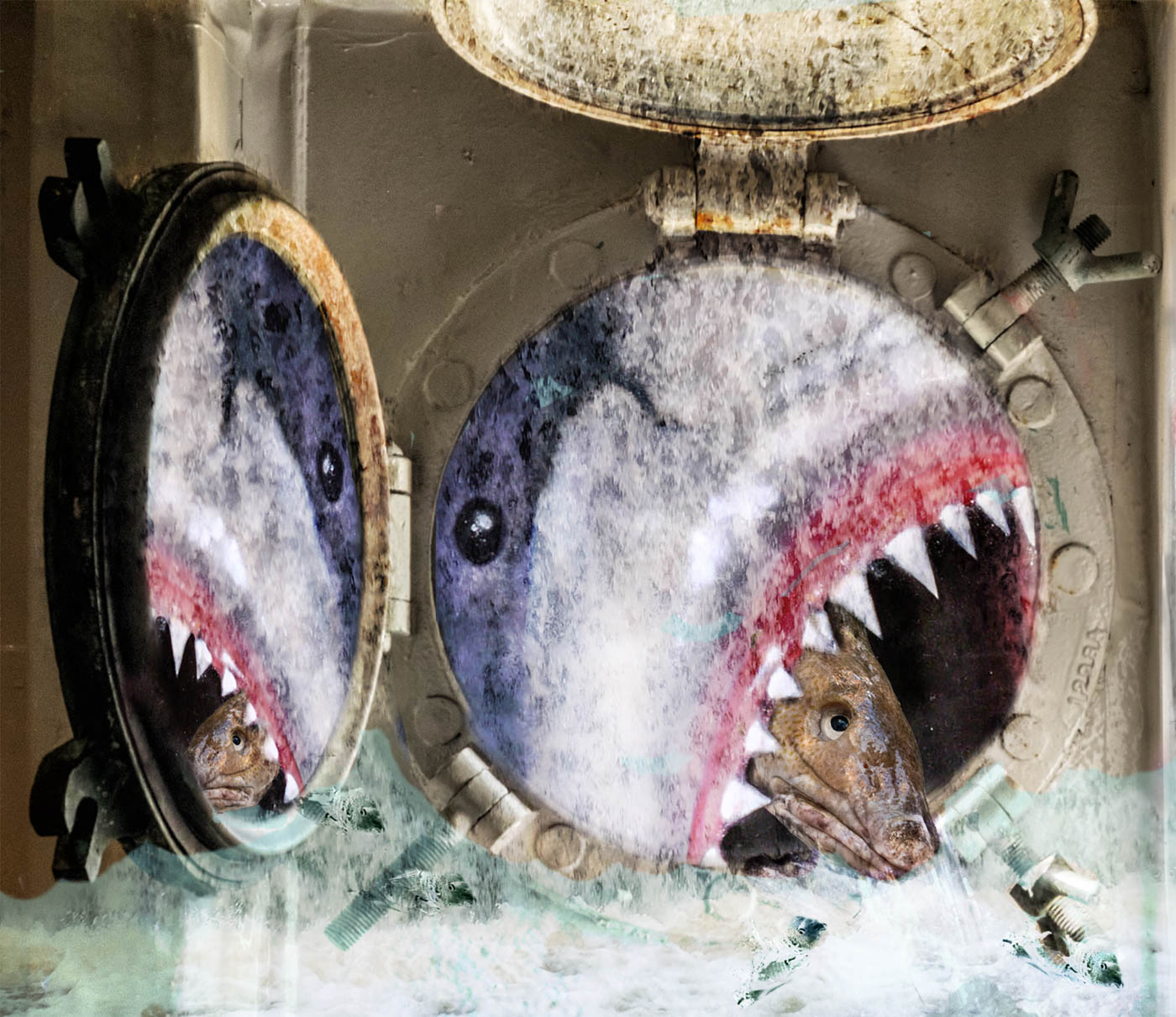
Michael, I really enjoyed this one. At first I thought you had photographed an underwater sea creature such is the wavy feel to the image and 'creature'. This is a very imaginative image, very well executed. Well done. |
Nov 3rd |
| 99 |
Nov 22 |
Comment |
Gerard, the title of this puzzles me, even given that my own name is Peter and I know the biblical references. Maybe it's the gates of Heaven idea which is somehow linked to the graves and the kind of makeshift gates across the entrance. But you asked which we preferred and I'm with Michael on this one. Mono tends to kill the beauty of the place despite its sad references. I also think that it is very bright, whether in the mono or the colour, especially on the gates where the highlights look blown out somewhat. |
Nov 3rd |
| 99 |
Nov 22 |
Comment |
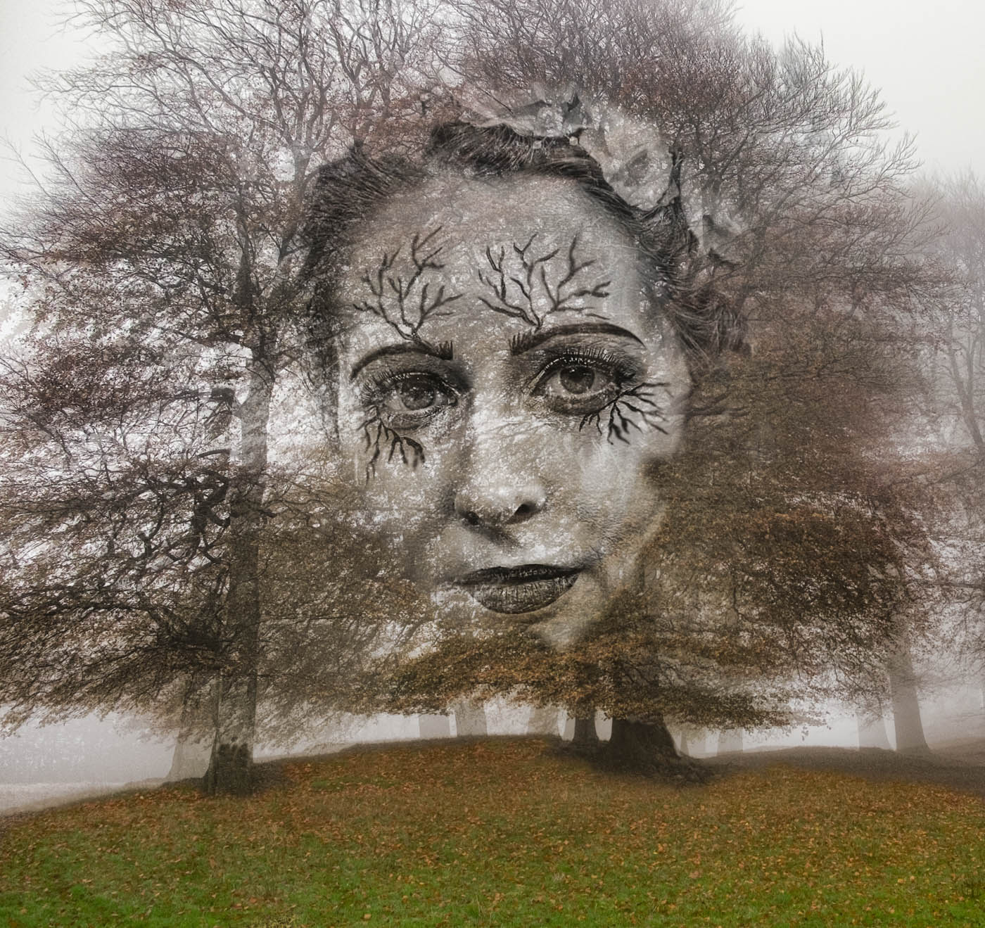
Barbara, this is a great image for Halloween! Plenty of drama in this and I like the flip. Not so sure about the birds as they overlap and do suggest bats - which may or may not be good! The foliage at the base is perhaps too little for it to be useful and draws the eye for no real good purpose. So I'd either take it all out or add more. |
Nov 3rd |
5 comments - 1 reply for Group 99
|
11 comments - 2 replies Total
|