|
| Group |
Round |
C/R |
Comment |
Date |
Image |
| 17 |
Sep 22 |
Reply |
Sheldon,this works better. The position of her is better in relation to the background but I reckon you could still take a little off the shine of the lighting on her cheek. |
Sep 10th |
| 17 |
Sep 22 |
Comment |
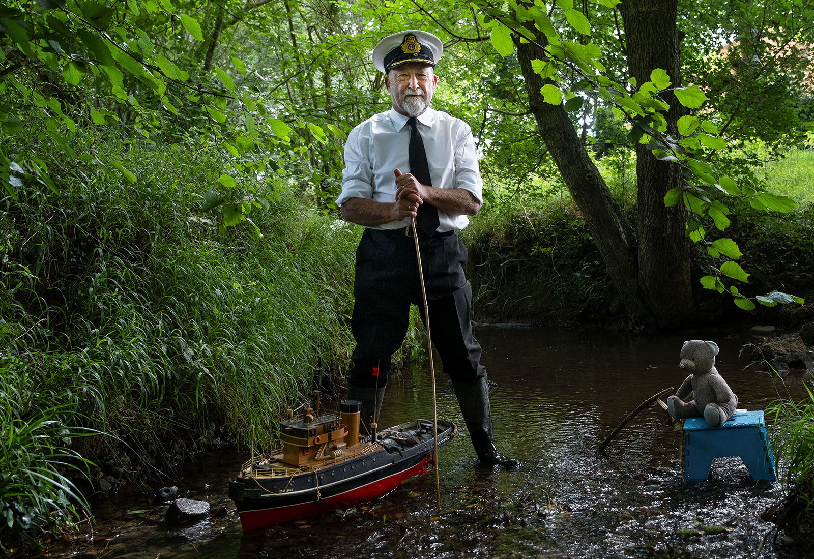
Great shot but sad story. A real in your face shot! Well worth waiting for. I wonder if you might consider brightening the eyes and bear's snout a little? I particularly like the bush it is standing next to but would remove the straggly bits of others from the right. I'd also consider darkening slightly the foliage behind the bear as the eye is drawn to the light greens - maybe adjusting the saturation of these might be an easy way to do it. |
Sep 7th |
| 17 |
Sep 22 |
Comment |
Joe, this is an impressive building with a lot of history. Good work on an iPhone and use of the sky replacement. Well worth visit should I ever make it across again! |
Sep 7th |
| 17 |
Sep 22 |
Comment |
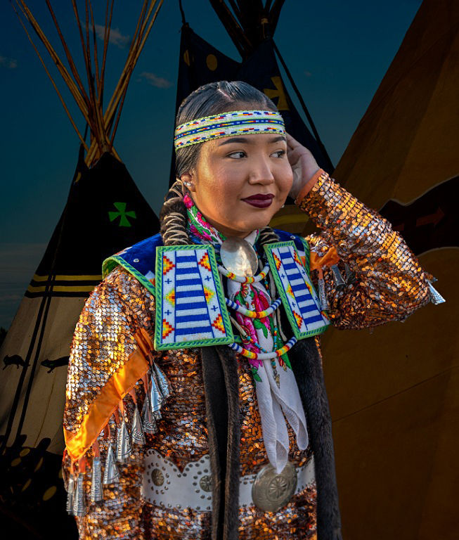
Sheldon,this was a good stop and capture and well cut out. The pose is an interesting one. Presumably she is adjusting her headdress or hair? It also looks as if she is listening for something so that may give you an idea for a title. Placing her against the tipis gives really good context for her but I find the very tight alignment with the left hand side of her head ,as we look it, rather distracting. I would move her over slightly to the right. The other thing is that she is brightly lit from the left and whilst you want her separated from the background which should be darker to achieve that, I also think that the tipis on the left should have the lighting brought up somewhat as currently the overall lighting appears unbalanced. I've tried a little to do this in the attached image and also tried to reduce the highlight on her face using the brush tool in camera raw. |
Sep 7th |
 |
| 17 |
Sep 22 |
Comment |
Brian
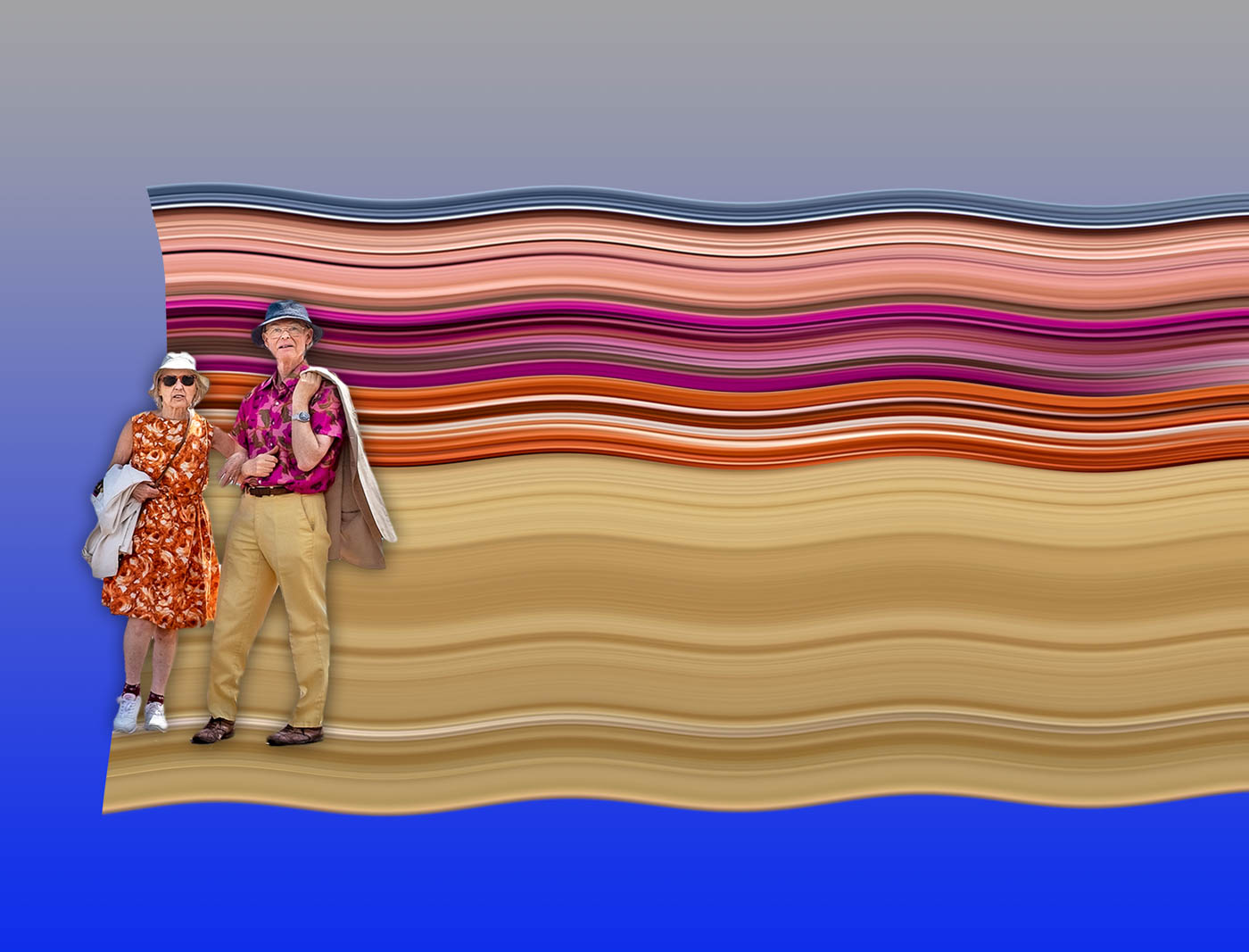
This is an image which tells or suggests a story - from the positioning of the couple, their shoes, the umbrellas and the background. So, it has a lot going for it. Joe's comment about the lack of sharpness is accurate and I reckon that you were some distance from them and your focal length could not get any closer. And, as he says, you may have cropped quite hard and that has a reduced the clarity of the image. But the composition is good. You might try a sharpening software like Focus Magic to see if that brings the sharpness up a bit but there are also downsides to that as it can produce a halo effect at the edges. |
Sep 7th |
| 17 |
Sep 22 |
Comment |
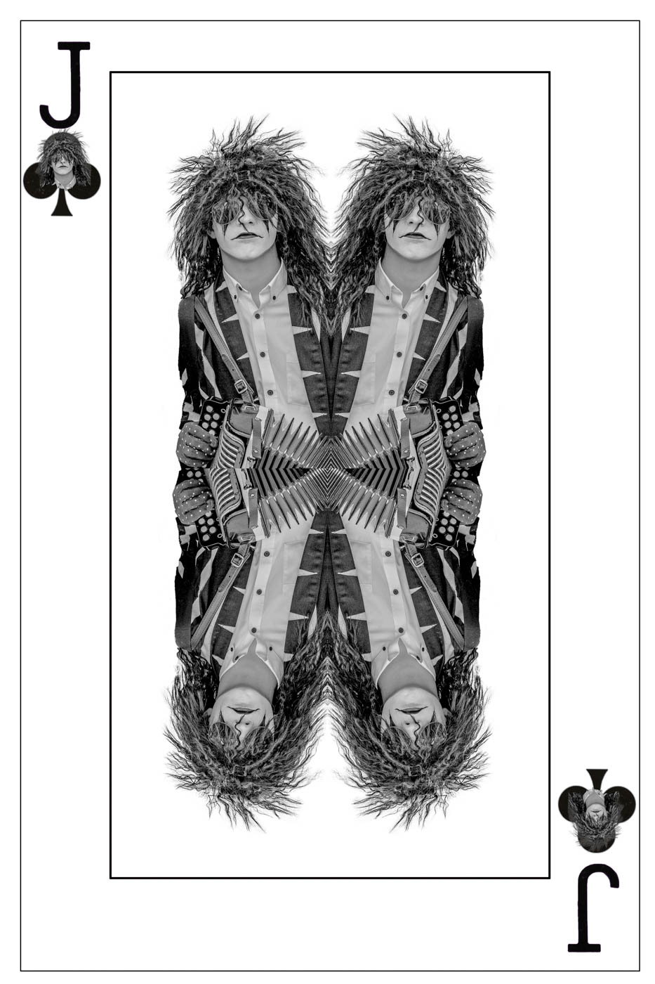
John, when I first looked at this I thought this was a real person! So, it goes to show how skilful the artist was who created this and your capture of the artwork. In terms of improvements I'd consider bringing out more from the heavy shadow areas on the crouching rider. I find using the brush tool in camera raw very good for that kind of work. |
Sep 7th |
5 comments - 1 reply for Group 17
|
| 99 |
Sep 22 |
Reply |
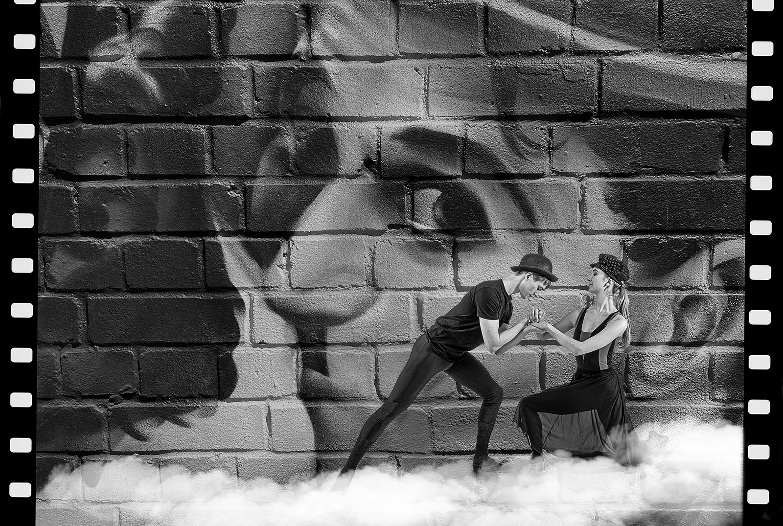
Gerard, thanks for your critique. This image has gone through several versions since I even posted it in this group. I have always felt there was an image in combining the Chaplin dancers with this wall art but have struggled to get it right or better. I think your suggestions are really helpful and concur with some others that I have had elsewhere and not just in this group. But your suggestion to distort or bend the wall to provide a base for the dancers I had not thought of and may indeed solve one of the central problems of how to link the dancers with the memory of Chaplin. Thanks very much, I will give it a try. |
Sep 13th |
| 99 |
Sep 22 |
Comment |
Randy, I really like this shot for a lot of reasons but primarily because it breaks as many rules of photography as you could want to use to critique it! The first rule that comes to mind is 'where is the focal point'? Well in this shot it could be anywhere. But that's probably one of the greatest assets of this image. You can go anywhere in it and still find something worth looking at. I wouldn't change anything in it and the house/face at the top is a real bonus. Just one thing, your title would be even more appropriate if you dropped a couple of words and called it simply 'A road less travelled' which emphasises the somewhat unsettling prospect of walking down this street. |
Sep 13th |
| 99 |
Sep 22 |
Comment |
Kathleen
Another interesting and unusual image. I think the sepia treatment works well. I think your composition is the feature that strikes me most. This is a partial view of the basketmaker and yet it does provide quite a bit of information about him/her. There is a hand and a foot but is that enough? Probably it is but i would have liked to see more although I appreciate you were concentrating on the details. |
Sep 9th |
| 99 |
Sep 22 |
Reply |
Stephen,It's always good to have other input from other group members. I have since updated the image which may or may not work for you. As to their feelings for each other that is interesting as they are actually a couple. Maybe the romance has worn off a bit but I can still see it! |
Sep 8th |
| 99 |
Sep 22 |
Reply |
Thanks Kathleen. I have now uploaded a new version following an idea from Barbara. |
Sep 8th |
| 99 |
Sep 22 |
Reply |
Barbara,thanks for your feedback and your very good idea. I had been playing around with a different image of these two using a cloud base and with the girl on a stepladder and boy climbing up to her. But it was worth trying the cloud idea with this image too - so here's a different version which may help the fantasy element of it. |
Sep 8th |
 |
| 99 |
Sep 22 |
Reply |
Michael
OK, I had a go at adjusting it and see that some of the others have given you some similar options. My version attached was loaded back into SilverEfex and I ramped up the amplify blacks and then applied a heavy vignette in Camera Raw. Maybe works, but maybe the other versions are better. |
Sep 6th |
 |
| 99 |
Sep 22 |
Comment |
Kathleen
Another interesting and unusual image. I think the sepia treatment works well. I think your composition is the feature that strikes me most. This is a partial view of the basketmaker and yet it does provide quite a bit of information about him/her. There is a hand and a foot but is that enough? Probably it is but i would have liked to see more although I appreciate you were concentrating on the details. |
Sep 4th |
| 99 |
Sep 22 |
Comment |
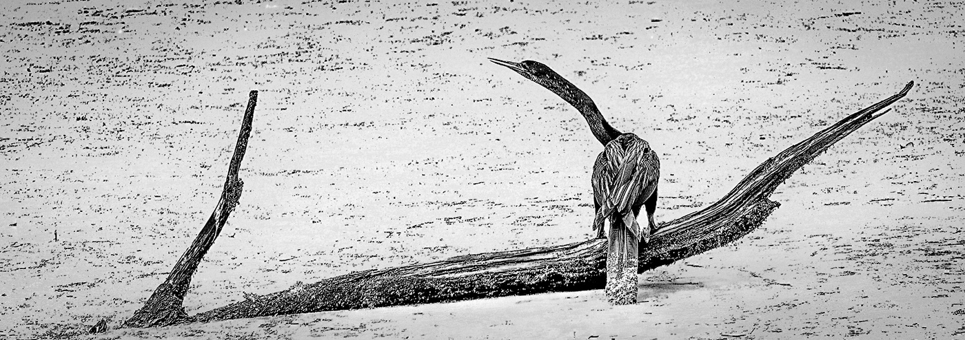
Michael
This is an intriguing image. As you say the bird has become part of the branches and the curve of its neck is a real bonus.i also like the letterbox crop. My only question is does the high key effect work? I'm not so sure on this. If you keep to it i think it needs to be far dramatic in the depth of the blacks. The stark background might be relieved a little by a light broad vignette.
|
Sep 4th |
| 99 |
Sep 22 |
Comment |
Linda
This a bleak and wild image especially in mono. The flip works well and the contasts in the sky dramatic. You might consider a small crop on either side. I like the leaning tree srump on the right but would lose its partner on the far right. This then leans the shorter stump into the image and you could clone out any messy bits from the far tree. On the left I'd only remove a little of the shapes and crop up nearlto the left hand stump. The effect of this is to bring the focus onto the central stump that pokes up in between the two stumps in the background. |
Sep 4th |
| 99 |
Sep 22 |
Comment |
Findin something where apparently there is nothing is a real artistic skill. You have done well to see the possibilities in these shapes and area. I suppose many might say there is nothing here to excite or intrigue the viewer but for me the combination of shapes,patterns and textures make the composition rewarding. I did wonder if a crop to the base would improve it but in the end liked the overall balance. I'd also keep the wires in. Clever title. |
Sep 4th |
| 99 |
Sep 22 |
Comment |
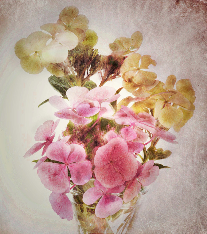
Barbara
Again it's strange to prefer the mono to the colour version when the whole beauty of a flower frequently rests in its colour. But your conversion really does work well. But i also like Linda's treatment as this pushes the flower forward. Good use of the tissue for the background - I must remember that. |
Sep 4th |
7 comments - 5 replies for Group 99
|
12 comments - 6 replies Total
|