|
| Group |
Round |
C/R |
Comment |
Date |
Image |
| 17 |
Aug 22 |
Reply |
Thanks Joe,sorry to hear you are no longer in the group. Have enjoyed your images over the years and wwill look out for yours if you are now in another group. Have you a new group number? |
Aug 16th |
| 17 |
Aug 22 |
Reply |
Brian thanks for the comments and yes he was a barista of srts,at least he sold coffee and pulled a few levers! |
Aug 16th |
| 17 |
Aug 22 |
Comment |
Joe, I find this a very pleasant scene with a good lead in line going to the lighthouse. As others have suggested a crop of some kind would help. For me I'd follow Glen's right crop but also would take it down a bit to take out some of the streaky clouds. So now you have at least three options! |
Aug 10th |
| 17 |
Aug 22 |
Comment |
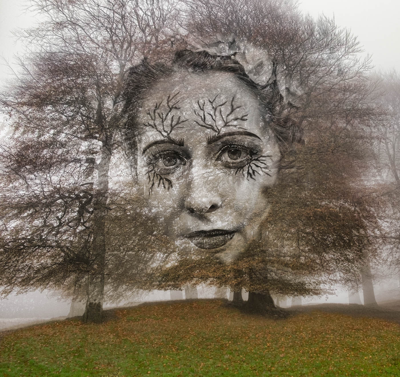
John, this is an intriguing image. You have done well in removing the people as there is nothing to show they were there. My feeling is that this image needs more drama to emphasise the tangled branches. So you might increase the contrast somewhat and adjust the blacks especially in the branches at the front. You might also find that playing with the texture slider helps bring out some of the creases and scars on the trees. Works well in mono. |
Aug 4th |
| 17 |
Aug 22 |
Comment |
Glenn, great shot of a very sharp grizzly and a very wise decision not to stay to see what happened! Would suggest a slight crop off the top and on the left and a little darkening of the background. And maybe darken the bear's nose ridge a little. |
Aug 4th |
| 17 |
Aug 22 |
Comment |
Sheldon, great action shot. Love the dust and composition. The shutter speed almost froze it but not quite which was useful for giving the impression of action and speed. I wonder tough if you could sharpen up the rider's face a little. I have been experimenting with Photoshop's High Pass in Filters and used carefully that can make a dramatic improvement where the focus is slightly off. The other thing is that the background, particularly the fence area would be better if it was somewhat darker and less obvious. You were lucky to have such a prime position! |
Aug 4th |
| 17 |
Aug 22 |
Comment |
Brian, this is an interesting pose. I agree about her hair colour being a very attractive feature and a good reason to keep this in colour. I think in model shots where you have command of the staging, lighting and props that it's easy to see something as important and overlook other things that stand out only when looked at by someone else and this is why these critiques are very useful in trying to improve our images. So, I'd ask - what do the many bangles on her arm add to this portrait of Veronica? Ok, she was wearing them but do they really tell us more about her than her face and body? To me they are a distraction. Also, I think the lighting on her face and hand is rather harsh and needs to be toned down - either at the point of taking or in post processing. Finally, I'd ask about the covering she's wearing. Whilst for modesty purposes she might have wanted it but its texture and shimmer are also somewhat distracting particularly at the bottom right. If she was prepared to pose like this maybe she would have done without it but still ensured some modesty by a lower placement of her arm.
So, I hope this is not seen as a destructive criticism because it's not meant to be. I have over the last couple of years got more involved with model photo shoots in a studio and these are some of the things I have picked up and I'm far from an expert.
Keep going with these and if you have the chance to work with Veronica again, why not go for a straight head and shoulders portrait which could really emphasise that red hair even more.
|
Aug 4th |
5 comments - 2 replies for Group 17
|
| 99 |
Aug 22 |
Comment |
Barbara, the conversion to mono is well handled and appropriate in that it perhaps brings out more the delicacy off the flower. But whilst I know you wanted to show the shadows, I find the sunlight beneath the flower and on the far right somewhat harsh. As is the lighting on the extra stem on the right which in my opinion doesn't add anything useful in this case. |
Aug 4th |
| 99 |
Aug 22 |
Comment |
Randy, this is great image to critique! Here in the UK and perhaps with you too, we'd call this a 'Marmite' image - you either love it or hate it! For me, I love it as it challenges the viewer with a different view of a very everyday scene - accidental or not! The sheer blast of white throws the whole scene into relief and the sketch effect renders the image almost ghostly. I don't go with the crops suggested as I like the whole scene including the figure in the distance who also seems to have long legs. |
Aug 4th |
| 99 |
Aug 22 |
Comment |
Micael, this is a soothing and peaceful image which works well in mono. It is kind of ethereal. The only aspect of it that jars slightly for me is the streaks of white top right which really pull the eye. So maybe consider toning that down somewhat. Both versions are good but if I have a preference I like the sky-meets-water effect as this adds too the somewhat otherworldly quality of the image. |
Aug 4th |
| 99 |
Aug 22 |
Comment |
Linda, I really like this - a happy looking lad enjoying the time of his life. Well composed and separated from the background. I do feel that the lighting on his face, legs and chest is somewhat bright and also that his helmet has some glare which could be toned down. |
Aug 3rd |
| 99 |
Aug 22 |
Comment |
Gerard, great image - simple but effective. Now, I may be wrong about this but is this completely sharp? I've looked long and hard at it on a large monitor, I think that either it isn't or I need new glasses! It looked sharper on Linda's smaller image but when I enlarged it, then it didn't. So now I don't know if I should even have mentioned it - but there you go! |
Aug 3rd |
| 99 |
Aug 22 |
Comment |
Kathleen
Welcome to the group and what a cracking image to start with. You were completely right to flip this as strangely it makes more sense than the right way up! I agree with both crops and also like the sepia effect you have added to the image. So, I have no further suggestions to make but very much look forward to seeing more of your creative images. |
Aug 3rd |
6 comments - 0 replies for Group 99
|
11 comments - 2 replies Total
|