|
| Group |
Round |
C/R |
Comment |
Date |
Image |
| 17 |
May 22 |
Comment |
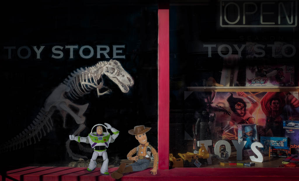
Hi Joe - this is an interesting period piece. Nice tones and textures and if this was a glass fronted piece you have done well to avoid reflections. There are some dodgy-looking items there at least to a modern eye especially that odd looking plunger-type item bottom front. It is in effect a record of a period in time but even so the arrangement turns it into a carefully constructed piece of art in its own right. |
May 7th |
| 17 |
May 22 |
Comment |
Glenn, this is a great image from your phone and shows just what's possible with them. Some good lead-in lines both left and right and an excellent depth of field. If you did want to adjust any aspect of it I would suggest that you tone down the ends of the fence poles as the rather orange colour hits you straight away and you want to be drawn further away than that. It looks to have been a brilliant day and the sky very blue so maybe playing with the saturation might help make it less bold. And one other thing I have just noticed but maybe completely wrong - does the image slope up to the right a little at the horizon? |
May 7th |
| 17 |
May 22 |
Comment |
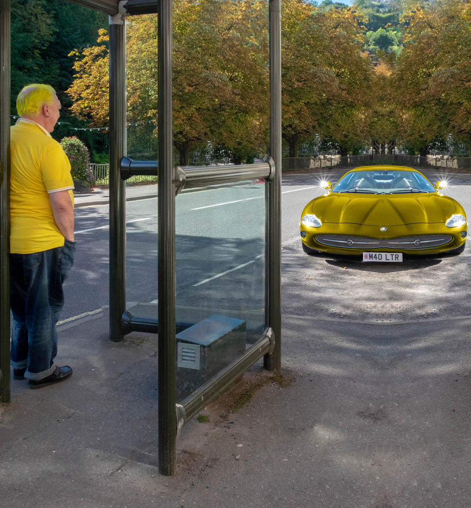
Joe, this is some machine! A difficult shot to take to get in everything but forcing you to include other cars either side of it which draw the eye. The clouds on the car are the unusual feature so why not crop in really tight and concentrate on those. f you could also mask the other cars at the edges and really darken those sections down that would throw the main car into more prominence. |
May 7th |
| 17 |
May 22 |
Comment |
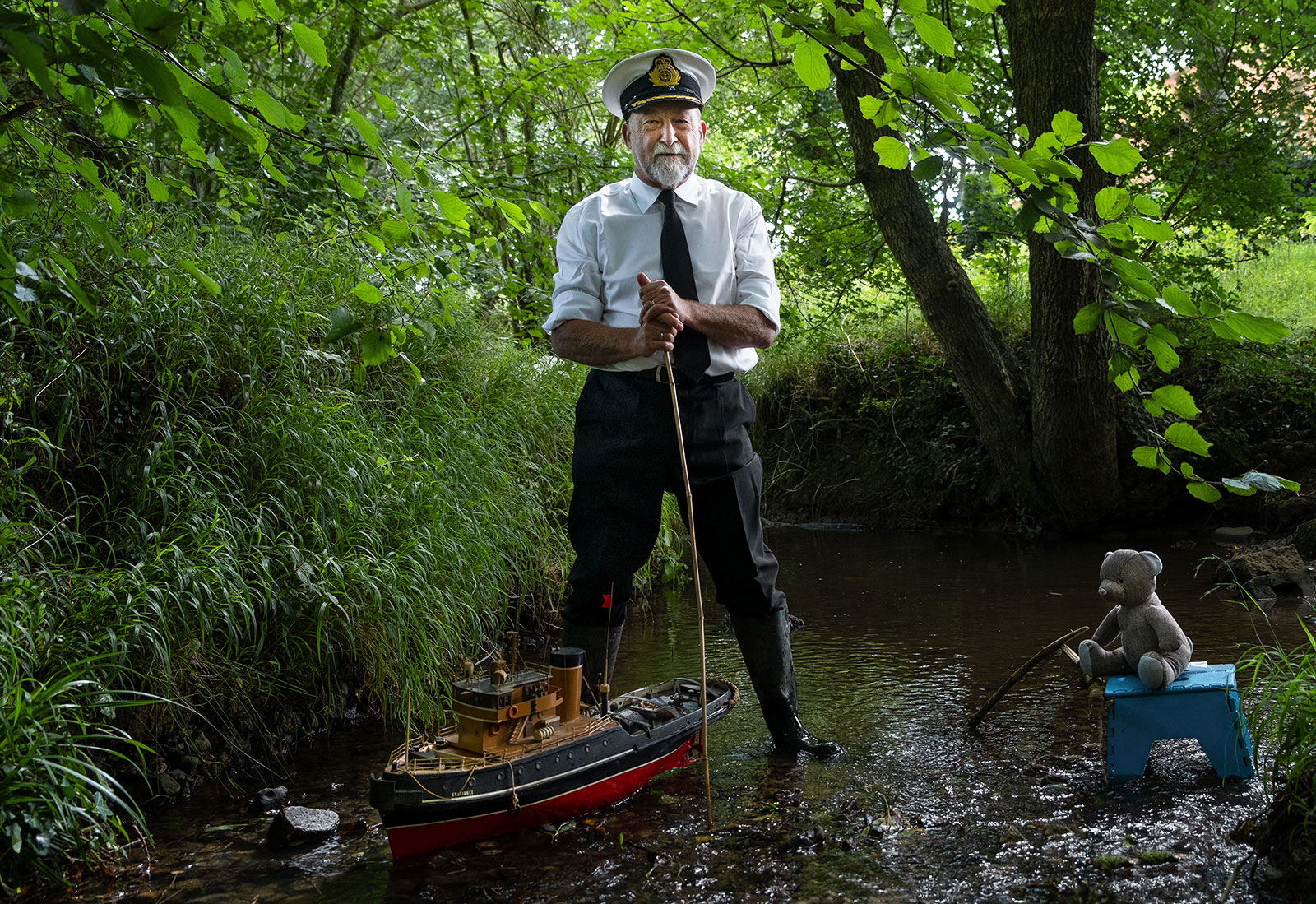
Sheldon this is an amazing image which puts the human existence into perspective! Just what is going out there?! Technically this is a well created image. I do like the swoop of the stars and the reflection in the pond and the way you have reduced the effect of the light pollution. The slight haze by the distant mountains helps create another sense of the mystery and awe. You might not want to crop this shot but it could lose a little from the left without ruining the overall composition. Well done on the stacking and us of Topaz Ai which I also find very effective. |
May 7th |
| 17 |
May 22 |
Comment |
Hi Brian and welcome to the group
This is a striking image of Rosalind. Her expression is unusual and almost as if you have caught her unawares and maybe that was your intention so that makes it very different which is appealing. But it is quite flatly lit so there is no real drama in the image - only a small hint of a shadow and in portraits that is quite an important aspect of creating an arresting image. There is also a school of thought which advocates tidying up things such as stray hairs but for me those around the model's neck are the only ones I would consider taking out but again that's a matter of personal choice. But I would suggest you tidy up the stray hair on the model's sleeve. It will be good to see other portraits you have taken. |
May 7th |
| 17 |
May 22 |
Comment |
I suppose the first thing that strikes me about this image is that it provides an immediate point of focus which is the very brightly lit gable end of the farmhouse in the distance. So the question is, does that distract the viewer from the rest of the scene which provides the majority of the picture. The title clearly directs the viewer to the farmhouse but is that all you want to look at? Probably it is but in that case I would suggest cropping off the right hand section of trees as you would still retain most of the peaks in the distance. Maybe you could also try to bring up the contrast in the clouds a little. |
May 7th |
6 comments - 0 replies for Group 17
|
| 99 |
May 22 |
Reply |
Linda
Thanks for the reply and the work you have done on this image which has certainly improved it. I will take your advice on board.
Peter |
May 11th |
| 99 |
May 22 |
Reply |
Gerard, that's a very useful tip. |
May 9th |
| 99 |
May 22 |
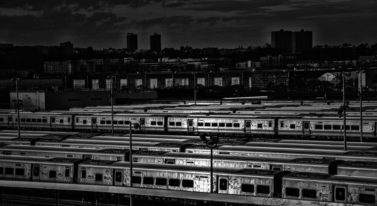
Comment |
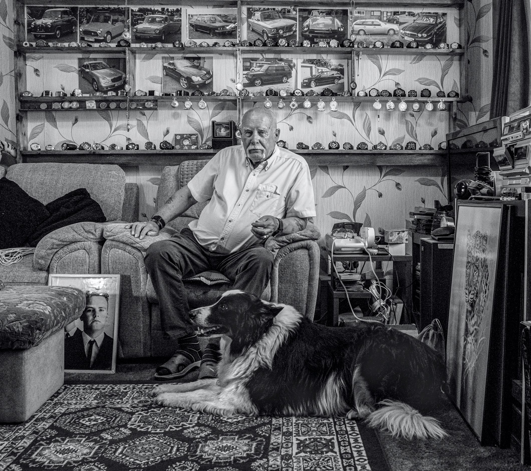
Randy, this is an interesting image of basically different kinds of compartments and their windows and that's including the apartment blocks in the background. Cropping off the base is a right thing to do because of this as that adds little to the image. I think this could be made even more dramatic. I tried a favourite filter of mine in Nik Color Efex - Bleached bypass Intense detail and this is what happened. |
May 7th |
 |
| 99 |
May 22 |
Comment |
Michael, this is a beautiful image and I like your treatment and final composition. I like the way the flower appears out of the textured background and the lighting ion the flower head. I feel that it's rather nitpick to suggest an improvement as I think this is well done but you might consider bringing back up slightly some of the detail, if possible, in some of those stamens towards about two o'clock on the lower head as they are disappearing a little - but hey, it's perhaps a step too far! |
May 7th |
| 99 |
May 22 |
Comment |
Linda, this is a brilliant image. Great texture in both the grass and the donkey. No improvements from me. |
May 7th |
| 99 |
May 22 |
Comment |
Gerard
I like this very much but concur with the view on the harsh lighting on the stacks. It does have creepy feel to it especially with the wires hanging down almost reminiscent of a gallows! -Maybe the product of my over-active or deranged imagination. But I would like to suggest something al little more radical. Why not take out the lefthand stack and have just three - it could be done by filling in the sky and by some additional work to get rid of the messy bits. That might give it more drama as I find the fourth stack intrusive. See the rather quick version attached. |
May 7th |
 |
| 99 |
May 22 |
Comment |
This is a strong mono image. As always there has to be a reason why a mono image of something so colourful should be shown that way given that you are taking away an essential part of the object namely its colour. But the mono reveals the structural beauty of the flower but with your careful use of lighting you still get a feeling of the flower's delicacy. I enjoyed this very much and your decision to flip it was a good one. |
May 7th |
| 99 |
May 22 |
Reply |
Gerard
Thanks for the comments and what a good pair of eyes you have! Yes, the coat was far too big for this model - we had borrowed it from the props box in the studio and was all we had. I will try to tone down the white under his eyes and adjust the background and see what happens. As for the finger on the trigger - yes foolish but perhaps adds a suggestion of something unpleasant likely to happen! |
May 2nd |
5 comments - 3 replies for Group 99
|
11 comments - 3 replies Total
|