|
| Group |
Round |
C/R |
Comment |
Date |
Image |
| 17 |
Apr 22 |
Comment |
Joe
Sorry for the delay in commenting on this image. Other things cropped up! By coincidence I have just walked past a local fairground set up for our mayDay holiday so your image has inspired me to go along to take a few as there are always some good possibilities. Yes, I agree about the side railings and might even be tempted to crop in closer on those two fierce-some looking dragons. |
Apr 30th |
| 17 |
Apr 22 |
Comment |
Glenn, this fox certainly looks fierce but are probably not if they are close to a picnic area. Sharp on the eyes and whiskers - a forceful portrait. |
Apr 3rd |
| 17 |
Apr 22 |
Comment |
Sheldon, I really like this. It's simple and very effective. It's become a piece of modern art as if from the Cubist school. One small point - I wonder if that is dust marks on the blue column on the right - there are several variations off the blue and it might be an idea to replace them so that it is consistently blue throughout. Very well seen. |
Apr 3rd |
| 17 |
Apr 22 |
Comment |
Joe, this works for me as it is not a straightforward record of the artist's work but you have added to it and the eyes the artist cropped as they are come over in a kind of creepy way. what I'm not sure about are the silhouette heads of the visitors and in particular the one on the far left which is a bit of a puzzle - just what is the mall 'head' on the far left or is that a hand? It might even be better to clone that out if you could still retain part of the painting. |
Apr 3rd |
| 17 |
Apr 22 |
Comment |
John, it's amazing what PS can do to images by turning something straightforward into something eye-catching and fascinating. That's what's happened here although you would probably incur the wrath of a motorcycle fanatic! I really like the swirl of this and the way whatever it is has been transformed into something like a spiral staircase in the top part. |
Apr 3rd |
5 comments - 0 replies for Group 17
|
| 99 |
Apr 22 |
Comment |
Randy, I have to confess rather worryingly that had I been taking this image my Kodak moment would have been the young lady in the extremely tight jeans! Taken in Budapest by the writing on the tee shirt and one which certainly conveys the busy street scene. Street photography being what it is there its often some parts you might wish were not present but then you wouldn't have the full flavour of the place. So it's a busy scene but that's how it was. |
Apr 3rd |
| 99 |
Apr 22 |
Comment |
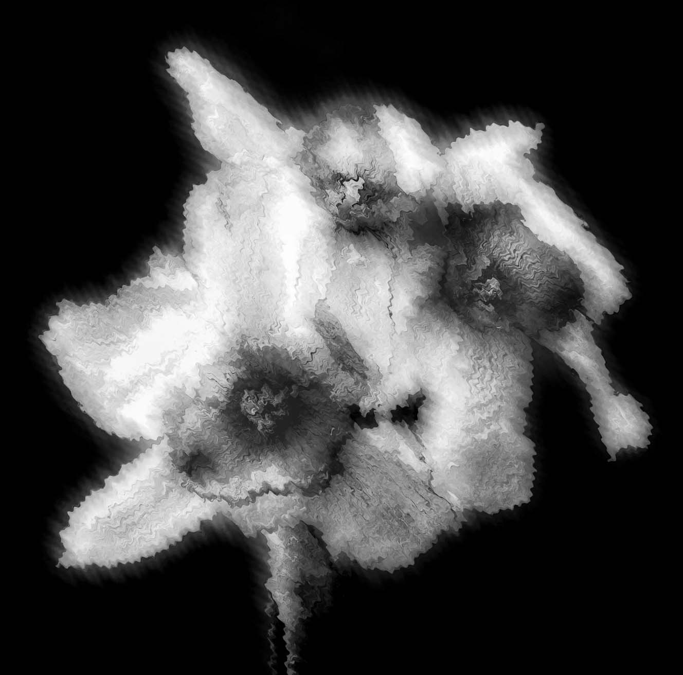
Michael, this was a very interesting experiment and now that I have seen several mono images of colourful flowers presented in this group maybe I ought to try something too! I guess the Topaz Studio was responsible for much of the ghostly effect in the final image and whilst I quite like it, the crispy version also has thin gs to recommend it. But I also find that both are somewhat overbought in places and would suggest you try to brig that back somewhat. I also wonder if you applied something like a ripple blur in PS that this would increase the ghostly effect. See attached. It might be actually the opposite of what you want! |
Apr 3rd |
 |
| 99 |
Apr 22 |
Comment |
Linda, the mono conversion certainly works well and your alterations improve the original. Bringing it forward by the cropping has helped give the building far more prominence and the darker sky increased the feeling of a wet day. |
Apr 3rd |
| 99 |
Apr 22 |
Comment |
Gerard, this is a bleak scene! But also one that invites you to walk into and up the incline to the horizon. It also reminds me of an etching. I would leave the far right tree on the horizon as an anchor point but certainly remove that stray corn stalk bottom right. This would make a great greeting card. |
Apr 3rd |
| 99 |
Apr 22 |
Comment |
Barbara, this is a particularly effective and beautiful image. I think it may be yet another flower which you have converted into mon and another which really works. The treatment and lighting has made this bloom virtually 3D and whilst the intense whites some might say are burnt out, for me that's what gives the flower its depth. If you compare it with the original you will see that here there is no intense white. What I would be tempted to remove would be the extraneous petals that just emerge out of the background.
|
Apr 3rd |
| 99 |
Apr 22 |
Reply |
Stephen, thanks for your comments which are much appreciated. I know about Karsh but didn't particularly have his style in mind when I created this image but I guess it has similarities although nowhere in the same league.
I actually toned down the highlights as I am very conscious that brighter highlights particularly on faces get the thumbs down and opens up the discussion of when a highlight is actually a burn out!
This was taken on an 18-55mm telephoto and this shot at 43mm |
Apr 2nd |
5 comments - 1 reply for Group 99
|
10 comments - 1 reply Total
|