|
| Group |
Round |
C/R |
Comment |
Date |
Image |
| 99 |
Mar 22 |
Comment |
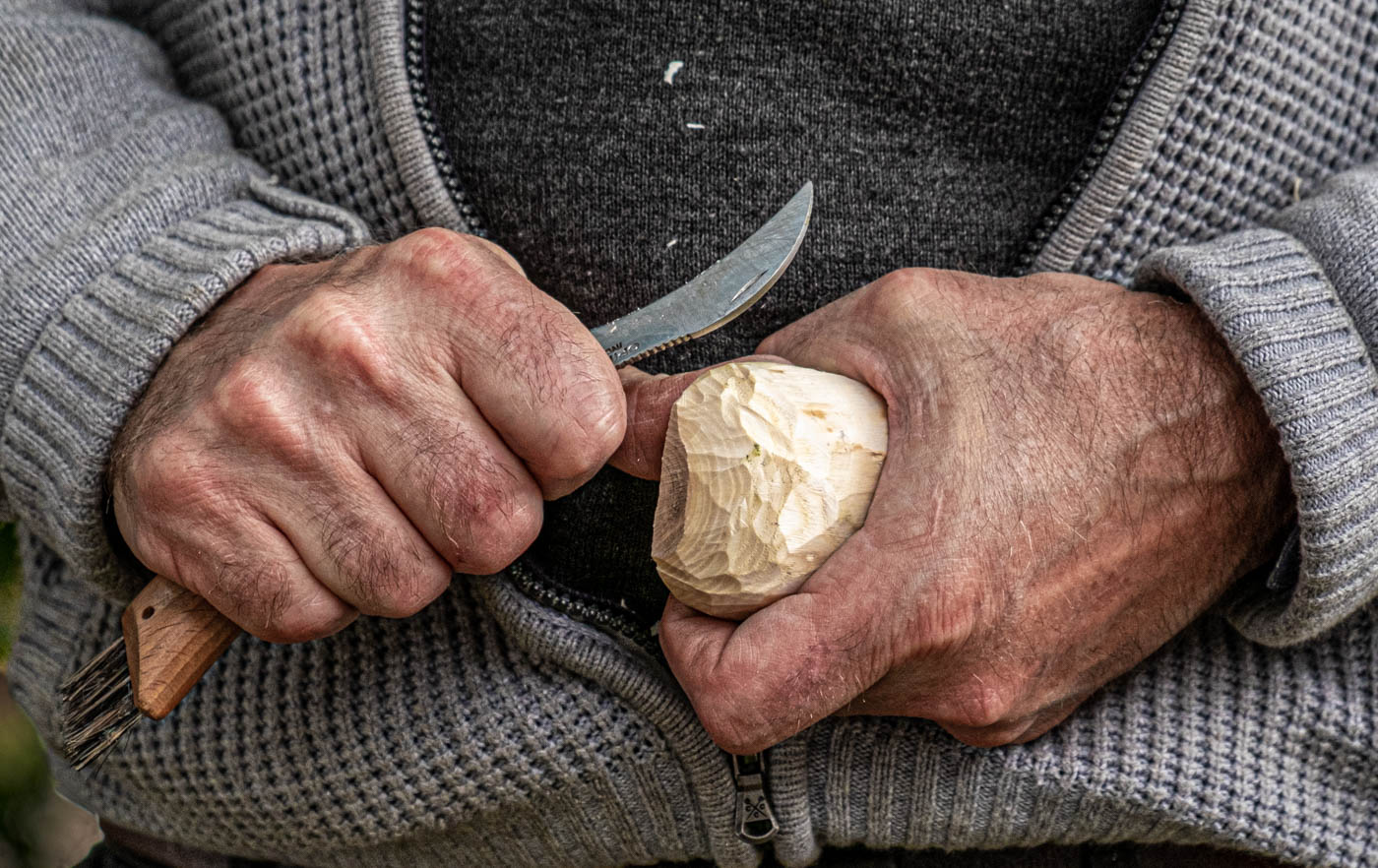
Randy, this is a very amusing shot! However, I'm not sure that the two objects balance each other although there is a certain similarity between the shape of the eggs and the portly figures on the right. But which of these two holds the viewer's interest more? I'd say it was the eggs. This works well in mono but the highlights on the eggs could be taken back somewhat and the shadow on the far right egg also adjusted. The eggs are certainly very unusual and were more than worth. Did you consider buying them?! |
Mar 5th |
| 99 |
Mar 22 |
Comment |
Michael, I like the power and aesthetics of this image and it certainly works in mono as does your crop from the right side. Oddly in the original there looks to be the remains of a plant in the top right section which has disappeared in the final image and I'm not sure if that is a good thing or not! Your composition really brings out the best of this sculpture. |
Mar 5th |
| 99 |
Mar 22 |
Comment |
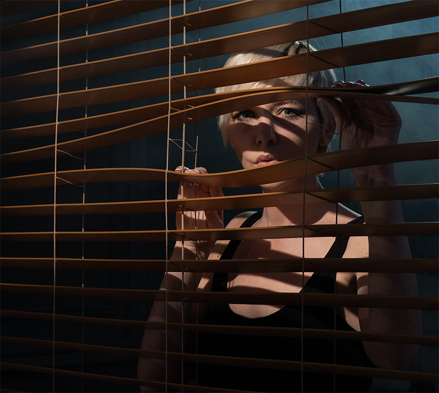
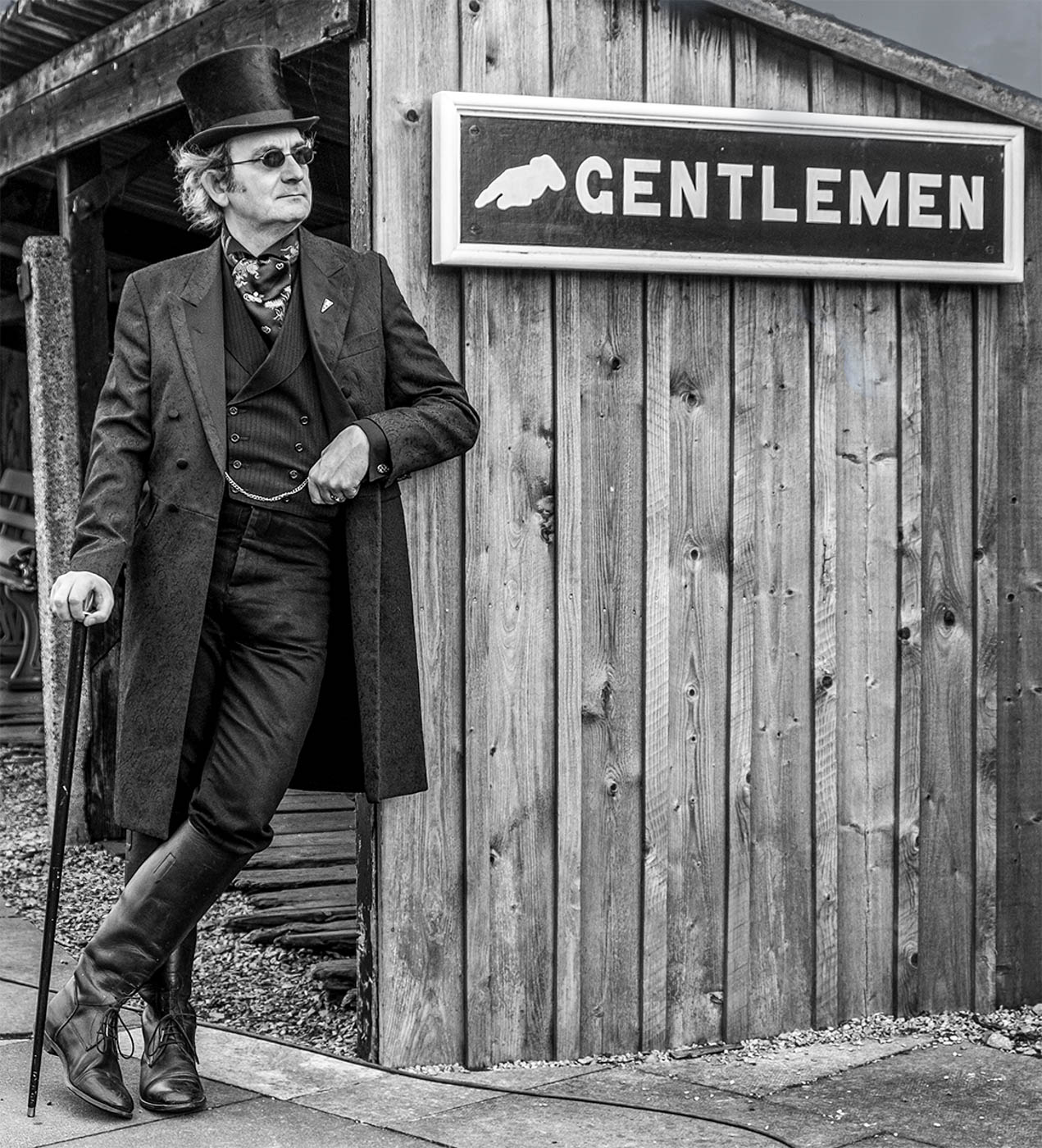
Linda, this is a great character portrait. You have captured the life of this man so well. I think your masking of him from the background has worked well - what method did you use for that? I am always trying out various software to find the best that copes with hair such as in this shot. Sometimes I use Topaz Mask AI but more usually the Photoshop masking feature. Personally, I don't mind the sharpness of his craggy features. However, I do think the blurred background is a little light. |
Mar 5th |
| 99 |
Mar 22 |
Comment |
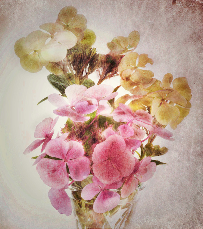
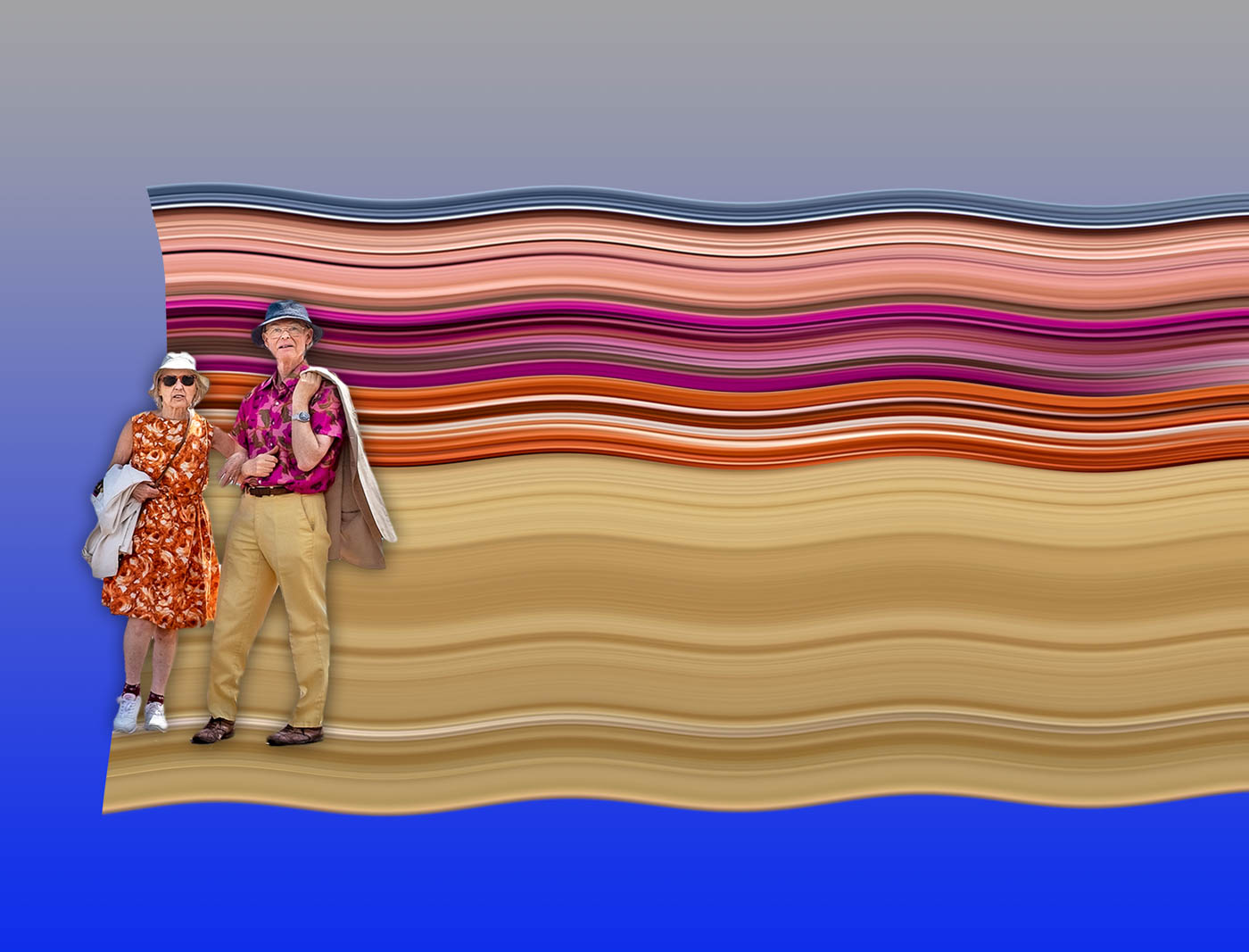
Gerard, my answer to your question will not help your dilemma! I think either of your shots works for completely different reasons. Although it's pretty clear what these objects are, it is also a reasonably abstract composition that means not everything has to be realistic. So, in a sense the main image with the noise is perfectly fine for me. The de-noised shot is also acceptable but I would suggest slightly less interesting for the above reason. I did try flipping the image horizontally but your composition works better. I also like the almost 'liquid' texture of the stem of the most prominent seed head. |
Mar 5th |
| 99 |
Mar 22 |
Comment |
Barbara, this is a worthwhile transposition from the original. Your sky change certainly gives the image far more drama. Compositionally, I think there is too much sky as the landscape you have photographed is linear. So I think Gerard's crop works better creating a letterbox frame for the image. I too would also bring out more of the detail in the trees on both sides especially the section of the inlet where the eye is drawn. |
Mar 5th |
5 comments - 0 replies for Group 99
|
5 comments - 0 replies Total
|