|
| Group |
Round |
C/R |
Comment |
Date |
Image |
| 17 |
Feb 22 |
Comment |
As you say you needed a fast shutter speed to catch this guy on the move and you have done it very well. That front lifted leg makes all the difference to raising the shot itself. Good definition on the coat and the scrubland provides a helpful frame for the coyote - he obviously blends well with his surroundings. Don't envy you a 5am start though! |
Feb 13th |
| 17 |
Feb 22 |
Comment |
This is almost a 3D image. The central tree and blue of the canyon cliff faces beyond it seem to push through to the viewer. Well done for braving the elements and getting something so dramatic and visually pleasing. |
Feb 13th |
| 17 |
Feb 22 |
Comment |
The simplicity of this image is what is pleasing about it. I like the lead in curve and the suggestion that the white markings are replicated by the 'mother figure' of the large block at the top. I'd agree with the comment that a slight crop at the top would help the composition. |
Feb 13th |
4 comments - 0 replies for Group 17
|
| 99 |
Feb 22 |
Comment |
Randy, it is Original 2 that gets my vote. This is a lot easier on the ye because you are led in via the dark of the lower part of the image.. There is also the context of a whole window frame with many more individual panes. This is essentially a very cluttered image but that's the point of it. I enjoyed exploring it. |
Feb 13th |
| 99 |
Feb 22 |
Comment |
A great story to this one. I like the finality provided by the vignetter as if life is closing down, which in fact it has but hopefully now recovered. I think the sepia effect also helps this give the shot a period feel. Well done for a shot on the run! |
Feb 13th |
| 99 |
Feb 22 |
Comment |
Michael thanks for your comments on my images in both groups.
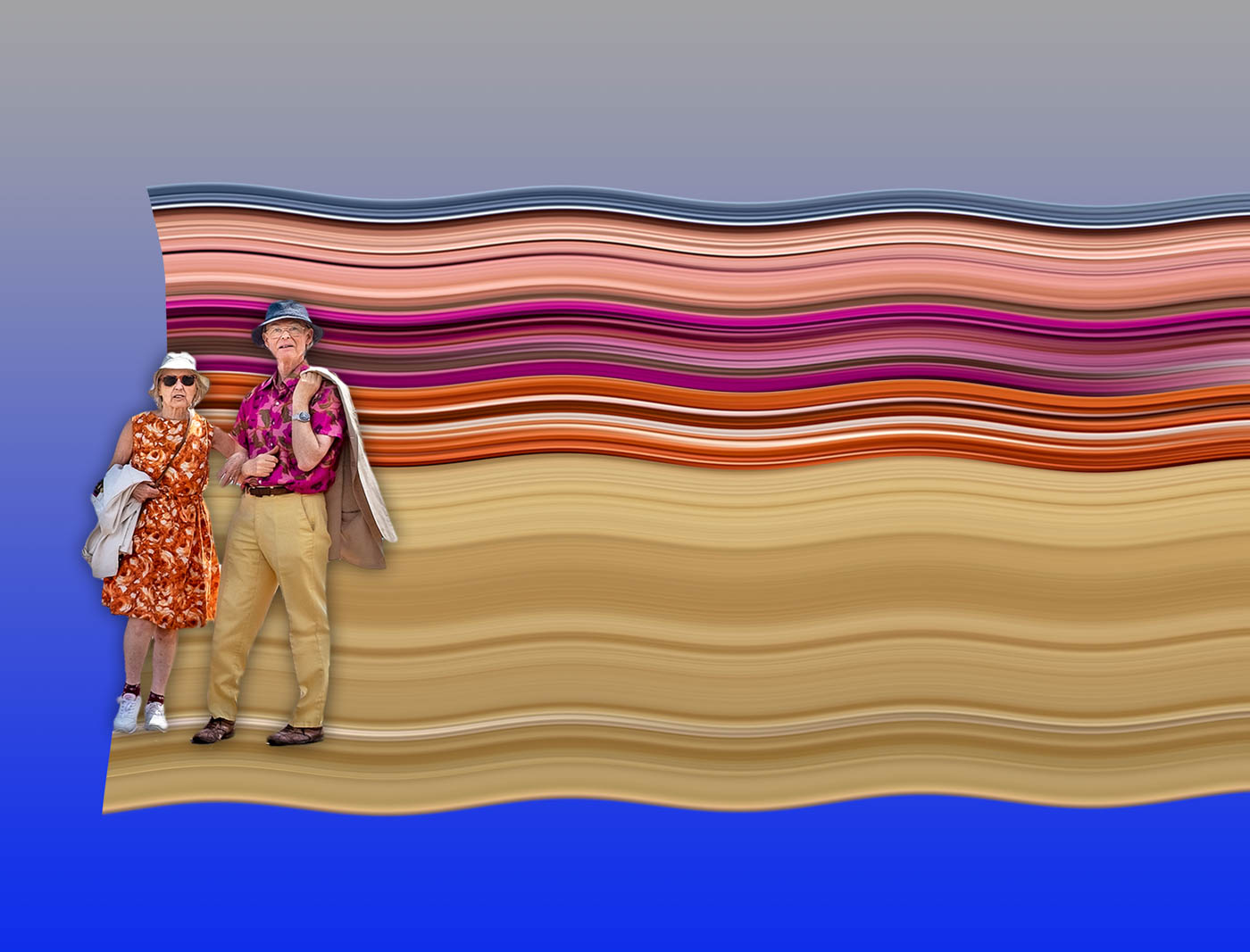
This image of yours certainly works better in mono than in the original colour version. It is a very abstract image reminiscent of many images by Mondrian. Images which you might say there is nothing there to see but at the same time that there is everything to see. For me I'm happy with the composition as presented and even with the often infuriating title 'Untitled'! Because to title it would lead the viewer in a direction that he/she might not want to go. So I can't suggest any changes as I like it as it is. |
Feb 13th |
| 99 |
Feb 22 |
Comment |
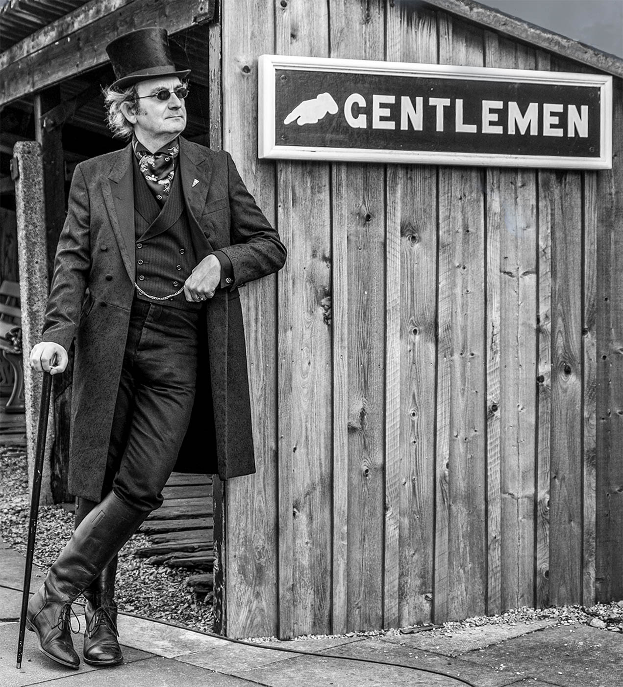
For me this works better in the mono version. This is a greta character study of a man taking a break. I like the crop you have done but find the bright white line running down the back of his shirt distracting probably because the background is so dark behind him. I also think there is no definition in the black of his hair on the top of his head and it would be good to see that if you can pull the blacks back. I also think you have been caught between a rock and a hard place with the cafe in the background. You don't want it to distract but at the same time the solid black is very intense which in turn drives the viewer up to the items on the shelves. So maybe play around with the blacks but I'd also clone out or darken more the oval sign top left.
|
Feb 6th |
| 99 |
Feb 22 |
Comment |
I think these are bones of some creature like a crab but it could be any other sea creature. An interesting shot with plenty of texture and shapes. Of the two alternatives posted here I tend to go more towards that created by Randy. The original is somewhat over bright. |
Feb 6th |
| 99 |
Feb 22 |
Comment |
I like this very much. It is delicate yet pronounced. Strangely although it is so minimal, there is so much detail there to see. I like the composition and treatment. The mono has rendered the colour shot so much more dramatic. |
Feb 6th |
| 99 |
Feb 22 |
Reply |
Randy
Many thanks for your comments which were similar but totally opposite to those made by Gerard! It seems that buttocks divide opinion depending on where you are coming from and I reckon it's far better for me not to make any comment on any of that. |
Feb 6th |
| 99 |
Feb 22 |
Reply |
Gerard
Many thanks for your comments which were helpful and also made me laugh! But in reply I think I will just direct you to the comments made by Randy and my reply to her. |
Feb 6th |
6 comments - 2 replies for Group 99
|
10 comments - 2 replies Total
|