|
| Group |
Round |
C/R |
Comment |
Date |
Image |
| 17 |
Sep 21 |
Comment |
Glenn, I like the lead-in line from the boat house to the rocks and beyond. A great sky and plenty to see on either shore. Looks like this was a place where you got plenty of shots. |
Sep 8th |
| 17 |
Sep 21 |
Comment |
Sheldon, this is a stunning landscape with plenty of colour variation and depth. You have done very well considering the haze. I hesitated about playing with this image as the landscape is so awesome but I did wonder if upping the contrast might bring out the far side a little more and this is the result. |
Sep 8th |
 |
| 17 |
Sep 21 |
Comment |
Matisa, this is a bold and dramatic image and I enjoyed several aspects of it - particularly the unusual stretch of trees in the foreground. Was this taken through the window? I ask because there seems to be the reflection of the sun on the water - a circular blob and that could be fairly easily cloned out. The buildings lean a little to the right and need some vertical correction - but this is a very good 'grab shot'. |
Sep 8th |
| 17 |
Sep 21 |
Comment |
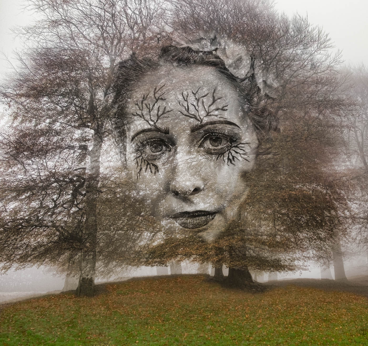
This is an interesting shot with a definitely 'painterly' feel to the final result. I enjoyed the muted colours and the tracks leading through to the end of the shot where there almost looks like there is a figure standing.. There might be a question about the blue shade to the path of snow and wonder if the processing has caused this. The bright branch end on the right in the trees could perhaps be toned down a little. |
Sep 8th |
| 17 |
Sep 21 |
Comment |
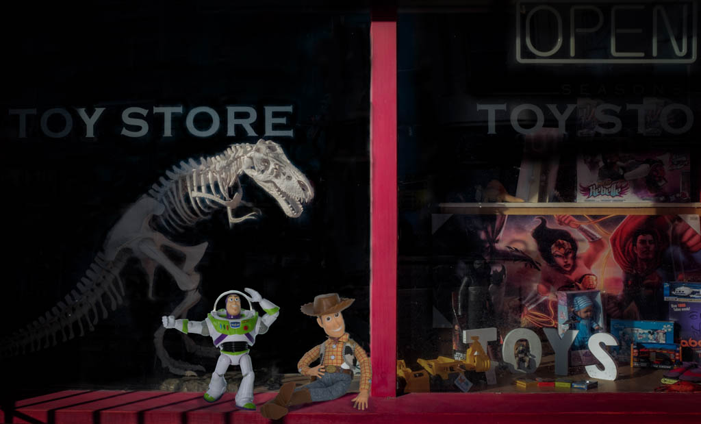
This is an amusing shot of this sculpture or model. I like the way you have caught the reflection of the cat which still has a little detail in it. I find the background somewhat distracting and wonder if a mono version of this might work a little better or maybe just tone down the bright green behind the flagpole? |
Sep 8th |
| 17 |
Sep 21 |
Reply |
Stephen, thanks for visiting and commenting. Strangely I also did a mono version of this because it was quite dark and it works pretty well so may move towards that. Interesting comment on her skin tones and I agree that airbrushing them might on this occasion be not respectful to her. |
Sep 8th |
5 comments - 1 reply for Group 17
|
| 99 |
Sep 21 |
Reply |
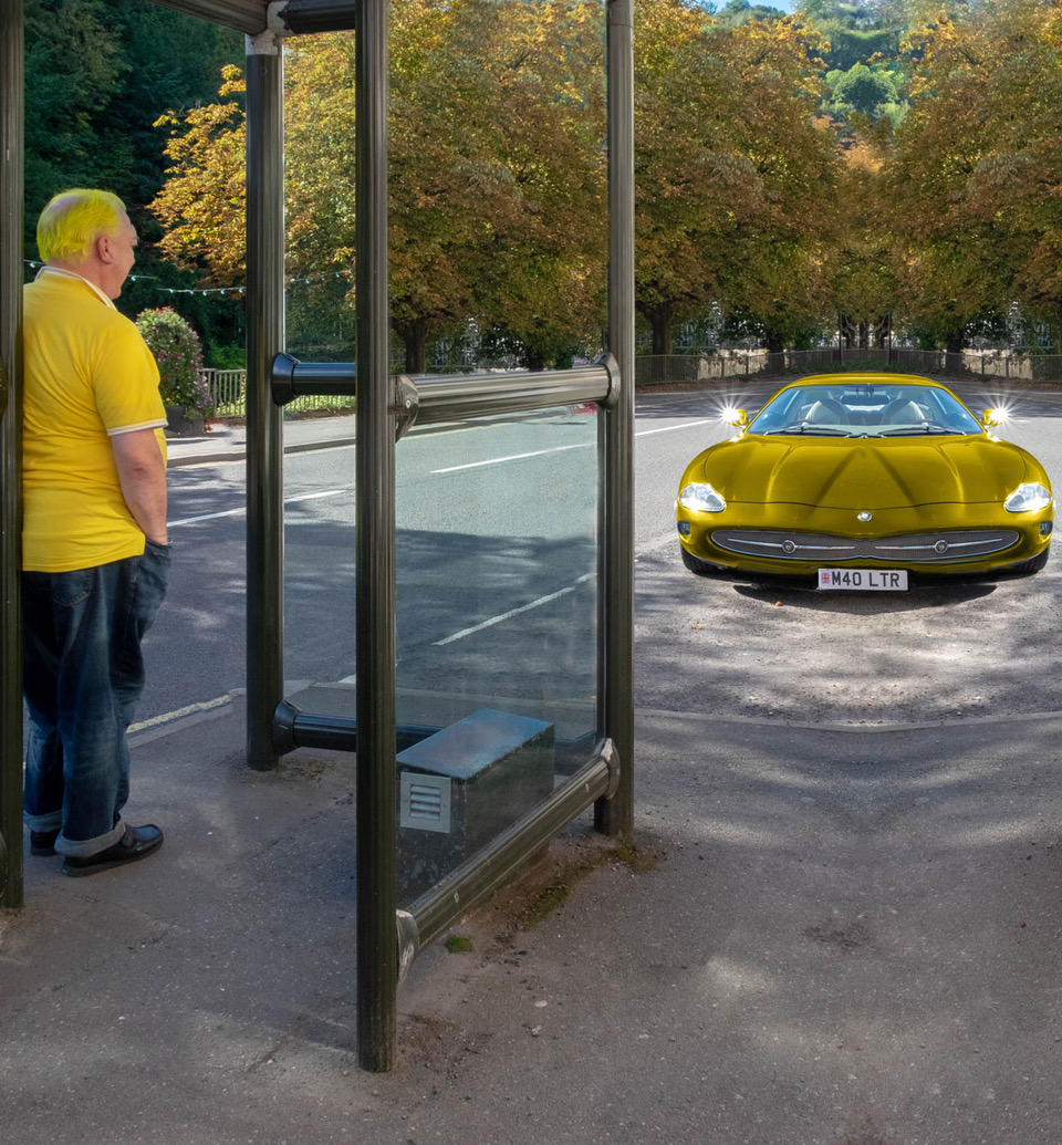
Lance, many thanks for your comments and for joining the conversation. I agree with both your comments and Gerard's as well as those from others in this group that this is an image which divides opinion. But I do agree with your point and those made by Linda that the image needs something to bring the viewer into the narrative. As a result I have re-worked the image so that it is clear the image is more obviously set in a car wing mirror. This is attached. I also think that this image reflects my feeling that the images I have been creating and editing have been turning them into 'safe' images to satisfy competition judges - so in effect they have ended up as not my images. We'll see how 'brave' I can be with future creations! |
Sep 20th |
 |
| 99 |
Sep 21 |
Reply |
Linda, thanks for your comments. I think you have made a very good suggestion here which I will adopt. Seeing more around the mirror provides essential context for this shot which I may well now try out in the 'Abstract' competition in a couple of months. |
Sep 9th |
| 99 |
Sep 21 |
Comment |
Randy, I do quite a bit of street photography - having people in images always appeals to me, so it was great to see this one. For some this might be a shot where there is nothing happening as it's so ordinary and compositionally there are plenty of things that might be considered best not there. Like the traffic cone for one! But the point of this shot is that it is about ordinary life going on. I like the Empire State shrouded in mist and the fact that no one is looking at it. So this is totally the opposite of Gerard's comments!
But I think you ought to title it and would suggest '9.41' - that's the time on the bus shelter and provides the viewer with the kind of statement that shows your intentions - life in New York at that time. |
Sep 7th |
| 99 |
Sep 21 |
Comment |
Michael, somehow I reckon that you saw my image of the dog in the wing mirror and decided to put up something equally as obscure! But what I really mean is that it's so good to see this group putting up some images which in other context would be either thrown aside or discounted as poorly executed.
This image expects the viewer to make an effort to understand it and whilst they may not like it, at least there is an interaction to be had. There is something quite ominous about the reflections inside the house - suggesting a fire has happened perhaps sometime along the way. I'm intrigued by your exposure time and would like to know why you adopted that for this shot.
Thanks for posting something different. |
Sep 7th |
| 99 |
Sep 21 |
Comment |
Linda, this is a terrific image and there is definitely a touch of the Stan Laurel's about this animal's expression - so well done for capturing it. Unlike some of the others I quite like your use of a textured background but would adjust the swirls around the top of the head as I find those distracting. An alternative title might be 'That's another fine mess you've got me into!' |
Sep 7th |
| 99 |
Sep 21 |
Comment |
Gerard, I think you too have gone in for some 'Lenswork' here! Many thanks for alerting me to that magazine by the way as I did not know of it. There's a lot to look at in this image and maybe that's why it did not get picked in a pSA exhibition - probably not 'safe' enough.
For me, I like the fact that it confronts the viewer with a set of really bizarre and unusual aspects - bananas, hydrogen and the threat of having your car impounded! What's not to like? So I have no compositional suggestions but maybe just that I find the contrast rather on the high side and that the white of the top cylinders in particular are a little glary - if that's a word. Toning them down might be something to consider. Keep these alternative images coming.
|
Sep 7th |
| 99 |
Sep 21 |
Comment |
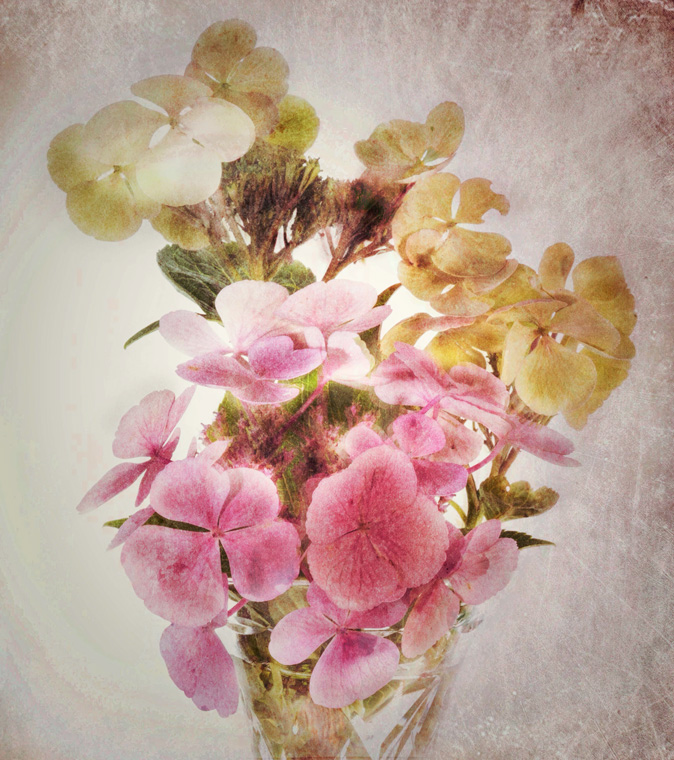
Barbara
When I see mono images of flowers the first thing I think is 'why do that?' Surely it's better to see the full glory of the flower with all it's colours and delicate shades. But then when I look at your image, I can see that is a pointless thing to consider. Your version in a sepia mono is equally a thing of beauty and gives the flower another life. There is a physicality to the treatment you have applied and it is pin sharp. I don't mind the background because it provides extra context for the flower. Good work. |
Sep 7th |
| 99 |
Sep 21 |
Reply |
Gerard
Thanks for your comments which are really helpful. I think what they confirm is that I find it really hard to do 'abstract' and I agree that this is probably more of a conceptual image and one which I often find myself drawn to. Interesting that you say you do not think it a PSA image which makes me wonder if that means PSA images are 'safe' in that they generally operate within certain photographic rules like the ones you list. A shame if that's the case.
However, what I think this also means is that it's back to the drawing board for something less conceptual and more 'clearly' abstract! If I can manage it. |
Sep 4th |
5 comments - 3 replies for Group 99
|
10 comments - 4 replies Total
|