|
| Group |
Round |
C/R |
Comment |
Date |
Image |
| 17 |
Aug 21 |
Reply |
Stuart, thanks for your advice. I'm still in two minds about the cropping of this as I can see advantages in both. However, at the moment the general opinion is that a crop of the kind i have now followed through which virtually replicates yours is on the cards! |
Aug 17th |
| 17 |
Aug 21 |
Comment |
Joe
Thanks for the two images. I can see what you went for the first in that it is far more dramatic and makes a good point about the reason for the lighthouse. I agree with Sheldon's suggestions but would also pose the question - is the lighthouse vertical or is it slightly off - or is that just an optical illusion? I've started at it for a long time and still can't make up my mind! |
Aug 11th |
| 17 |
Aug 21 |
Comment |
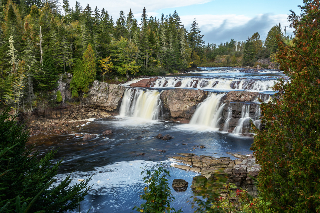
Glenn, a beautiful scene and the slower shutter speed gives the feel of the power of the water going over the falls. I thought that maybe the brightness and contrast needed increasing so have tried that and have attached this image - what do you think? |
Aug 7th |
 |
| 17 |
Aug 21 |
Comment |
Sheldon, this is an interesting and unusual image because if you hadn't explained it was an artistic installation, I would have assumed it was simply a view of an area which was being cleared of dead trees. Which perhaps is precisely what the artist has in mind.
The image has a good lead in line to the light at the end of the tunnel and i think the dog walker is useful in giving that sense of scale. But I think the highlights on the sculpture are somewhat harsh and could be toned down somewhat. Maybe you might also consider darkening the avenue of trees either side to give far more dramatic effect to the central line of light? |
Aug 7th |
| 17 |
Aug 21 |
Comment |
Marisa, thanks for showing this - a fascinating landscape shot with a road that looks like a ski slope coming off the mountain. Sheldon has already outlined many useful tips for you to follow to improve this image and help with future shots so I will not add to them. All I would say is that you need to keep going as you will learn and remember things as you go. The important thing is to take lots of photographs and get to know your camera. Join a camera club if you are not already in one and look at the photographs of other photographers - I often visit the other groups in this PSA Digital Dialogue. This will help you see what other people try to do with their images and how they can be adjusted if need be. |
Aug 7th |
| 17 |
Aug 21 |
Comment |
Joe, as an ex-bookseller among other things, I was interested to see this shot of book promotion and encouragement to read. A great effort by the local communities. We have something similar in parts of the UK but they often take the shape of turning old public telephone boxes into mini on street libraries. Very good too that they have a special kids section at an appropriate height! Thanks for sharing. |
Aug 7th |
| 17 |
Aug 21 |
Comment |
John, another interesting shot of a small item which seem to be something of a speciality for you! It's always difficult to photograph silver but you have done a very good job here and the fish is well set off against the wooden background. It does look fractionally soft but maybe that's how it is. Interesting to see some of the reflections in the head of the fish of the rest of Britannia. I too have visited Britannia and it is a great place to take in the history and get some really interesting shots. I was particularly surprised to come across a sweetshop on board when I visited - did you see that too? |
Aug 7th |
| 17 |
Aug 21 |
Reply |
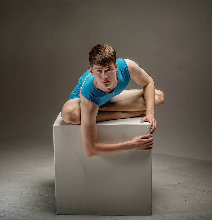
Sheldon, thanks for the suggestions. When I was processing this image I was in two minds how much to keep in. I liked the negative space for showing the area the dancer would work but I also kind of like what happens when you cut it back as suggested. So here it is with the other improvements added. |
Aug 7th |
 |
6 comments - 2 replies for Group 17
|
| 99 |
Aug 21 |
Reply |
Linda
Thanks for your very kind comments. Yes, cuting out the background took an absolute age but I have learned some useful techniques with this over the years but even so it's possible to make mistakes and I saw some when I went back to the image following some of the comments raised here - but I'm not saying what they were! I kind of like your treatment but maybe think the central brightness is too like a spotlight. I sometimes use a similar effect in Nik Colour Efx which is the darken/lighten centre module and that can be quite effective so I might try that. |
Aug 17th |
| 99 |
Aug 21 |
Reply |
Yep, the new one does it for me. |
Aug 11th |
| 99 |
Aug 21 |
Comment |
Randy, a good shot of everyday life. I agree with much of that has already been said about the bright area and the cropping down from the top to remove quite a lot of the doorway above the child standing in it. The real 'problem' is the cafe seats and I'm in two minds about them. I think you do need to crop out the bright lights on the table and ten you are left with the chair that obscures the boy's feet. So what to do? Do you lose the boy altogether or just crop up to above the top of the chair and leave him with no feet? But of course everyone would know he had feet as he is out running about, so does it matter that you cannot see them? This is a debate that often is of consequence in one discussion or area but not in another. If you want to totally improve the image then do all the other suggested adjustments, then my view crop right up to above the chair top and live with the result. On the other hand, as Michael says, if you want authentic street photographic distractions and all just keep the seat and alter the lighting on the other parts. |
Aug 6th |
| 99 |
Aug 21 |
Comment |
Leanne, you certainly have been inventive with this image in terms of adjustments. You have managed to restore some sharpness but as you say it is still on the soft side and I don't think you could have done any more.
I would suggest that as you've called it Textured steel and bricks that the bottom section with the street lights, whilst giving context, do not add to that title and are a bit of a distraction for me. So I would crop from the bottom to just above the tree. I like the bridge arch at the top and would like to have that as the point to which the eye eventually goes. Also strangely, whilst that point looks vertical the struts/supports that holdup the railway line look off the vertical but I guess they must have been like that. Plenty of drama in this image but I think your textured overlay could be a little less heavy, maybe. |
Aug 6th |
| 99 |
Aug 21 |
Comment |
Michael, your mono conversion of this succulent works for me. This has an almost animal-like quality suggesting a creature maybe ed up on itself with the head deep in the centre! Maybe I need to get out more! If you really wanted to play with this an eye at the centre might be fun or just to live the very centre in colour.
Great texture and depth of field make this a very pleasing standalone image. Your use of Silver EFX has helped too. Good technique. |
Aug 6th |
| 99 |
Aug 21 |
Comment |
Linda
thanks for this very dramatic image. If ever an image called for mono conversion, then this was one of them. You have made this all about the character/texture of the tree stump which resembles a creature that has crawled out of the sea. I also think the background tree on the left helps the composition and would leave it in. Good to have taken out the people. For me this is a great image and very well handled. |
Aug 6th |
| 99 |
Aug 21 |
Comment |
Gerard, thanks for these images and also for showing us the setup. Pretty cramped in that corner I guess to get to the shutter! But a great place to take advantage of the natural light.
The mono version is the one for me too as I agree with the others that the red in the bottle detracts from the main subject - the flower. I too like the ascendancy of the flower and the contrast with the background. What I'm less sure about is the double shadow of the bottle as I find two somewhat distracting. If you were to cut one out it wouldn't be difficult and for that would have to be the one leading to the lower left corner and I would then also lighten/soften the remaining shadow. |
Aug 6th |
| 99 |
Aug 21 |
Comment |
Barbara, I like the composition particularly for the capture of the approaching bee which adds drama to the image. The insect/bee on the flower, I'm not so keen on!
Converting to mono is always a difficult choice when faced with a highly impressive colour image which displays the object in all its glory. But it's good to experiment and i think this does work. Technically I would have preferred more sharpness in the flower centre. I see you were at 1/640 @ f1.8 but with an ISO of 160. Increasing the ISO would allow for a smaller aperture and better depth of field. Michael's reference to Nik Brighten Centre in Color EFEX is a good one too as I use that quite frequently. |
Aug 6th |
| 99 |
Aug 21 |
Reply |
Leanne, many thanks for your comments. I've uploaded the full colour image too. As for the power pole - I'm in two minds about that. It would be easy to take out but I also feel it adds authenticity to the setting. |
Aug 5th |
| 99 |
Aug 21 |
Reply |
Michael, thanks for your kind comments. For my views on the power pole, see also my reply to Leanne. Colour image also attached. |
Aug 5th |
 |
6 comments - 4 replies for Group 99
|
12 comments - 6 replies Total
|