|
| Group |
Round |
C/R |
Comment |
Date |
Image |
| 17 |
Jul 21 |
Comment |
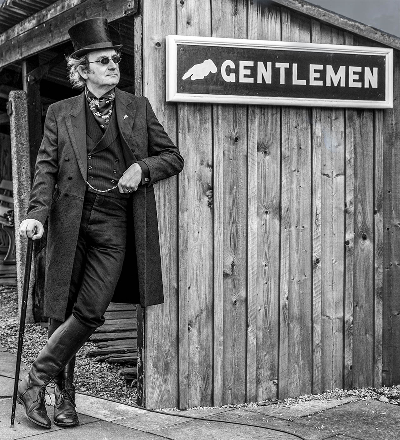
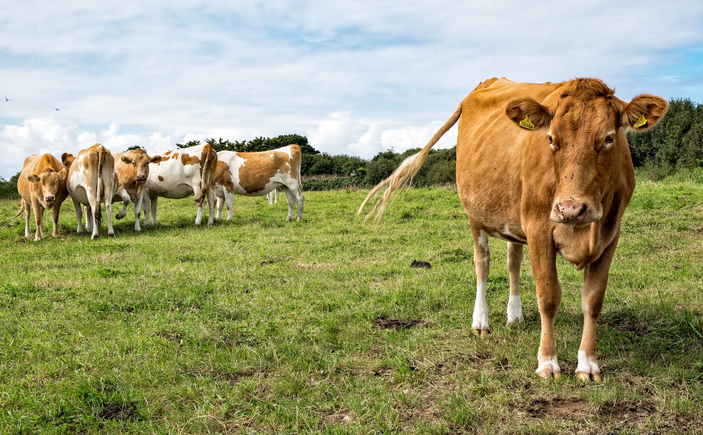
Good record of this vehicle and showing evidence of its age.The exposure looks good - interesting low shutter speed, so you have a very steady hand! Have you tried it in mono or would that ruin the effect you want? |
Jul 7th |
| 17 |
Jul 21 |
Comment |
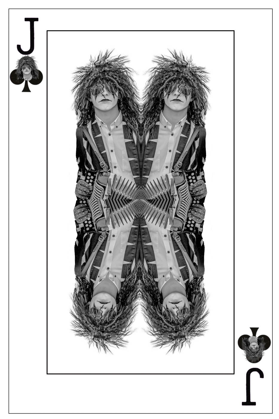
I need to be careful with comments here because I don't wish to offend through ignorance. But my first reaction to this image was that the singer's face appears to be very orange - is this to do with the lighting or is it just my monitor or is his skin colouring likely to appear that way? I'm sure you'll tell me! Other than that I really like this shot as it it captures the singer's happiness. The other member off the group is more of a problem - especially the highlights in his glasses which might be better taken out. |
Jul 7th |
| 17 |
Jul 21 |
Comment |
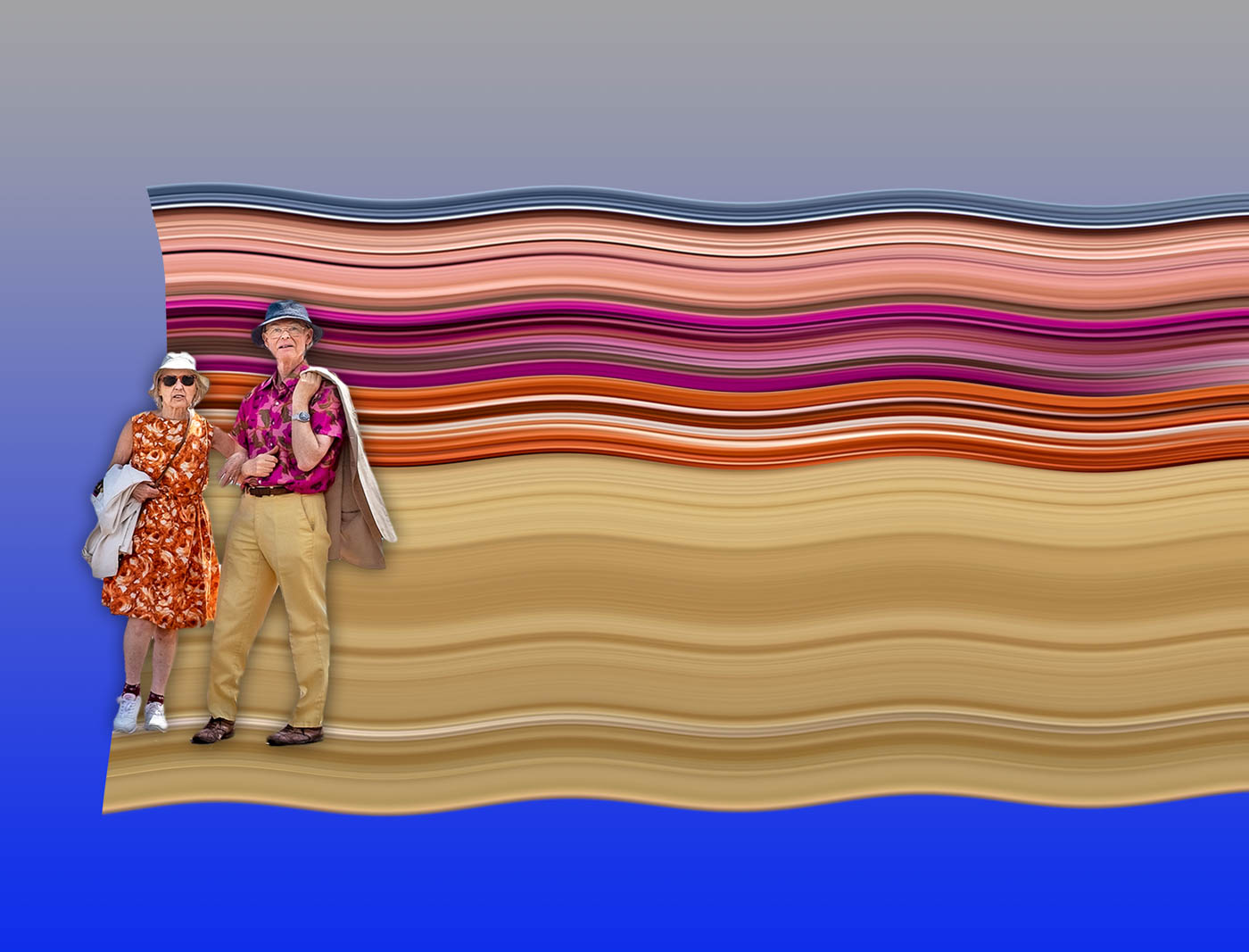
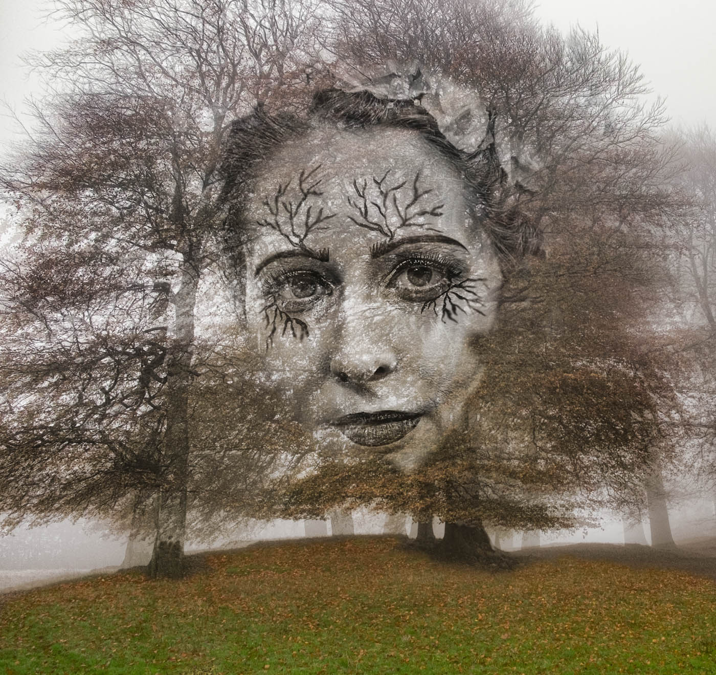
I really like the drama in this caused by the shapes and colours and it will make a fantastic wall display. There is something almost surreal about it and I can see why you are pleased with it. I cannot suggest anything which would I'm prove this other than completely altering your intention - which would be pointless! |
Jul 7th |
| 17 |
Jul 21 |
Comment |
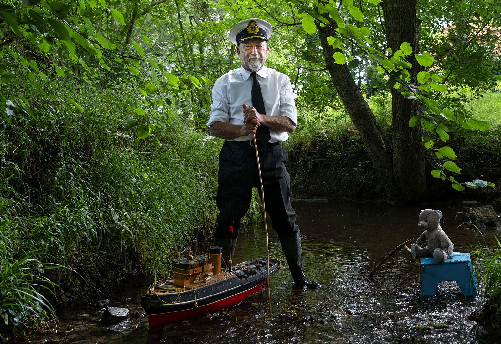
Excellent movement in this in the child and the water. I think the child does need to be clearer though and I would crop a section off the bottom and clone out some of the remaining clear lights. |
Jul 7th |
| 17 |
Jul 21 |
Comment |
This is a very intriguing image because it invites the viewer to speculate on the relationship between the statue and the building. The exposure is good and I like the composition. I cannot suggest any improvements but just find it appealing in its simplicity. |
Jul 7th |
5 comments - 0 replies for Group 17
|
| 99 |
Jul 21 |
Comment |
This is a good macro shot revealing the intricate detail of these buds. The background is not intrusive and the mono treatment shows the fine hairs/tendrils on the flower buds. You don't say if you used a tripod for this but 1/250 should have been enough to restrict movement. But the depth of field is the main issue particularly with the second from left foremost bud which is very soft whilst its companion are spot on. Maybe if the light is not so good, bump up the ISO to say 400 and try for an aperture of at lest f11 to get greater depth of field. I don't mind the stalk strand coming in from the top right as being out of focus. |
Jul 10th |
| 99 |
Jul 21 |
Reply |
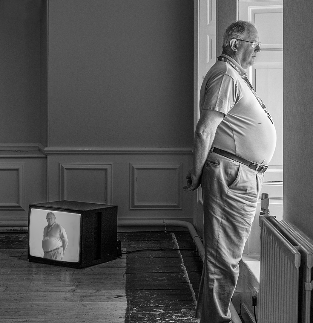
Gerard, many thanks for your detailed comments and those from the other members of the group. It was pleasing to see so many responses and interesting suggestions. I agree with you on how we generally read images in the West and so for me the lead in has got to be left to right with this image from the tv to the man looking out the window. Actually flipping him would also reverse the words on his neck cord even though those are small. As for him not having any feet - this kind of irks me too a little but then everyone knows he will have feet otherwise he wouldn't be standing up! I think sometimes that photographers worry too much about things like this even though I do admit I try to get everything in the frame when taking the shot.
I also liked your suggestion of putting the man in the tv - something I have done before and oddly enough with another image from this art gallery. So here it is but whether it makes it better or not I don't know. Fortunately I did have another image of this attendant and I have used it to give a direct line of gaze from the tv to the viewer of the image with the attendant oblivious of the fact that he is on tv. |
Jul 8th |
 |
| 99 |
Jul 21 |
Reply |
Michael, thanks for your comments. Please see my replies to Linda and Gerad and the new revised pic. |
Jul 8th |
| 99 |
Jul 21 |
Reply |
Linda, Thanks for your comments and suggestions which were very helpful especially regarding darkening the back wall. But I feel that flipping the image does not work for me as I want the tv to be on the left and the man looking out the window on the right as for me the lead in line is always left to right - see Gerard's comments below. I have also reworked the image and for fun taken on board a suggestion from Gerard - see image below. |
Jul 8th |
| 99 |
Jul 21 |
Comment |
Randy, yes you've certainly caught that despair in the eyes of the monkey so the image works on that level. It's always difficult photographing through glass and it is hard to achieve good sharp images let alone get rid of reflections. So this is somewhat soft and a little noisy but the crop is good as it isolates the subject. You might try adjusting it using something like Topaz DeNoise A1 which does a really good job without losing too much definition. I have attached that version done using that using the 'clear' setting and increased the sharpness, then pulled back the highlights in Photoshop. |
Jul 7th |
 |
| 99 |
Jul 21 |
Comment |
Solitary trees always make good subjects and this is one of them. You certainly get the impression of a stark environment as you suggest and the noise/grain in the sky helps emphasise this. I feel the triangular base is perhaps a little too dark. Compositionally this works well. |
Jul 7th |
| 99 |
Jul 21 |
Comment |
Linda, this works very well for me and the work you have done on the original is a great improvement. The flipping horizontally was an excellent idea and the use of gradients really makes for a more dramatic image. |
Jul 7th |
| 99 |
Jul 21 |
Comment |
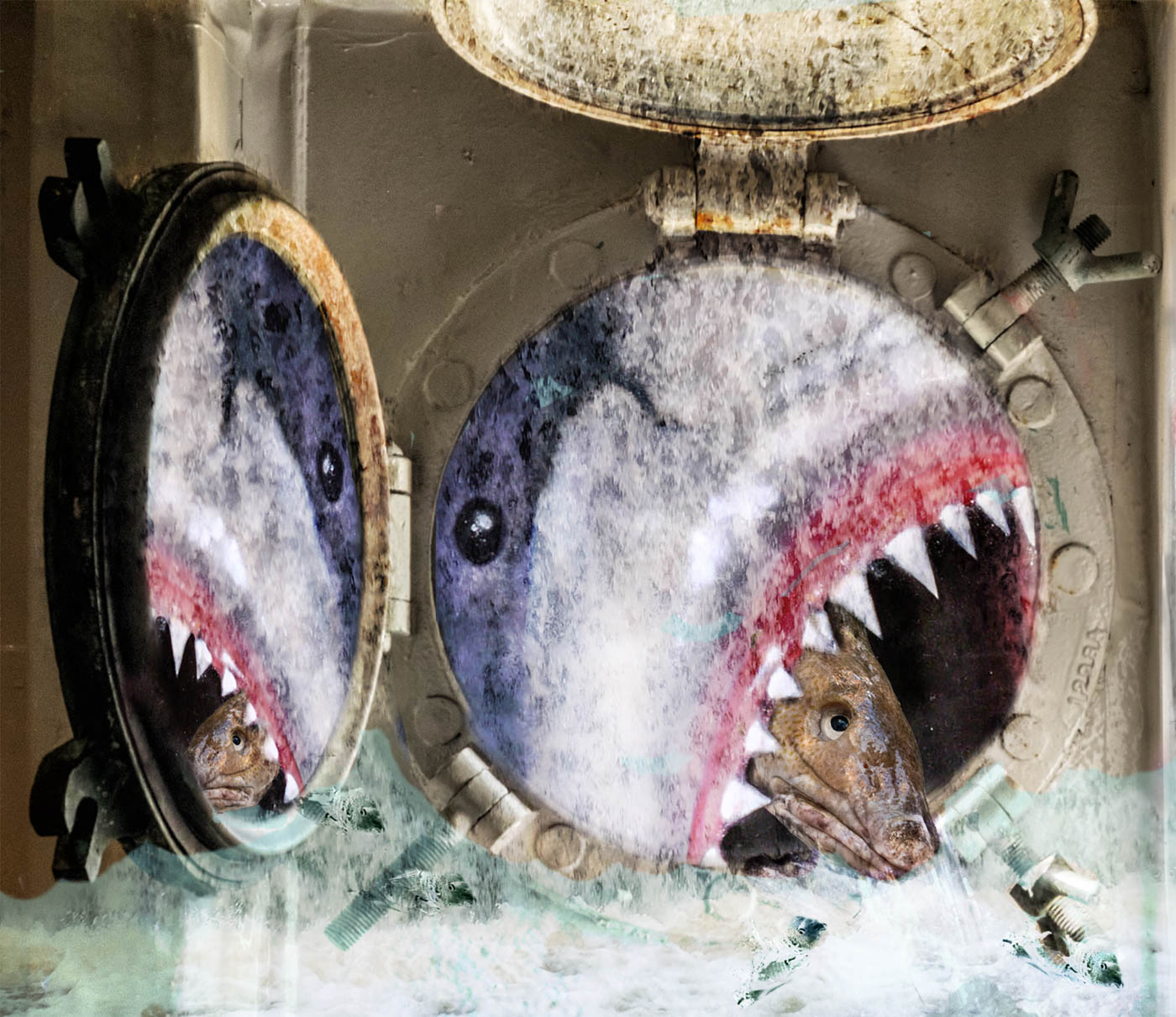
Gerard, this is a great bit of creativity and technical expertise. The main subjects are well captured in a pose that does indeed suggest a 'conversation' and the amount of detail in them is excellent. But I don't think I see the story as you see it mainly because intense heat is not suggested to me by the charcoal log even though it must have been hot sometime. So if you also factor in your title 'Flying by a star' - how does that fit in? I think you have something here that you could rework to make the narrative more obviously related to that title if you still want to use it and so I would suggest a different background and the night sky might do it. The other thing is that line that goes across the bottom and surface the 'robots' are standing on - it might be better to ditch that in processing so that the 'robots' kind of float in space. Although I have been pretty picky with this,I really think you have something good here which has given me much food for thought. |
Jul 7th |
| 99 |
Jul 21 |
Comment |
The mono version works well with this. Although you've titled it 'Just a parking lot' it is far from ordinary as the dramatic sky adds impact. Your crop of the original works well. The only thing that bugs me is that lamppost which is not vertical - probably how it was, so it's matter of taste to correct it. |
Jul 7th |
6 comments - 3 replies for Group 99
|
11 comments - 3 replies Total
|