|
| Group |
Round |
C/R |
Comment |
Date |
Image |
| 17 |
May 21 |
Reply |
Thanks Glenn. I will try out some changes with saturation and contrast and see what the result is like. As for it being counter-intuitive to combine focus stacking with intentional camera movement - this was exactly what the speaker who showed us her images had done and what inspired me to have a go. It is a crazy kind of paradox - aiming to get things totally sharp and then adding intentional blur! |
May 13th |
| 17 |
May 21 |
Reply |
Sheldon, thanks for the comments. There was more stem but these things stand up so straight that I thought too much stem might look boring so I went for more or less a square format but will try again with maybe a different flower. Good 'spot' on the dust spot which I hadn't noticed. |
May 8th |
| 17 |
May 21 |
Comment |
Great location for this photo shoot. I like the lead in from the rocks and the way the sunset if held between the trees. HDR effect has heightened some of the colours in the rocks and vegetation which look a little unnatural, unless that's how they were. Would like to see this without the HDR effect if that was possible. |
May 5th |
| 17 |
May 21 |
Comment |
Joe, this is minimalist to the extreme but great for that. This is one of those images to lose yourself in and unwind. Maybe the sea is perhaps a touch dark and I'm not sure about the curving horizon or is that not the horizon and that's further off? I notice you used a very slow shutter speed so that may account for the lack of sharpness. That sky is very well captured.
|
May 5th |
| 17 |
May 21 |
Comment |
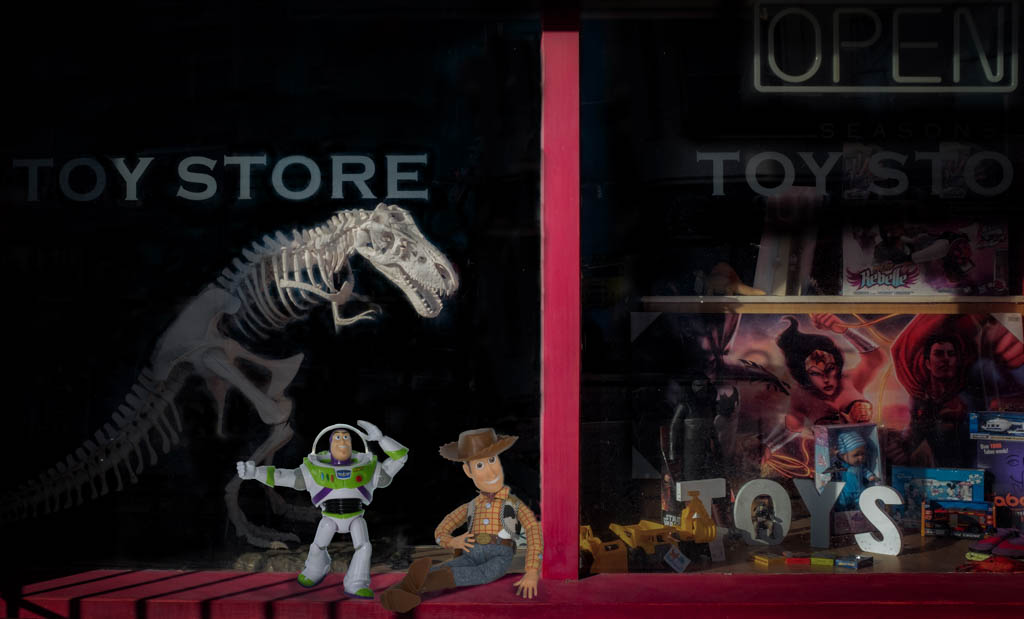
These certainly look as though they could do some damage! Good use of focus stacking - was that done in camera or manually? For a macro shot where detail is everything, you have nailed this. I suppose the only question is 'where to look'?nI thin seeing it on a small screen doesn't do it justice and this is pone of those images which might look really special on a large print on a special paper. |
May 5th |
| 17 |
May 21 |
Comment |
Marissa, welcome to the group. Looking forward to seeing your images. Yes, a very serene feel to this image with the eye taken down to the fountains at the far end. You might like to consider a gentle crop to the bottom section to take out some of the grassy area and maybe to the left to remove the house and garden objects so that brings the focus totally on the pond. If this is within walking distance and that tree is still in bloom it might be worth trying to get closer to it for another sot with the fountains behind it. |
May 5th |
| 17 |
May 21 |
Comment |
Joe, this image was clearly a nightmare to make a decision on and I think you have made the correct one. Looks like the pier is keeping this building upright in a manner of speaking! Great details in this, including the bird on the shore leading you into the pier and then the boat and horizon. Just wondered if the contrast could be increased a little to make it pop a bit more. |
May 5th |
| 17 |
May 21 |
Comment |
A very penetrating stare on this bird! So your title is very apt. I'm not sure what the Topaz filter you've used does to an image but there is a kind of strange effect produced almost as if it has distorted both the background and the bird - or is it just my eyesight playing tricks? The bird is well framed and the colours are good but i find the background tends to dominate somewhat. Sorry John if this sounds negative - it's not meant to be. Taking images of birds of prey is not easy even if in captivity. |
May 5th |
6 comments - 2 replies for Group 17
|
| 99 |
May 21 |
Reply |
Gerard, many thanks for your comments. I will try out some of your suggestions. |
May 10th |
| 99 |
May 21 |
Reply |
Linda, thank you for those very helpful suggestions. It's just what makes these groups so useful as another pair of eyes can spot something that the author of the photograph has missed. |
May 10th |
| 99 |
May 21 |
Comment |
Great, moody shot with just enough details the far bridge structure to make what might be quite an ordinary object appear very different. You might consider a small crop to the top of the sky section to bring it down just above the top of the sharper trees and I don't know how much there is of the black base as where it ends is difficult to see on my screen. Sometimes a very thin white border helps the viewer know where the picture ends but it may not be appropriate with this image but maybe worth a try.
|
May 5th |
| 99 |
May 21 |
Comment |
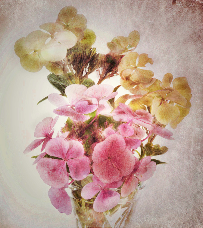
Great texture on this flower and very good depth of field. There's got to be a good reason for turning a colour flower image into a mono and I think your choice and crop prove you made a good decision as the flower appears more dramatic this way. My only criticism, and it is a picky one, is that there is a lot of dead space top right. Maybe you haven't got more of the flower's stem but if you have and could make a slightly longer image so that the flower head appears more at the top of the frame, still on an angle, that might use the space more effectively. |
May 5th |
| 99 |
May 21 |
Comment |
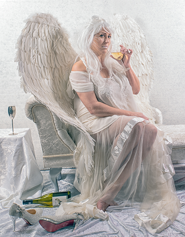
That's an up close and personal introduction Gerard, so it's good to see you bristles and all! Interesting that you entered this in a competition and didn't win - but what did the judge make of it? It's a pretty good shot for someone new to serious photography - sharp, well exposed and a good composition. Maybe though it's the lack of eye contact that the judge didn't like and for me that maybe what this image lacks. I don't need to see the glass of wine but I need to see more of the eyes. It could still be 'minimalist' but just have greater contact with the viewer. Mono also works well with a good range of blacks through greys to white. |
May 5th |
| 99 |
May 21 |
Comment |
This is a very unusual structure, at least one that I don't recognise in the UK. So I don't quite know what makes up the sides of this jetty as it looks like rocks on one side and then some sort of covering on the other? Whatever it is it provides a striking lead-in to the houses on the far shore. You were right to drop in the sky and handled that well. Would agree about bringing out more of the shadows in the pier but I'd leave the bird out of it! And I think the mono conversion makes this sea/landscape far more dramatic than the colour version. |
May 5th |
4 comments - 2 replies for Group 99
|
10 comments - 4 replies Total
|