|
| Group |
Round |
C/R |
Comment |
Date |
Image |
| 17 |
Jan 21 |
Comment |
A powerful image with a strong composition and well handled exposure and processing. The light on the rocks and the lighthouse is excellent as is that of the sunset. I agree that it is a pretty picture and it would look good on a calendar or in a guide book. The negative space above the sunset has plenty of room for a title even if that might destroy the overall effect. |
Jan 10th |
| 17 |
Jan 21 |
Comment |
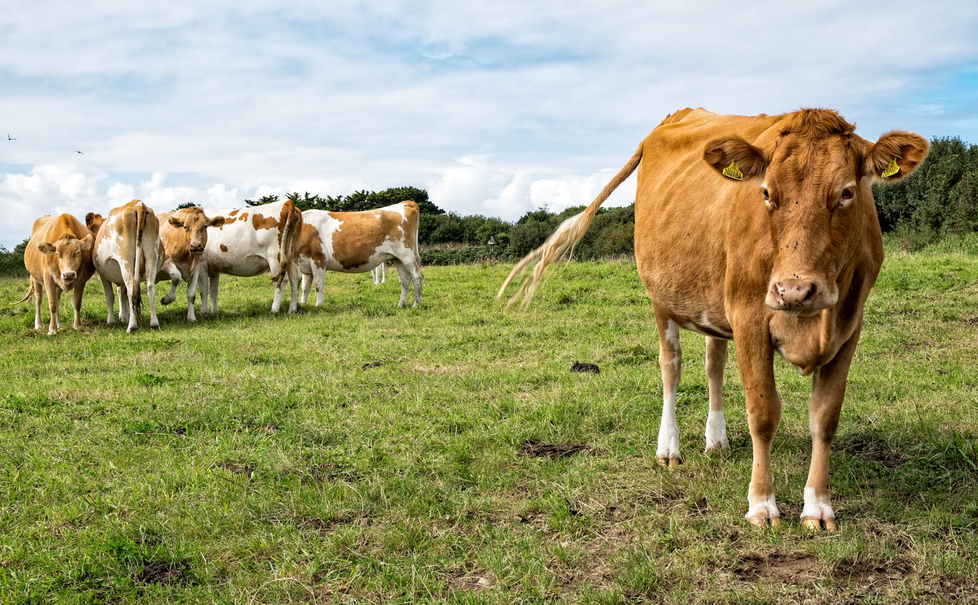
This is a startling image but a great one to start 2021. This is really an image of two halves - the sunflowers and the cattle in the field beyond. I think the contrast between the two works well but I'd lose the sky which is over bright and adds nothing to the image. I think it could also do with a crop elsewhere but I'm not too sure what to suggest - maybe in from the right? The other thing is that the more distant sunflowers almost appear as a mosaic of colour which perhaps in themselves is the image. Not sure about the greens of the sunflower foliage but maybe that's how it was. Sunflowers and ice cream - what more could you need?! |
Jan 10th |
| 17 |
Jan 21 |
Comment |
This angle works for me. It gives the impression of you passing him just as you describe. The exposure is also well handled right up through the stairway. Not totally convinced about your view on a tattoo-less person sitting next to the sign unless of course his expression and posture could be construed as if he is trying to decide if getting a tattoo is a good thing! Good piece of street photography. |
Jan 10th |
| 17 |
Jan 21 |
Comment |
I like the idea you had here of using the frame to create the impression of a painting. The exposure front to back is very good as you have plenty of detail in each area. I might possible darken the white paint lower right but would not crop it out as I think you have left the right amount of wall in. Some might argue that the 'picture' in the frame is not very interesting but many works of art show similar 'mundane' buildings But the pictures is all about shape, colour,light and perspective and this works here.
|
Jan 10th |
| 17 |
Jan 21 |
Comment |
This is a bleak landscape and I think you choice of mono works well in that respect. I like the composition and the sense of movement in the grass. The dark sky is a good frame for the image but the unusual cloud formation top right which almost looks like a giant aircraft is a little distracting. I think you could remove this to good effect.
|
Jan 10th |
5 comments - 0 replies for Group 17
|
5 comments - 0 replies Total
|