|
| Group |
Round |
C/R |
Comment |
Date |
Image |
| 36 |
Sep 18 |
Comment |
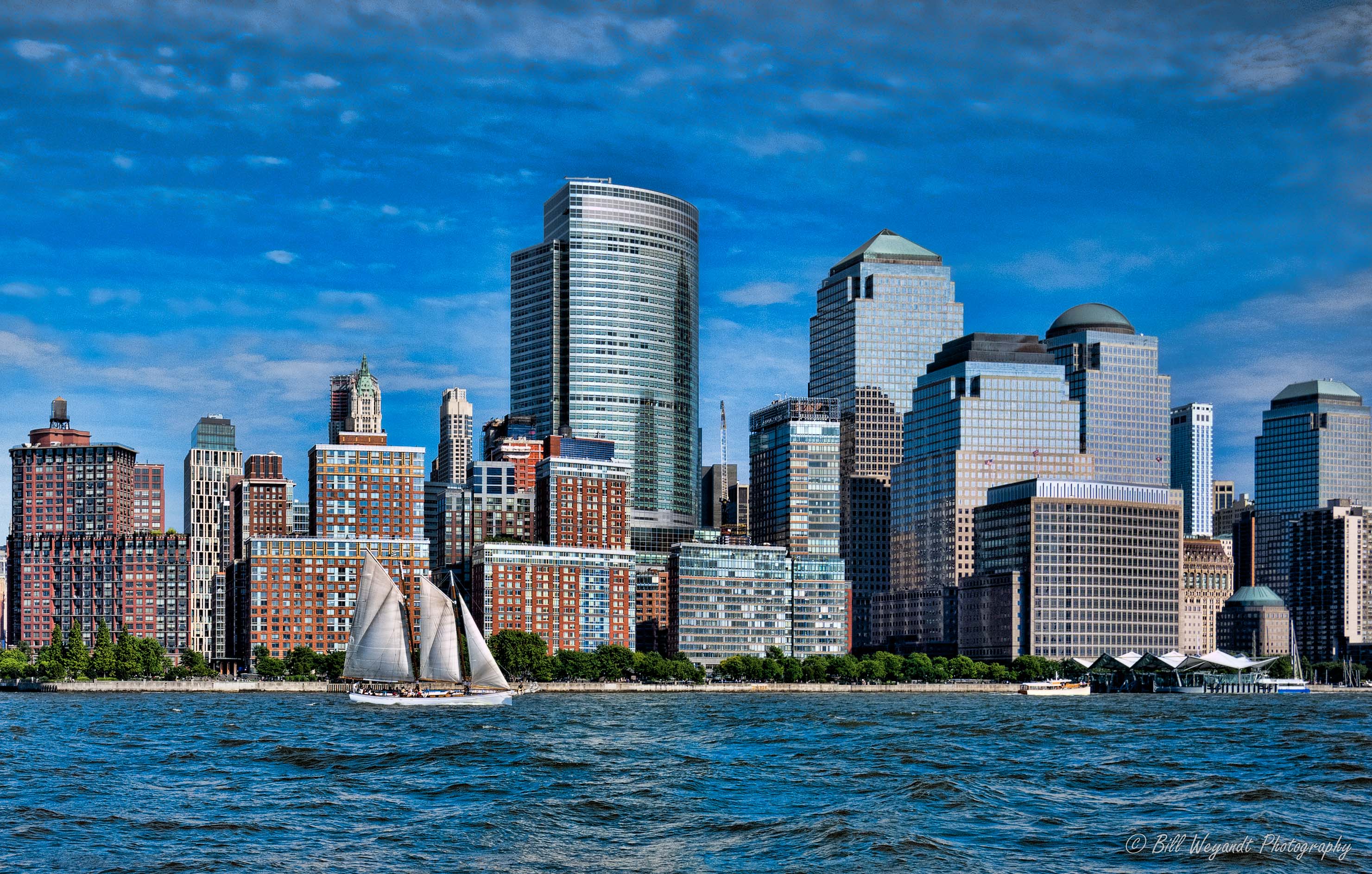
Good composition and capture of cityscape details, David. I know this spot well, having spent about 30 weeks on business staying at the Hyatt or other nearby lodging off St.Kilda road from 1988-2006. After trying to zoom in Lightroom, I am guessing this was a significant crop down of a larger image (?), so there is not much more you could do with shadows without noise issues, but I would take down the highlights or exposure of the two partial lights in the upper right to try and draw less attention by the eye due to the fact they were cut off. |
Sep 8th |
| 36 |
Sep 18 |
Comment |
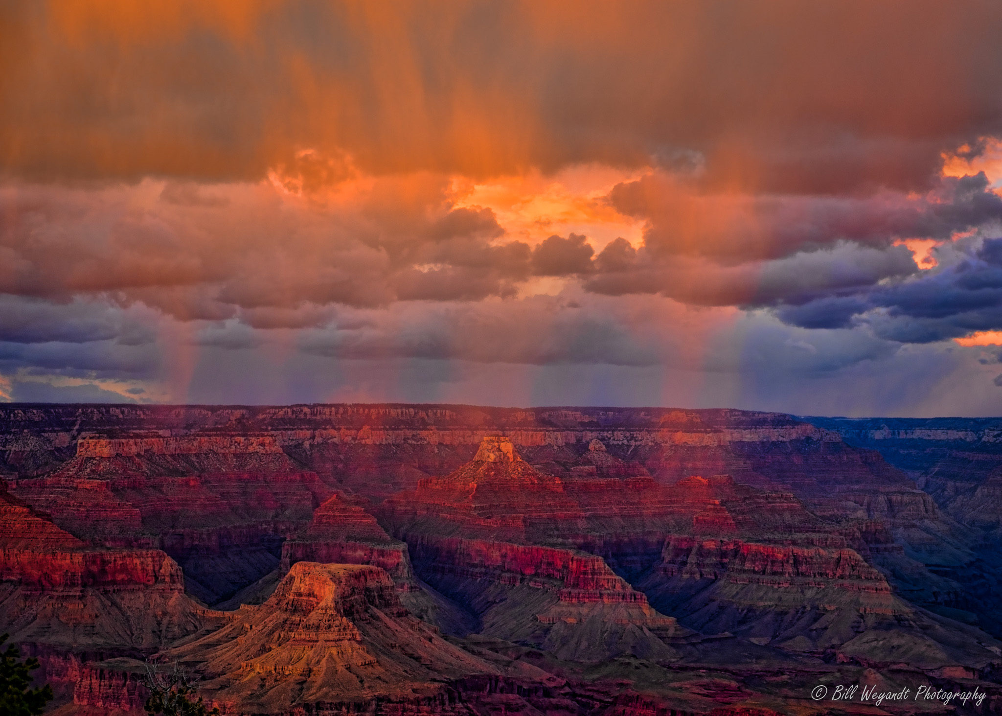
Nice subject and composition, Richard. Good impact. I would take down the highlights a lot, add a touch of shadows and dehaze, and about -1 degree of levelling were I going to print this. |
Sep 7th |
 |
| 36 |
Sep 18 |
Comment |
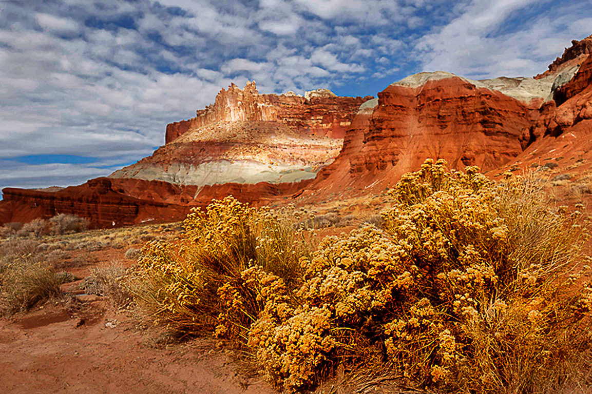
Pleasing composition and catch, Hattie. I hate to be redundant, but I too would try and draw more color out of the clouds and take down their brightness. |
Sep 7th |
| 36 |
Sep 18 |
Comment |
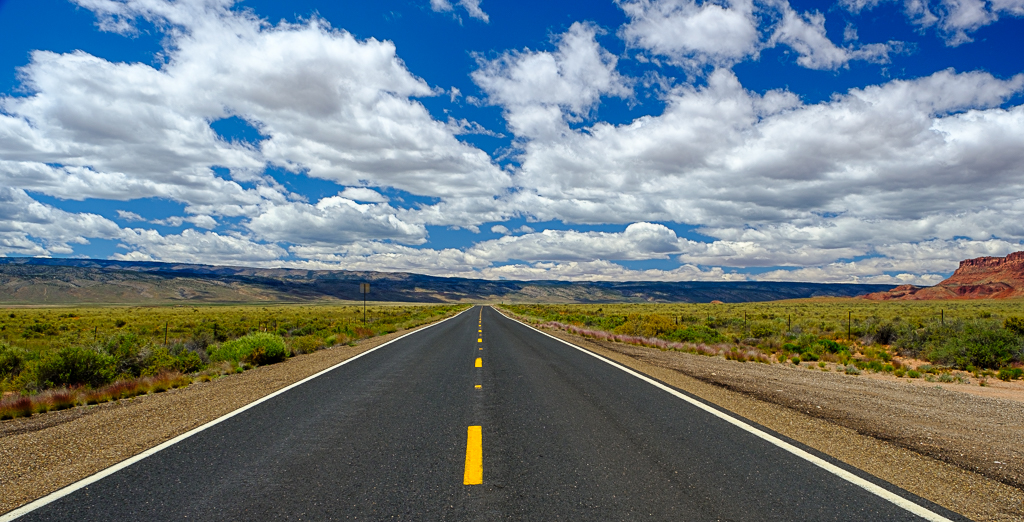
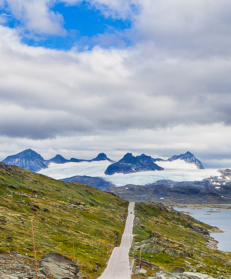
This image gives the viewer a very good sense of place, Arne, and the road provides a nice leading line to the glacier. From your intro the wide slab of pavement in the foreground and large amount of tundra in the left half aren't your focus (and there is so much of them for the eye to wander), it's the road and the glacier, plus maybe some of the nice patch of blue sky and water. |
Sep 7th |
 |
| 36 |
Sep 18 |
Comment |
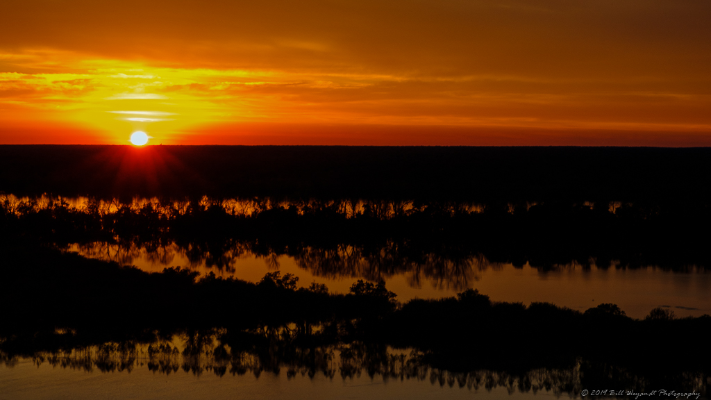
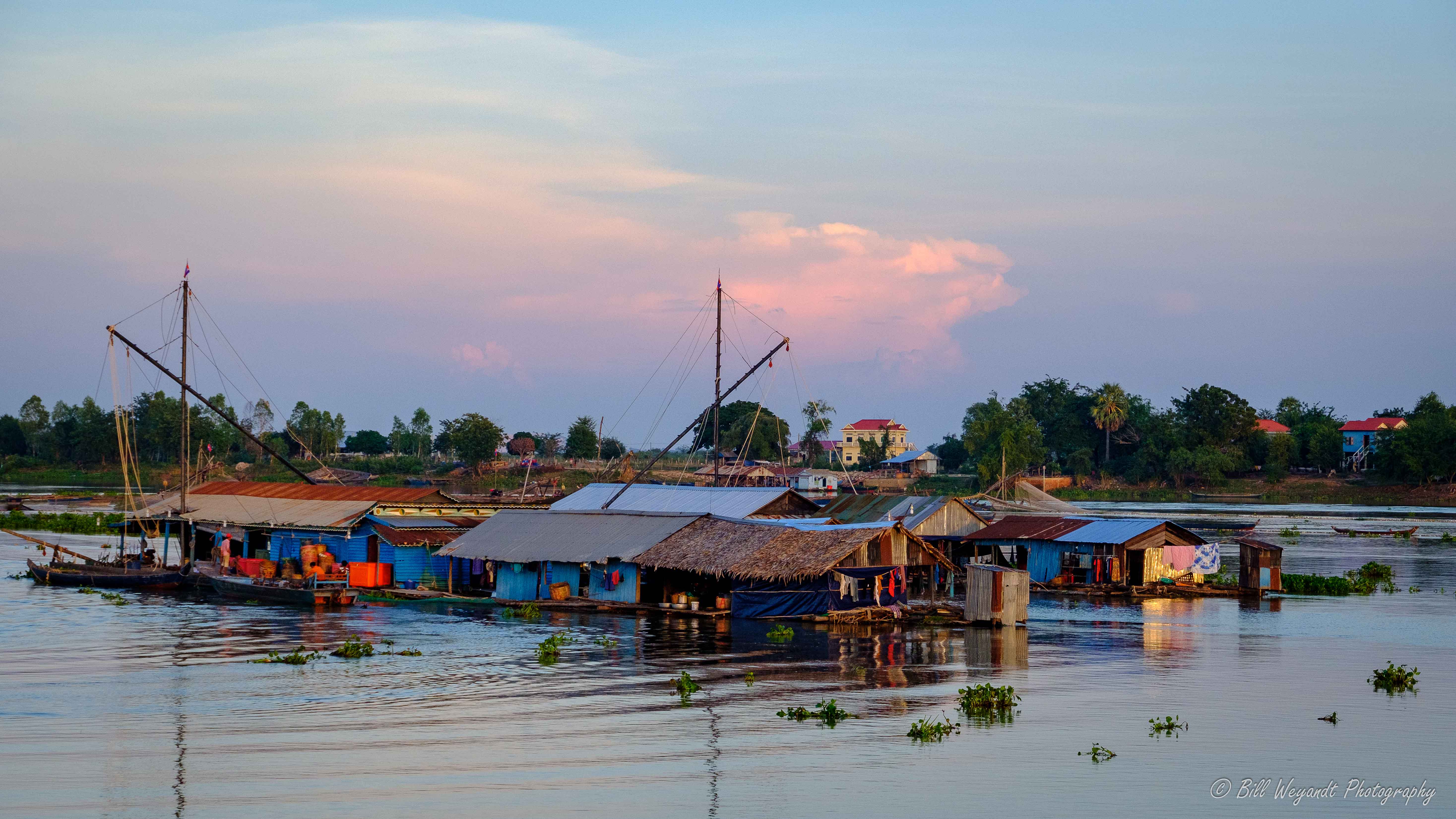
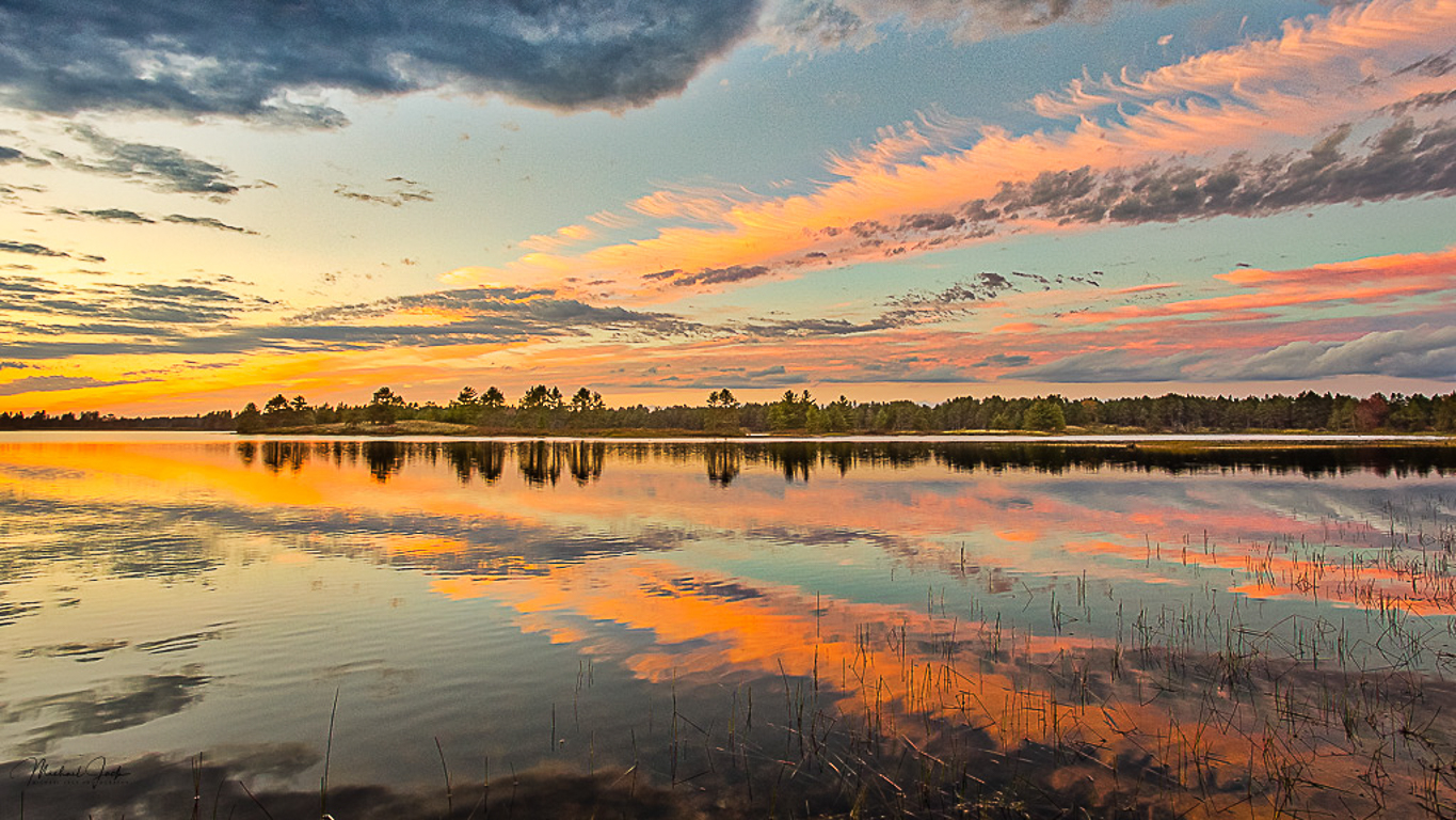
Great image, Michael! Lovely colors, composition, and capture. The one thing I would change if this were mine would be to crop to a 16x9 to give the sky and water a more symmetrical feel, as the large mass of dark clouds in the upper left weighs down the emotional feel of the rest of the image in my mind. A nit (if you print) would be to clone out the three short bits below your watermark. |
Sep 7th |
 |
| 36 |
Sep 18 |
Comment |
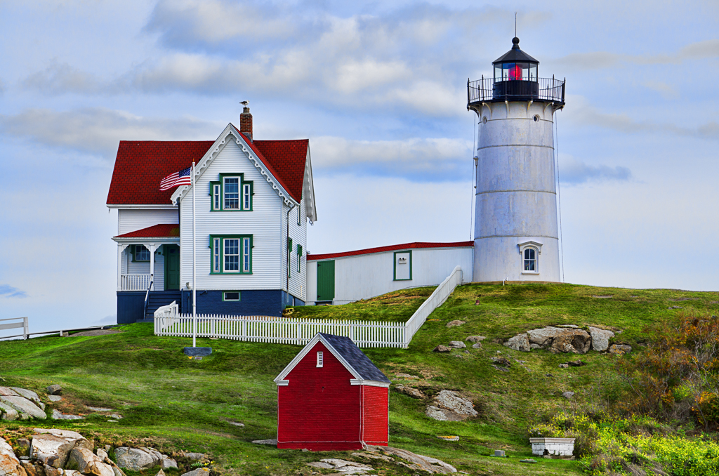
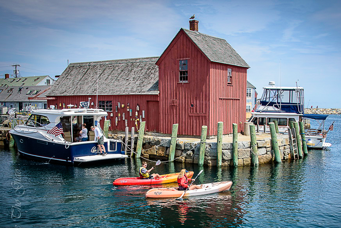
Nice capture! I always like a bird on the chimney, too. In my opinion there is too much water in the foreground. I tightened up the crop from the lower right to focus more on elements of interest, and bumped the vibrance and a added a touch of dehaze to bring up the colors and contrast a bit. |
Sep 7th |
 |
6 comments - 0 replies for Group 36
|
6 comments - 0 replies Total
|