|
| Group |
Round |
C/R |
Comment |
Date |
Image |
| 36 |
Jul 18 |
Reply |
Thanks for the comment, Stephen. |
Jul 14th |
| 36 |
Jul 18 |
Reply |
Thanks for the comment, Stephen. |
Jul 14th |
| 36 |
Jul 18 |
Reply |
Funny! |
Jul 10th |
| 36 |
Jul 18 |
Comment |
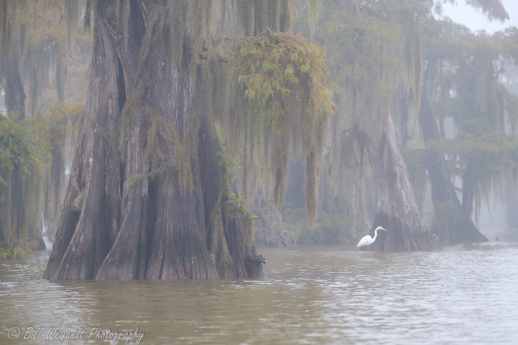
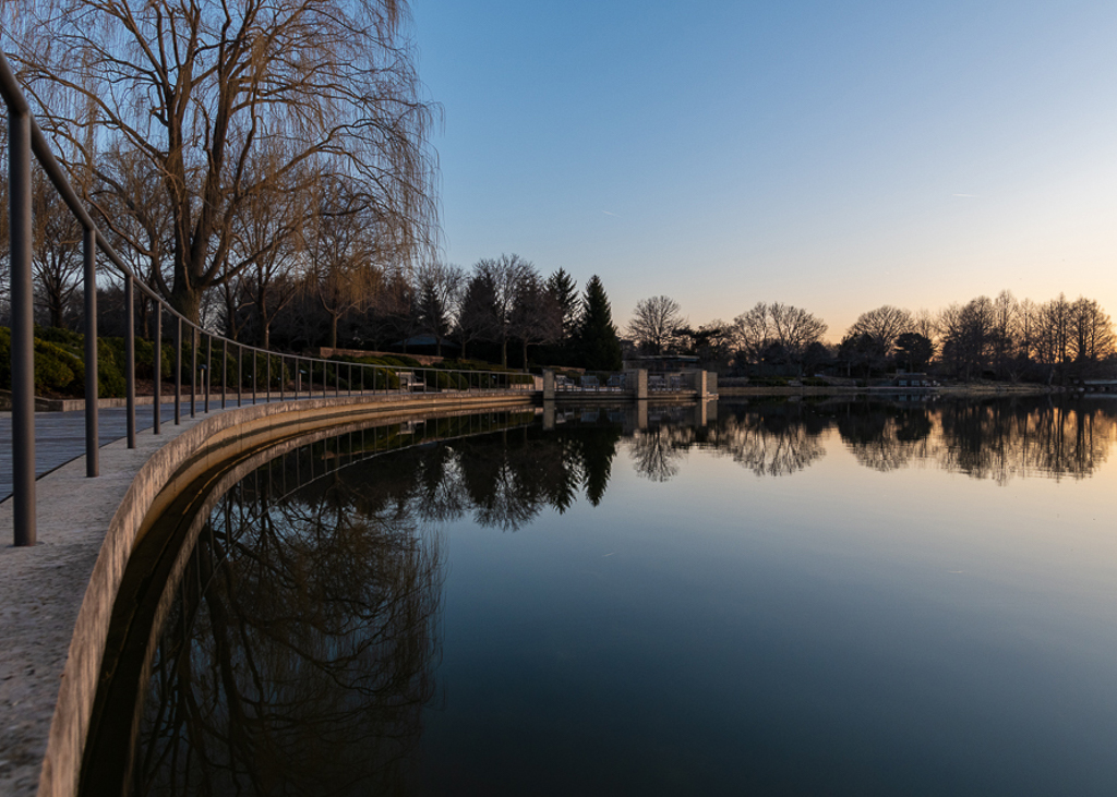
Nice capture, color, and mood, Michael, with the mist and backlit clouds. The bottom right branches don't bother my eye much except the long one near the bottom sticking well out into the water. The large tree silhouette in the left foreground is more problematic, as it strongly pulls the eye over to that side, and I am at a loss as to how I would deal with it effectively in editing. Where is a chainsaw when you need it? |
Jul 8th |
| 36 |
Jul 18 |
Reply |
I respectfully disagree with your levelling, Hattie. You squared it up on the very leftmost vertical member (which is not an element of interest). The original was dead level on the ultimate subject of interest the image is meant to lead your eye to, the alter and vertical window behind it, per Michael's comment. |
Jul 8th |
| 36 |
Jul 18 |
Comment |
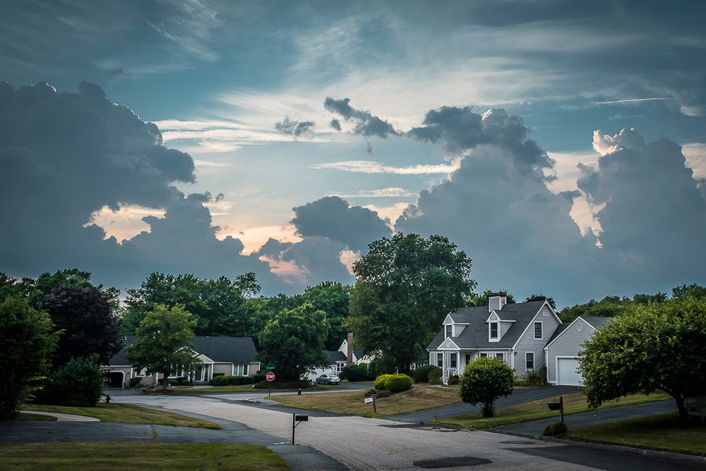
Good job of making an interesting image out of a mundane typical suburban landscape, Le. After reading Michael and Hattie's comments about the amount of high sky, I agree with Hattie, as it frames the bright patch in the middle. What I did in the attached was levelled with the vertical lines of the big house (it looks like you used the mailbox in the foreground), and pulled in the right hand side a bit from the top to get rid of the partial white garage door. That brought the top down a bit but not too much. I like the patched potholes, good photojournalism comment on the road conditions in most northern cities/states. |
Jul 8th |
 |
| 36 |
Jul 18 |
Comment |
Nice B&W treatment. I've had Otis Redding's "(Sittin' On) The Dock of the Bay" going through my head ever since I pulled up your image. What more can I say? |
Jul 8th |
| 36 |
Jul 18 |
Comment |
Nice mood, symmetry, and color. Distracting items on both sides to my eye, a partial bench on the left, and the right side brightness pulls my eye out of the picture. I would tone it down, or crop to just leave a hint. |
Jul 8th |
 |
| 36 |
Jul 18 |
Comment |
Focus, exposure choices, color all make for a good image, David. One thing I would consider is a possible crop on the right hand side (5x7) and up a bit on the bottom, as the image presented feels a bit unbalanced with more visual weight on the left hand side. |
Jul 8th |
 |
| 36 |
Jul 18 |
Comment |
Nice composition, feel, mood, and color. The tree, bushes, and grass appear very fuzzy and soft, not sure if this was your intention, a windy day, or introduced in the jpeg conversion. |
Jul 8th |
6 comments - 4 replies for Group 36
|
6 comments - 4 replies Total
|